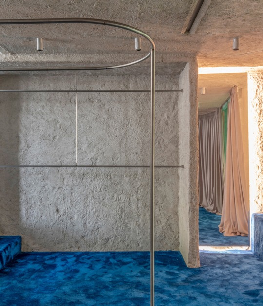
The restaurant located on the third floor is accessed by elevator, when the doors open a large granite monolith receives visitors, inspired by a Galician horreo where only the name of the restaurant is discreetly illuminated. The rough texture of the miracema stone is softened by the artisan scratching that was randomly performed on it.
The rest is an elegant set, made with a very careful handcrafted hand, exploring the transformation of economic and local materials. A place that you want to go to, when you also know that after the architecture will also come an excellent kitchen.
Description of project by Faci Leboreiro Arquitectura
NOSO is a project that defies creativity and designing skills, we designed a signature cuisine restaurant in a small space: 70 diners in 180 sq.m. (1,937.5 sq. ft.) with a limited budget, creating a space that would dazzles the diner and fulfills the client’s expectations.
We designed several distribution schemes, maximizing circulation spaces and comprising the preparation area in a single work island, so the kitchen reduced its size significantly, achieving the desired capacity.
We work only with craftsmen and to achieve the desired effect, we explore the transformation of economic and regional materials, through these artisanal processes, in elegant, sophisticated and national pieces.
For example, the grey granite of the walls was scratched in strips of 2 cm (0.79 in.), alternating with the complete pieces, creating an interesting texture in the stone volumes; the steel lattices that envelop the whole space were cut and assembled by hand, complementing the sober atmosphere of the place; we used Mexican oak by transforming it into singular pieces, creating a striking access corridor.
Every corner of the restaurant was designed to generate a functional and spacious environment. The execution of the project, also carried out by us, was done in a time of 3 months and a half.
As a first contact, when the elevator doors open, a large granite monolith that was inspired by a Galician hórreo (typical granary built in wood or stone, raised from the ground by pillars) receives us, where the restaurant’s name—Noso—is discreetly illuminated and the rough texture of the Miracema stone is softened by the artisan scratching that was randomly performed on it.
The monolith, gives place to the showcase that lodges the menu of the day, through a fracture originated by a steel plate.
As the project continues, an impressive 8-meter-long corridor, composed of slender wooden beams that descend over the wall, creates a dramatic perspective, as well as a rhythm that continues towards the hall. Through a game of reflections in the mirror and a dim lighting, the commensal is guided from the gloom of the access to the light of the hall.
The reception, surprising with the dynamic way to the hall, where the kitchen's pass table functions as a visual auction and the commensal is received by the interesting assembly of the dishes, becoming it a show for the short wait for the table.
Passing through the reception, you will find the volume of the bar, a smaller hórreo, interrupted by the wooden shelves that house the bottles that serve the bar. The inclination in the stone walls, together with the light that emanates from them, creates the sensation that the heavy monoliths float.
Once in the living room, a latticework—conformed by 174 steel plate pieces and inspired by the white wings of the seagulls that can be seen in the Rias Baixas—takes over the room, creating filters and dynamic lighting as if it had its own light, giving a sense of privacy to it.
The wooden ceiling and walls, together with the floor of polished white concrete plates and the comfortable gray armchairs, create an atmosphere of sobriety and neutrality, designed so that the commensal can concentrate on tasting the culinary creations of the chefs. The only piece of art found in the restaurant is the sculpture by Carlos García Noriega, which serves as the visual spot.
On the tables, only illuminates a lamp in the center that baths the table of light as if it were a painting. This lighting gives privacy to the table and helps the concentration in the tasting menu.
In the background, through an open kitchen—specifically and carefully designed with Sandra Fortes and Miguel Hidalgo—you can see their elegant and meticulous work, not before first going through one of the restaurant’s most special spaces: the wine cellar.
In addition to the more than 300 labels storage, the restaurant shelter special objects and greetings that the chefs own: sculptures, the commemorative bottle of elBulli, recipe books, among others. In order to, a series of wooden shelves have been designed to preserve them, following the 12° inclined walls.
At the center of the cellar, a provocative Italian green marble table becomes the table of honor for the restaurant: the chef's table. Only 10 guests can enjoy a specially designed menu for that day; a conceived and specially designed table just for the most special occasions—a canvas of nature for the art of cooking.
The interior design was conceived with unique and special detail, such as Noso’s menu and dishes.
It was a project hard to execute, given the short time for work, the complexity of the design and the details that were required, however, the passion given by the chefs and the architects resulted in a great project—a delight from beginning to end.


