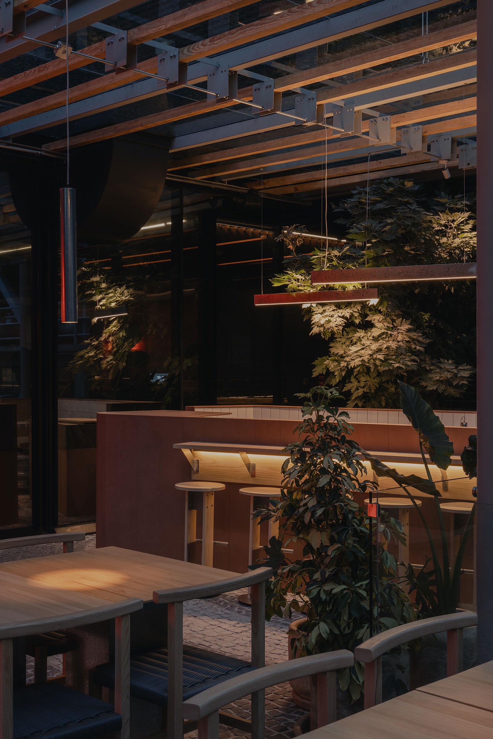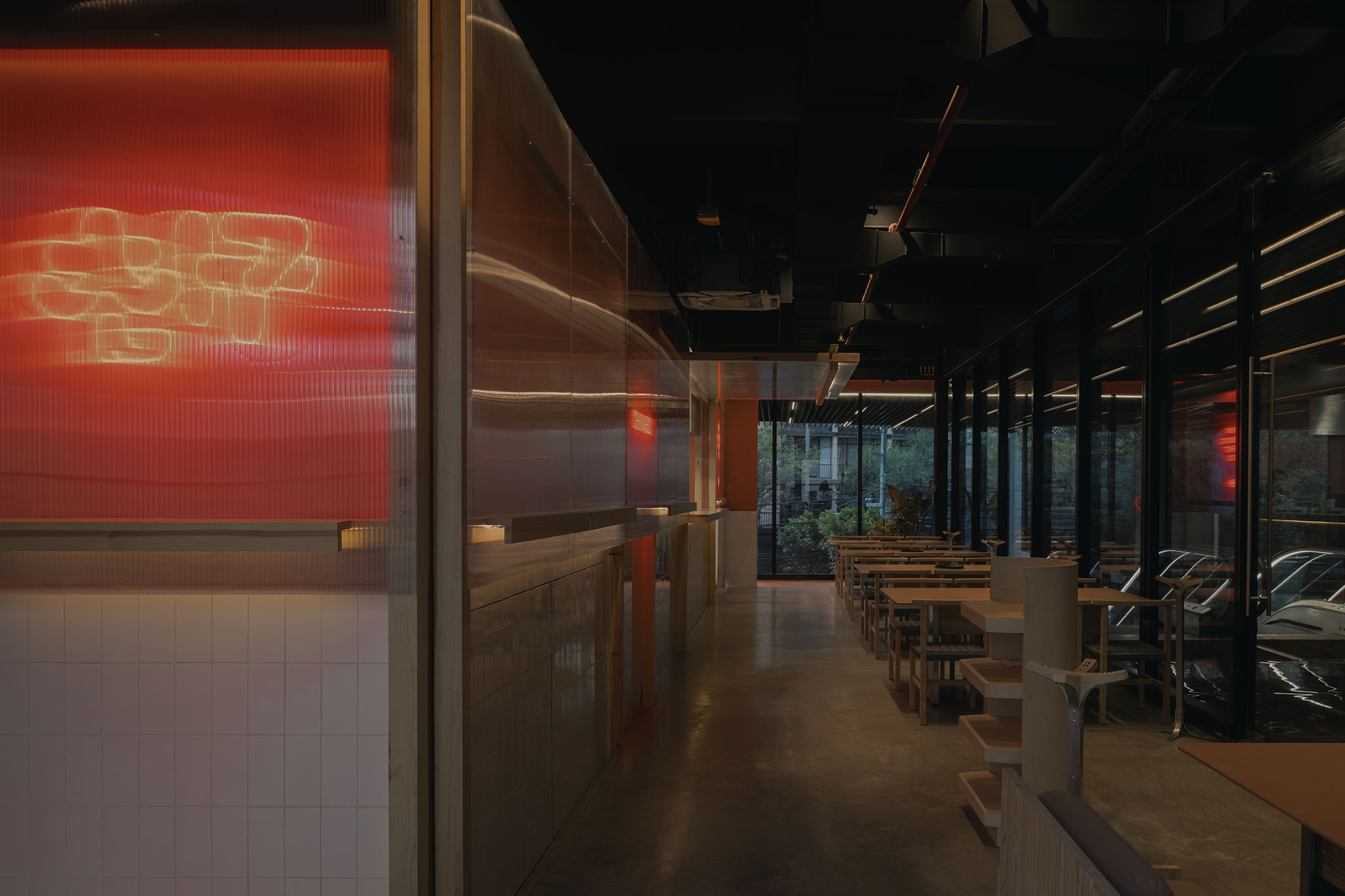
The main space developed by Worc is arranged around the kitchen, divided into two different areas. The restaurant has an interior space where the main services of the establishment are located, and an open-air space, but with the shelter and protection of an interior space. The materials, through the reflection of light, textures and colours, are responsible for distinguishing the different spaces of the restaurant.
In the interior space we find a more intimate atmosphere, separated from the exterior space by translucent divisions that seek to generate a feeling of spaciousness and continuity of the interior in the exterior space. The presence of wood throughout the premises is combined with the neutral tones of the concrete and stainless steel of the kitchen.

Chingu by Worc. Photograph by Zaickz Moz.
Project description by Worc
It’s a restaurant that opens its doors in the Condesa neighborhood, designed by the Mexican firm WORC, whose concept arises from recreating the authentic flavors of Seoul’s street food in Mexico City. It is a space that serves as a stage for friends to share, immersing visitors in Korean culture through design and gastronomy.
Upon entering, a red neon sign welcomes diners with the inscription “KDMXAUTHENTIC STREET FOOD,” inviting them to experience a space where a small lobby, long tables, and a kitchen island and restrooms for the restaurant are located.
The main challenge of this project was to combine the Mexican context with the contemporary aesthetics of Seoul. The choice of materials played a crucial role in making this possible; the tones used tend towards the neutrality of the space but offer vibrant colors and textures.

As a restaurant, the most important space is the kitchen, and here all the furniture is made of stainless steel, a material known for its practicality and durability. However, the aesthetics proposed in this place extend this material to the diners’ furniture, where it is combined with accents of pine wood to provide chairs, benches, bars, and tables.Polished concrete was used for the floor, as well as white tiles for the bar, creating slightly reflective surfaces to bounce light and create a more intimate atmosphere. The main vertical enclosures consist of railings, glass doors, and translucent partitions that aim to create spaciousness and continuity in the space.
As for the terrace, the goal was to create an environment with enough openness to be an outdoor space but with the shelter and protection of an indoor space.Here, there are planters and hanging pots that slide along a large concrete wall with visible formwork. In addition, for the cover, a resource was implemented that puts a twist on the traditional wooden pergola by including steel elements from which thin lamps of the same material hang, emitting the same red light as the neon signs that decorate the place.


