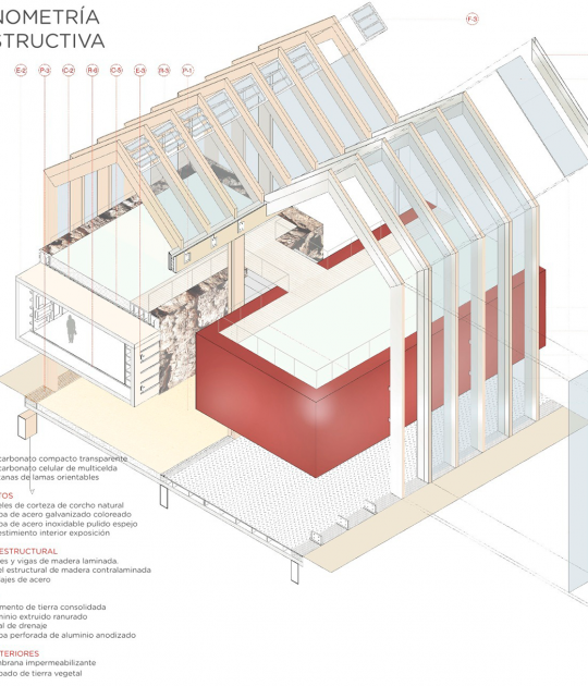
An internal physical and visual unit is created, making a vertebrate furniture move through the program, solving the needs of each space. The central building consists of six heights with three programs. The three large stacked boxes of two levels are practiced dislocations that provoke the aprici≤n of landscapes, favor the feeling of dislocation and create games of scale. The double exterior spaces are closed to the access road by a metal mesh.
Thanks to the correct use of its materials the building has received the energy certification A and the international seal Breeam very good.
Description of project by b720 Fermín Vázquez Arquitectos
Germina Foundation is an organization that works with children and young people at risk of social exclusion, caring for them, monitoring and reinforcing their education, and providing educational support for their training and future entry into the labor market. This monitoring process, which aims to build a bond by engaging participants through complementary programs from the moment they arrive as young children up until their entry into the workforce, needed to have a space where it could accommodate its three key age groups in three areas that could be either connected or independent. The program for the building also had to house the organization's administrative staff. Improving the neighborhood's social fabric, community action, and collaboration with local organizations through workshops, courses, and other social activities are also among the foundation's aims.
The purchased site, located in a low-income neighborhood in the city of Badalona, included the ground floors of two existing buildings and a small unbuilt plot between them. This three-part configuration allowed for a logical, sequential layout for the program –children, adolescents, and youths– plus a central hub shared by all three (kitchen and play areas) and the spaces for the organization's management staff.
Despite the fragmented plan, it seemed appropriate to create a sense of unity throughout the interiors, not only in physical but also in visual terms. Accordingly, against the dividing walls with no natural light, a large articulating furniture element (server) spans all three programs (receivers), creating a solution for the myriad needs for each space in one single gesture.
Three programs were set out in the central six-story construction: shared spaces (next to the main entrance and acting as a hinge joining the three venues), a youth area (in the middle levels) and, on the upper floors, the administrative offices (removed from the children's activities). The three large boxes piled up on two levels are pierced in such a way as to offer perspectives of landscapes that help enrich the interior and exterior spaces, endowing them with character while also conveying an airy feeling and providing a play on scale expressed in the facades, deliberately venturing away from residential proportions, and helping to create a unique identity for the project as a whole.
The two outdoor spaces, which will be steadily landscaped over time, are separated from the surrounding urban area by a wire fence which provides safety for the children inside while also fulfilling the architectural need for keeping the façade aligned with the street.
The duality between a comforting interior space –intended to provide a second home in which children will feel well cared for– and the building's location in a run-down urban environment; and between a warm, domestic space and the need for austerity –budget-wise as well– that would use few added or superfluous ornaments to reflect the serious activity to which it is devoted, suggested the contrast between an organic presence in the interior –wood– and a more austere outer appearance –concrete.
The wooden joinery, the south-facing retractable awnings, the roof garden, the use of low-impact materials and highly efficient facilities, among other features, allowed the building to receive an A energy certification and a Very Good international rating from Breeam.


