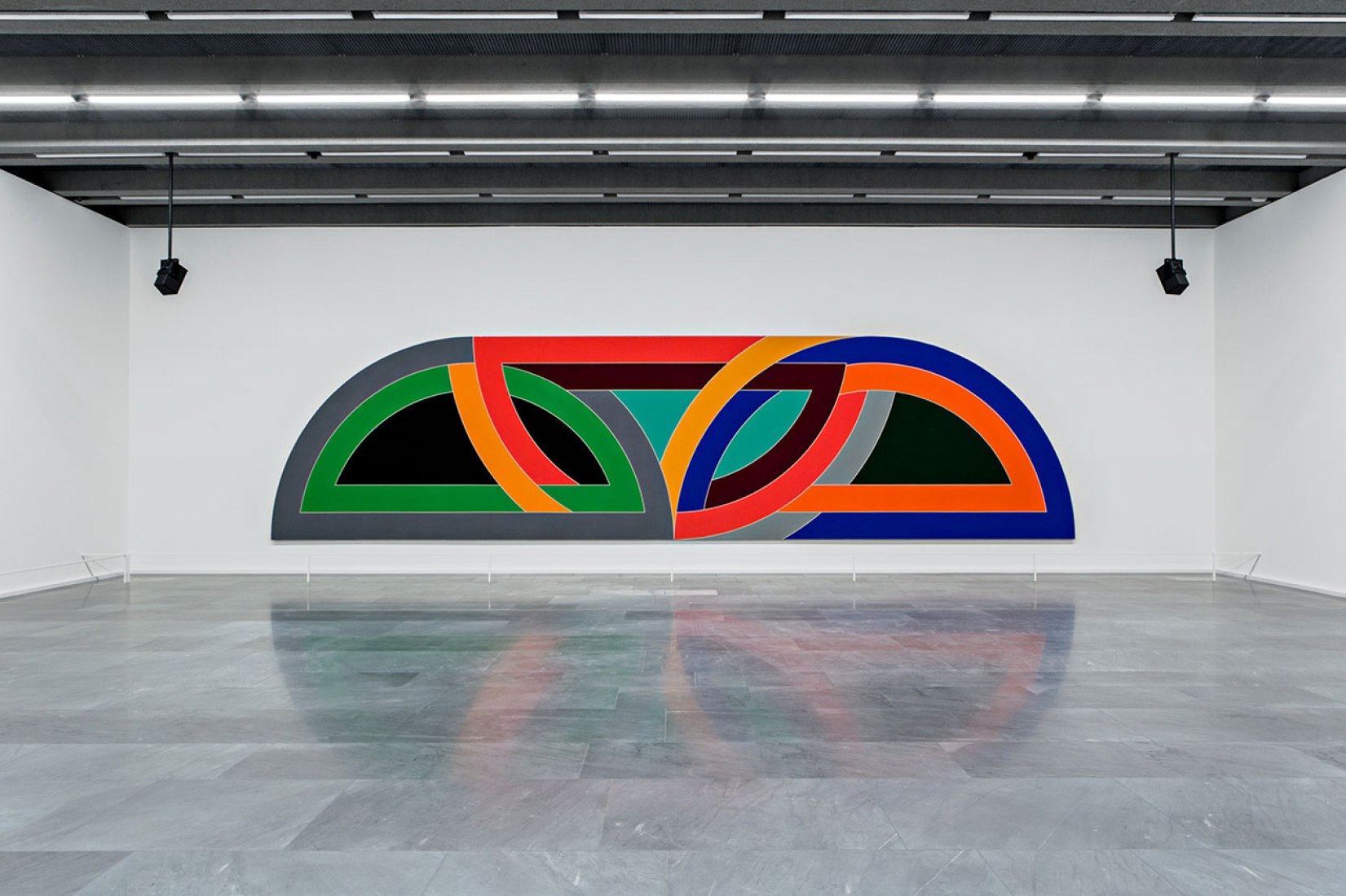
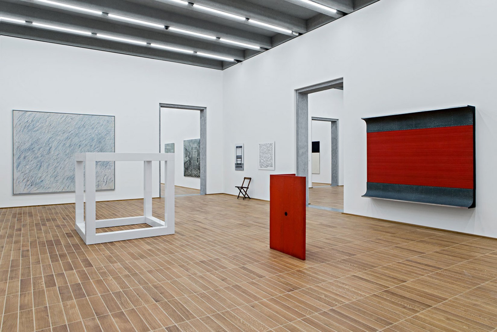
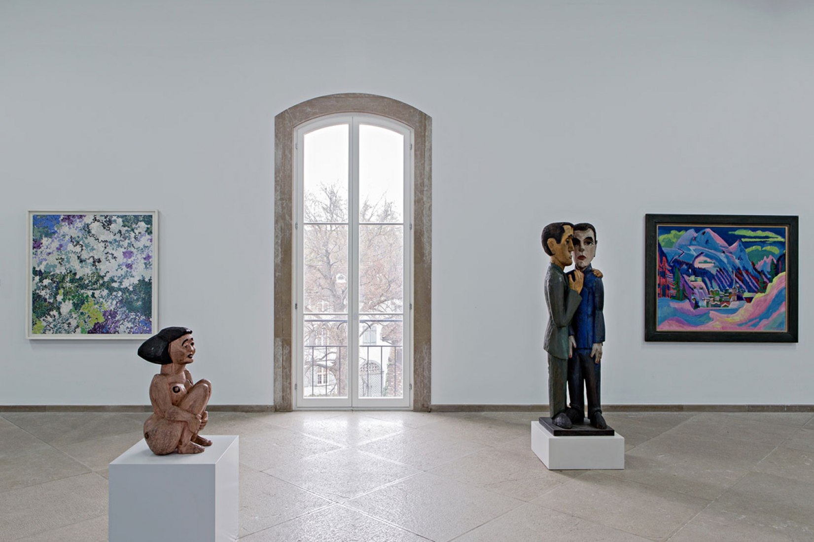
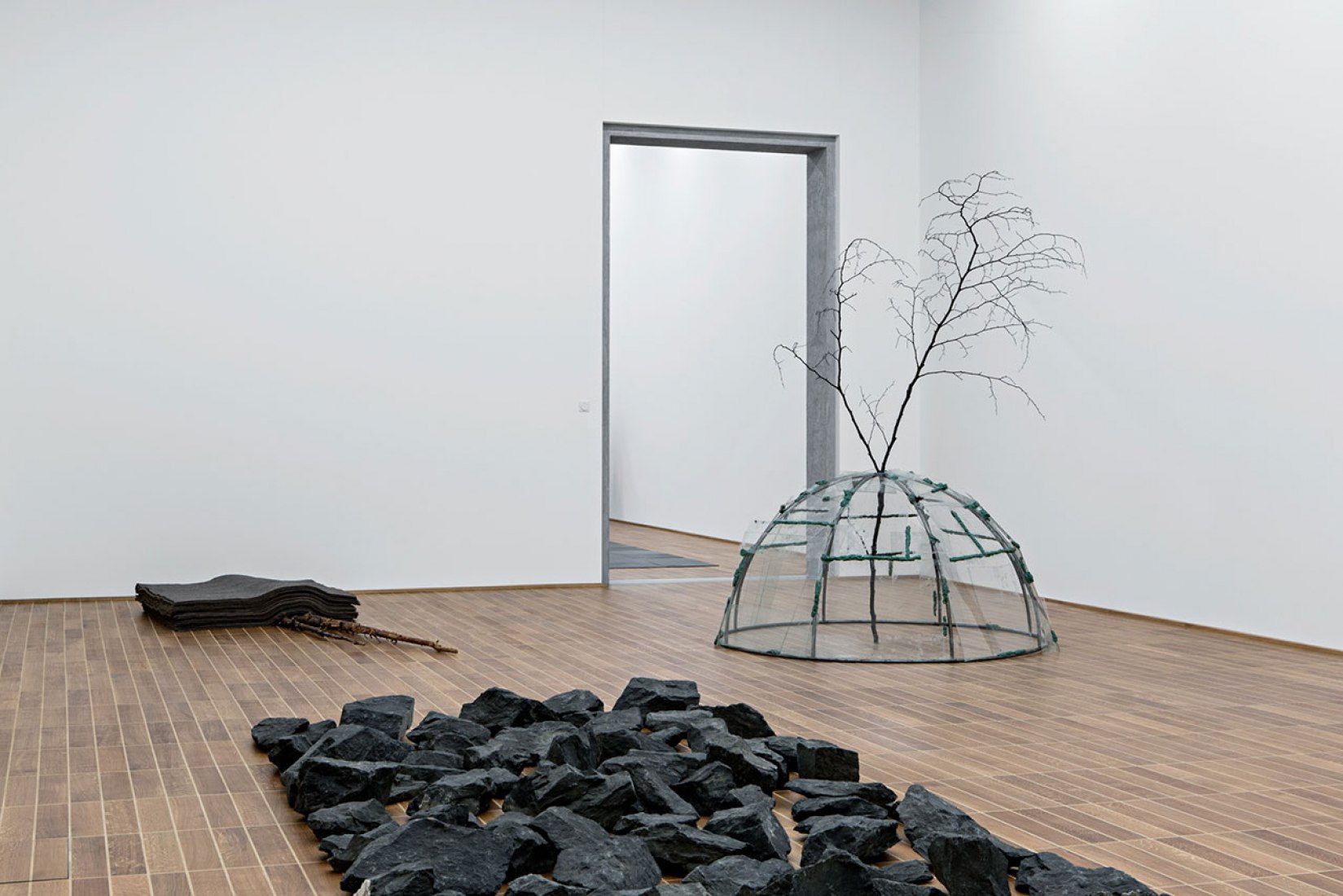
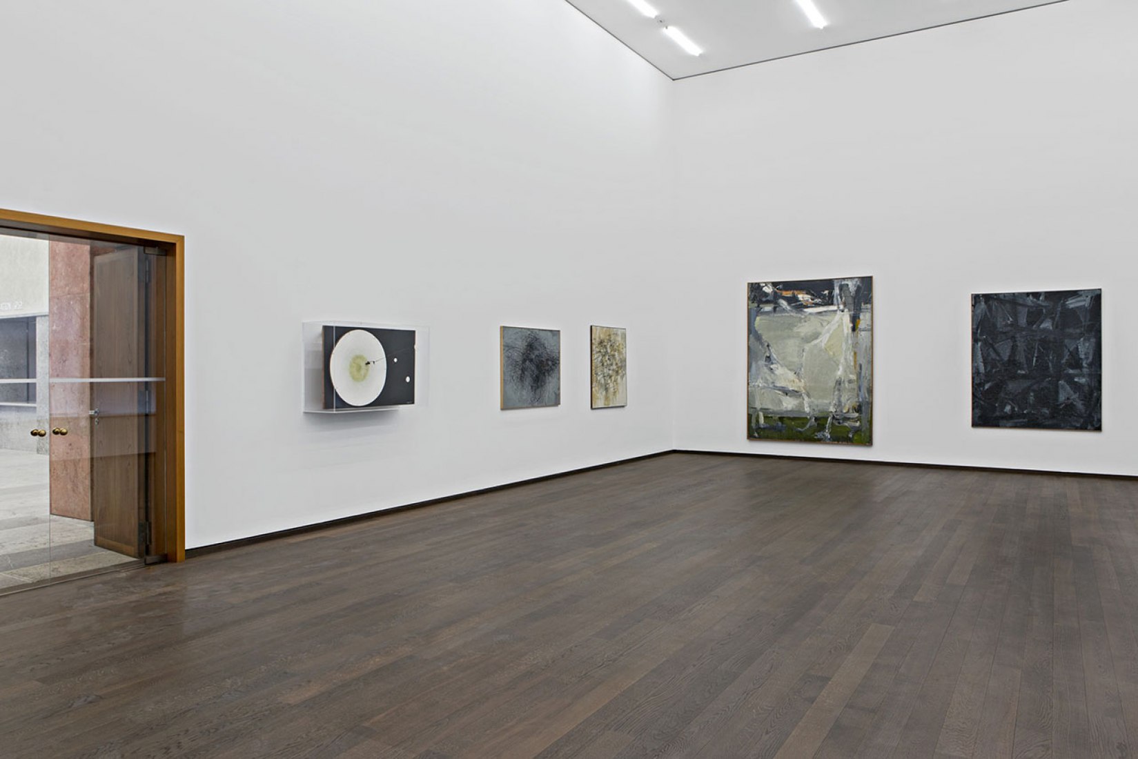
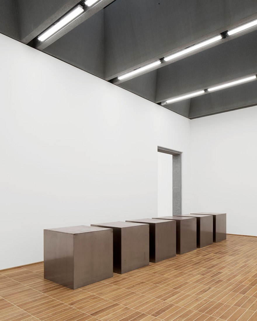
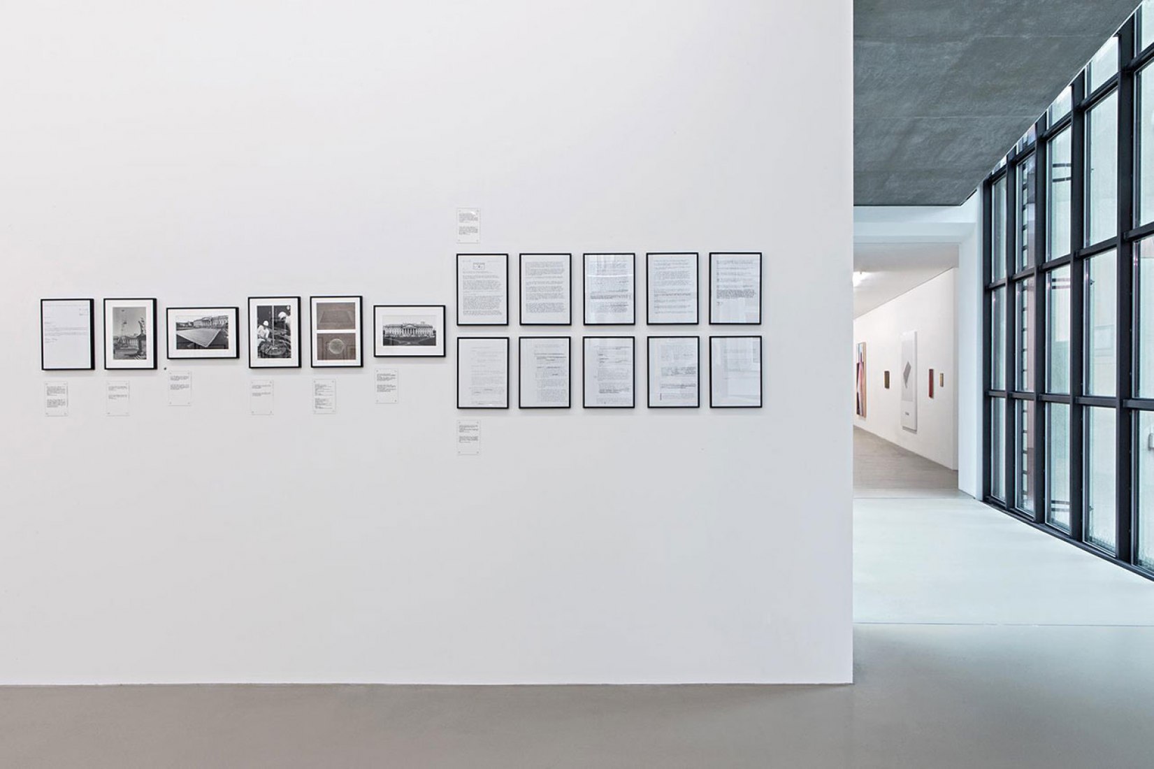
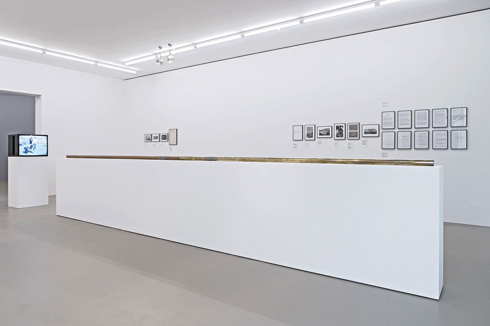
The exhibition chosen for the inauguration is "Sculpture on the Move 1946-2016", which explores the evolution of the traditional idea of sculptural form and is organized by the curator Bernhard Mendes Bürgi. Visitors can also enjoy the exhibition of "Barnett Newman - Drawings and Prints", prior to the inauguration of the new building
Description of the project by Christ & Gantenbein
The Kunstmuseum Basel’s new building redefines a prominent location in the heart of the Basel. As a place for the exhibition and preservation of art as well as events, it embodies both a new departure and continuity. The new and enlarged museum consists of two buildings that together form a unified presence in the urban space. They are in direct communication with each other across the street that runs between them. The new building’s roofline is level with that of the existing structure, so it meets its counterpart on an equal footing; its entrance looks out toward the main building’s arcades, which conversely enjoy an excellent view of its striking façade. The new building’s distinctive inverted corner is a symbolic response to the old Kunstmuseum’s no less distinctive projecting corner. At the same time, the indented façade is a gesture of welcome, an invitation. It frames the intersection, effectively turning it into its own forecourt.
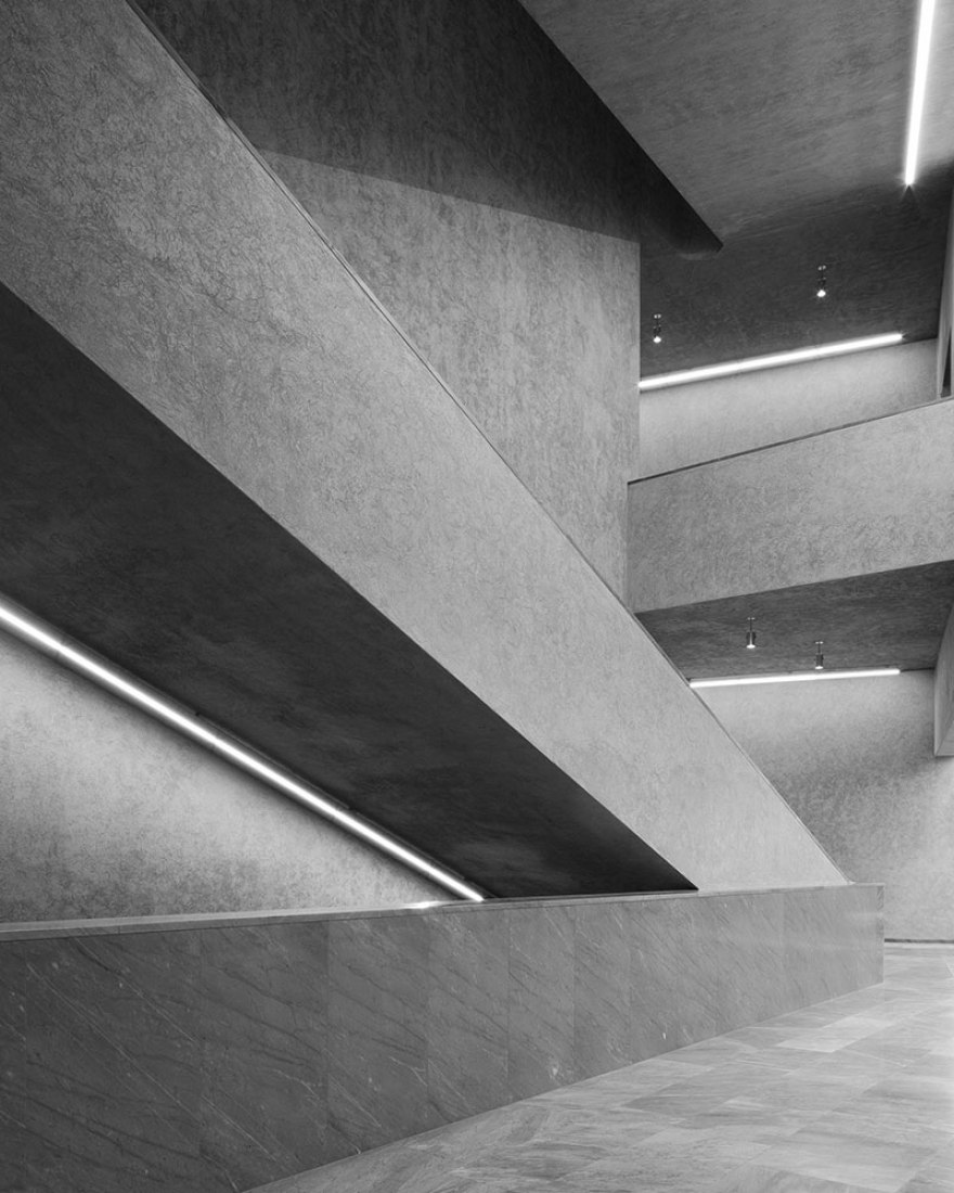
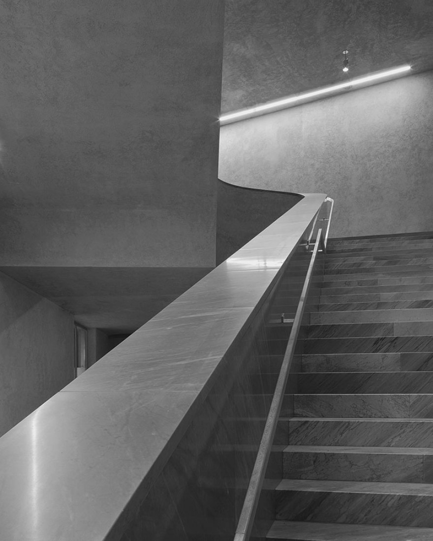
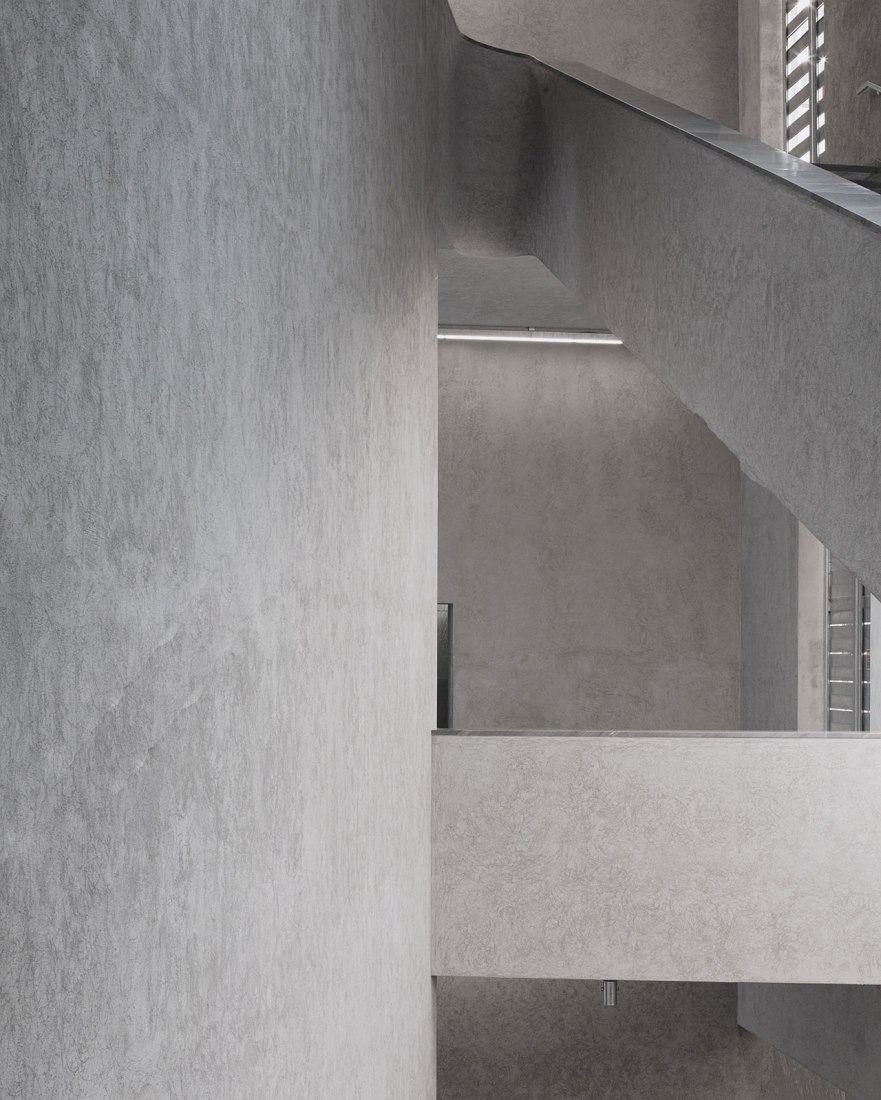
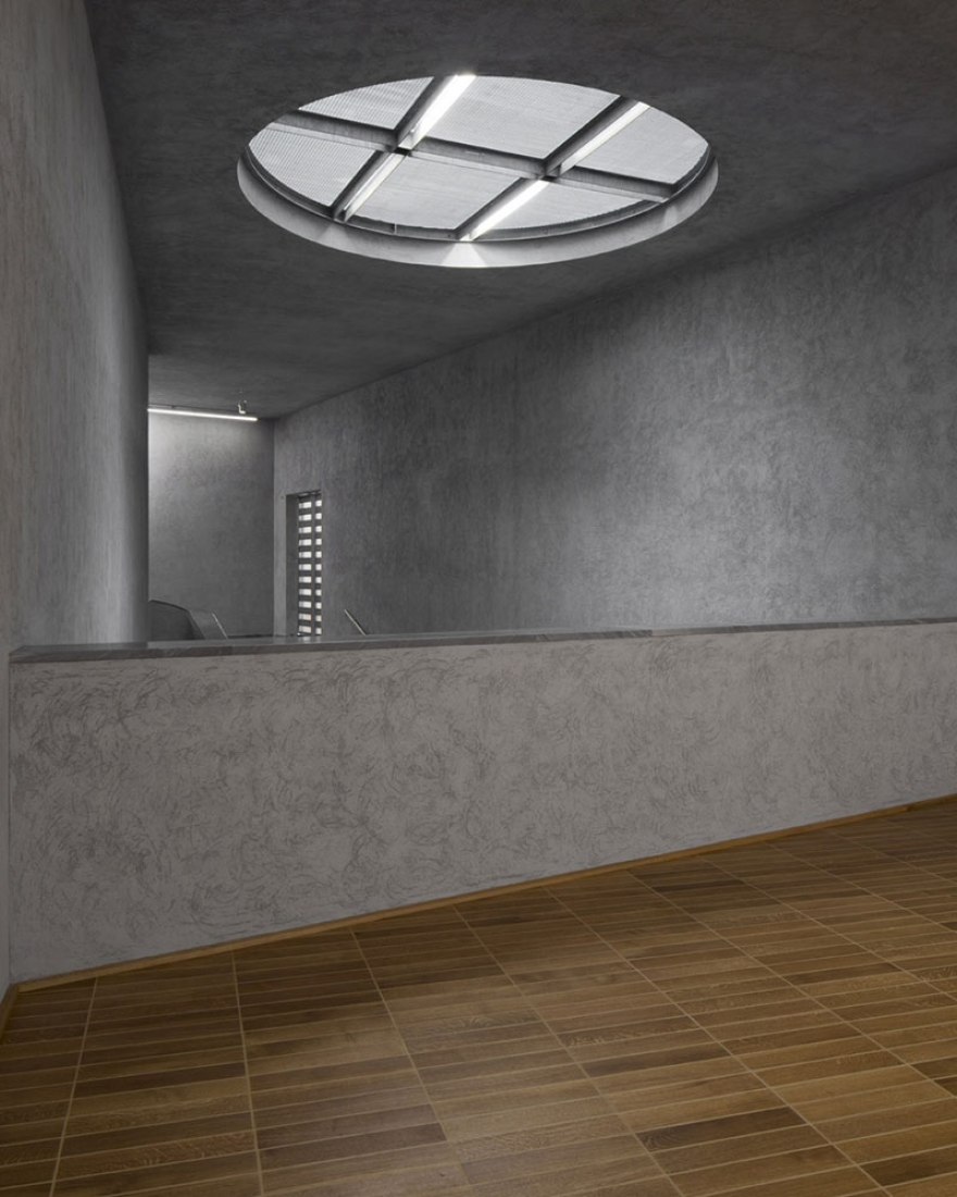
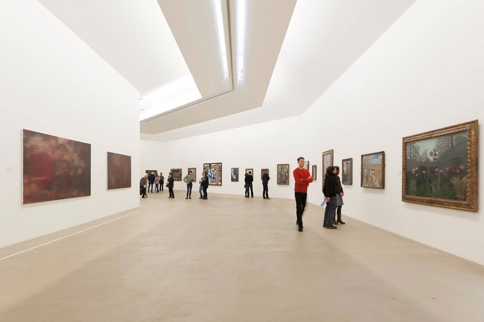
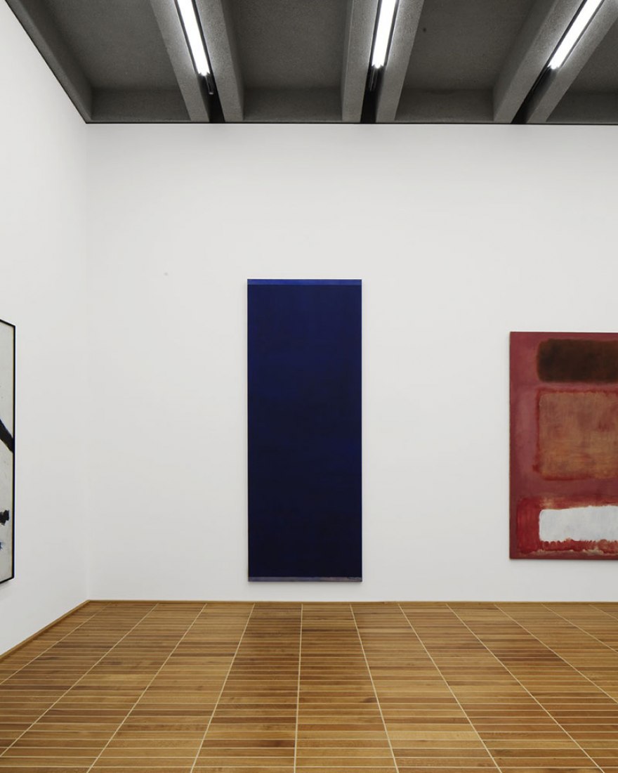
Each floor of the new building has two exhibition tracts connected vertically by the monumental central staircase. Together with the foyer zones, the staircase describes a free and expressive figure in space illuminated from above by a large round skylight. By contrast, the gallery suites as such are structured by right angles. The rooms vary widely in size, ranging from cabinet to large hall. On average, the galleries in the new building are a good deal larger and hence more flexible than those in the old building, while still hewing to classical expectations of what museum spaces should be like: serene and restrained, agreeably proportioned, and made of timeless materials. These are spaces that allow art to take center stage.
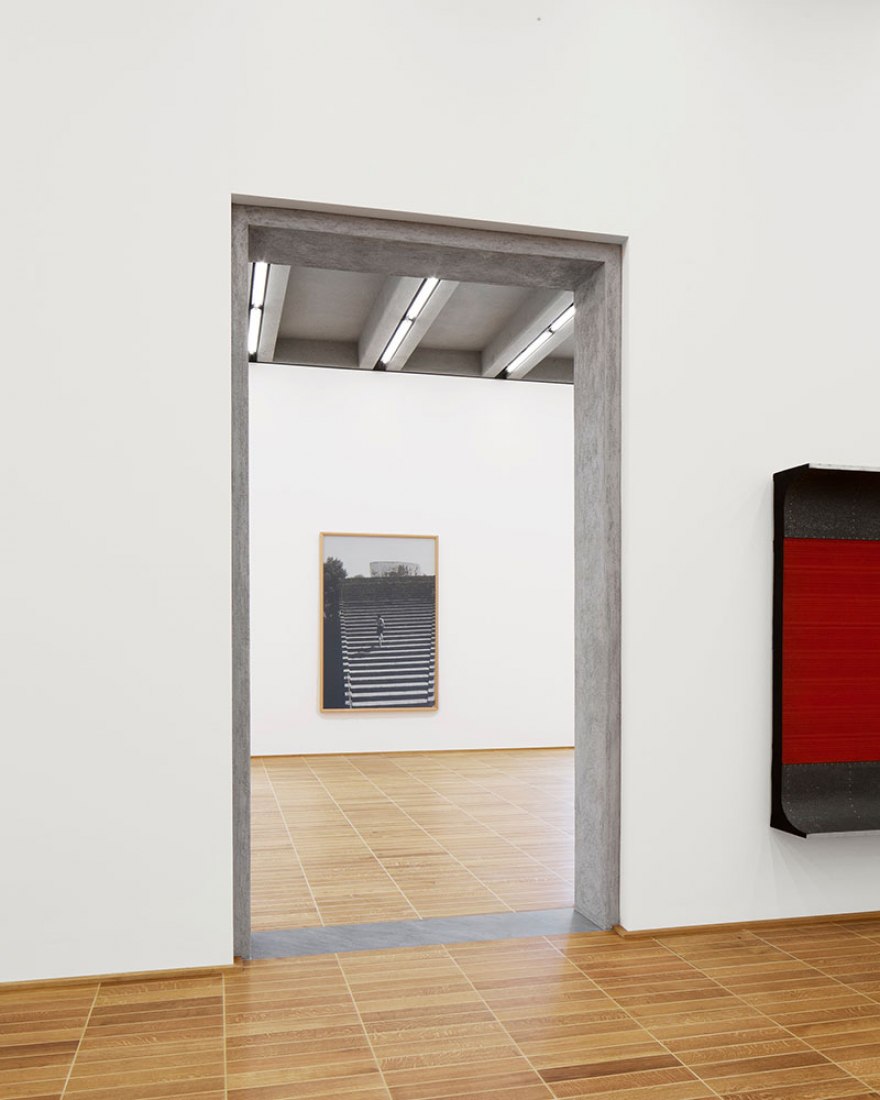
The rooms have a powerful physical presence. The elements that define them are clearly articulated components; assembled, they generate a tectonics that maximizes the architectural effect of the whole. The galleries feature an industrial parquet floor made of oak strips glued directly onto the screed and grouted with wood cement. The supporting wall made of concrete with gray rendering is similarly explicit, as is evident in the door and window reveals. Visibly fronting it, but set back at the edges, is the solid, ten-centimeter-thick plasterboard wall that serves as both substrate and backdrop for the paintings. As exposed structural elements, the prefabricated, sandblasted concrete ribs that span the galleries visualize the load-bearing relationship between walls and ceiling. Not only do they lend the ceiling its own specific structure, they also give direction to the space underneath.
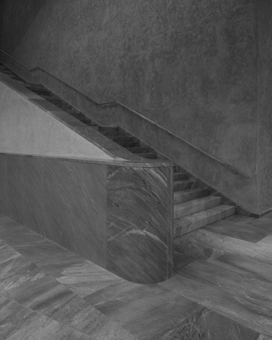
The actual connection between the main and new buildings beneath the road is not so much an underpass as an ensemble of large open spaces leading into a generous hall that is foyer, gallery, stage, experimental space, auditorium, and function room rolled into one. Here starts the central staircase of the new building, which echoes motifs of that in the main building: gray, veined Bardiglio marble from Carrara on the floor and rough scraped plaster in a cooler shade of gray on the walls.
The façades are gray brick walls that exude the timeless and archaic air of an ancient ruin. They were designed to be self-supporting and monolithic, and their emphatic horizontality, with elongated bricks that are just four centimeters high, heightens their presence. The striking pattern of shadows cast by the alternately projecting and receding layers of brick amplifies this impression. Like the main building’s façades, those of the new building hint at classical architecture’s standard tripartite order of base, middle, and capital. This order is visualized through the brickwork’s different shades of gray as well as a frieze executed as a delicate relief. The frieze, in its archetypal form, has always been part of the traditional architectural canon, but in the form it takes here it represents something quite new: sunk into the grooves of the frieze blocks are strips of LEDs that illuminate the hollows between the bricks, shedding an indirect light into the surrounding urban space. The result is a visually stimulating effect as the archaic-looking masonry begins to shine.
Thus, while the new building does indeed speak the same language as its counterpart, the story it tells is a different and novel one. We understand it as neither a repetition nor a copy of the main building, but rather as an emphatically contemporary, forward-looking building capable of accommodating completely new forms of art and the engagement with it.


