Richard The describes,
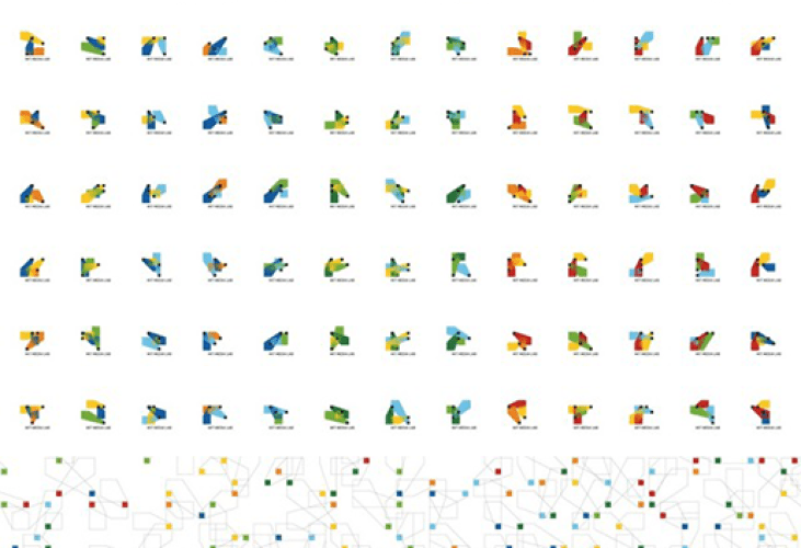
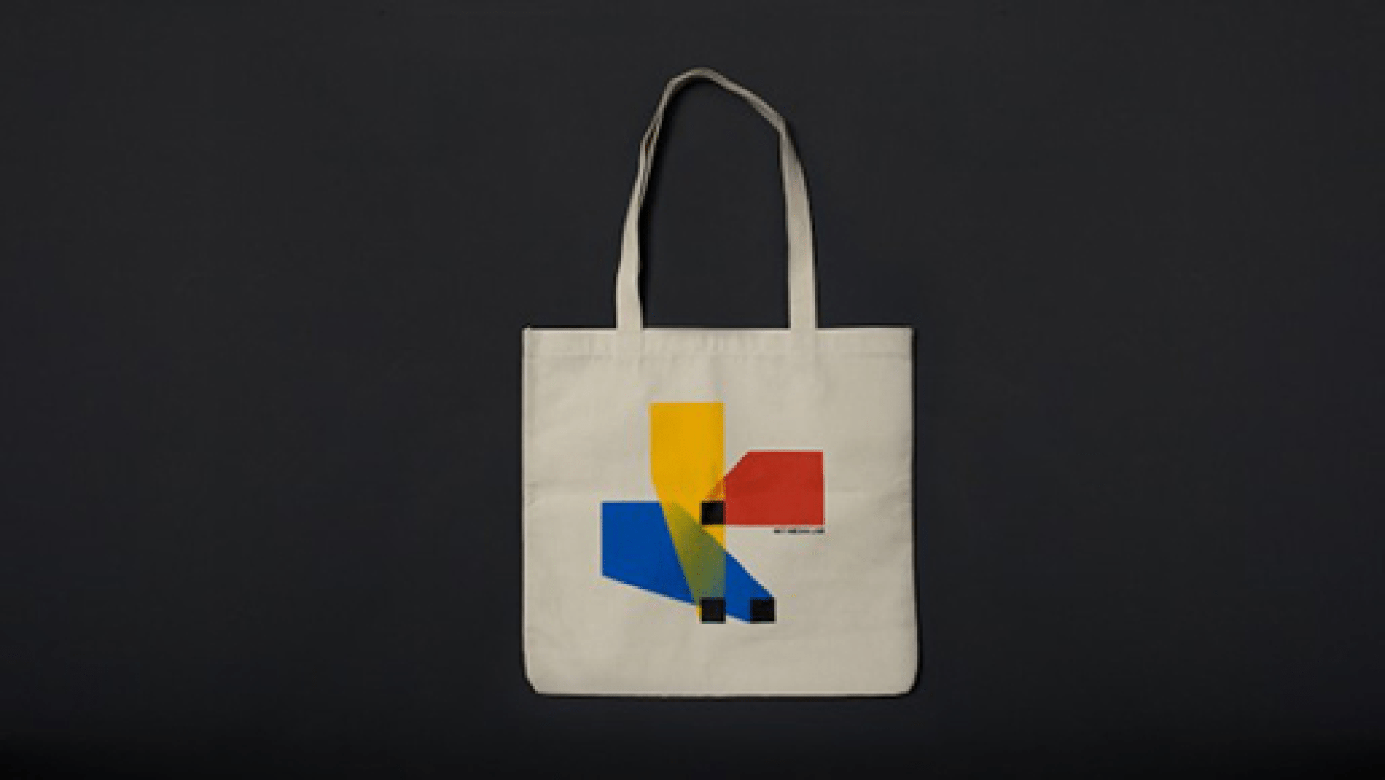
People come from many different backgrounds—engineers, scientists, artists, designers— and have very different ways of thinking, seeing and working. At the lab these people cross paths, collaborate, and inspire each other, and that’s the magic of this place. The outcome of this intersection makes up the logo shapes. The cones are organized on a square grid which is the underlying structure for each generated logo. The grid, albeit invisible, symbolizes the environment the MIT Media Lab provides, academically, physically and intellectually.
The algorithm is a Processing application that generates the individual logos. The team used it to generate 40.000 logos in 12 color combinations (~480.000 total). Exporting SVG from Processing, then converting that to CMYK pdfs in Illustrator (using AI scripting). The logos are based on a square grid (4×4 squares). Each of the three shapes can move around within the grid,according to a certain aesthetic ruleset (has to hit boundaries, has to intersect with other shapes).
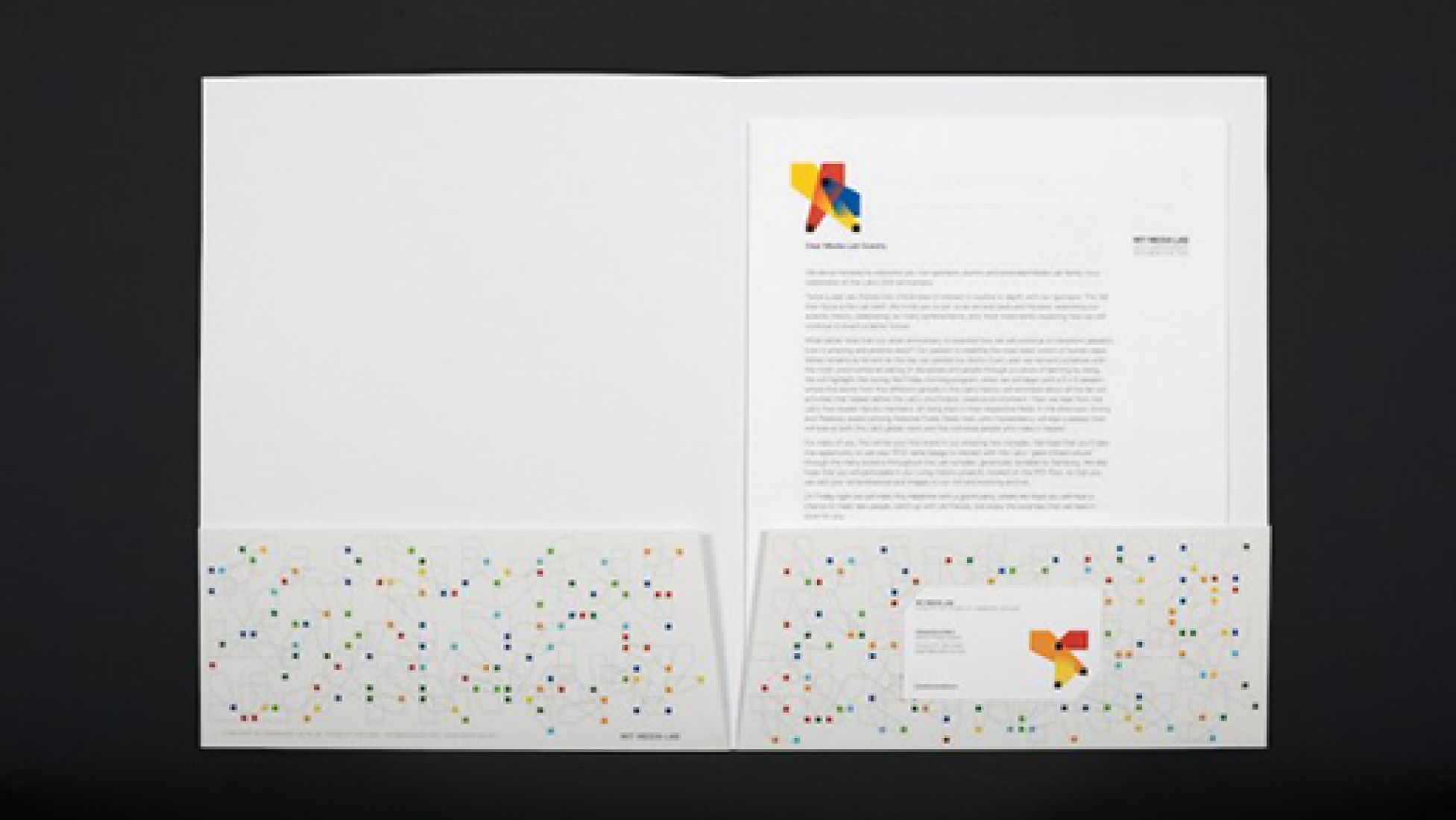
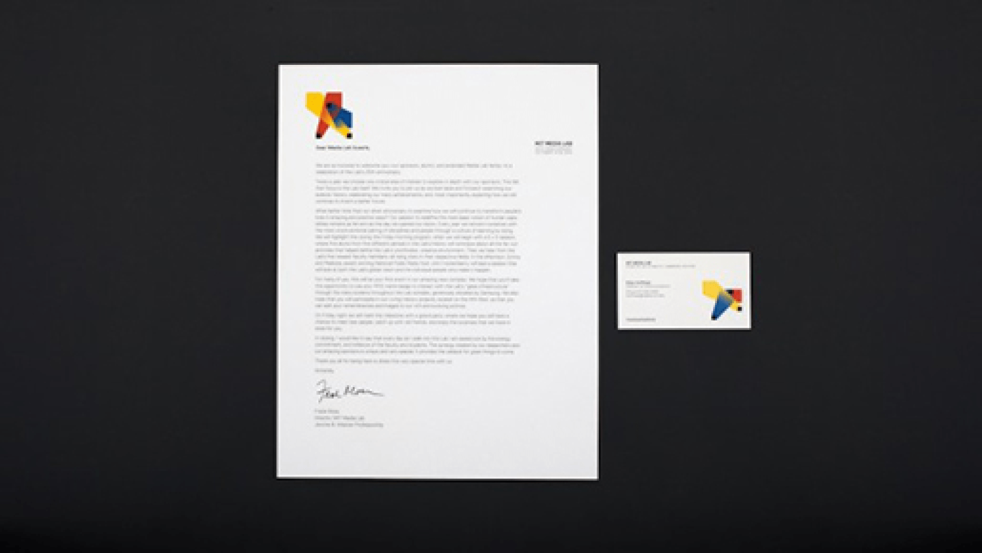
In addition, the web interface was developed where each person can choose one logo for their own business card (and for further use on their individual card etc).
Date: 2011
Studio: TheGreenEyl
Creative Direction & Design: Richard The, E Roon Kang
Programming & Design: Willy Sengewald


