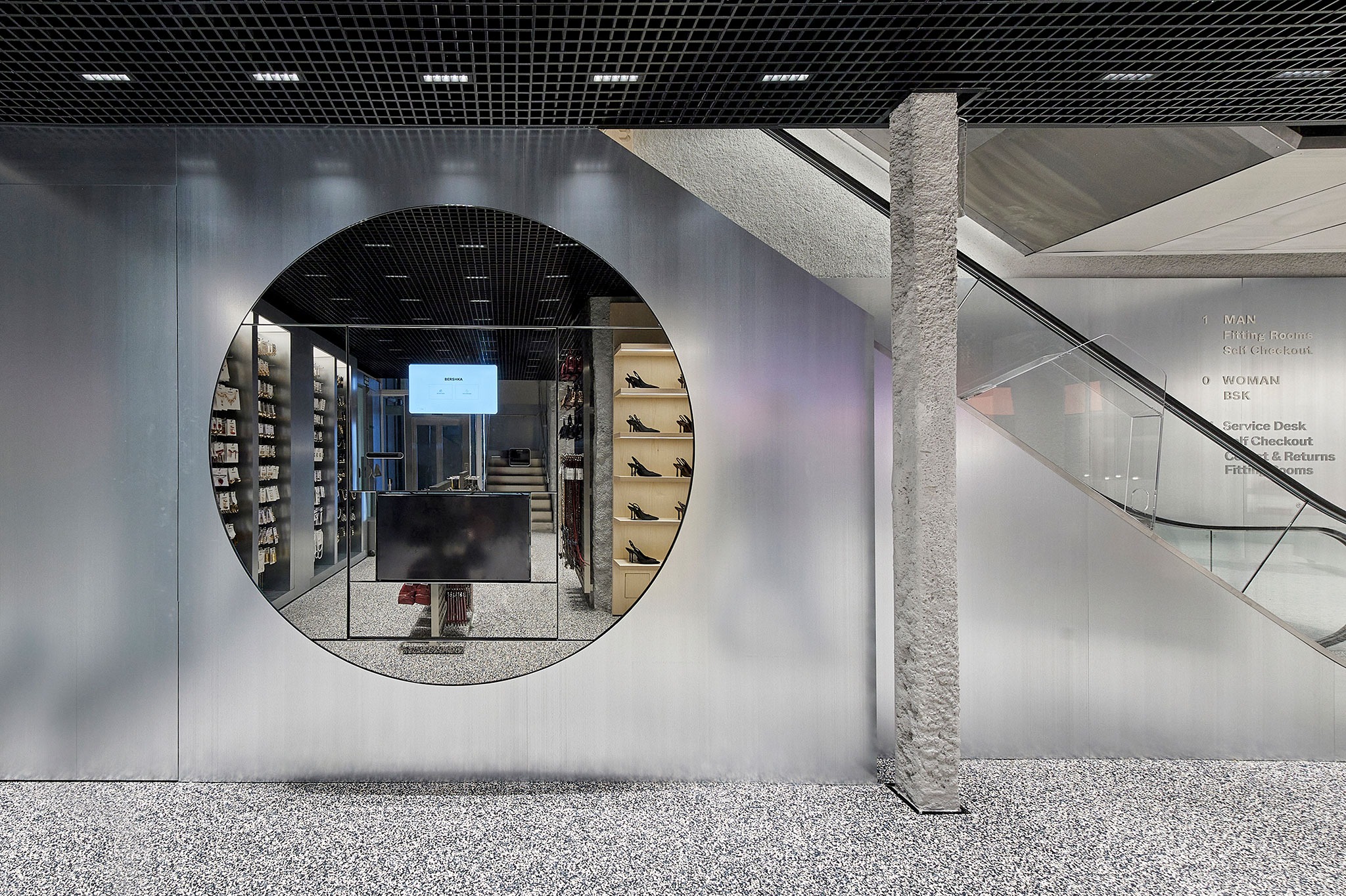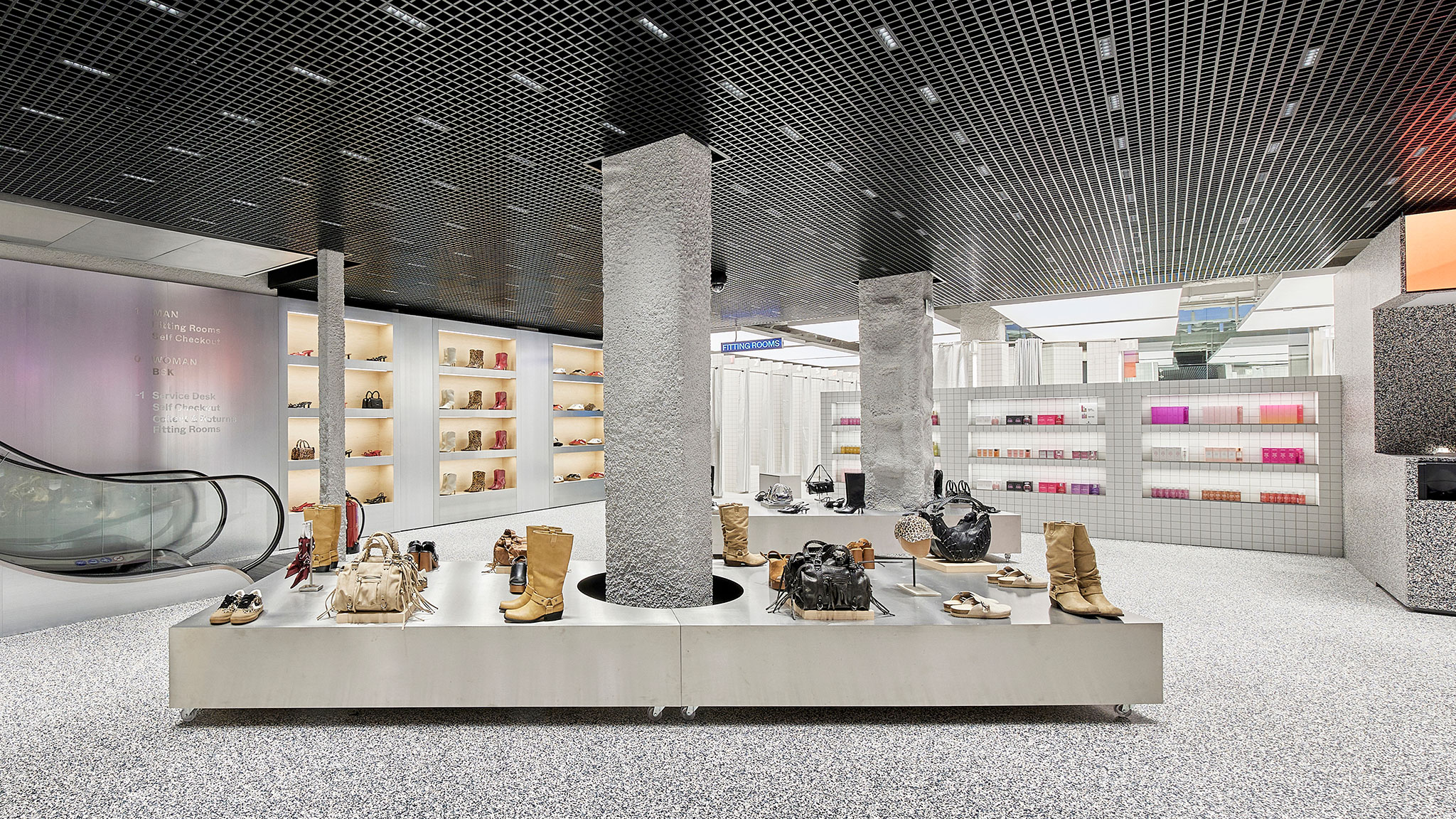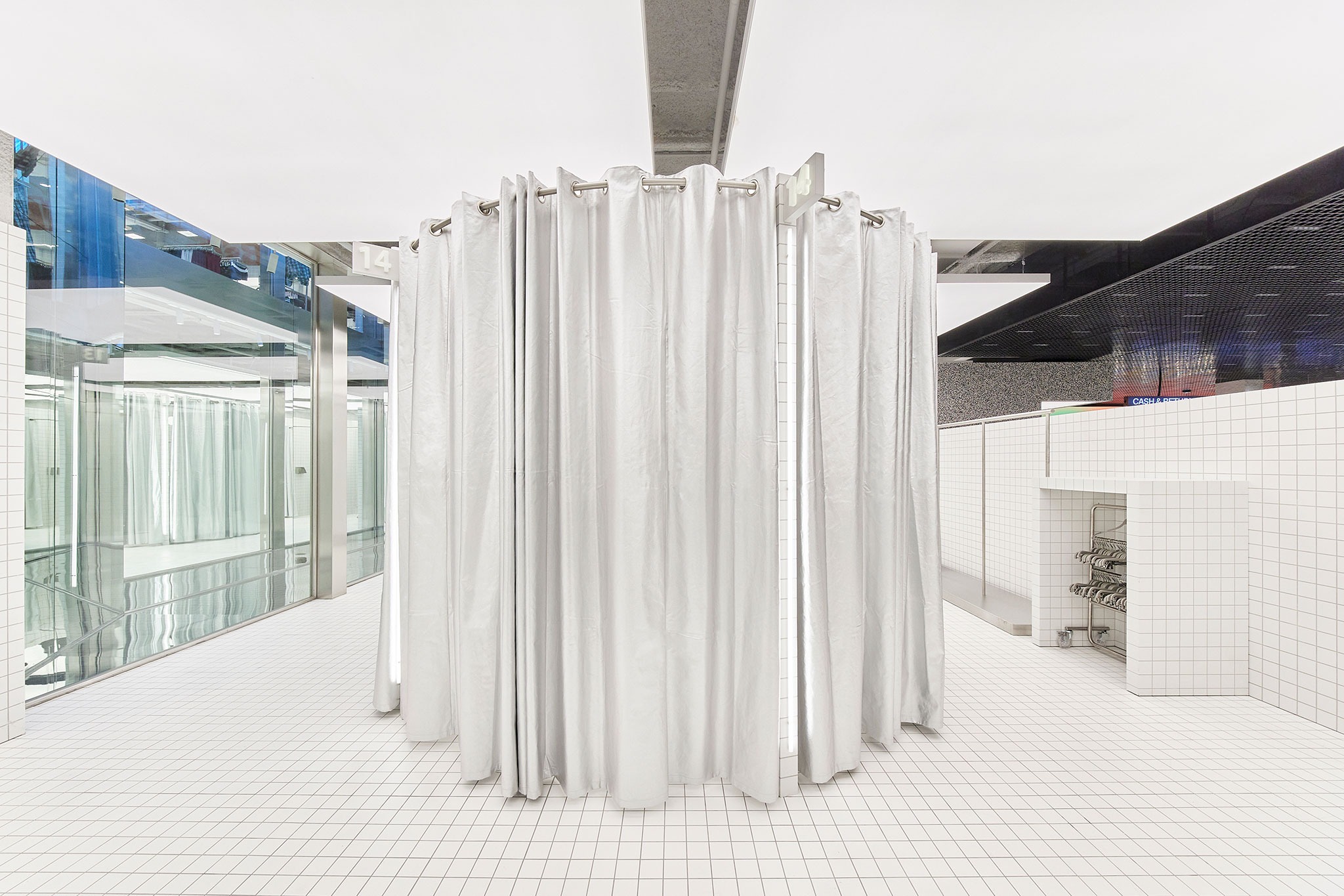
The project developed by Castel Estudio arranges the brand's different collections on three levels where visual continuity is maintained. Each floor offers a different experience to the visitor, avoiding monotony by seeking to maintain the customer's attention through slight changes in design and materials.
By using a few very neutral materials, the project ensures that the product offered is the protagonist of this new commercial space. Thanks to large openings in slabs, patios and skylights, the interior space receives natural light, while at the same time generating constant visual connections between the different levels.

Bershka Flagship Store Paseo de Gracia by Castel Estudio. Photograph courtesy of Bershka.
Project description by Castel Estudio
Castel Studio has designed every element of Bershka's new flagship store on Paseo de Gracia, Barcelona, to maximize the customer experience, creating a sensory journey that goes beyond simple shopping.
Customer Experience: A Sensory Journey
From the moment a customer steps through the door on Paseo de Gracia, they enter a space designed to capture and sustain their interest through a series of contrasts and environmental transformations. The ground floor offers a majestic and luminous entrance. Here, the generous height of the space, along with large windows and openings that allow natural light to flood in, creates a sense of spaciousness and freshness. This initial impact is designed to impress and excite, allowing visitors to immediately immerse themselves in the vibrant and modern essence of Bershka. As customers move to the upper floor, the atmosphere continues to evolve. Views of the street add a sense of openness and connection to the outside world, while the display modules subtly change in design and materiality, providing a visual continuity that keeps the customer's attention without being monotonous.

The P01 Floor: Modernity and Functionality
On the P01 floor, the design continues to surprise with a perfect balance of visual impact and functionality. This level not only offers stunning views of Paseo de Gracia but also features a striking bright blue furniture piece that acts as a captivating centerpiece. This contemporary design element is intended to effectively capture attention, creating a focal point that enriches the space without diverting attention from the clothing collections. The choice of bright blue introduces a vibrant contrast to the neutral surroundings, adding a modern and dynamic touch to the environment. However, its carefully considered design ensures that, despite its prominent presence, the furniture complements rather than overshadows the product. This approach allows the clothing and accessories to always remain the center of attention, while the furniture adds an aesthetic dimension that enhances the shopping experience, making the P01 floor an attractive and functional space.
The Basement Level: Intimacy and Exclusivity
Descending to the lower floor offers a completely different experience. This level is designed to be more intimate and inviting, deliberately contrasting with the openness and luminosity of the upper floors. In the basement, the sensation changes as the space becomes lower and the atmosphere darker and more cozy. The carefully designed lighting creates a warmer and more enveloping environment, ideal for exploring a wide range of accessories and enjoying a more relaxed shopping moment. The cash register elements, in the form of sculptural islands, not only serve a practical function but also act as visual points of interest in this space. The open layout allows customers to move comfortably, while the soft lighting and intimate atmosphere foster a pleasant and unhurried shopping experience.

Reflection on the Space for Staff: Comfort and View
We have not neglected the well-being of employees in this design. The back of house area has been carefully planned to provide a comfortable and functional work environment. Employees enjoy spacious and bright spaces, with stunning views of Paseo de Gracia. This design not only optimizes efficiency and comfort but also seeks to motivate and satisfy the team who, in turn, contribute to providing an exceptional experience for customers. The well-being of staff is fundamental, as it is key to better service and a more enjoyable shopping experience for visitors.
Conclusion
Every corner of this flagship store has been designed to enrich the customer experience, from the moment they enter the bright and expansive space on the ground floor, to their immersion in the intimate and cozy atmosphere of the basement. The transition between these environments not only guides the shopping experience but also reflects a deep consideration for the customer's sensations and emotions. Similarly, the care taken in designing the back of house area ensures that the Bershka team operates in an optimal environment, contributing to a smooth and pleasant shopping experience. Together, this project seeks to offer a comprehensive experience that fascinates, surprises, and satisfies every visitor, reflecting the dynamic and modern essence of the Bershka brand.


