Regarding its environmental organization, the office tower has a system that provides it with shade thanks to the design of its sawtooth façade that closes on the edge facing the sun and opens on the opposite side that does not receive direct sunlight.

Techcombank tower by Foster + Partners. Photograph by Weerapon Singnoi.
Project description by Foster + Partners
Building on the design for the Techcombank Headquarters in Hanoi, Foster + Partners has completed a new office tower for the company in Ho Chi Minh City. The 21-storey tower is organised around two approaches, programmatic – accommodating different tenants and uses – and environmental – a self-shading building that works with the tropical climate. The project aspires to LEED Platinum certification.
“Our latest building for Techcombank in Ho Chi Minh City creates a welcoming and collaborative office environment, to attract the top talent to their workforce. Driven by environmental analysis, the building’s orientation and innovative shading system helps to maintain a comfortable internal environment, while three central atria fill the office spaces with natural light and enhance visual connections.”
Gerard Evenden, Head of Studio, Foster + Partners.
The footprint of the tower is defined by the site and the required setbacks. Located on a double fronted plot, the main entrance is off Le Duan Boulevard and the second entrance is on Nguyen Du Street. Vertically, the tower is expressed as two blocks with the core located to the rear, facing the adjacent hotel. The recessed space between the two blocks houses the amenities floor for employees.

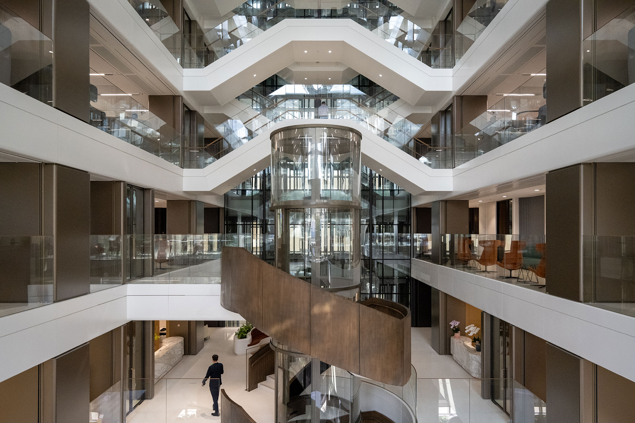
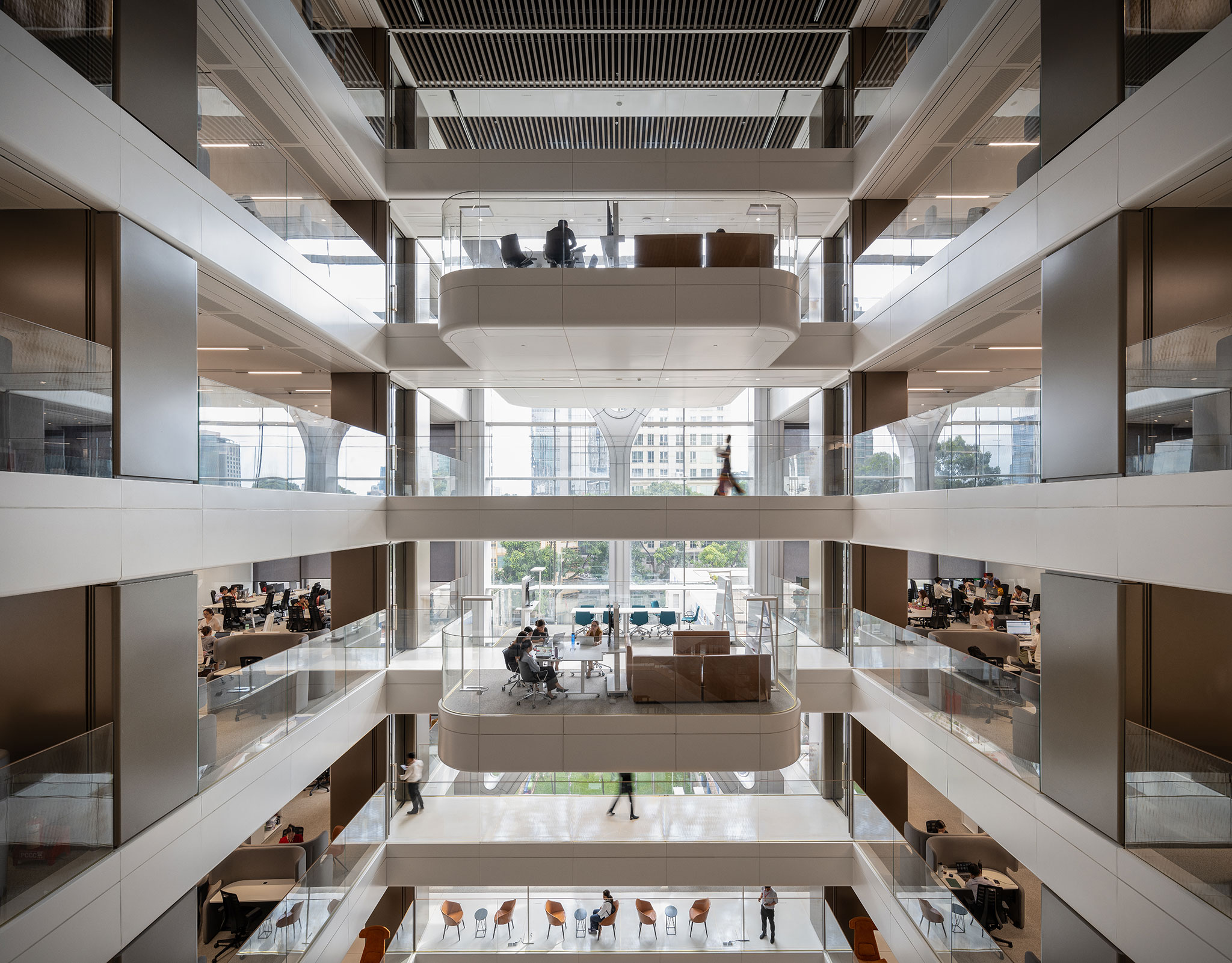
Techcombank tower by Foster + Partners. Photograph by Weerapon Singnoi.
The design creates a light-filled and welcoming environment, with three central atria that rise to different heights. The first runs from the base to level 9, while the second and third reach the full height of the tower from levels 11 and 14. These void spaces provide visual connectivity and contain meeting space ‘pods’, coming together to encourage a collaborative and inclusive workplace culture.
The edges of the floorplates follow a sawtooth pattern in response to the angle of the sun. The orientation of these edges allows the tower to effectively self-shade and creates a textural façade. One edge of the sawtooth faces the sun and is shaded using a screen, while the opposing face is clear glass as it does not receive direct sunlight, allowing a clear view out to the city and surrounding areas.
“The design of the screen has been heavily influenced by local crafts such as bamboo weaving, which is manifested as a metal mesh panel that allows some light to pass through, creating a delicate shaded pattern.”
Toby Blunt, Senior Partner, Foster + Partners.


