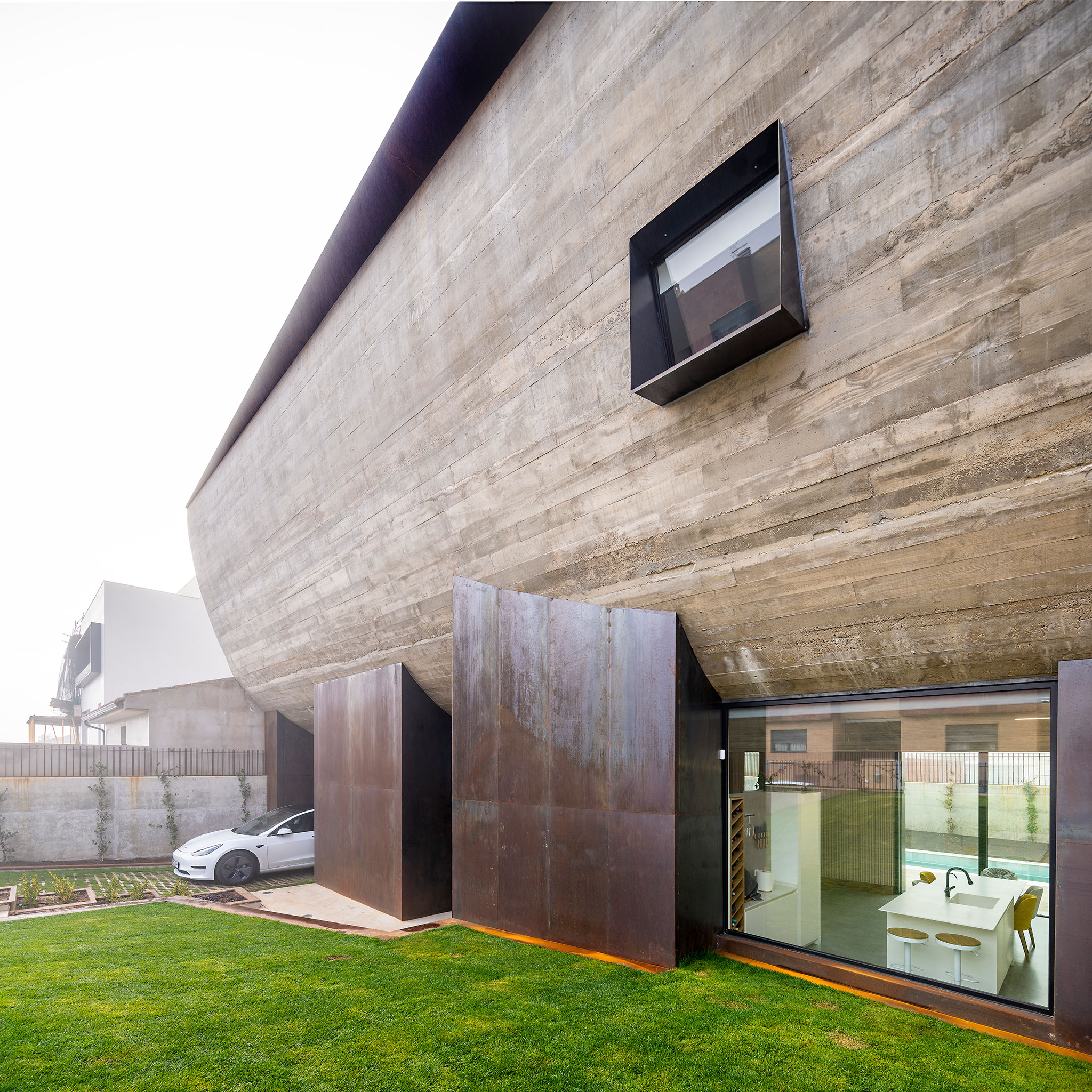
The ground floor becomes diaphanous by connecting with the backyard through glass windows, exceeding the limits of space. The south orientation of the patio and the entrance of natural light, thanks to the curved structure, gives a feeling of spaciousness through its white walls and furniture. This floor is where home life takes place. In addition, a metal cable on the outside filters and regulates the entry of direct light from bioclimatic solutions.

Renewal of the concept of "adjoining houses". NAU House by MUKA arquitectura. Photograph by Javier Callejas.
Description of project by MUKA arquitectura
PROJECT REPORT.
In an urban context where adjoining houses are necessarily attached to each other at the side walls to form a linear succession of juxtaposed volumes, materials and heights, this project seeks to vindicate a different way of engaging with urban planning and approaching the potential forms of a single-family dwelling, as well as its relationship with its surroundings.
Given the diminutive size of the minimum plot established in Ciudad Real’s planning requirements and the obligatory setback areas that govern the position of the building both at the front of the façade and at the rear boundary, the most obvious – and imperative – solution was to create two small courtyards at each end of the plot, with the house itself interjecting between them. Another aspect to consider was that the front part of these plots generally offers very restricted possibilities for use as it is dedicated to both pedestrian and vehicle access, while the rear, with very little natural light due to the enclosures of the adjoining plots, is most often turned into a cramped patio, spatially stifled by adjacent buildings and walls.
The design was fundamentally resolved in section in the clear gesture of a curved volume which houses the bedrooms, opening up the (slightly recessed) ground floor and offering visual continuity between the two courtyards from the inside. This formal solution brought with it the possibility of concealing areas of glass by hiding them behind the steel pillars on which the concrete volume rests, blurring perceptions of the boundary between inside and outside and giving rise to questions which this design aims to respond to in a very specific way. What does a courtyard in a single-family home look like? What constitutes a dwelling? In the case of this design, could the ground floor be considered an inhabited threshold under the shelter of the main volume?
It is these issues that in essence determine the more radical use of common areas here. The carving out of the floor plan and elevation of the lawned areas at the ends of the plot are used as resources that ensure the limits of the plot can be perceived in their maximum extension from the living room and the kitchen, as areas where most of the family’s daily life takes place. The Corten steel supports holding up the concrete body serve to house secondary uses of the residence on the ground floor, while the slightly rotated position of some of these supports emphasizes the geometry and curvature of the whole.

Renewal of the concept of "adjoining houses". NAU House by MUKA arquitectura. Photograph by Javier Callejas.
The distribution of volumes on the first floor works to establish contrasting relationships with the urban environment between the main and rear façades. The façade on Calle Villahermosa, oriented to the northeast, seeks to disrupt links between the more private uses of the first floor and the rest of the adjoining buildings and their nearby windows: here, a single opening breaks the concrete shell to establish just one specific connection with the street. This urban reclamation, achieved through a denial of any compositional and volumetric associations with the adjoining dwellings or any correspondence with their material forms, aims to speak for an alternative manner of understanding the links between the parts and the whole, and the connections between the dwelling or the sum of multiple dwellings and the city.
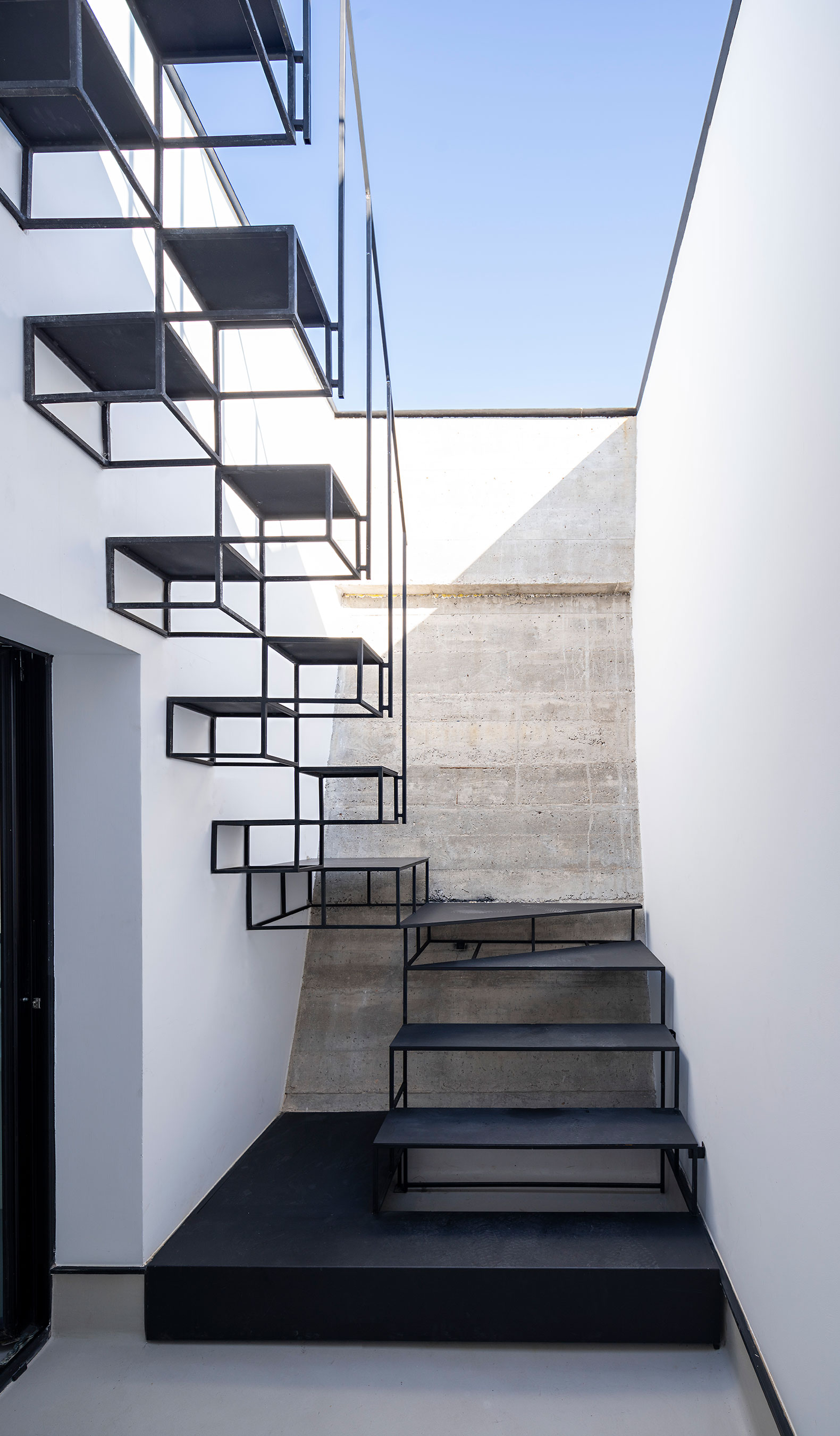
In the rear courtyard – and with a predominantly south orientation – the concrete shell ends asymmetrically compared to the main façade, at a lower point, to give a more permeable aspect. The entry of direct natural light is screened and regulated by bioclimatic solutions in the form of steel cables interspersed with plant growth. As well as serving to extend the gaze towards the sky from the ground floor, the curved gesture of the main façade allows natural zenithal lighting in rooms for secondary uses and facilities, the staircase hall and in a courtyard that lights up one of the bedrooms. Finally, the bathtub in the master bedroom, carved out of the very tip of the curve, has a skylight allowing natural light in while maintaining the necessary privacy of this room.
The concrete curve is staggered at its ends, allowing design opportunities in the floor plan that improve how people can use the house and its relationship with the exterior, such as window sills extended into seating in the interior that function as reading and resting points next to the windows, planters inserted into the geometry and concavity of the floor itself, desks and work tables, and additional storage areas in the home.


