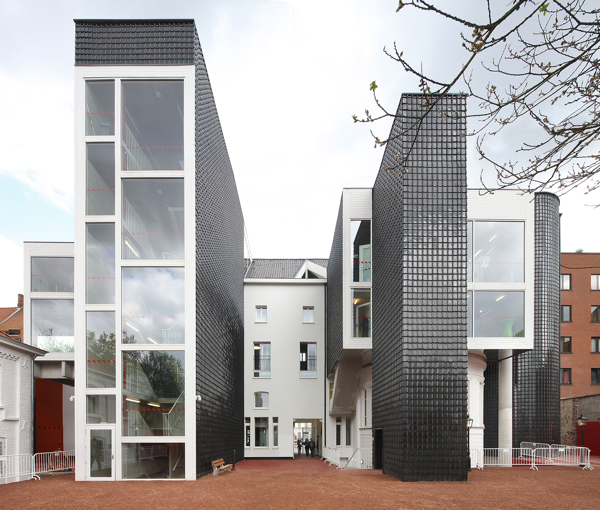
Constructively, the Belgian studio managed to reduce the section of the columns as the height increased, to obtain more space to accommodate the different spaces and activities. The structure was rehabilitated due to its poor condition and the main façade was restored to its former glory.
 L-BERG by Architecten de Vylder Vinck Taillieu. Photograph by Filip Dujardin.
 L-BERG by Architecten de Vylder Vinck Taillieu. Photograph by Filip Dujardin.
Description of project by Architecten de Vyder Vinck Taillieu
The City of Ghent is greater than Ghent itself. Ledeberg, Muide, Meulestede, Gentbrugge, Brugse Poort: these are some of the urban districts that are now amalgamated into the municipality of Ghent. What was once the Town Hall of Ledeberg is today designated as a Municipal Services Centre for the City of Ghent; an extension of the city’s administration, a welcoming hand held out to its newer citizens.
This has already been for many years. In 2006, the city decided that the former town hall was due for a comprehensive renovation. The building was marked by the ravages of time, but its merited a new lease of life.
Before it became a borough of Ghent, Ledeberg installed a wedding hall and a magistrates court in the building, as well as a reception hall, with a stage, filling the whole of the first floor. The various municipal services occupied leftover spaces between the larger amenities. The mayor’s office was a remarkably long, narrow chamber at the front of the building.
When the building became a Municipal Services Centre for the City of Ghent in the 1970s, a local police station was added to the existing utility structures at the rear of the Town Hall. Like the other structures, it was a nondescript shed.
The Town Hall had undergone countless alterations over the years. Nothing was original except the front facade. The stately classical facade masks the original four-part design and all the later modifications. In its heyday, it also sported a splendid cast-iron entrance canopy. This frontage, together with the church and the bandstand, set the tone of Ledeberg: an air of grandeur, a place full of life. As for the reception hall in the Town Hall that was the festive heart of Ledeberg.
And so it was until 2006, the year of the closure and the renovation plan. The brief for renovation drawn up in 2006 also addressed the interior of the block behind the Town Hall; a new building was required to replace all the nondescript 1970s structures in the courtyard. The City of Ghent was aware of the imperative to retain the reception hall, the very soul of Ledenberg, in the renovated building. But the marriage hall and the courtroom were to be repurposed to meet municipal service needs. The Registry Office and the police station also had to be re-housed the police especially.
In the proposal, these ambitious requirements formed only a starting point for even greater ambitions. It was evident from the outset that constructing a new building in the courtyard invited a question mark. At least, placing such a question mark was a legitimate ambition.
It was clear. The existing building was an improbable tangle of corridors, rooms, mezzanines, hidden staircases, and unused cellars. It even had a little old gaol. Trying to inject all the city’s new requirements into the already overstuffed body of the old Town Hall must have been seen as overambitious: hence that new building at the back. Nonetheless, a purely arithmetical review confirmed an initial conjecture: there was enough room. But disentangling the puzzle seemed insurmountable.
Optimism must have been the driving force. With calculation and some clever chess moves, the puzzle had some prospect of a solution. An inauthentic three-meter deep extension across the whole width of the rear was mentally excised, to make way for a strange juxtaposition of ostensibly disparate elements which nonetheless seemed to go together. Stairs, lifts, and auxiliary rooms such as a foyer for the reception hall were disposed along the length of the oblong volume of the original building.
Each had its logic and proportions, but they were together nonetheless. The rear facade was now deeper than before in some places, but much less deep in others. Perhaps this idea was prompted by the old marriage hall, for its rounded transverse extension already protruded into the block interior. And these protrusive bodies are equally part of an already strange collection of buildings at the rear of the building. Everything falls into a composition. The existing building did not fully reveal its past until construction was in progress. The suspected four-part design was confirmed. However, the condition of the structure proved worse than had been expected.
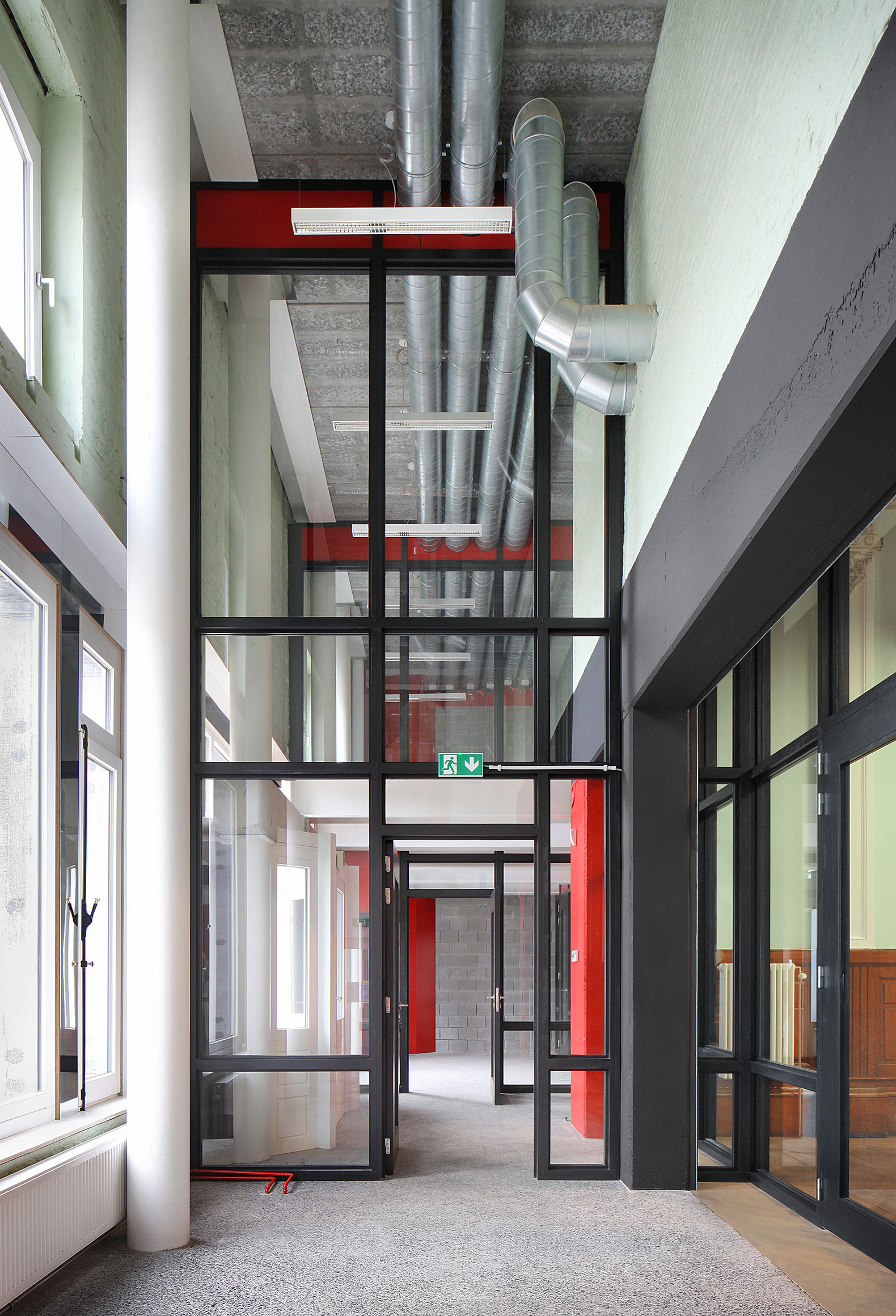
An almost too simple idea is sufficient. A structural concept of stacked tables reinstates the diversity of heights of the floors; stacked up over the old marriage hall and law court, leaving the entire floor space of the reception hall free. The legs of the tables and the columns are closely spaced. That is not only an advantage for the foundations, but it makes the intervention graphically clear. It also makes it possible to use relatively slender columns. Finally, the columns all have different cross sections not only per floor but also between columns on every floor. In that respect, each column expresses the forces it must bear.
The strategy was to accommodate all the intended users in the building without erecting anything new in the block interior. So the police were assigned a place at last: the previously unused attic, a virtual ship, is their new eyrie. With the tabletop floors and the added sections on the rear facade, the attic is no longer worthy of the name attic. It has become a comfortable, reachable top floor where its occupants can work undisturbed. The distance from its public presence at ground floor level is bridged perfectly by the staircase tower and by the intervening service floors.
The front facade gets back what it deserves its dignity. The return of the canopy in a new manifestation (the old one survived only in photographic memory) puts a frame around the dignified facade as it was formerly meant to be, and today could be realized. The building deserves it. The public square deserves it. Ledeberg will have its City Canopy (Ghent has its City Hall).
An additional building was avoided. Optimal utilization was achieved. As sustainable as could be.
Epilogue
The old Town Hall forms one side of an urban block. At the request of the City of Ghent, we drew an idea for that building. The question was how to provide access to the interior of the block. Could everything be organized differently in that interior area? At present, the area is filled with decrepit garage sheds. The assumption in the brief although non-explicit was that the area could be used for public gardens and a children’s playground. However, a scheme emerged which may be better suited to the wishes of the neighborhood. A tree-shaped drawing of an access route and the division of the area into no-nonsense allotment gardens yielded unexpected fruits: everyone gained a different bit of garden and an individual gate to it. A paved area may serve just as well for parking the car as for a summerhouse. It’s what people want.


