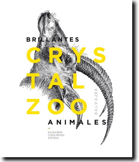
The building is intended as an extension of the public space in front of it. Starting with a spacious lobby, José Luis Campos of CrystalZoo says in its report, "almost without realizing it, the square goes into the building in the same way that the building becomes plaza".
The study was awarded FOPA prize recognition, naming it the best work constructed in the province of Alicante with this project.
Description of the project
This new municipal library is located in a small town West of Alicante, San Vicente del Raspeig. The town originally had three separate libraries, two for children and one for adults. The project’s aim was to consolidate the libraries in a 2,300 sqm space.
The library is in the Huerto de los Leones Square, between Blasco Ibáñez and Labradores Streets. It’s in the town centre but lacks formal cohesion or a recognizable identity. It was a very unstructured urban centre that this project was able to transform into a reference point, or as the studio described it an urban ‘attractor’.
The Project is based on the concept of urban renovation for new urban activities. The introduction of this new building not only alters and reactivates the flow of movement of the citizens in the square and town streets but also allows for new activities and new users of this urban space.
To that end, the building – the project – uses two urban identity strategies. It was conceived as an extension of the public space in front of it and it was designed as an independent urban element, both physically and visually, with respect to the neighbouring buildings.
‘The building begins with a wide vestibule that dominates the street, confusing the spatial limits and attempting to direct the flow’, Crystalzoo said in a statement. ‘Almost without realising it, the square enters the building the same way the building becomes the square,’… Like a big vacuum… it captures the pedestrian, who without realising it, is led into its interior in a spiral of books where the light accompanies him in his ascent and as he enters, he is accepted and protected. The most urban spaces relax and lose themselves, giving way to a more intimate place where silence reigns.’
In the interior, the ramp, which its creators have defined as ‘a spatial helicoidal cover’, becomes the spatial protagonist This rising ramp is built with the support of a wall, a sloping plane that begins with a dividing wall and turns in as a helicoidal from the basement to the upper floor, ending in a study area. Access to this space is created by folding the wall with respect to the dividing wall.
The project makes use of natural light to create controlled, graduated lighting that helps promote or calm activities that take place according to the location. The more active and open activities in the extension and visual connection with the square on the lower floor and the quieter and more individual activities on the upper floors, where the functional programme changes and activities require a cheerful interior, full of light, with changing views and interconnected spaces’.
The library is connected to the exterior by a platform, which is a continuation of the square as well as the beginning of the ramp, giving it the clear symbolism of a path of initiation rising towards knowledge, whose walls provide visitors with phrases that attempt to introduce them into the world of knowledge.
As well as being able to walk through the building following the gentle ramps, visitors can also take a more direct route by using the building’s vertical connections, which consist of stairs and an elevator, demonstrating lessons learned from Wright’s Guggenheim.
The functional organisation of the various programmes of the library is oriented towards the central empty space, using the perimeter wall as a storage area, both for documents and for computer carrels with the circulation desks nearby.
The building is constructed using raw concrete, which was chosen by the architects for different reasons including ‘the strength it transmits as a living malleable element, and its ability to generate complex geometric shapes in addition to its structural continuity.
The studio received a FOPA for this project, naming it the best work constructed in the province of Alicante. In 2012, San Vicente del Raspeig included the Library in its Catalogue of Protected Properties and Spaces and recently, at the end of 2014 was declared a Tourist Destination thanks to, among other factors, its support for contemporary architecture.
Text.- José Juan Barba


