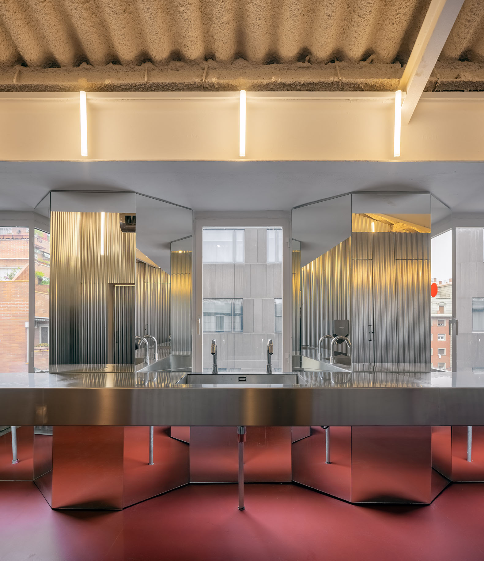
The result is a vibrant and fun interior, which enhances the space and its industrial structure, being characterized by a contained use of new materials: "Sheets and mirrors in the toilets and three-layer fir boards in the coffee areas are joined by continuous paving of natural linoleum that contrasts with the strength and hardness of the concrete and the metal structure that houses them."

Forkstone by LoCa Studio. Photograph by Pol Viladoms.

Forkstone by LoCa Studio. Photograph by Pol Viladoms.
Project description by LoCa Studio
Transformation of an old industrial space/parking into a modern office area in Espai Serrahima, Barcelona.
Located in Espai Serrahima, a hub for artistic and cultural companies, this former industrial building has been renovated to serve as a modern workspace. The building was originally a textile factory, but an addition of concrete-steel structure was added later in the 1970s providing the complex an eclectic and uncommon image within Barcelona. Over the years, the space was repeatedly transformed, hosting activities from parking to warehousing, and/or a culinary research center before the interest in shifting it to become an office space.
Designed to enhance the building's unique identity, the renovation recognizes the memory and history of the place. Improvements were made to increase thermal and acoustic comfort and enhance natural ventilation across the room while preserving the building's identity.
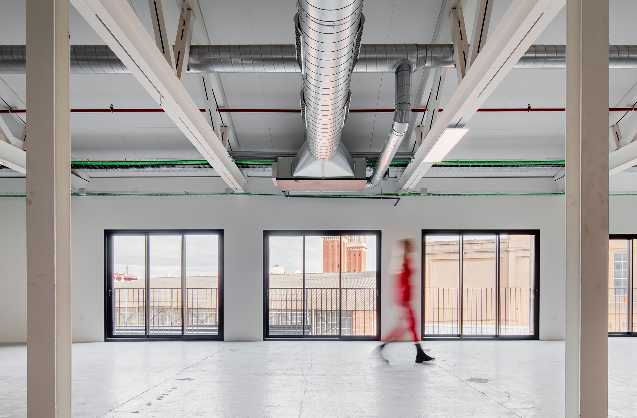
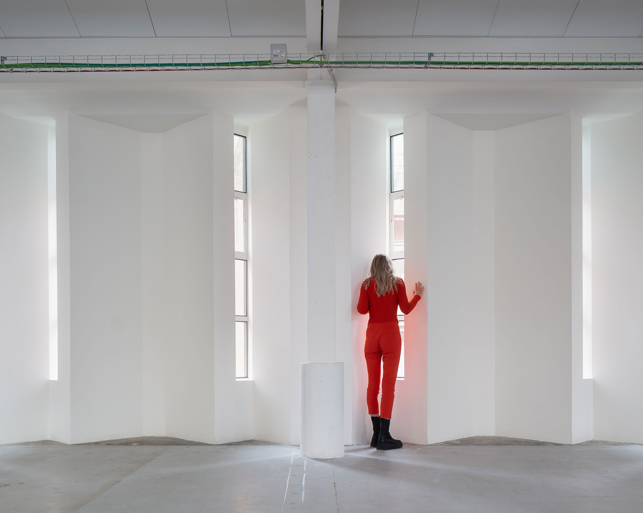
Forkstone's project works on recognizing the value of the existing by removing the superfluous. The space was grandiose enough, and strategies were set to highlight its natural condition while improving comfort: removal of internal divisions, improvement of the isolation, enlargement of the openings, facilitating visual connection with Barcelona's urban environment, providing update infrastructure and services with construction solutions according to previous interventions, preserve the empty neutral container, introduce color to counterbalance neutrality and contribute to the fun.

Forkstone by LoCa Studio. Photograph by Pol Viladoms.
The previous close space was opened to the outside following the rhythm of the existing steel structure. The big carpentries link users with the privileged urban landscape of the office, with views to Plaza de España and the Barcelona Fair backs. A non-common view that shows the city's industrial past, an unknown Barcelona for many.
Elements introduced are the minimum to accommodate new activities: a meeting area, and a kaleidoscopic restroom facing Carrer Mèxic. Materials and construction-design strategies implemented here complement the building's previous industrial character while fostering the outdoor connection. A hard and cracked concrete pavement is kept in the whole room while a new colorful natural linoleum flooring has been added at the extreme. The contrast identifies activities and orientates people and visitors.
The clever use of color and emphasis on the unique structure, the scale of the space and its industrial history, and some playful materials create a lively and enjoyable atmosphere. The transformation was designed to provide maximum comfort for the new occupants and encourage them to enjoy the privileged location of the space.


