The extension references the historical buildings in the area. Vertical fins protruding in a consistent grid give rhythm to the large façades of the extension building. They are crafted from a Swiss Jura limestone whose colour nuances give the façades a vivid effect of depth and were built up solidly with an exquisite level of craftsmanship.
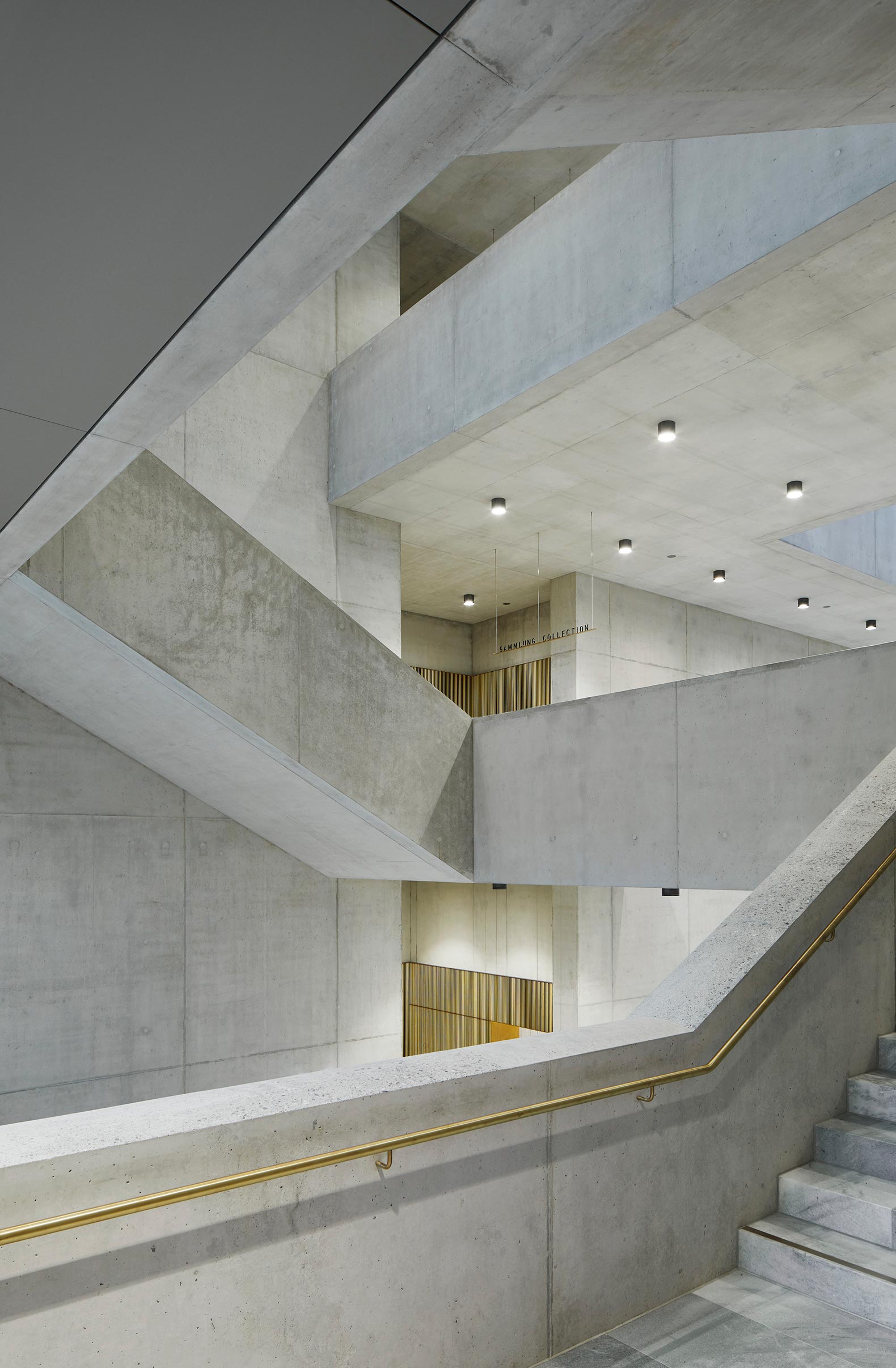
The visible supporting structure is the connecting element within the building. The structure of walls and ceilings made of reinforced concrete appears in the interior as exposed concrete. Marble, wood and brass complete the small range of key materials.
The interplay of architecture with natural light lends atmosphere to all areas of the rooms. The light-flooded central hall receives ample daylight through generous glass skylights and floor-to-ceiling windows.
The bar, with its wall covering of green velvet, represents a conscious creative counterpoint to the restrained rooms of the museum. The integrated mural ‘Pétales et Jardin de la Nymphe Ancolie’ by Max Ernst, was initially created by the artist in 1934 for the Corso Bar, also in Zurich.

Project description by David Chipperfield
The new Kunsthaus Zürich extension, designed by David Chipperfield Architects Berlin, expands the existing Kunsthaus museum, situated between the Grossmünster church and the university. The Kunsthaus Zürich now represents the largest art museum in Switzerland, comprising four buildings from different eras – the Moser building (1910), the Pfister building (1958), the Müller building (1976) and now the Chipperfield extension (2020). The new freestanding building houses the collection of classic modernism, the Bührle collection, temporary exhibitions and art from 1960 onwards.
Based on the Central Campus masterplan published in 2007, the museum buildings and the Schauspielhaus theatre located on the east side of the urban square Heimplatz, form a gateway of the arts as an urban entry to the education mile. Here, the large freestanding buildings of Zurich’s universities are lined up like a string of pearls leading northwards.
The urban concept for the extension envisaged the placement of a clear geometric volume on the northern edge of the square. The building form takes inspiration from the old cantonal school, built in 1842 to the north of the site, which defines the urban frame with its architectural clarity. The urban plan defines two new external spaces: the urban square to the south, framed on all four sides by buildings and the new Garden of Art to the north as an open and permeable natural environment. An expansive entrance hall, spanning the full length of the building, creates a link between these two new urban spaces. Due to its low-threshold accessibility it likewise acts as a public link between the institution and the city. A visitor passageway running underneath the square connects the new building with the existing Kunsthaus, creating one institutional entity.
The architectural identity is modelled on traditional stone façades, as found in the existing Kunsthaus and many other significant public buildings in Zurich. The extension is therefore embedded in a building culture that is an expression of an enlightened civil society. The new building combines tradition and innovation through slender vertical fins crafted from local Jurassic limestone with sawn surfaces and placed at regular intervals in the façade, embedding the building it its urban and cultural context in a contemporary manner.
The internal organisation is based on the concept of a ‘house of rooms’. This idea finds its expression in the different design of the rooms in terms of size, orientation, materiality and lighting, giving each its own character and creating a diverse sequence of spaces. All public functions such as the café/bar, events hall, museum shop and museum education services are arranged around the central entrance hall at ground floor level, while the two upper floors are reserved exclusively for the display of art. The varyingly dimensioned exhibition spaces are characterised by a calm materiality and an abundance of daylight – side light on the first floor and skylight openings on the second floor – placing the immediate experience of art at the centre of the visitor experience.


