With this proposal, El Departamento manages to take the concept of commercial space beyond its traditional functions, uniting technique and materiality and turning the project into a visual and spatial language in itself that allows customers, through a comfortable, intimate and close shopping experience generated by the vibrant interior contrast of its metal display and storage structures and the warm atmosphere of the fitting rooms, to experience the connection between product and design and the innovative and dynamic spirit of the brand.
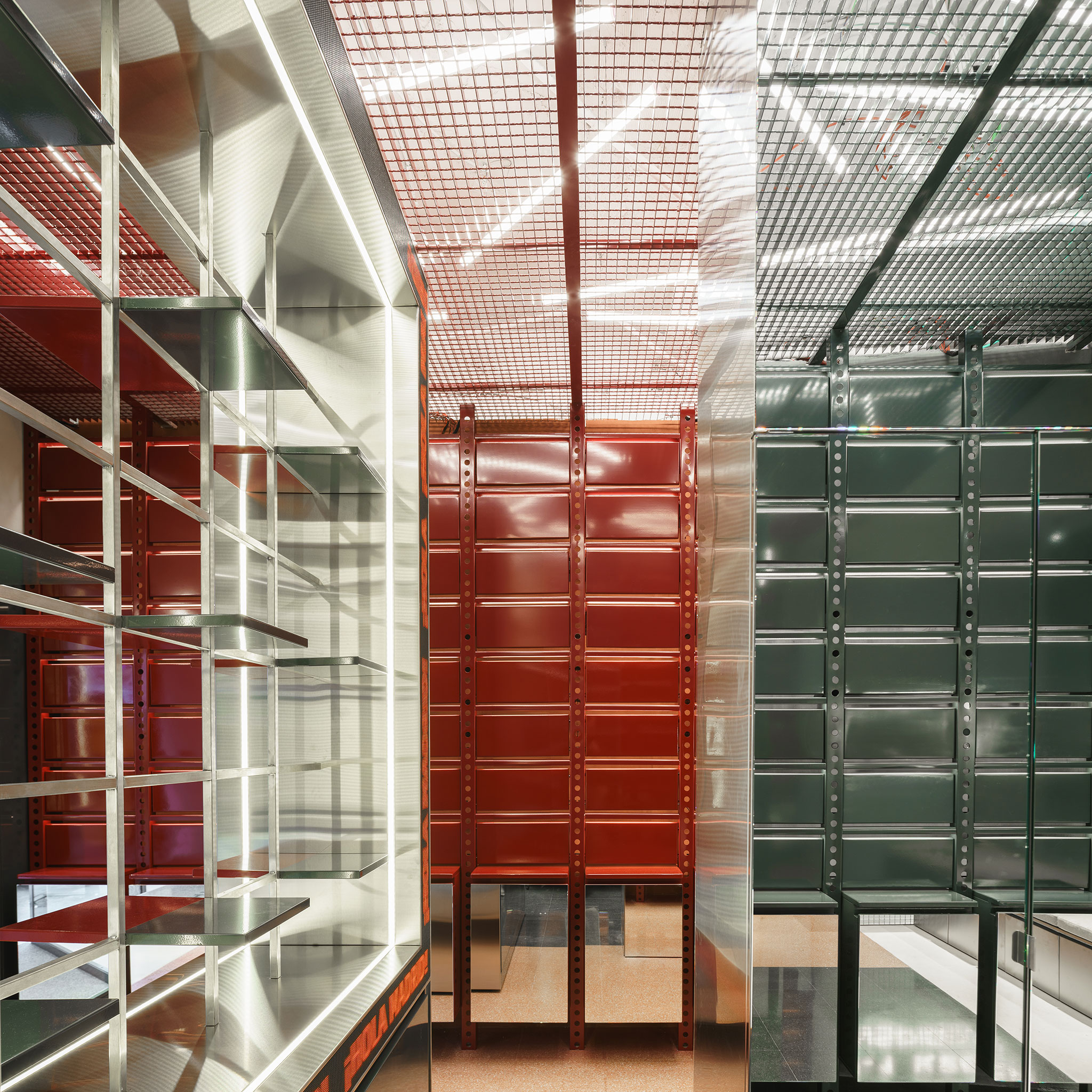
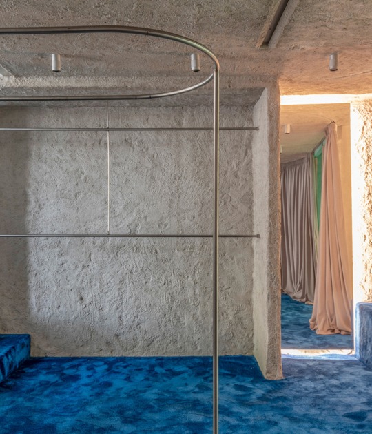
Developed from a two-tone exposed metal structure that is presented as the protagonist of the interior, the project is a functional and versatile system that gives the whole an industrial look, where a metal grid that extends to the ceiling allows a glimpse of the facilities, combining continuity and fluidity and culminating in a path of warm and soft materiality with neutral tones, where the stuccoed walls and lighting are the final contrast of the different areas and provide conceptual cohesion to the project.

Siroko Store by El Departamento. Photograph by Miguel Fernández-Galiano.
Project description by El Departamento
Located at number 2 on the central Fuencarral street, the Siroko store is the result of an in-depth exploration carried out by El Departamento to transfer the dual essence of the brand to a 110 m2 space. Inspired by adventure and the balance between logic and intuition, the project divides the area into two very different environments, symbolizing the cerebral hemispheres through color. This layout culminates in a transition corridor towards the fitting rooms, conceived as an area of connection and comfort that evokes the integration of both hemispheres during the REM phase.
The design, developed under the creative direction of Alberto Eltini and Marina Martín, together with the rest of the El Departamento team, materializes the duality of Siroko through two areas that are opposite in tone and concept. This structure reflects the exhaustive research that El Departamento has carried out around the firm's values to respond to its commercial needs and narrate the essence of Siroko: a balance between the rational and the emotional, the world of the mountains and the asphalt. Each space takes the visitor on an immersion into the brand's identity.
The left hemisphere, inspired by the concept of logic, analysis and sequencing, is represented in a black area evoking precision and linearity. The selection of dark tones and black metal creates a technical atmosphere, reinforcing the qualities of resistance and specialization that characterize Siroko products. The opposite area, inspired by the right hemisphere and its associations with intuition, creativity and freedom, is tinged with intense red tones. This vibrant environment invites exploration and adventure, linking the space with the innovative and dynamic spirit of the firm.

Both areas are articulated by an imposing two-tone exposed metal structure that is the protagonist of the interior design. This functional and versatile system meets the needs of display and storage while unifying the two atmospheres. The structure extends to the ceiling, where a metal grid reveals the bare installations, giving the whole an industrial feel that emphasizes the brand's identity. Chromatic differentiation, combined with the uniformity of the metal, reinforces the conceptual contrast of the areas and provides fluidity and continuity to the spatial experience.
The route culminates in a corridor of neutral and soft tones; a serene transition between the two hemispheres, where the fitting rooms are located. Conceived as a representation of the REM phase, this space connects the opposite sides of the brain, achieving a conceptual cohesion that translates into a bright and very welcoming design. The warm materiality of the stuccoed walls and the controlled lighting provide privacy and comfort, promoting a comfortable, intimate and close shopping experience.
Thus, El Departamento has managed with this proposal to take the concept of commercial space beyond its traditional functions. In the Siroko store, technique and materiality become a visual and spatial language that allows customers to experience the duality of the brand and the connection between product and design.


