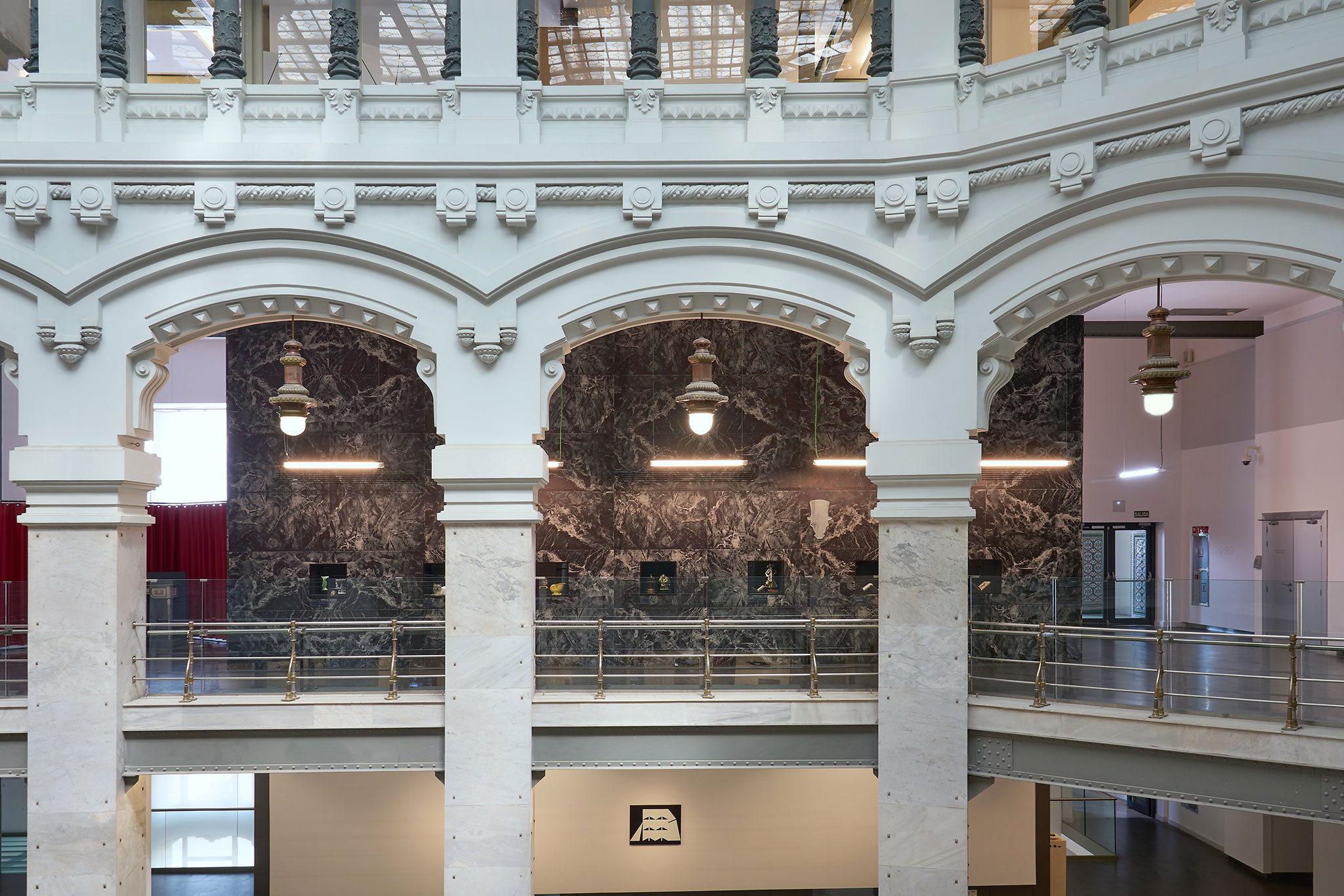
The Cibeles palace is a building that follows the line of the cheesy, according to Pedro Pitarch, the result of a contest won by Palacios and Otamendi in 1904. It is the perfect setting to host an exhibition of these characteristics, thanks to the interior of the palace that reminds us the Secessionsstil / Viennese Secession.
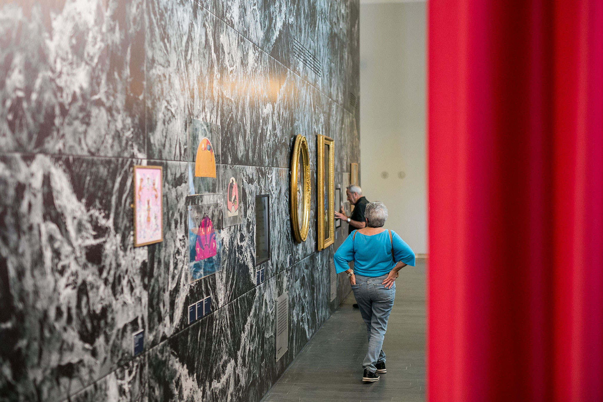
The exhibition houses more than 100 decorative elements, including furniture, publications, photographs, works of art, comics, advertising posters... everything to bring users closer to this cheesy movement.

"Elogio de lo cursi" by Pedro Pitarch. Photograph by espacio.photo.
Project description by Pedro Pitarch
How to design an exhibition space to house a historiography of a genre so complex to explain, but at the same time so close?
How to face the concept of "the cheesy" from the architectural point of view?
The project for the spatial design of the exhibition "Elogio de lo Cursi” arises from reflection on a term that is so difficult to translate into other languages as it is perfectly recognizable.
Sergio Rubira, curator of the exhibition, introduces us to “lo cheesy” through the definition of the RAE Dictionary:
"1. adj. Said of a person: who pretends to be elegant and refined without achieving it. U.t. c. s. / 2. adj. Said of one thing: That, with an appearance of elegance or delicacy, it is pretentious and in bad taste”. It seems then that the cheesy is characterized, as the character of the marquis pointed out in the comedy "Lo cheesy" by Jacinto Benavente, for being the opposite of what it is intended to be.

"Elogio de lo cursi" by Pedro Pitarch. Photograph by espacio.photo.
Faced with the apparent immediacy of approaching the design of the expo from a deliberately cheesy aesthetic, we have decided to do precisely the opposite: avoid a recognizably cheesy aesthetic, working with “the cheesy” from a purely conceptual point of view.
If the cheesy pretends to be without actually being. If the cheesy yearns to be elegant and refined but ends in ridicule. So the exhibition should be just that: A deliberate pretense of elegance and refinement to the point of being ridiculous. Almost a satire of good style.
But what could be universally considered the epitome of elegant and refined in architecture and design? Assuming an almost sarcastic attitude that design deserved, the answer ironically led us to Mies van der Rohe, his materiality and his spatial composition.
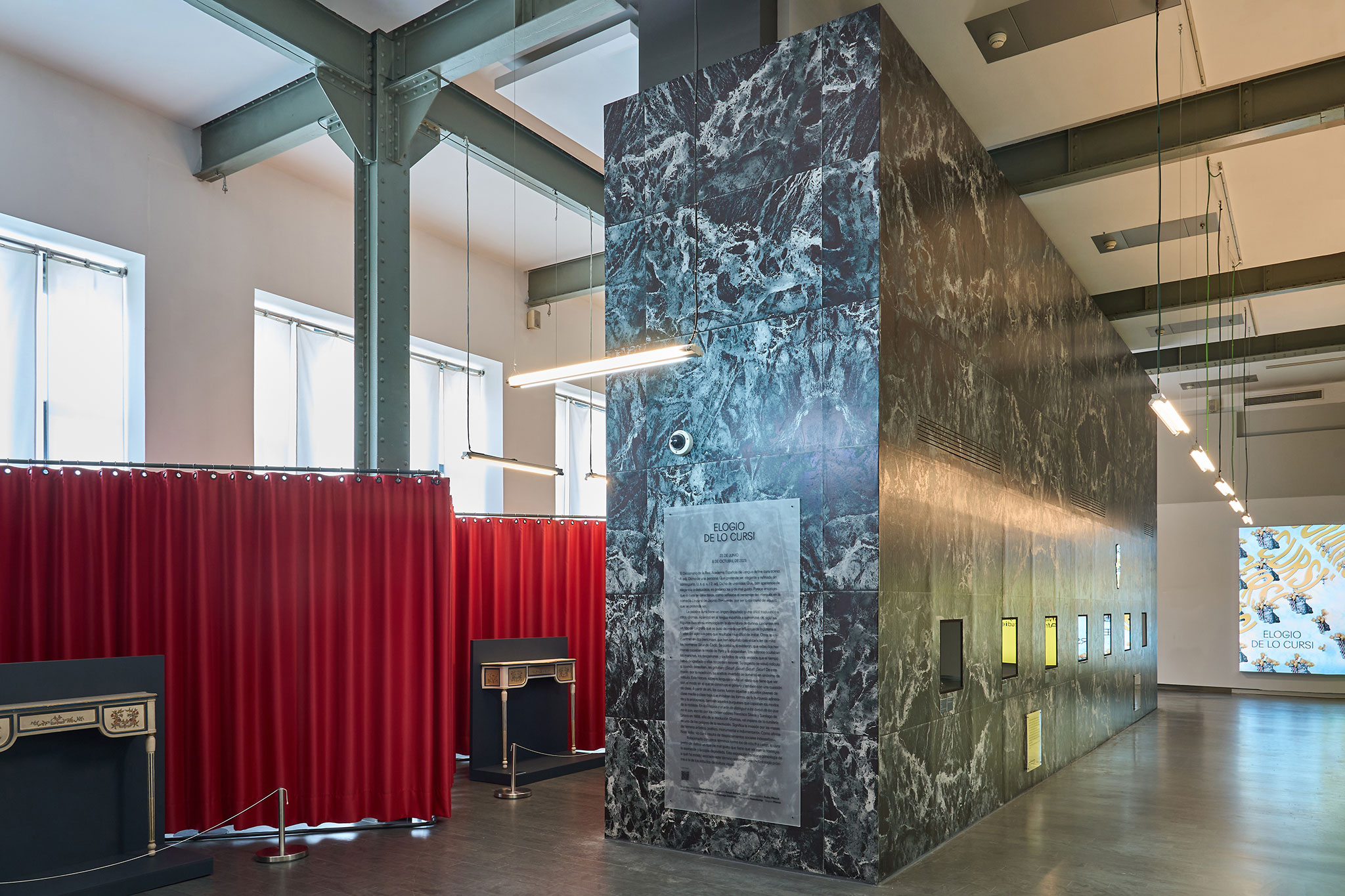
From that irony, the project takes the pattern of the marble of the Barcelona Pavilion, as well as the modulation of the two interior monoliths of the Neue Nationalgalerie in Berlin, to recreate two symmetrical prisms in both wings of the Cibeles Palace, place of the exhibition.

"Elogio de lo cursi" by Pedro Pitarch. Photograph by espacio.photo.
The exhibition space is divided into three elements:
- The two large marble prisms that articulate the two exhibition areas. Organizing the pieces of the 19th century and those of the 20th in two areas that avoid a linear path to propose a drift.
- Two double drapery niches, designed with a structure of tubular steel profiles inspired by the structure of the Weissenhof chair and the designs of Lilly Reich. Lacquered in anthracite gray and suspended by curtains that, far from materializing with Mies/Reich's maroon velvet, materialize in a vulgar satin fabric.
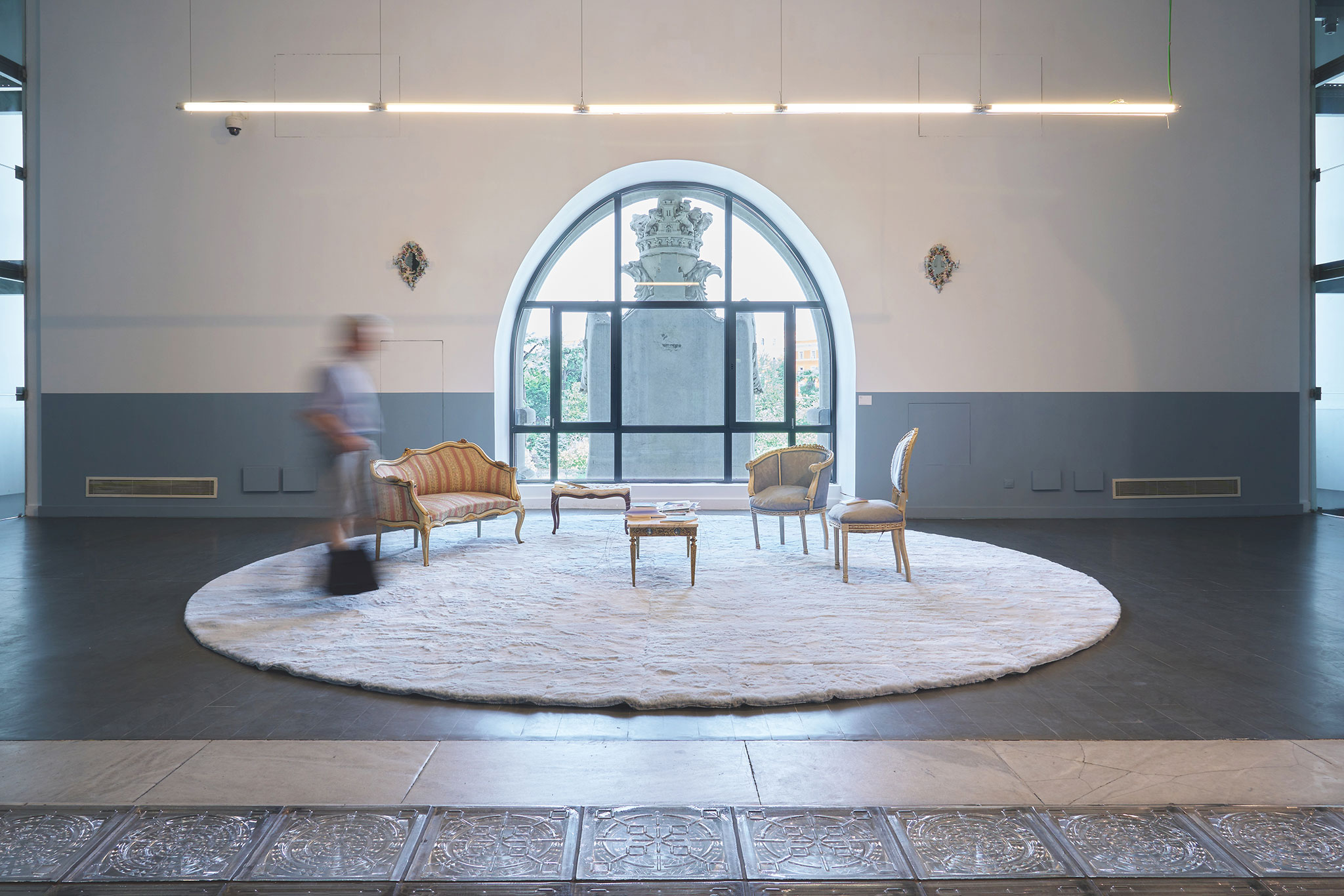
- A cheesy living room. A set design with a deliberately cheesy aesthetic that transforms the centrocentro foyer into a domestic space. For him, a 7m diameter plush rug in sky blue has been produced.

"Elogio de lo cursi" by Pedro Pitarch. Photograph by espacio.photo.
In parallel, the relationship with the Palacio Cibeles building was inevitable: the building is absolutely cheesy. The result of a competition won by Palacios and Otamendi in 1904, the building develops between the need to satisfy the public of the time with a Neoplateresque external aesthetic and the internal ambition of approaching the Viennese Secessionsstil with its structure, its transparent walkways and the "buttoned" from his tackle.
It is ironic that the style of the Viennese Secession is the precedent of a modern movement in which Mies belongs, which, with this exhibition, sneaks into the original building in a fake mode. Like a set design that seeks to unnecessarily monumentalize itself based on that pretentious attitude typical of the cheesy.
In the end, the exhibition is nothing more than that: a deliberate pretension that becomes almost ridiculous.
Marble that is actually wallpaper. Velvet that becomes satin. A monumentality of papier-mâché.


