MQ Architecture created a design where spaces are multipurpose. The fully operational kitchen is also an informal dining area, bathroom incorporates a shower, there are six open workstations, a phone booth, and a conference room that doubles as a video booth and makeshift bedroom for one night.
White oak wood covers the entire room, keeping the original wooden floor of the building refinished and sealed so that the material shows the scars of 150 years of history. The details are gold, and colors charcoal gray, cream and white complete the workshop regarding the principles of the brand.

Juniper´s Workshop by MQ Architecture. Photograph by Imagen Subliminal.

Juniper´s Workshop by MQ Architecture. Photograph by Imagen Subliminal.
Description of project by MQ Architecture
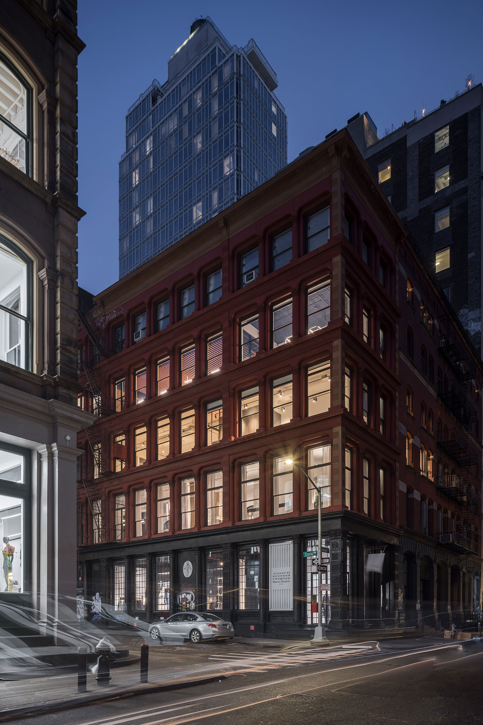
Juniper’s Workshop is located at 1 Crosby St, in one of the most Instagrammed corners in the heart of SoHo. In 2019, Juniper Design Group chose this remarkable location to establish their showroom on the second floor of the building.
In 2021 during the pandemic, they decided to expand its branding including an additional workshop space on the fourth floor of the same building. They requested a “flexible and highly collaborative hub, showcasing the technical aspects of their Systems and Services”. The program required a fully operational Kitchenette, a Bathroom with a shower, a Smart Product Storage, 6 open Workstations, a Phone Booth, a Conference Room, and more importantly, a full Collection Systems Display.
The understanding of the history of the building was crucial in the design process. Also known as 28 Howard Street, the 5-store building was designed by D. & J. Jardine in 1872, during the post-civil war period when the neighborhood was involved in a deep transformation from a residential community to the commercial district we enjoy today.

Juniper´s Workshop by MQ Architecture. Photograph by Imagen Subliminal.
Our project flows between three original elements of the iconic building:
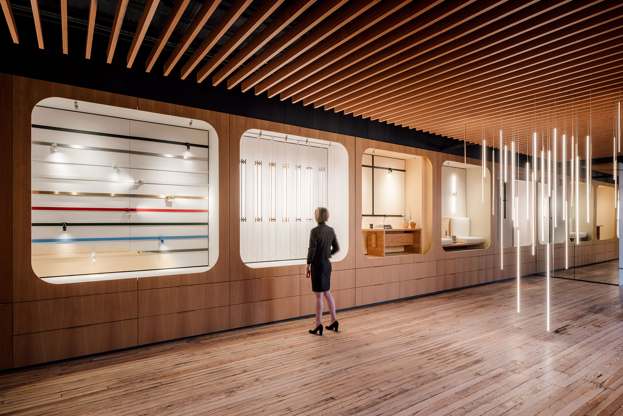
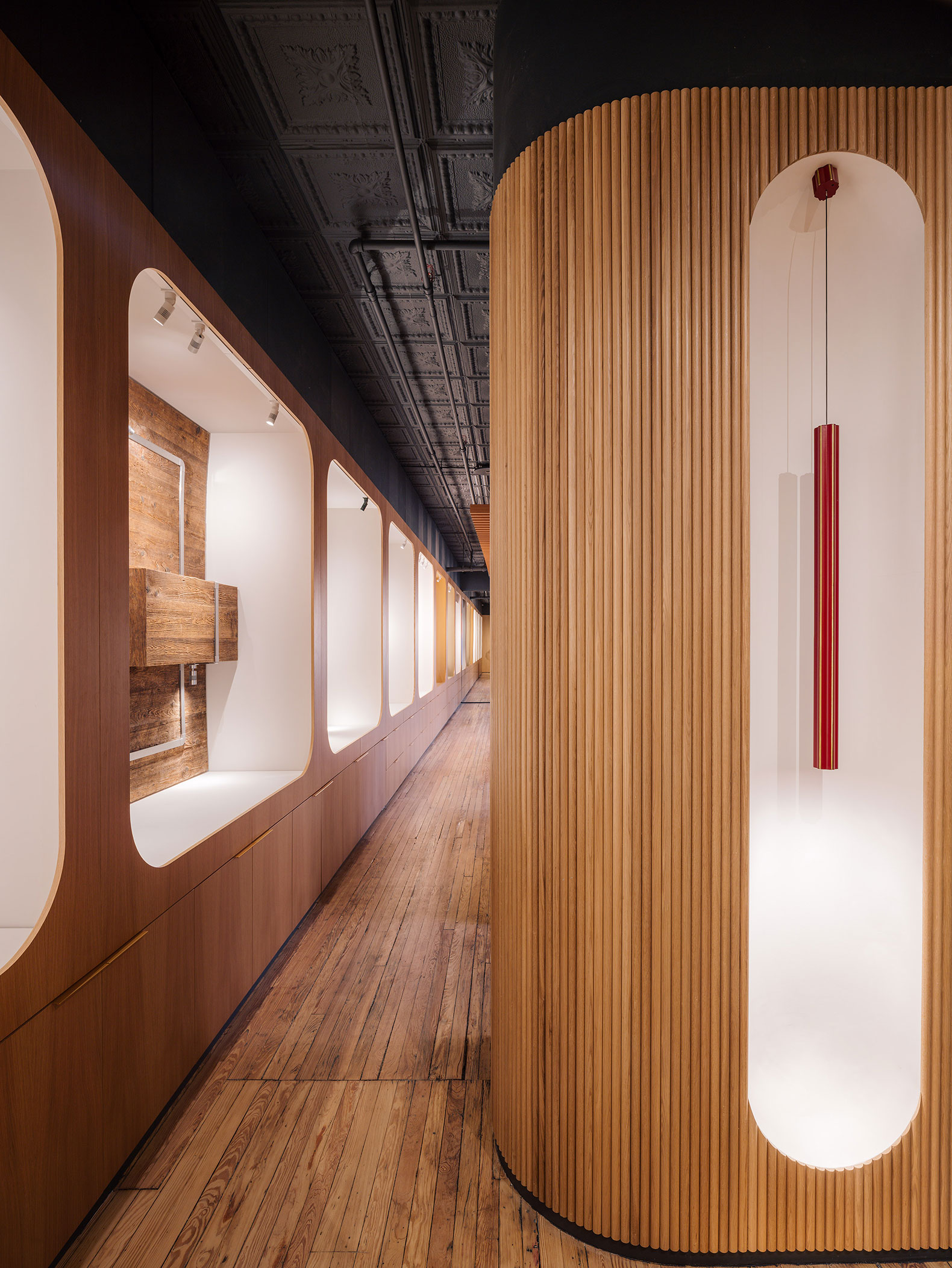
1. The Cast Iron Façade was designed under the umbrella of the Renaissance Revival. In both facades of the upper levels, the existing recessed fenestration and the curved lintels are an important influence for our design of the opposite wood wall and the “Juniper Vignettes”. There is a direct dialogue with the façade through the rhythm, shape, curves, and geometry of the product displays where the lighting products are carefully presented to the customer like delicate jewelry, discovering their beauty but also providing their characteristics and technical properties.
2. Tin tiles cover the ceiling in its entirety. These tiles, made of corrugated iron sheets, were originated in New York City at the same time as the construction of the building in 1872. During the next decades, they increased their popularity as an affordable alternative to the luxurious European plaster ceilings. Unfortunately, they almost disappeared during World War II when metal became scarce. Despite being criticized during its heydays for being an imitation of another material, we decided to protect the heritage and legacy of the city and restore the tin ceilings, recovering and dignifying the character and memory of this material.
3. The floor showcases its original solid hardwood. Despite not being in perfect condition (scratches, patches, stains, and differences in color) we decided to refinish and seal the material showing the scars of 150 years of history, perfectly matching the desired SoHo warehouse aesthetic.
White oak wood, black squared ceramic tile, gold accent details, charcoal grey, cream, and white colors complete the mood board and the color palette of the workshop, linking our design to the brand principles.
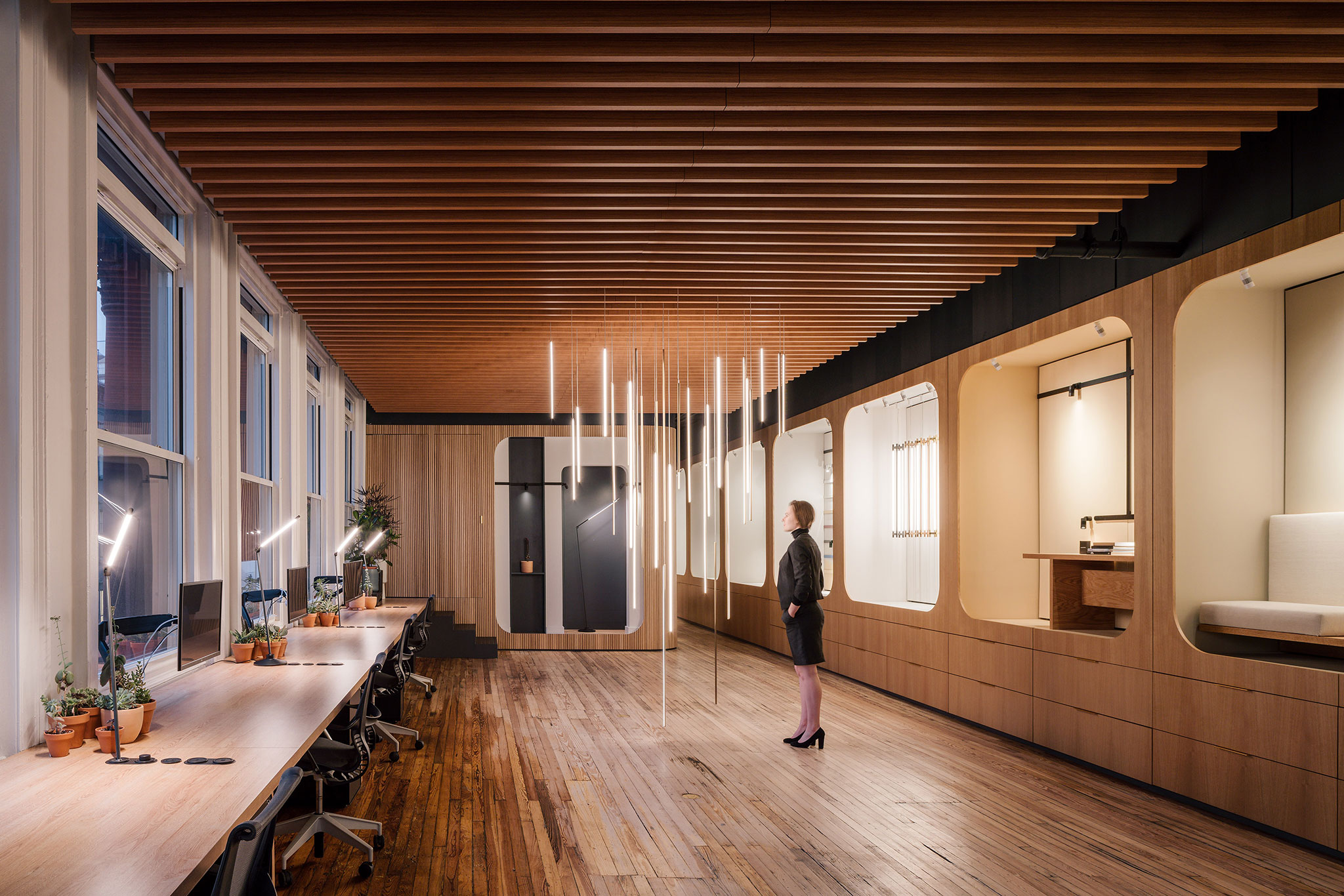
To clear the center of the room for multiple uses (conferences, product display, future additional paneling display…) we proposed a full perimetral operation: First, wet rooms and mechanical spaces are condensed in the Northside of the plan. Secondly, all the lighting product of the company is shown, displayed, and stored inside the vignettes in the East wall where an strategically placed mirror virtually doubles the length of the wall. Finally, the continuous desk counter confronts the user to the West façade and the views of Soho.

Juniper´s Workshop by MQ Architecture. Photograph by Imagen Subliminal.
Spaces allow for multiple uses, that way, the conference room is also a video booth and an impromptu one-night stand bedroom, the phone booth is also the existing boiler room vestibule, the bathroom is also the shower, the kitchenette is informal dining, and all the vignettes also store a myriad of samples. The workstations are hot desks that also create a surface for product display, and the welcome lobby is also a prime product display room.
Two product carts were also designed as part of the commission. They can be plugged in and allow visitors to power and Juniper samples. The new floor outlets allow the carts to be used in the space, but they can also be taken to the lower floor or trade fairs.
Juniper declares on the first page of their Product Catalogue: “Honesty in Design can be found in the Details”. We profoundly share with them this motive and it’s captured carefully in the design of this workshop.


