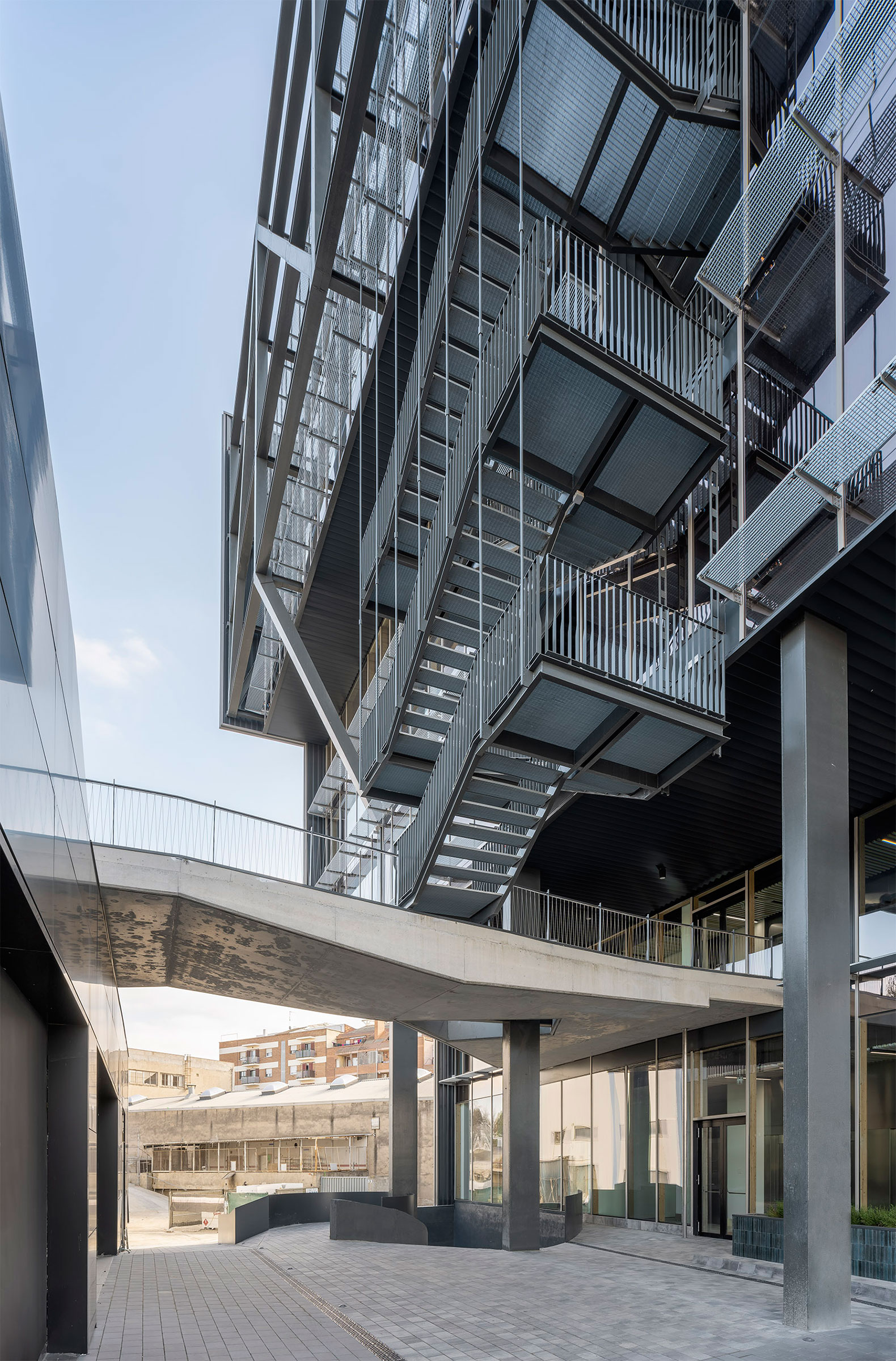
The new building designed by Bailo Rull Arquitectura has 8 floors in which, in addition to office space, there are services for common use such as multipurpose rooms, a landscaped and accessible roof on the first floor, a dining room, and interior and exterior spaces for activities. related to wellness.
For every 7.2 square meters of office space inside, Slow users have 1 square meter outdoors.
Unlike typical office buildings that are often designed with identical facades, Slow BCN has distinct facades that seek thermal efficiency: a glazed curtain wall to the north, a south facade with a solar filter of plates and operable panels, and ventilated east and west facades with a perforated industrial sheet metal finish to control solar radiation.
The building has three certifications: DGNB Certification, which determines the degree of sustainability of the building and some elements of the health chapter; the energy demand certification A, having obtained the consideration of nZEB building.

Slow Building Barcelona by Bailo Rull. Photograph by Duccio Malagamba
Project description by Bailo Rull Arquitectura
Formation of a new urban center in an old industrial estate.
SLOW office building.
The design of this office building arises from the urban consideration of the context where it is located.
1. Specific Modification of the Original Planning.
The project arises from the beginning proposing to the property and the town hall, the need to change the current regulations taking into account the urban evolution that the site has undergone. The site, where the offices are located, has gone from being an old industrial estate on the outskirts of Sant Cugat to being today one of the most important entrances to the city. The modification proposal has consisted of changing the original volumetry of a 3-story industrial warehouse occupying the entire site, to a new 9-story high-rise building. The volume change allows, without increasing buildability, to define new access to the city, recognizing and revealing a new area of centrality originally latent in the site. The modification is sensitive to the public activity that takes place in the old neighboring building of the Merkantic and promotes the formation of new pedestrian routes.
2. Structure.
The project is defined from a structure that allows the development of a staggering volume that places the new volume of offices facing the roundabout of accesses to the city. A pillar branches out into inclined beams, until it forms, three-dimensionally, the truss of the main façade of the building.
3. Sustainability.
The punctual modification has allowed the proposed volumetry to adequately respond to the solar orientation of the site. A narrow and long volume, which takes the full length of the original industrial site, is defined by facades that take advantage of the different solar conditions. The East and West matte facades are finished with a simple solution of metal ventilated facade that gives the building an image of industrial construction. The south façade is resolved with depleted solar protection that forms a climatic cushion that improves the thermal behavior of the building. And the North façade is defined by a wooden structure curtain wall that helps to comfort the internal use of the offices.
4. Green roof and Health.
The new volume allows the construction of a landscaped terrace on the commercial volume of the car dealership. A green space for users that will allow them to have a workplace and relationship with the outside world.
A modern cover. We like to imagine Le Corbusier doing his morning physical exercises.
How can we imagine an office space today? Health and gym.


