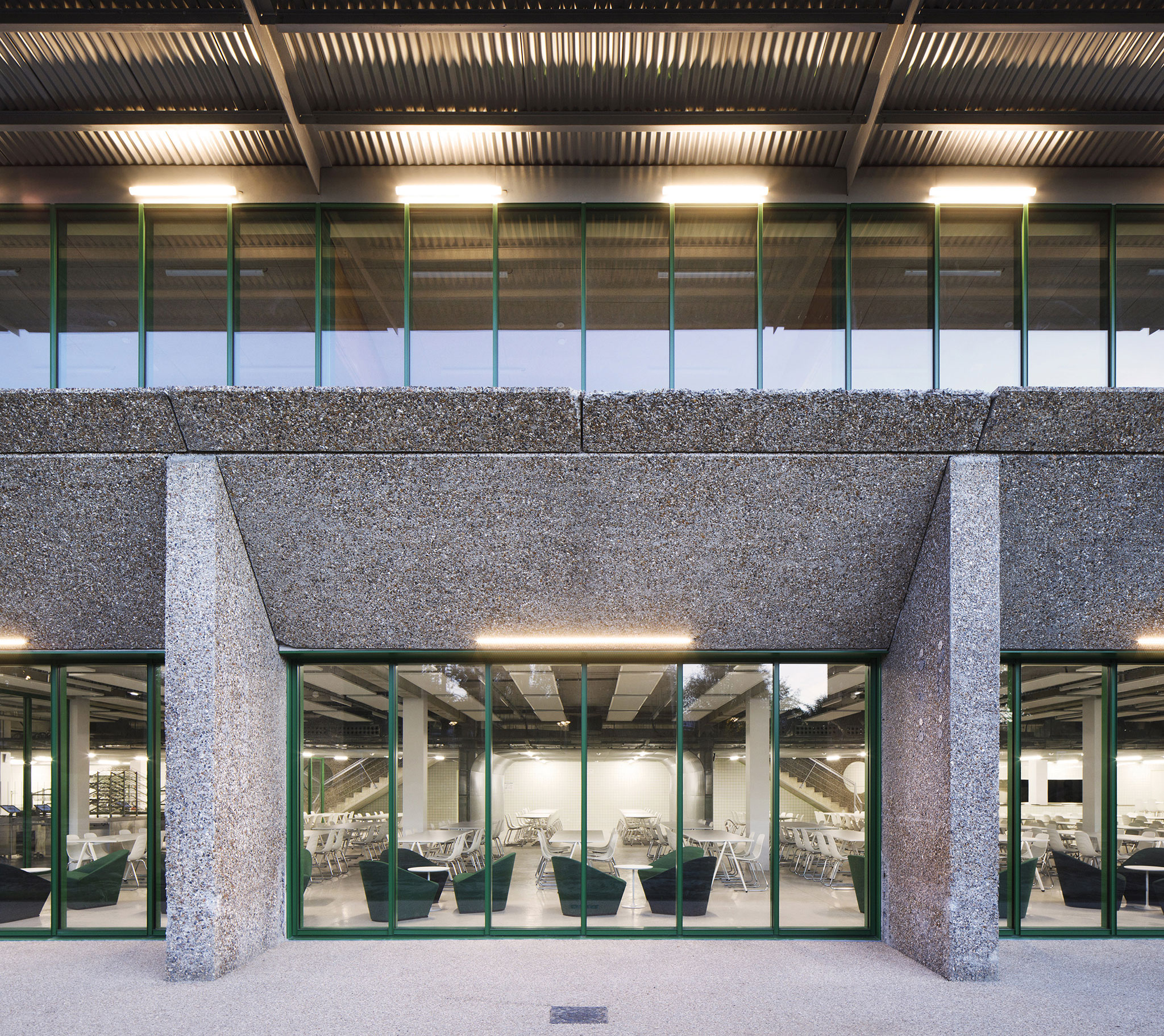
First step was highlight the intrinsic qualities of the original building. Of the refectory's pre-existing 2000 sqm building, the architects recovered the main elements from an architectural point of view. Not only the prefabricated concrete structure, but also the flexible construction system, offering a wealth of features such as paths, stairways and openings. In addition, the restaurant's offer was completed with a new expansion called the "kiosk".

Extension and restructuring of the Crous University Refectory by graal. Photograph by Clément Guillaume.
Project description by graal
Located in the heart of the Cergy prefecture park, the restructuring of the university refectory imparts a new radiance to this central facility of the campus' student and tertiary life. Erected in 1993, the building has the privilege of being set in the François Mitterrand Park thanks to its topographical location and its openness to this large landscaped public space. The facility is thus ideally integrated into the pedestrian network, at the crossroads of the two main routes that connect the Paris-Seine University sector and the Val d'Oise prefecture.
Discreetly embedded in the topography, the initial building faces a paradox: while benefiting from a privileged position, the refectory suffers on the one hand from a lack of visibility and on the other from interior spaces that are little enhanced by its lack of links with the outside.
Based on these observations, the refectory restructuring project is an opportunity to reappropriate and inhabit the landscape qualities of the site, in order to affirm it as a strong component of the park, well anchored in its context and uses. The original building also displays genuine architectural qualities: a durable, prefabricated, deactivated concrete envelope, a traced and flexible construction system, and a wealth of user features (paths, staircases, openings, etc.).
Through these intentions and the desire to highlight the intrinsic qualities of the original building, the project develops a double programmatic component: the in-depth renovation of the refectory's 2000 m², and the addition of an extension, called the kiosk, enriching the refectory' s initial offer.
The programme is spread over the two original floors, accessible on the same level thanks to the topographical movements of the land.
Forming a semi-subterranean mineral base, the garden level includes the dining room, which opens widely on the north side of the park and houses the kitchens in its rear part. The interventions on the existing structure consist in reinforcing the relationship between the interior and the exterior, in order to bring more light and views to the dining areas, and to enhance their uses. To achieve this, the openings in the façade were enlarged by removing the spandrels, the sloping ground was reshaped following the removal of the retaining wall and the new glazed façade became an opportunity to create entrances that were more visible from the park.
The interior is sequenced in three programmatic bands (relaxation, dining and kitchen areas) allowing the creation of a dynamic threshold between interior and exterior, notably through the new transparency of the façade.
Given the thickness of the dining space and its low ceiling height, the materials used were dictated by the need to make the space as generous as possible. The light grey resin floor, the glossy white tiles with green joints, the expanded metal elements and the acoustic baffles made of partly replaced mineral tiles, guarantee the flexibility and legibility of the dining space required by its programme.
A vault, also of expanded metal, enhances the original double staircase while providing a more intimate dining area. These sequences allow users to clearly identify the different ways of using the space. A bistro and an administrative area complete this vast, now luminous space, while the entire kitchen area has been restructured.
The interventions on the original building are based on its intrinsic qualities, and it is in the continuity of the initial framework that the extension is positioned on the base of the restaurant on the upper level. In response to the existing glazed volume that constitutes this ground floor, the kiosk is designed as a pavilion that opens widely onto the park and its wooded spaces. Its flexibility and positioning allow it to channel flows, articulate the existing entrances and offer new possibilities for appropriating the large terrace on which it is placed.
The fast-food space is modest in size and consists of solid multi-plywood panels that can be skillfully positioned over the existing fragile structure. These four wooden porticos reach out into the park to extend the roof made of corrugated stainless-steel sheeting supported by a galvanised steel frame. On the near and distant urban scale, this roof makes the facility visible and visible from the Avenue du Parc and the François Mitterrand Park, which then stands out as a signal.
On the existing side, the kiosk deploys an opaque technical band covered with a reflective cladding of corrugated sheet metal identical to the roof, interacting with the entrance. On the park side, the refectory area opens entirely onto the landscape through a transparent and rhythmic envelope made of a curtain wall of green spines. These elements, aligned with the original structure, are positioned in the continuity of the new glazed façade of the plinth, like a unique and assertive mesh. Designed as a light pavilion on a topographic mineral base, the kiosk becomes a unifying element between the different parts of the refectory, allowing it to assert its presence while ensuring the architectural coherence of the whole.
Through a sober and economical design, the project demonstrates how work on the existing building accompanies the repositioning of an ordinary programme, such as a "resto U", allowing it, through architecture, to reinterpret its uses and its programming.


