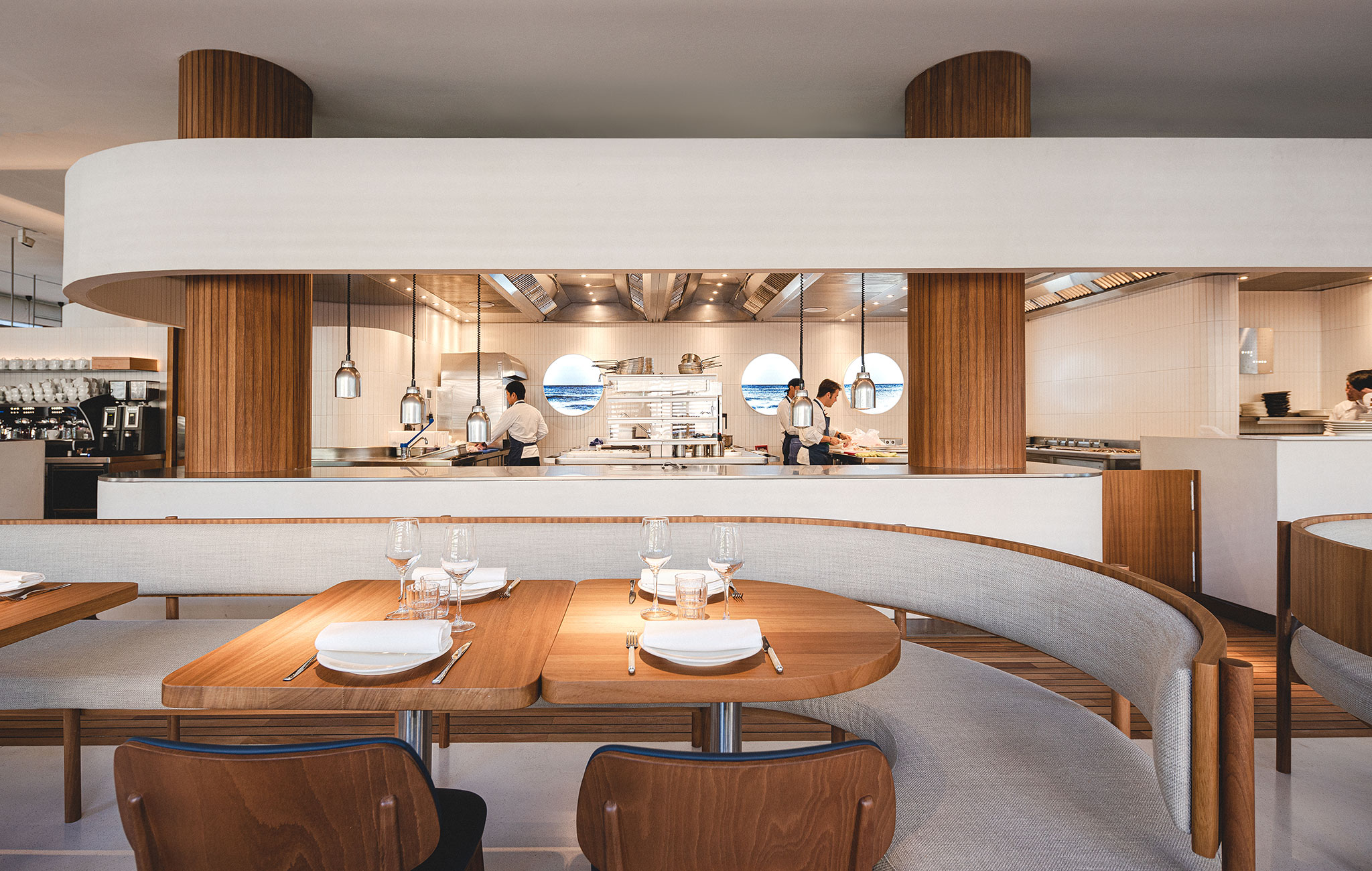
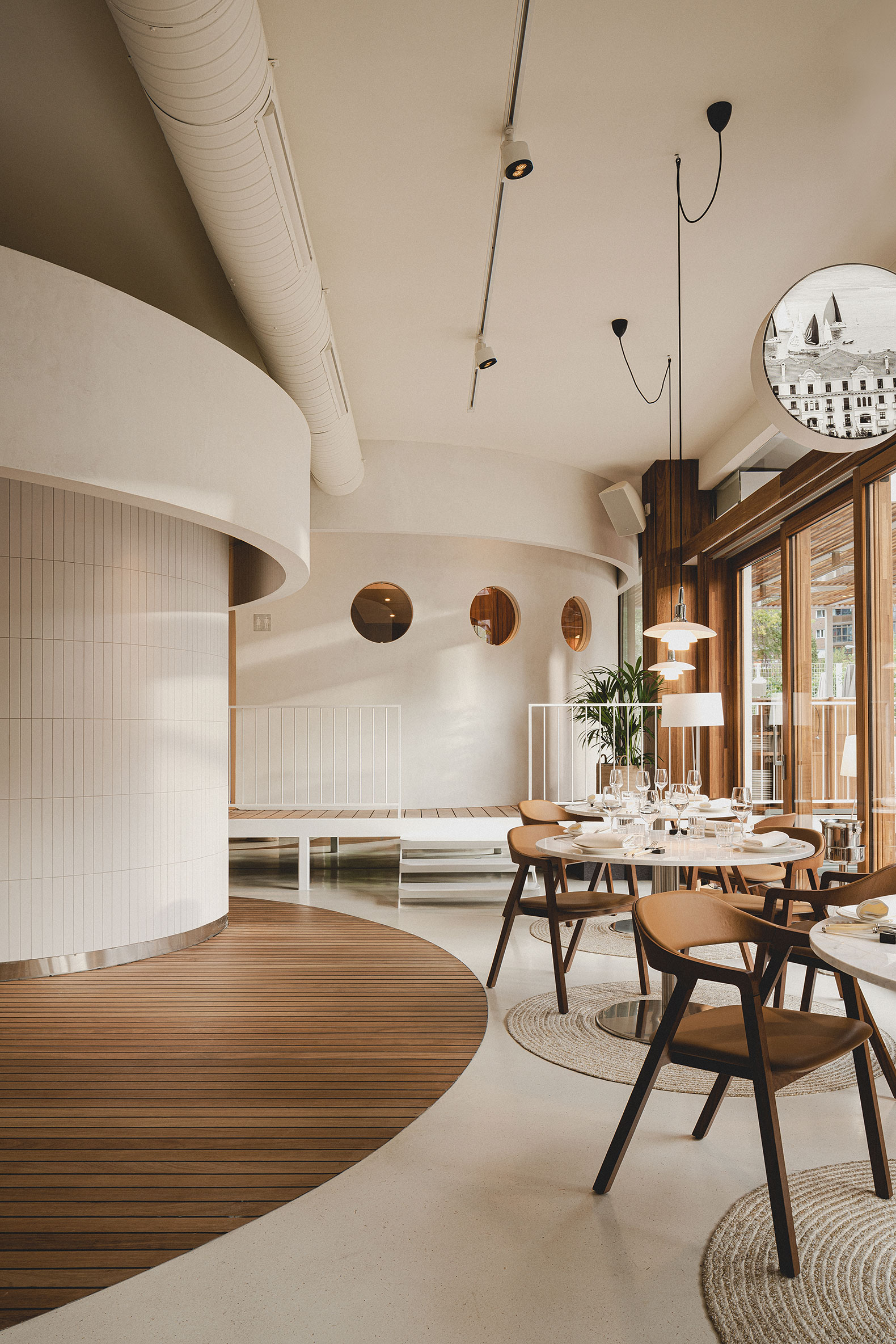
The materiality follows the maritime lines of the entire project: nautical wood on the pavements of transit areas and light micro terrazzo with minerals in earth colors for the flooring of the rooms, white polished cement in the interior volumes, wooden slats in the verticals elements, and smooth, white ceilings.
Another very characteristic element is the bathrooms, elevated on a platform that leads to the terrace, as if it were a pier, imbuing this outdoor space with character.

La Maruca de López de Hoyos by ZOOCO ESTUDIO. Photograph by David Zarzoso.
Project description by ZOOCO ESTUDIO
If in other times the city of Madrid had a beach - on the Manzanares’ bank and ten minutes by bus from the center -, today, the new restaurant of La Maruca draws a nautical club in the heart of the capital, paying homage to the great rationalist jewels of Santander's architecture, such as the "Isla de Torre" Sailing School or its Royal Maritime Club.
Through a process of abstraction, the project plays with the exterior-interior dualism, generating exteriors within interiors, and recreating open and nautical environments, in which the sea is perceived, but not seen. Thanks to the use of bands, the interior volumetry is molded, expressed through multiple facades, curved and friendly, inviting the visitor to walk and observe, as a sort of pilgrimage through the landscape with traditional images of the Cantabrian city.
The materiality of the project is closely related to the marine character: nautical teak wood with black polymer-based joint, used on the decks of ships, as flooring in the passage areas of the project; micro terrazzo with minerals in earth colors, for floors in living rooms; white polished cement as the finish of all volumes that create the interior building; teak wood slats for the vertical elements of the project, such as columns and pillars; finally, smooth white ceilings, with a very high degree of sound absorption.

La Maruca de López de Hoyos by ZOOCO ESTUDIO. Photograph by David Zarzoso.
The interior treatment of the ribbons and volumes that make up the building is noteworthy. The extreme slenderness of the ceramic pieces, and their vertical placement, allow us to perfectly adapt the cladding to the curved profiles of the multiple volumes, providing a texture with character. Thanks to a careful study of the horizontal lines of the project, a clear order is established that enhances the harmonization of the project and the understanding of the space.
Another characteristic element of the project is the bathrooms, elevated on a structure that goes beyond the limits of the premises and opens into its outdoor terrace, like a pier, a very recognizable element that imbues this outdoor space with character. The bathrooms - or cabins - are designed using only two elements: teak wood slats and a plinth of semicircular ceramic pieces of the same width as the slats.
The envelope of the restaurant is 360º. Like a transparent box, the glass perimeter enhances the permeability and promotes the observation of the interior volumes from the outdoor environment. An integral system of wooden sliding doors can change the degrees of privacy and solar protection of the interior.
Nothing is hidden. The spectacular open and exposed kitchen is ubicated in the center of the interior building. Like a ship’s engine room, it is offered in its entirety in an exercise of confidence in the team and transparency towards the customer. Stainless steel, reliable and immutable, is the absolute protagonist.


