Located in a tiny shopping enclave on 36 Dover Street, -just up the road from Comme des Garcons' Dover Street Market, London- is Victoria Beckham’s first store occupying 561 square-meter. The Georgian frontage of the store is designed as a simple glass front with no window displays that offers passers by and customers a full view into the store.
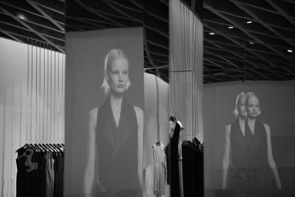
Visitors enter through a front door cast in concrete, intended to echo the proportions of the existing first floor windows on the building. Inside, shoppers are greeted by an epic mirrored ceiling, the effect has been described like stepping inside a very chic version of Doctor Who’s TARDIS. Beckham worked with celebrated Iranian-born architect Farshid Moussavi, a woman more known for building museums than fitting rooms.
The additional opportunity of this commission was how to develop a spatial identity for the brand as well as make the design sufficiently site specific so that future stores would not be simply a replica of it.

Victoria Beckham flagship store by Farshid Moussavi. Photography @ Jonathan Lu.
The concrete door weights 340 kilograms, but slides to provide an effortless entry to the store. The demise of the store at No.36 Dover Street comprise of three stories - a ground and lower ground level and the first floor, above which offices occupy a further 3 floors of the Georgian terraced building. Each of the floors is 31m long and 9.5m wide. The frontage of the store is 4.75 wide, therefore relatively narrow compared to the depth of the store. In addition, a large circulation core serving the offices above intrudes into the rectangular foot print of the store.

Victoria Beckham flagship store by Farshid Moussavi. Photography @ Jonathan Lu.
Inside, geometry is used as a way to animate the simple rectilinear space of the store. Two large triangular cuts into the ground and first floors make room for two board rectangular staircases that communicate the levels both physically and visually.
The ceiling of the first floor is intentionally made different to the ceiling of the ground and lower ground floor. Whereas the ground and basement ceilings are clad in mirror stainless steel to create an illusion of height, the ceiling of the first floor which is already a taller space, is designed as a concrete ceiling with a triangular geometry.


