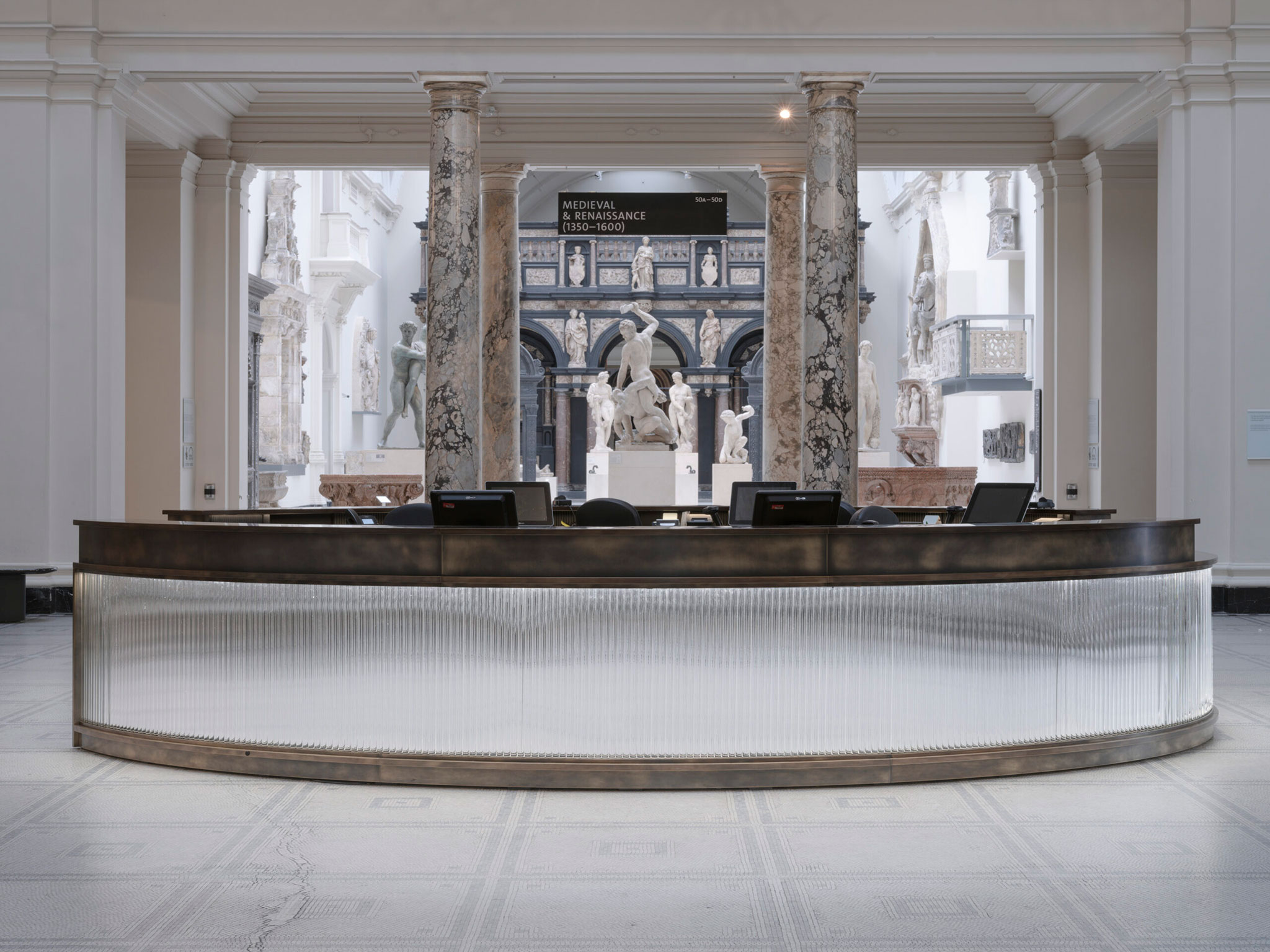
The glass produces optical distortions that accentuate the movement of people as they pass through the entrance. It also captures and projects daylight helping to illuminate the interior.
The information desk was designed to be able to respond to its double function of information and ticket sales during the day and its function as a bar for night events, making it easy to collect and store the items used during the day for the most important events. night entertainment.

V&A Cromwell Road entrance by Sam Jacob Studio. Photography by Timothy Soar.
Project description by Sam Jacob Studio
This project involved the remodelling of the V&A’s Cromwell Road entrance to upgrade key moments in the visitor arrival sequence.
The project deals with key public interfaces – including a new entrance lobby, new ticket/information desk and new WCs – that are also designed to introduce delight and surprise. The project argues that design is not just something to be put on a pedestal but is part of the everyday activities of life.
The design response works to complement the existing Aston Webb designed grade I listed building in a contemporary way. It draws on the long tradition of the museum’s functions acting as moments of delight that began with the world’s first museum cafe – the Gamble, Poynter and Morris Rooms opened in 1886 that showcased radical contemporary design as part of the visitors’ museum experience.
The new entrance lobby is formed by three bands of glass tubes arranged with 120mm diameter tubes on the lower level, then halving in size to 60 then 30 on the mid and upper levels. The glass produces optical distortions that accentuate the movement of people as they pass through the entrance. It also captures and projects daylight into the museum, with the whole structure helping to illuminate the interior. Glass here is used for the way it transmits light. It nods towards the museum’s own ways of categorising design, here echoing affects you might see in the glass collection. The new sets of sliding doors simplify the act of entering the museum and help improve the museum’s environmental performance.
Bag check desk is provided by new moveable stations whose design features bronze circles and triangles set into matt black Richlite making a subtle contemporary reference to the existing pattern of the marble floor.
As anyone who has been to a party at the museum knows, the ticket and information desk in the centre of the Central Hall also acts as a bar for evening events. The key design problem was to enable this day-to-night switchover to be as efficient as possible, allowing point of sale terminals, ticket printers, cash draws and so on to be smartly packed away before the revelries commence. Faced with glass tubes back with mirror panels, the front desk both reflects and distorts the movement around it, adding a sensation of mysterious depth and animation to its surface. The lighting of the desk changes from something more subtle during the daytime to more disco at night.
For the WCs, SJS developed terrazzo wall panels that used rejected jasperware from Wedgewood’s factory in Stoke. 700kgs of blue, pink, black and grey ceramics were collected, then crushed to make the panels. This creative use of waste material also draws on the V&A’s historic connections to Wedgewood – not only his statue on its facade, but the links to the V&A gallery in Stoke, and the displays of jasperware at South Kensington. The panels also play on the care that the museum takes of its ceramic collections, while here in the basement, the same types of vessels have been smashed to pieces.
The interior of each cubicle is tiled with a lifesize figure, taken from the museum’s ceramic collection. Scaled up and digitally printed onto colourful tiles, these allow a different kind of encounter with the museum’s collection. In the new accessible toilets, the same technique has been used with landscape references from the collection.
The project also saw the upgrading of lighting by Studio ZNA that helps guide visitors and helps reveal the beautiful historic architecture of the museum.
The project upgrades the visitor experience while also providing a contemporary response to the materially and symbolically rich language of the museum’s existing building. It explores the possibilities of an applied arts institution that, just as it has done since its foundation, embeds design within its own fabric. Design is not only displayed in the museum but also becomes the fabric of the museum itself.


