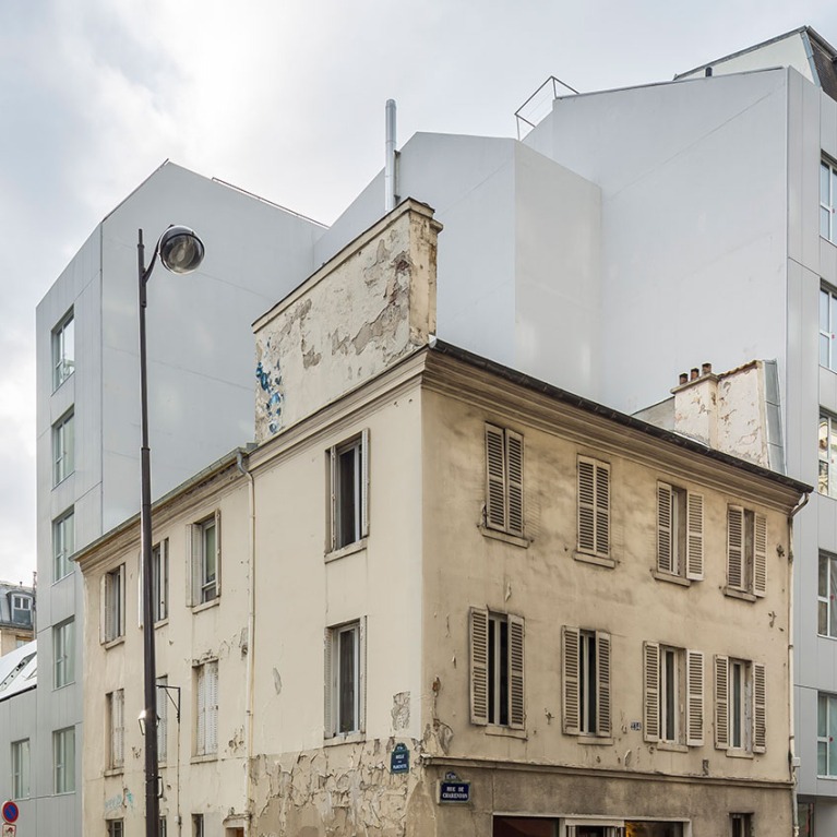
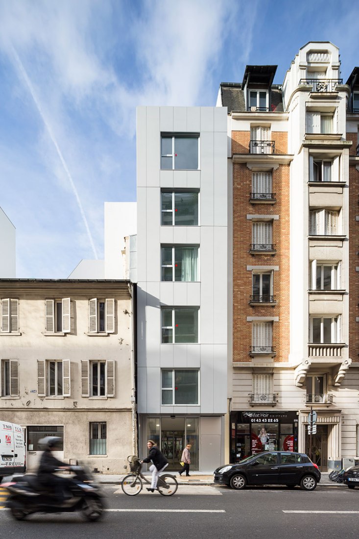
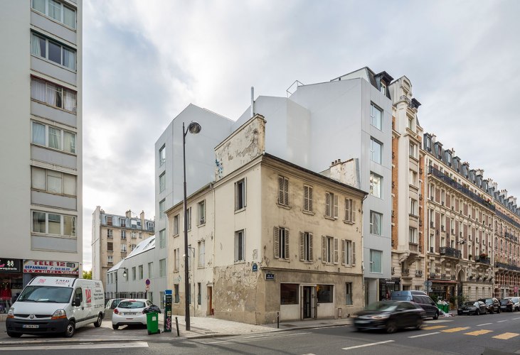
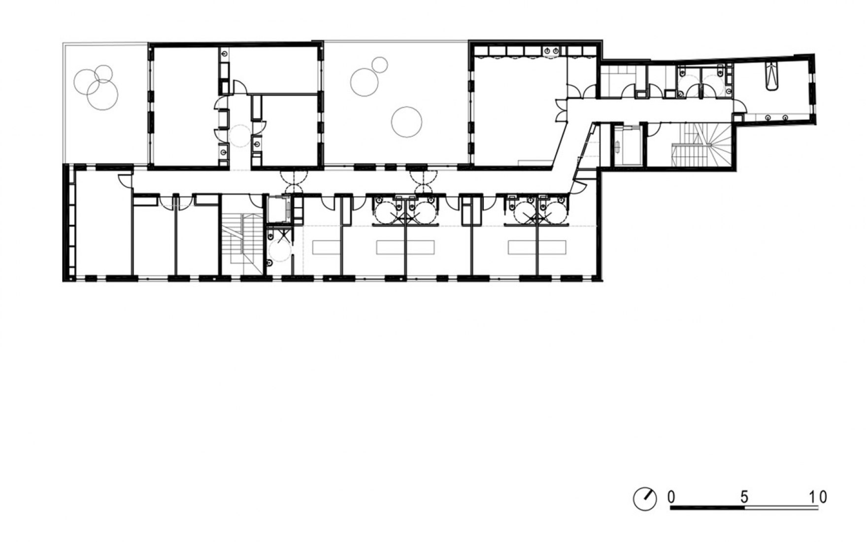
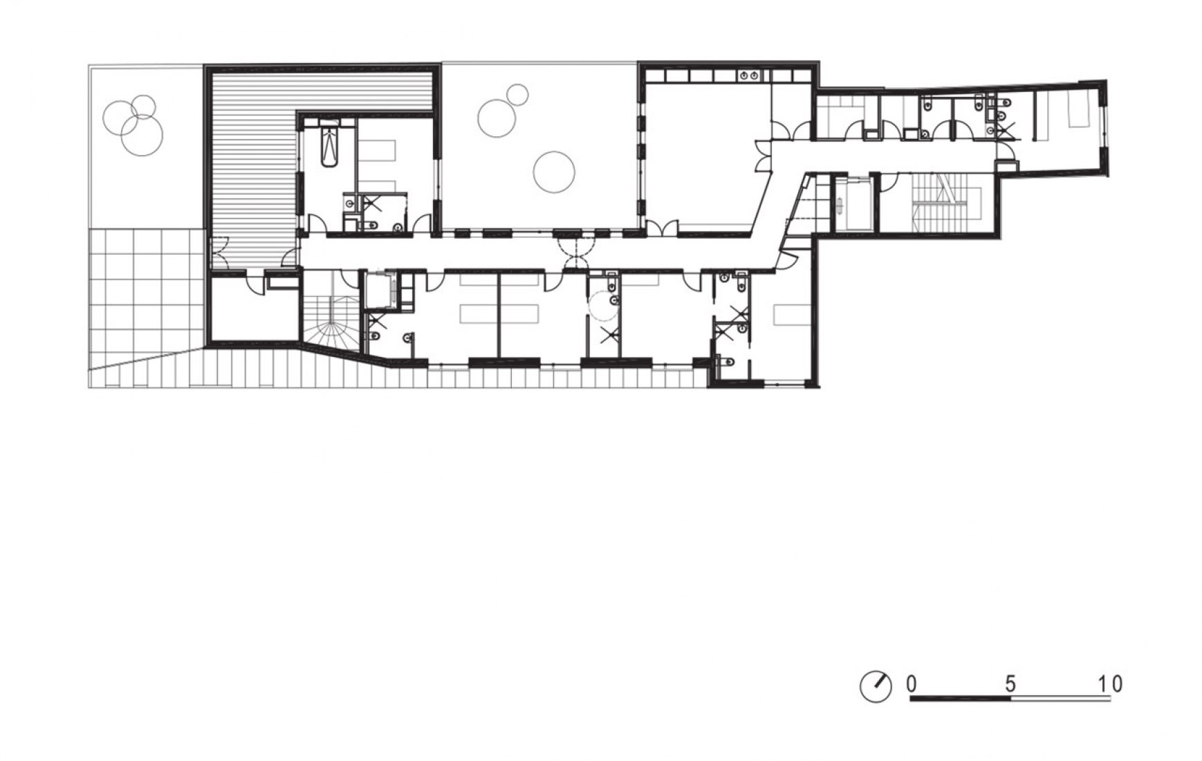
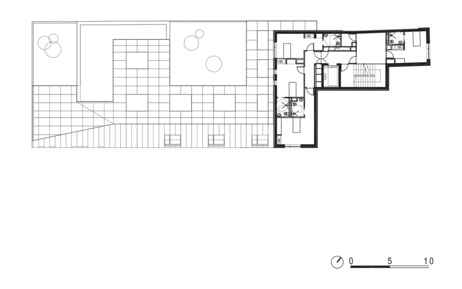
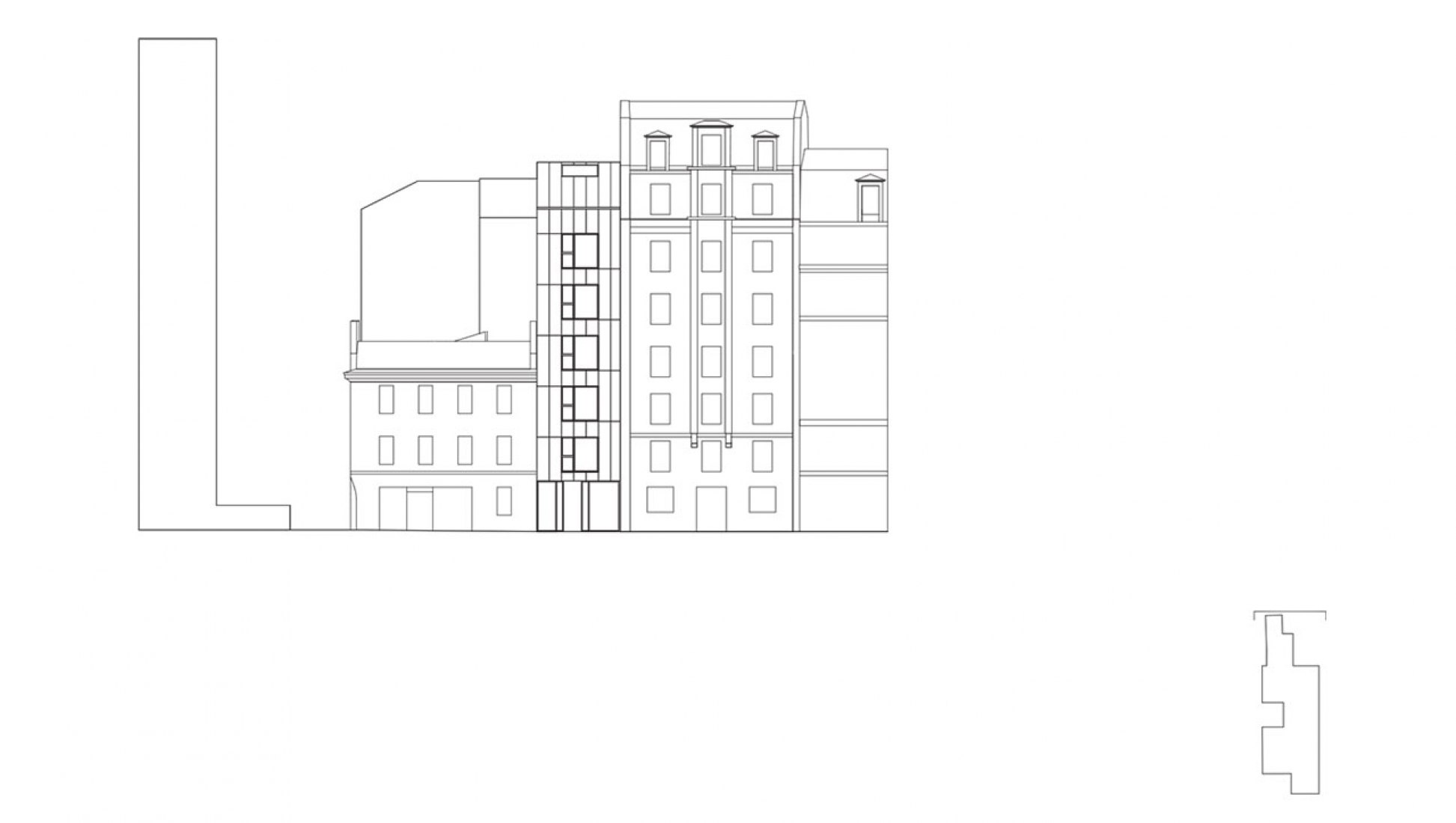
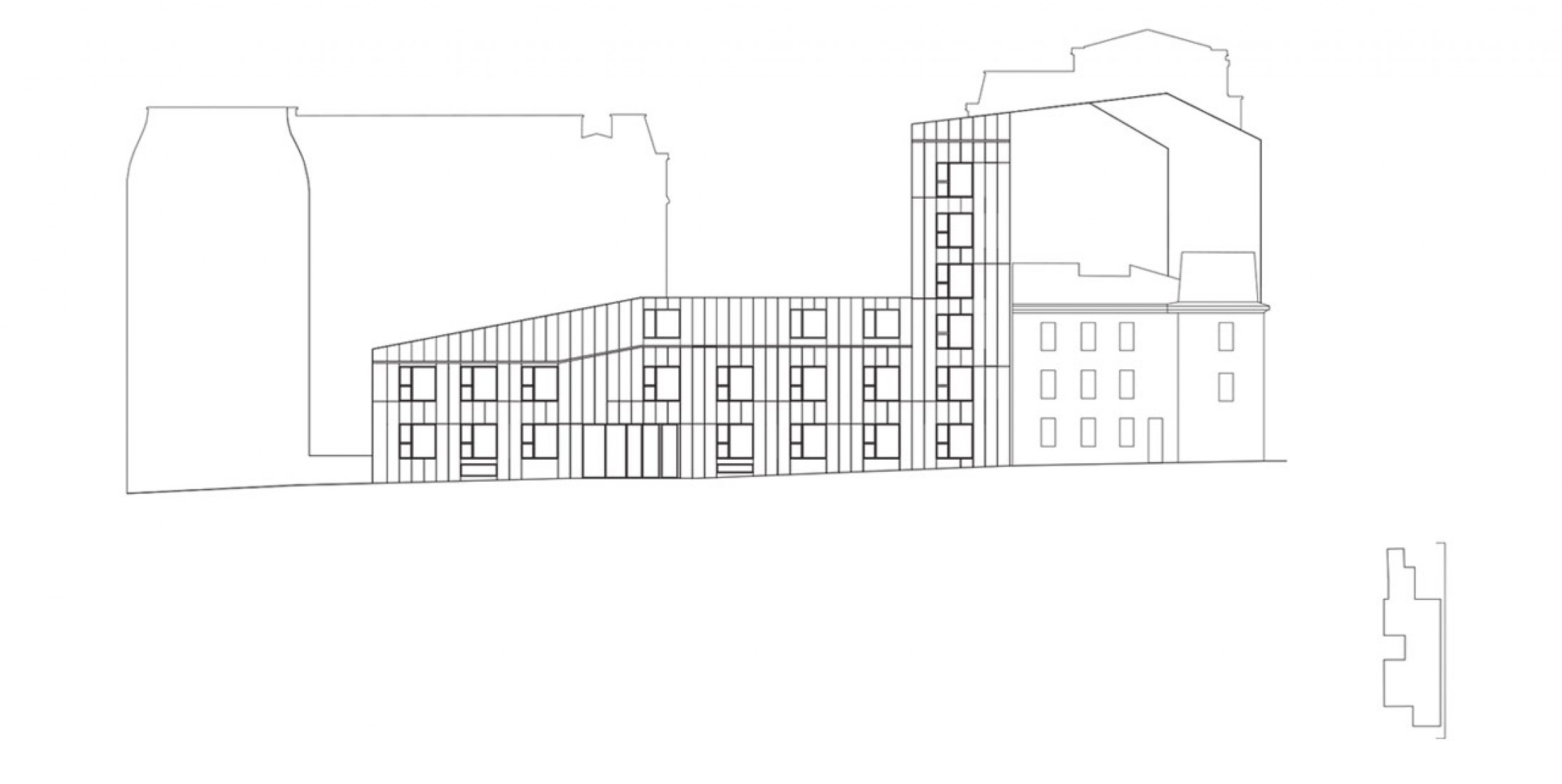
The building, designed and built by the architectural studio AZC is developed around very specific urban conditions. Situated in a historic urban plan of the city of Paris, the plot appeared in 1789, it has to play with municipal planning requirements.
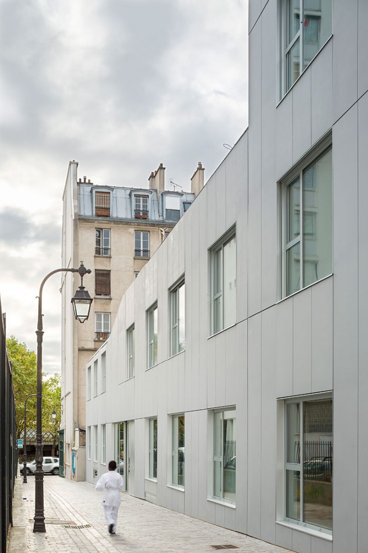
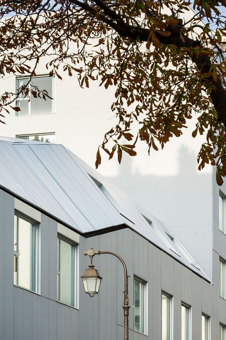
For this reason the volume changes depending on the section of the street where it is located. As a design decision by architects, medical center is more opaque and hard to the outside and much more friendly and warm inland, taking into account the type of user who will use it.
Description of the project by AZC
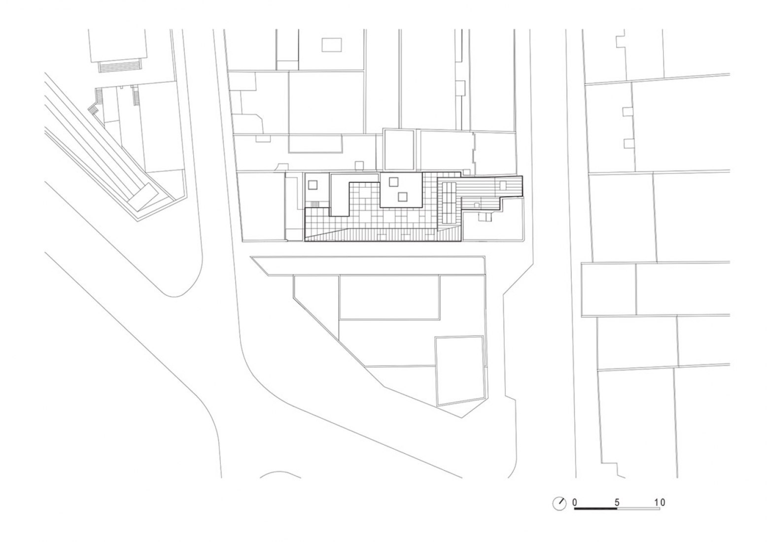
To understand the project one must understand the history of the site at 232 Rue de Charenton in south-eastern Paris, along the side of which runs a passage that can be found on city plans as far back as 1789, at which time it led to cultivated fields. Fraught with real-estate related tension due to the complex planning laws in Paris and the Bercy neighbourhood, the project took seven years to see the light of day.
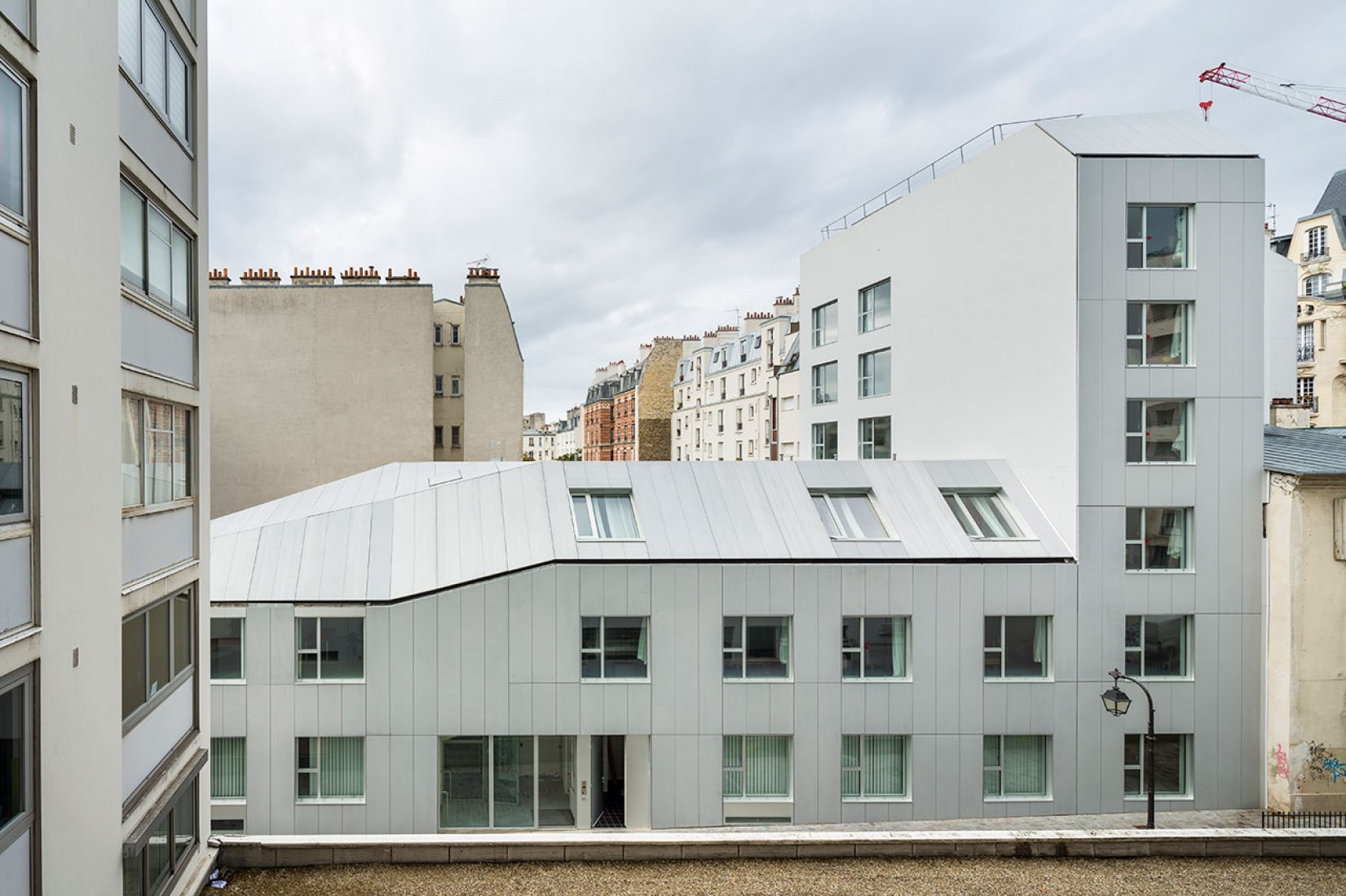
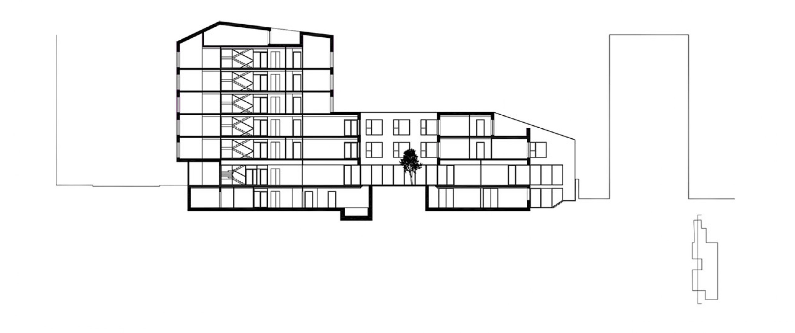
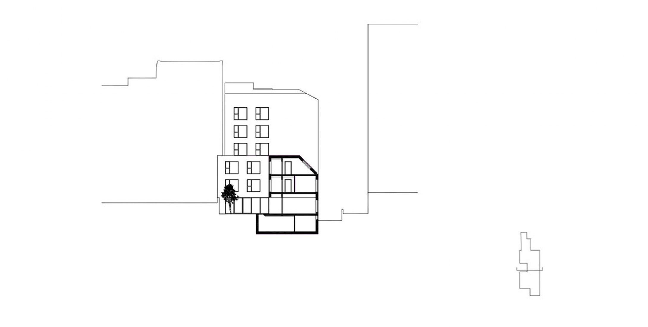
The site is surrounded by high buildings that cast their shadows, and cramped by a house on the corner whose owner refuses to sell. Nonetheless, the orientation is interesting and planning laws are moving in the right direction. To the north, on the Rue de Charenton, we were able to build to six storeys, to the south, at the heart of the block, up to three storeys.
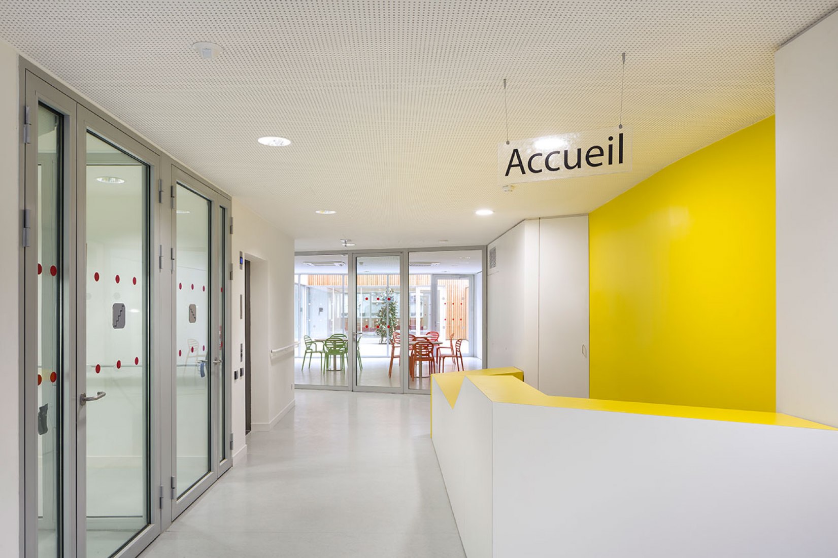
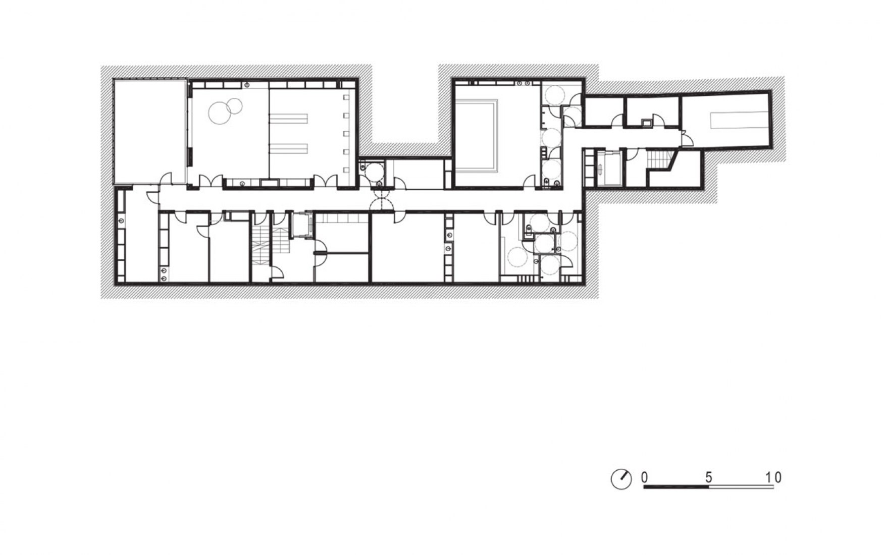
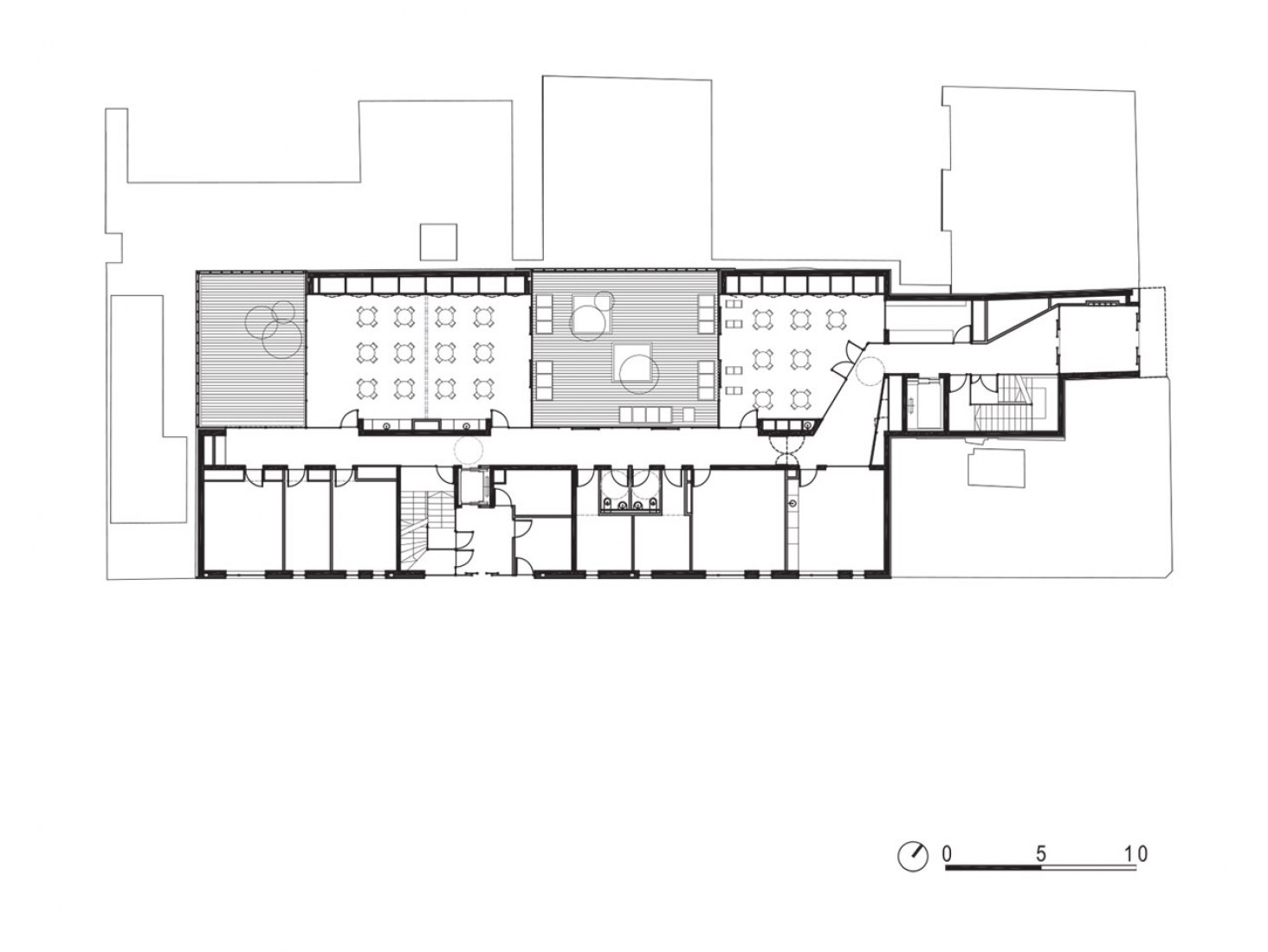
The relationship between the occupants and the city was one of our foremost concerns. On the ground floor on Rue de Charenton is the entrance hall, on the Ruelle de la Planchette is a service entrance, and between these two entrances, along the Ruelle de la Planchette, administrative offices, family reception areas, and part of the paramedical unit are located. Designing the circulation in bayonet formation enabled us to place large spaces at the heart of the block and small offices along the side street. At the centre, directly visible from the entrance hall, is the multi-use room and the two large activity and reading rooms.
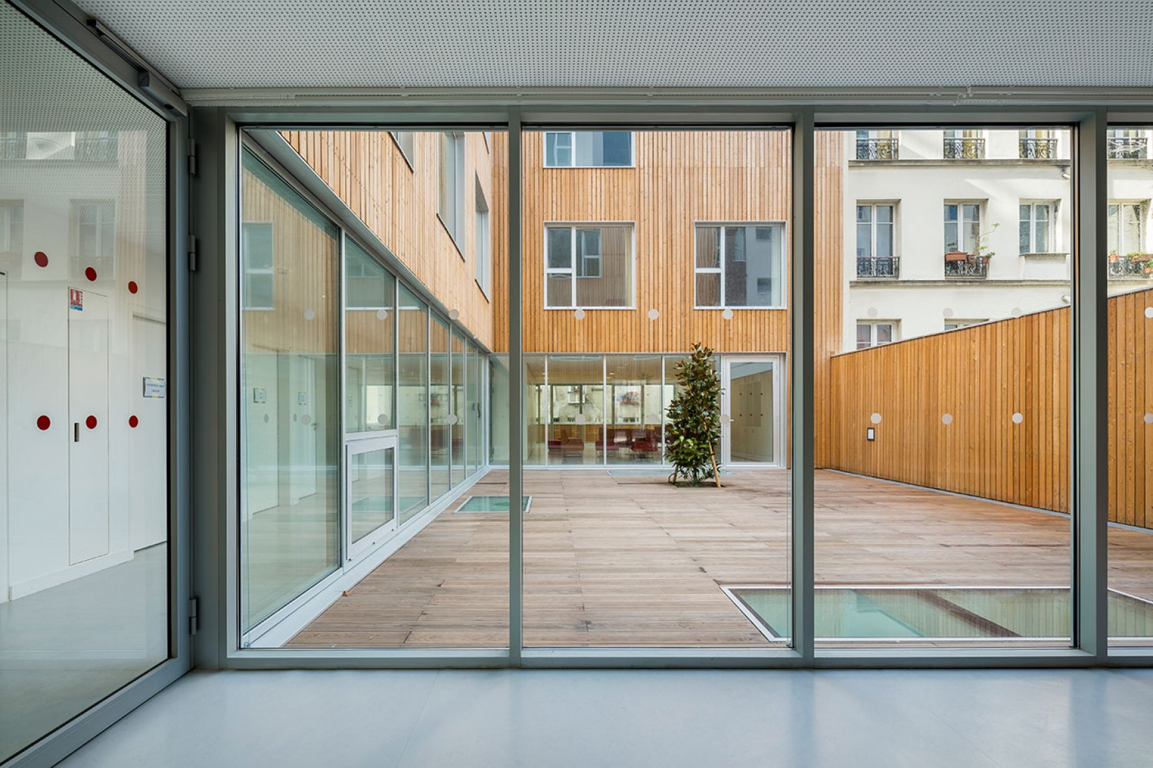
Large, central glazed areas, including the main patio, which is itself an ‘outdoor room’, help to maintain transparency throughout the ground floor.
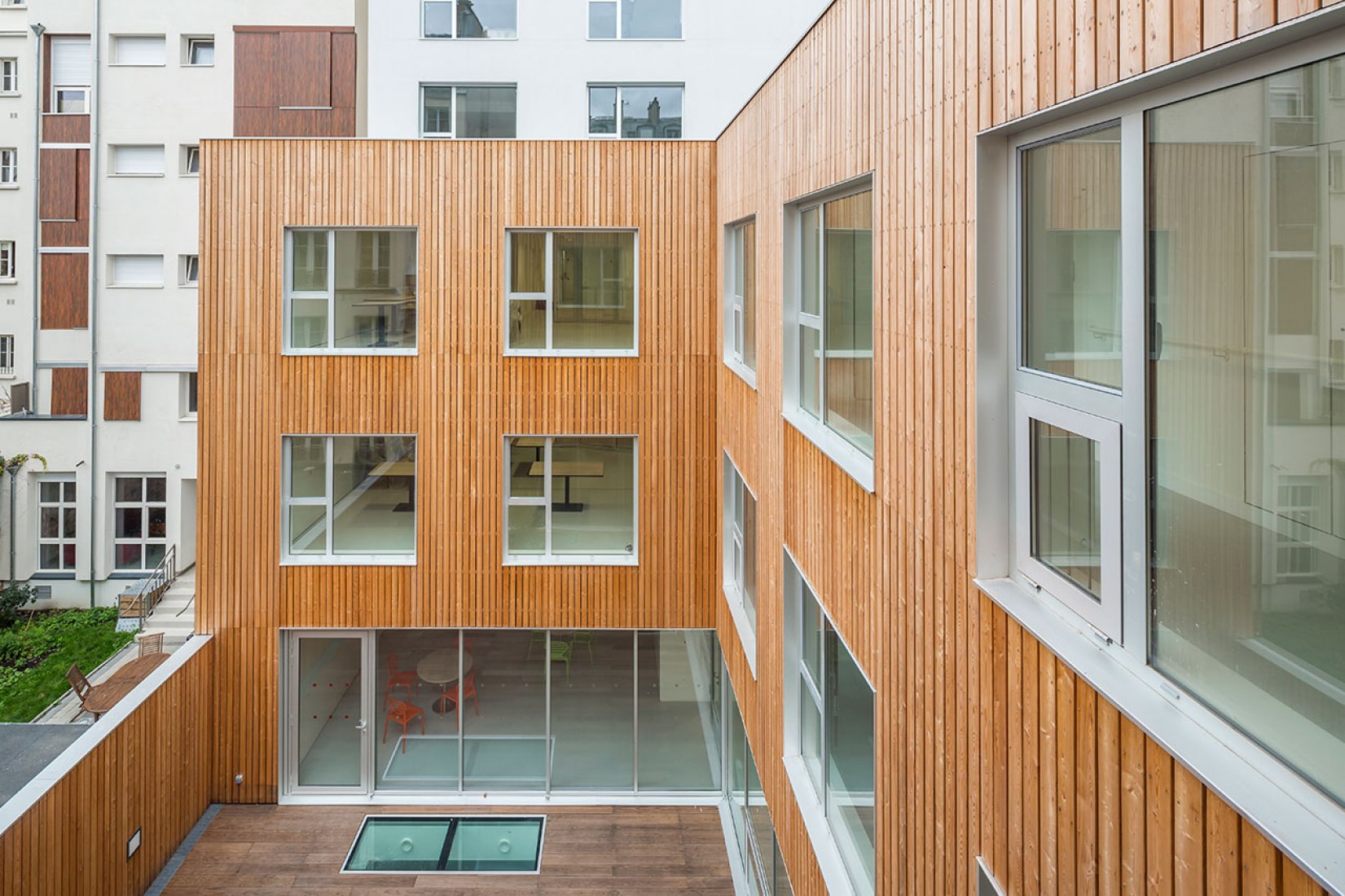
The patios are places for contemplation, like Japanese patios. They are the points towards which views from the communal living areas are directed.
Circulation ceases to be a ‘corridor’, instead becoming a ‘route’. One passes from one point in the building to another looking outside.
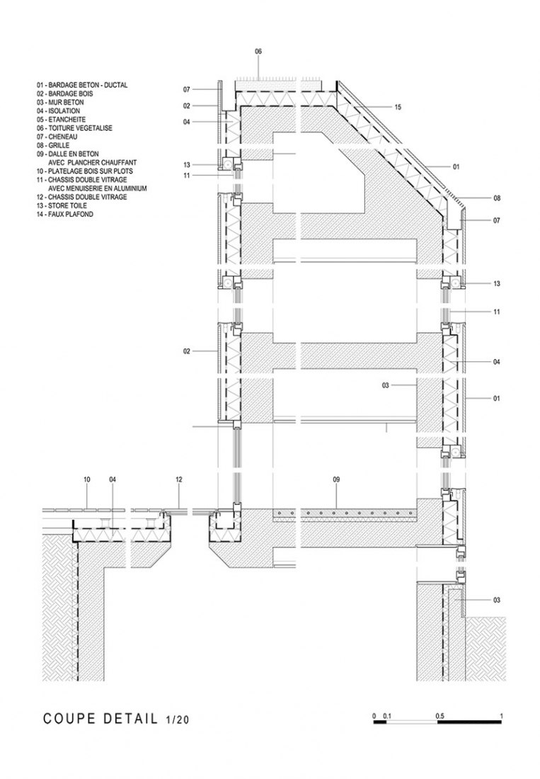
The architecture seeks a duality in the choice and use of materials. On the city side, a neutral skin, discrete and timeless, is achieved using an external facing in high-resistance concrete, grey in colour, dressing the edifice for urban life.
On the patio side, larch-wood cladding, which requires no maintenance, provides a welcoming appearance for the residents
