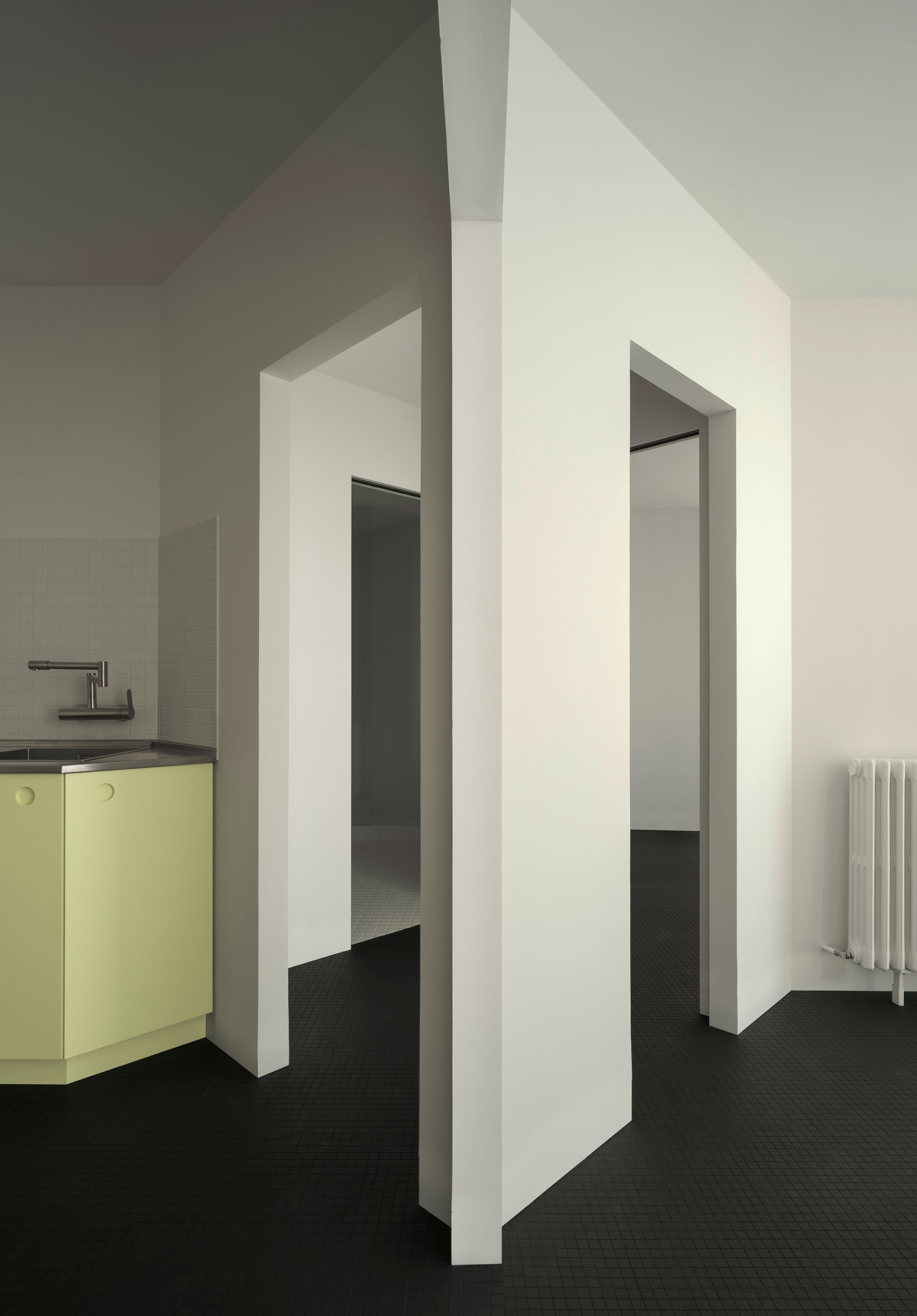
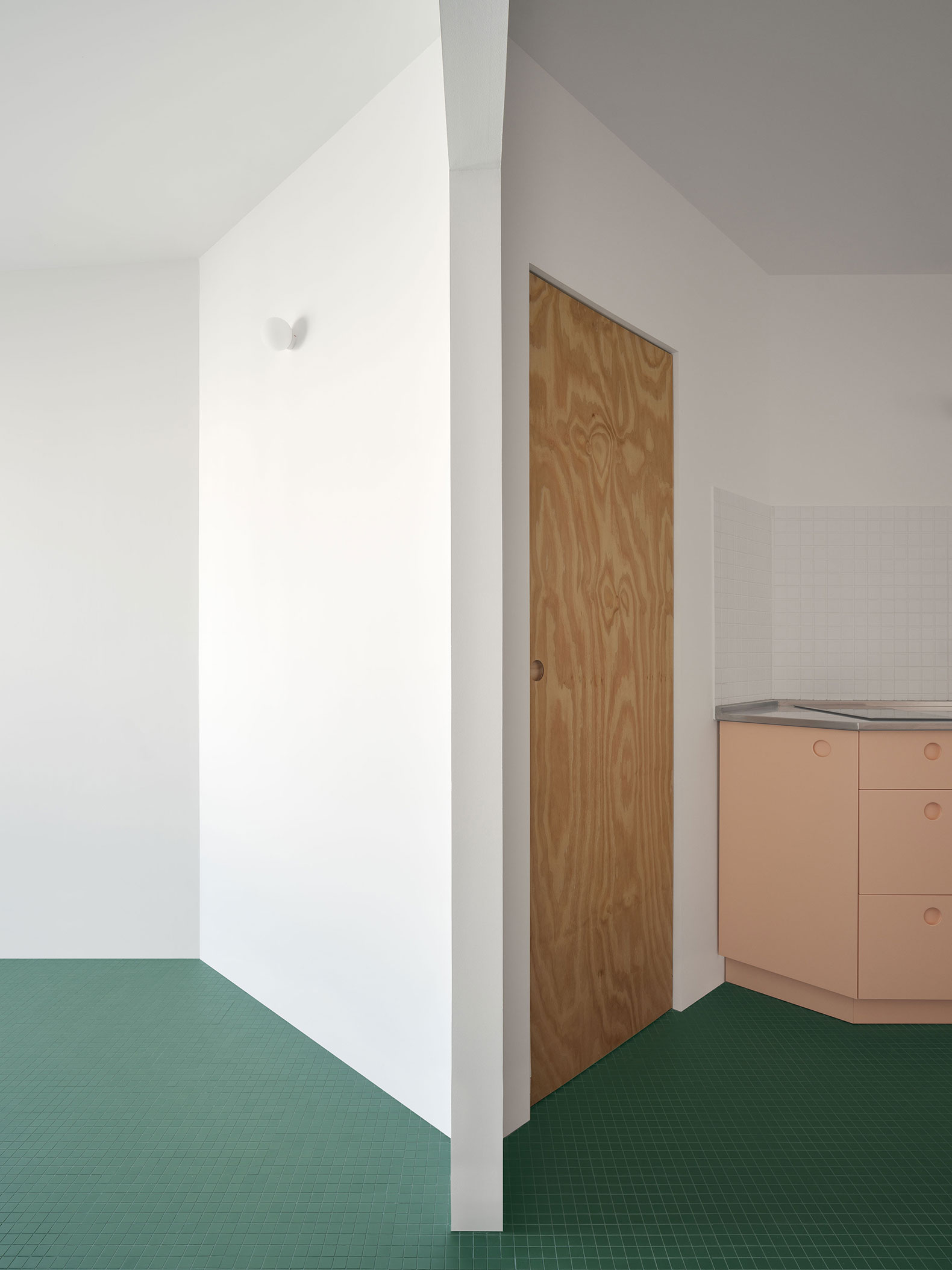
The two homes are distinguished by a color code located on the floor mosaics, different for each house. The bright colors of the furniture and appliances contrast with the sober colors of the floor, while the mirrors located throughout the street dilute the limits of the house.

Gracia House by HANGHAR. Photograph by Luis Díaz Díaz.
Project description by HANGHAR
The project consists of the renovation of an existing 130 sqm apartment into a double dwelling in a 1970s building. Casa Gracia derives from a doppelgänger distribution, resulting in two almost symmetrical apartments with visually equal perspectives, producing a series of hexagonal rooms indifferent to their program or orientation. Equally placed, symmetrical openings lead to different uses depending on their location in the plan.
Casa Gracia is a step forward in our exploration of inefficient plans and reinforces our goal to demonstrate the possibilities that spatial structures have in diluting domestic conventions. The project is understood as a spatial system indifferent to the site in which is implemented, continuing the spatial strategy of previous projects, here amplified by the introduction of a second-tier system of interlocking anterooms that function at times as connecting hallways or storage. These intermediary spaces derive from our interest in twofold spatial compositions and are a reenactment of many architectural references, from Loosian interiors to Gaudi’s Casa Vicens or Caccia Dominioni’s double doorways. The system, conceptually generic whilst physically specific, negates any relationship to perimeter, program, or orientation.

Gracia House by HANGHAR. Photograph by Luis Díaz Díaz.
Materially speaking, the palette is reduced to a continuous floor plane, that holds each house’s distinctive color code, made out of a simple mosaic. The spatial grid is highlighted by a series of lightweight and autonomous pieces of furniture that hold domestic appliances and storage. It is bright, loud colors are in contrast with the interior’s restrained and subdued material palette. The placement of mirrored surfaces across the home dilutes the project’s limits and amplifies a spatial system eager to expand itself beyond the physical space in which it is applied.


