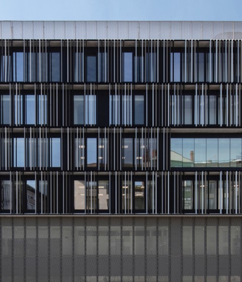
The building’s façade is protected by urban law; therefore it was necessary to restore its original image, undoing several modifications it had undergone over the years. A pergola was erected to shelter the access, and light is used as a tool to transform the building’s image on special occasions, playing with different color ranges.
Project description by Díaz y Díaz Arquitectos and Gonçalo Byrne Arquitectos
This project consisted on the renovation of an existing building located in central Lisbon, on a corner near Liberdade Avenue. The building is six stories high, occupies an area of 2,410 sq m and originally it was used for commercial purposes, and it also housed offices.
The project focuses on the rehabilitation, reform and change of use, to accommodate the new activity as a hostel. The existing L-shaped building, consists of basement, ground floor, mezzanine, six additional floors, and a roof.
The project addresses mainly an interior restructuring to make the spaces fit for the new use. It is necessary to change the entire layout on every floor; common spaces, very important in this kind of establishment, are created anew; there are several room types (singles and other sizes), as well as bathroom areas.
On the ground floor we find a diaphanous double height space, open to both streets via large windows connecting the interior to the exterior. The reception desk and waiting area are located here, as well as a small cafeteria. This flexible space serves as a meeting and relaxing area for users. The left-luggage area, lockers and administration offices are located on the Northeast side.
The basement layout is divided in two clearly differentiated spaces. On one side, the building’s facilities and the personnel changing rooms. On the other, a leisure area and a grand hall, flexible space where guests may enjoy different activities, and events, such as concerts, shows, exhibitions…
The mezzanine is occupied by the building’s dining hall and the adjacent small kitchen. This space enjoys a view over the ground floor as well as the street through the windows.
The layout on floors first to fourth is the same: a row of rooms facing each street, a central corridor across the whole plan, and two bathroom zones on the Southeast and Southwest ends, facing an interior courtyard.
From the fifth floor up, the Southeast façade retracts, creating a terrace for a suite. The rest of the plan maintains the same layout as the lower levels: a corridor that binds all the rooms together. The bathrooms are located on the Southwest side.
The roof is another leisure space. Due to the building’s height, it is an ideal spot to enjoy a wide panorama of Lisbon. That is why, apart from the areas occupied by the facilities, it is an open exterior space with a small cafeteria and terrace zone for guests to enjoy on days of fair weather.
In this intervention the existing structure has been preserved, with only very little changes in order to improve accessibility and adapt the building to current and use-specific regulations.
The building’s façade is protected by law; therefore it was necessary to restore its original image, undoing several modifications it had undergone over the years. A pergola was erected to shelter the access, and light is used as a tool to transform the building’s image on special occasions, playing with different color ranges.


