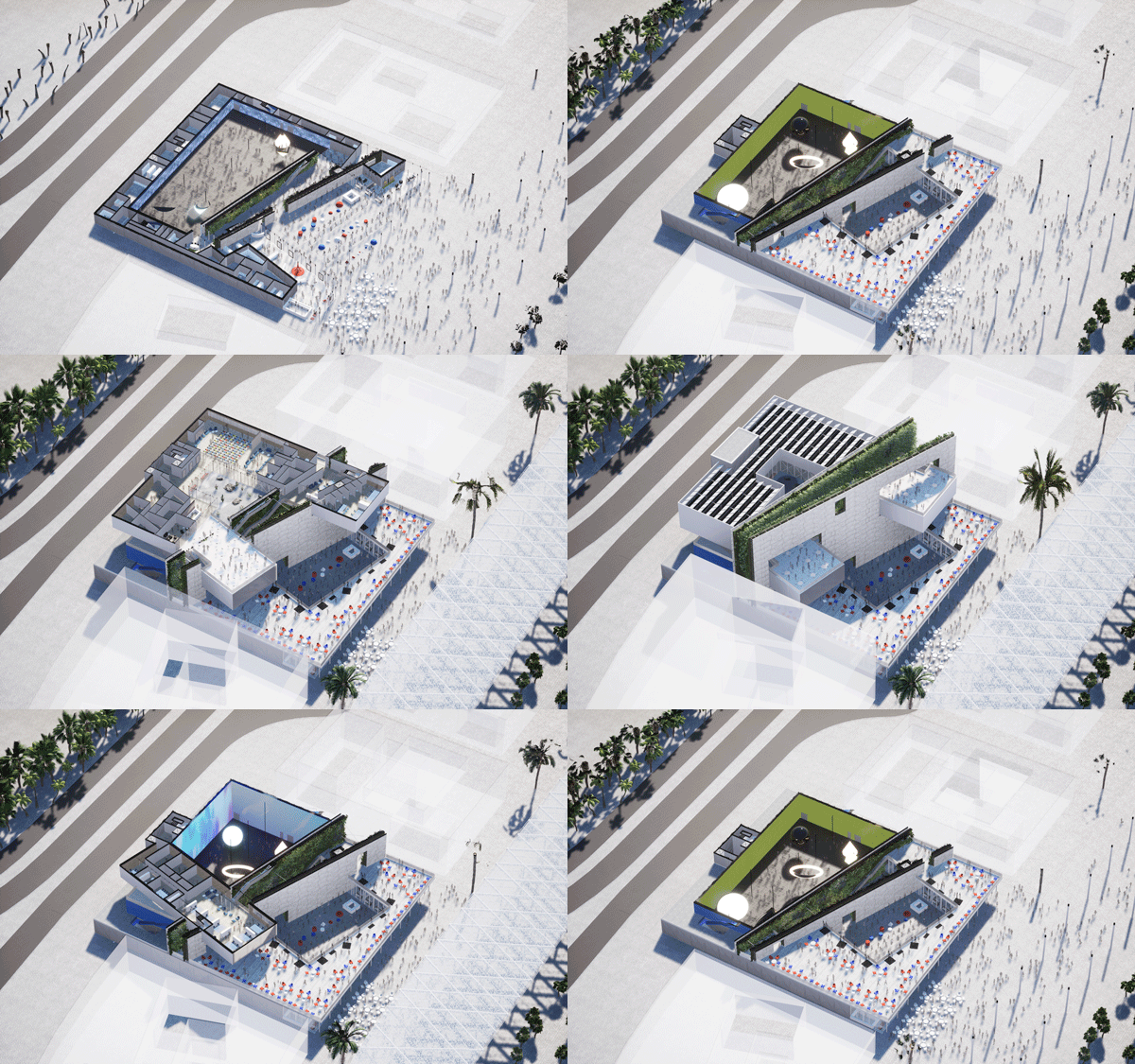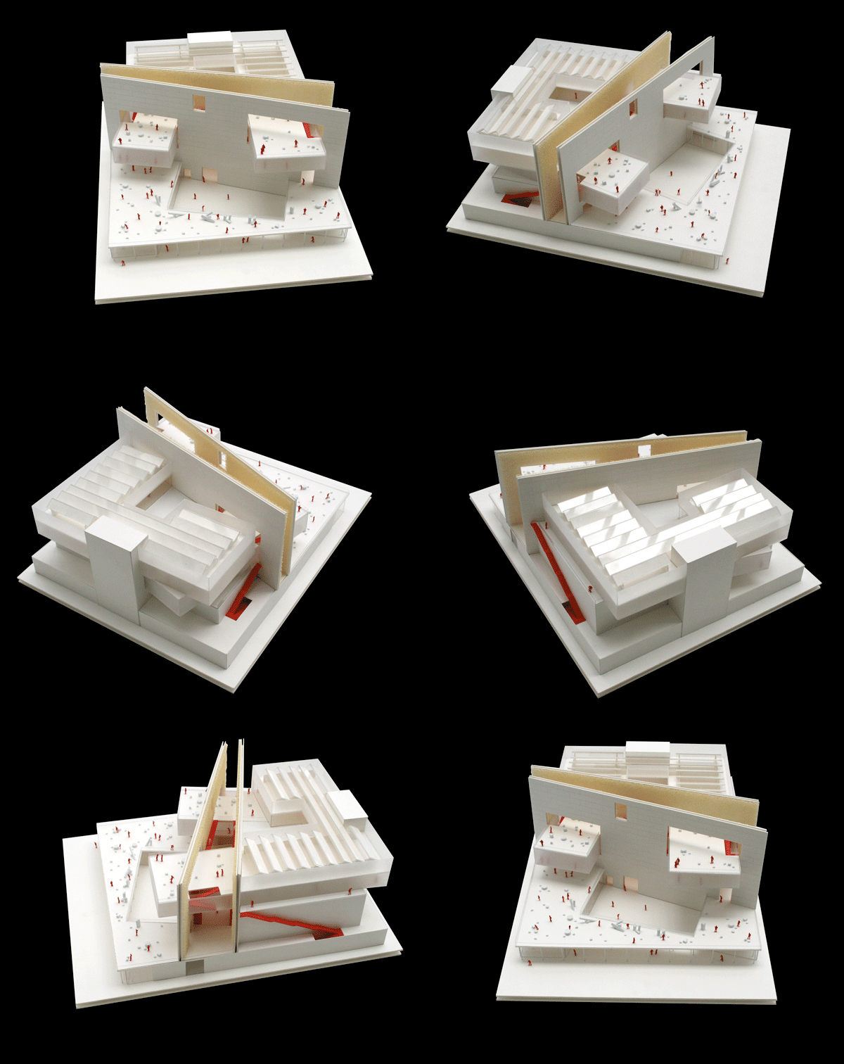
Description of project by Clément Blanchet Architecture
The proposal for the French pavilion for the Dubai 2020 Expo is intended as a device to enhance, at the same time, the virtual world and the real one, two supports for human communication, cultures and interactions.
Built around the themes of Light (as a display and as a vector of ideas and philosophy) and Mobility, the pavilion seeks to interpret them within a sustainable and a one-off building.
French architecture, and French philosophy, cannot be defined by a style but rather by a method. Since Descartes and the Age of Enlightenment, the French mind is the one that clarifies structures and orders issues into ideas. The management of all types of fluxes inside the building, the formal clarification of the program as well as the monumental facade reminiscent of a typical Republican building, are the consequences of a long rational history.
But to be « French » should also be about looking into the future with hope and determination to make it better.
Testimony of the current industrial and digital revolution, the project convenes a local approach within a global challenge.
The design intent is structured around seven main considerations:
1 – Thinking program not casing: too often pavilions are just decorated supermarkets designed to sell. We propose a pavilion that reflects architecture as a process and a medium of expression, not a fashion decision.
2 – Being noticeable: a world expo is a place of artificial wonders not unlike a Disneyland for architecture. How does one pavilion stand out from the others? By being radical and visible from everywhere. We designed the core of the pavilion as a big magnet capable of attracting visitors from far away.
3 –Addressing the context: The form of the pavilion is the result of its climate conditions. Both sun and wind direction decided the position of the the magnet-like wall. First of all facing south to protect the parvis, and then extruded and transformed into two facing walls acting as funnel to catch the wind’s freshness.
4 – Managing the queue: once created, the wind funnel was the perfect place for people to wait, in the shade enjoying the wind flow. To enhance this comfort we proposed that the two walls be fully covered in vegetation, transforming this place in a protected and unexpected oasis.
5 – Engaging the public : the outside wall acts as a spectacular screen (27x60 meters) for projections at night, while the inside walls are transform into a fully artificial vertical garden. Digital projection and tangible vegetation in one place.
6 – Structuring with the fluxes: the pavilion needs to be as respectful as possible to the demands of the client, both in terms of efficiency and adaptability,
7 – A Light pavilion: finally the list of demands, limitations, comfort and ambitions come together to make a pavilion truly representative of a country and its philosophy of design.
REFLECTING FRENCH ARCHITECTURE
The spectacular screen-like facade of the pavilion is designed to leave an indelible mark on people’s mind, by day and by night. During the daytime, it acts as a solar protection shielding the entrance plaza with its long shadow and displaying a huge clear stone wall, turning translucent in the evening, thus showing off the beauty and warmness of back lit stones. By nighttime, the screen comes alive, displaying paintings, landscapes and video art for everyone to see from the concourse and from the public terrace of the pavilion.
Light creates a new feeling for the architecture and encourages proximity and discussion. As the visitors will passively absorb the endless flows of digital advertising or interact alone with a handheld device, the pavilion will engage them and create new windows on the world for everyone to look through, together.
FRAMING THE SKY
In this strange place, created by the accumulation of various and autonomous objects, that is a world’s fair ; we wanted to introduce something of a complex ecosystem, in total autonomy, an artificial nature that is luxuriant, immersive and spectacular : two vertical gardens facing one another.
The beauty of the place arises from the dichotomy between the desert, endless horizontal line, and the verticality of the dense vegetation framing the sky. Here, the visitors envy the sky and the great heights of Dubai while being protected inside this hidden oasis, away from the burning rays of the sun and into a fresh cave-like garden.
CONSTRUCTION
The pavilion is designed to be the most virtuous, lightweight, low-carbon, removable/rebuildable project possible:
· In order to leave no trace on the site of construction, the pavilion will rest on superficial foundations that are easily removable and made possible by the structural design and the innovative gabion wall.
· The gabion walls are made of sand, poured into canvas bags, kept in shape by a steel structural frame.
This construction system allows us to build isolating and structural walls with a local resource. It is important to note that Dubai is one of the biggest importer of sand in the world, because the desert sand is not suitable for concrete construction ; thus these gabions would be the only way to exploit the local resources. Finally, because most of the weight of the wall will stay on the site after the removal, the very lightweight structure reduces the carbon footprint for transportation.
· The canyon is built by assembling together numerous steel bricks (6 x 1.5 meters) covered on one side with translucent ©Stoneleaf and on the other by a green membrane allowing the growth of various plants and fruits designed by ©SousLesFraises. The huge walls, ballasted with sand within the first brick layers, stabilize and bind the whole structure together, thus allowing for a superficial foundation system.
· Finally, the upper structures are built with the same structural frames as the gabion walls, resting on steels beams and CLT panels. The facades are made of glazed panels and perforated metal sheets where a solar protection is needed.»


