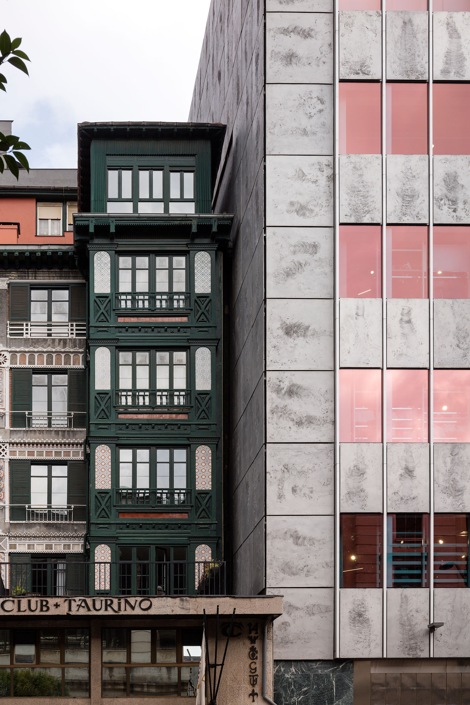
The façade of the building aims to be faithful to the original, correcting the modifications made over time. Some of the original glass has survived, and the original color of the glass has been reproduced exactly as it was originally and the solar control layer has been manufactured using a state-of-the-art magnetron.
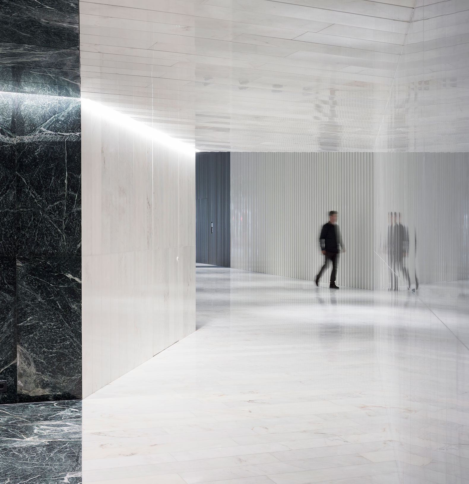
Inside, no original elements have been preserved due to the many modifications made to the tower in the past. Narrow white marble has been integrated into the floor and white corrugated sheet metal to create a light-flooded space. The lift core has been configured as a golden block formed by gold stainless steel panels, as a reference to the headquarters of one of Europe's largest banks originally located in the tower.

Refurbishment of the Bizkaia Tower by Gonzalo Carro. Photograph by Aitor Ortiz.

Refurbishment of the Bizkaia Tower by Gonzalo Carro. Photograph by Aitor Ortiz.
Description of project by Gonzalo Carro
The Bizkaia tower is a building whose construction ended in 1969. It was originally intended for office use, housing the headquarters of the Bilbao Vizcaya bank. The building has an area of 30,400m2 divided into three basements and 22 floors above ground, in all a height of close to 90m.
50 years after its construction, an integral reform of the building has been carried out that has allowed the has allowed commercial use on the first 6 floors, keeping the rest of the spaces for office use.
Given the state of the building, it was necessary to completely empty it, keeping only the structure to undertake a comprehensive reconstruction.
The building's structure, made up of metal pillars and beams covered with concrete for fire protection purposes, has also been reformed with generalized reinforcements on the commercial floors and on the office floors where public use is foreseen. With the exception of the central block of elevators and stairs in the tower, the rest of the communication cores have been demolished and their gaps closed, to generate other locations with greater capacity in new communication cores.
Other far-reaching structural changes have been undertaken as a result of functional conditioning factors in the commercial area, such as the implantation of an opening that connects 5 floors of the building with escalators and that has required the elimination of one of the building's main beams. This has meant the need to include new bracing elements.
Another key aspect of the reform has focused on the facade of the building, protected by municipal regulations. Prior to commencing with the drafting of the façade construction project, research and data collection work was carried out to be able to build a façade with identical characteristics as the original, correcting the modifications that the building had undergone over the years.
Given that some of the original glass remained on the Gran Vía façade, it could be used to exactly reproduce the original color, manufacturing the solar control layer with a state-of-the-art magnetron. The end result has been a façade identical to the original, but very different from the image that the building offered prior to renovation.

Refurbishment of the Bizkaia Tower by Gonzalo Carro. Photograph by Aitor Ortiz.
 Refurbishment of the Bizkaia Tower by Gonzalo Carro. Photograph by Aitor Ortiz.
On the ground floor, the façade pillars have been covered with marble, identical to the original and the panels between them have been closed with large glass and hidden profiles that avoid detracting from the façade. The entrance to the commercial zone is from the public square in front of the building. Access to the office area is through Gran Via street, as was the case prior to the renovation. The lobby is smaller lobby as the space of the ground floor has been given over to commercial space.
Inside, there were practically no outstanding original elements, as the building had undergone numerous interior renovations throughout its life. Designing an entrance according to the tower was another challenge of the project, especially given the geometry of the existing, narrow and elongated space that could generate a tunnel effect. In addition, in this space beside the street, there are three evacuation exits and access to two service elevators for the commercial premises, two ATMs and access for maintenance. For this reason, it was decided to divide this lobby into two areas, one outside as a hallway where the spaces described above converge and then the lobby itself with its reception area, elevator block and waiting room.
The strategy focused on integrating and concealing all the existing elements on the walls, especially the doors. For this, a square section corrugated sheet was designed, which concealed the hinges, joints and fittings of the doors, offering a clean image of this space. This sheeting was placed both on the ceiling and on the walls, using white lacquered steel on the inside and anodized aluminum on the outside hallway.
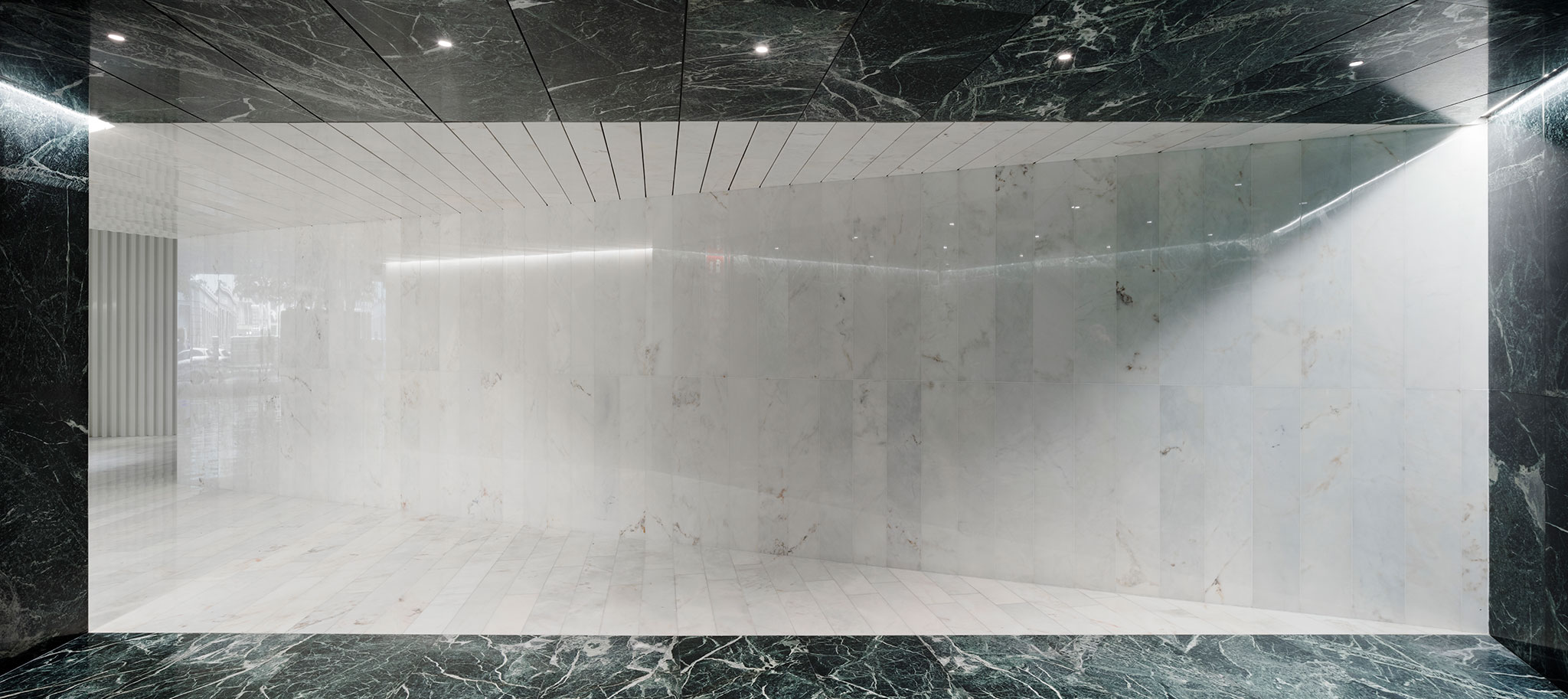
On the interior floor, white marble was installed, therefore, together with the white corrugated sheet a very bright interior space has been configured. Bush hammered granite has been used on the exterior floor, and together with the anodized aluminum, forms a gray ring that further enhances the interior white. The white marble of the floor, laid out following the rhythm and configuration of the frets, was also placed in the lower half of the reception panel, to form the furniture in this area and frame the access to the waiting room. Green marble is used in the waiting room, identical to the exterior pillars, both on the floor, walls and ceiling and which is accessed through a corridor with Estremoz white marble on the floor, walls and ceiling. The encounters have been taken to the corners and diagonals to generate different geometric and formal readings of the space. Lastly, there is the elevator core configured as a golden block formed by gold stainless steel panels, as a nod to the building that was the headquarters of one of the most important banks in Europe. On the contrary, the elevator lobbies of the rest of the floors have been configured as white boxes with perforated sheet metal with sound-absorbing sheets on the walls and a gray floor, made of micrograin terrazzo or self-leveling mortar.
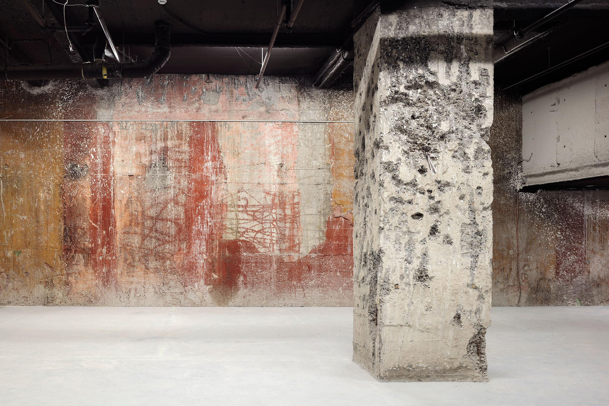
The office floors have been designed using the Core and Shell concept and all the installations are close and ready to be connected, except for the fire protection installation that has been completely installed. In the original vaults, warehouses of a special character were created, keeping the armored doors and enhancing the original concrete walls. These spaces have been complemented with warm elements such as carpeting, wood and sound absorbing felt slats or perforated sheet metal panels, trying not to completely lose the original character of the building.


