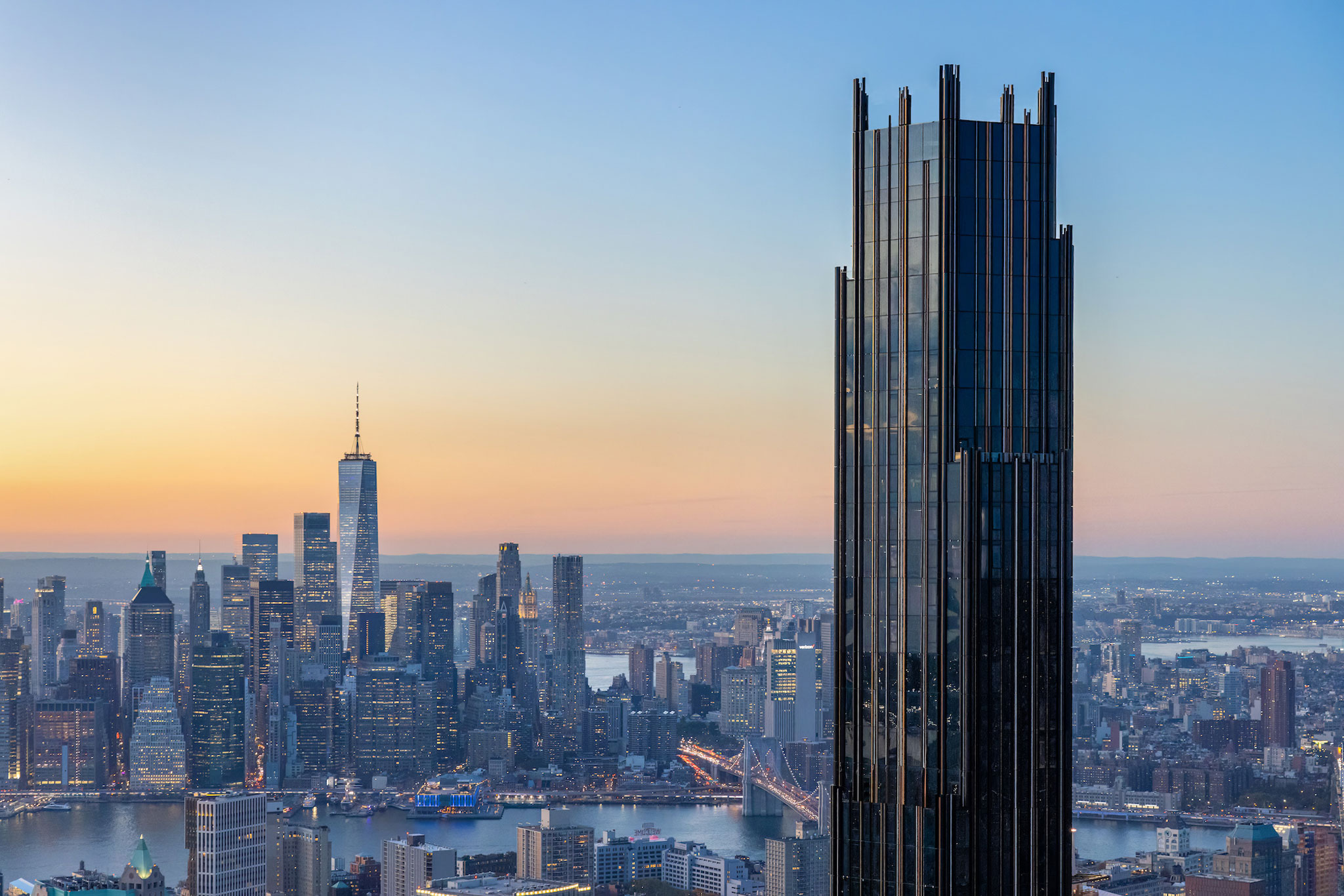
SHoP designed bronze and copper pilasters running the length of the tower that frame the black facade panels, coming to edges at certain points to create a staggered appearance. The building has become a new Empire State Building, the most visible structure on the Brooklyn skyline.
The tower also has a number of "wind floors" throughout its length that allow heavy gusts to pass throughout without rocking the massive structure. According to New York magazine Curbed, one of the taller wind floors has been outfitted with a basketball court, the highest in the world.
The residential skyscraper, which has more than 500 residences as well as retail at its base, is clad in white marble in this area, reflecting the art deco bank, and darkening as it rises. The tower features multiple entrances, one directly from the street and another through the renovated bank, which has become a retail and pedestrian space.

The Brooklyn Tower skyscraper by SHoP. Photography by Evan Joseph, courtesy of DADA Goldberg.
In contrast to the tower’s intentionally foreboding exterior, its interiors are luminous and welcoming. These include public spaces designed by Krista Ninivaggi of interiors studio Woods Bagot who works closely with the team at SHoP Architects.
Inside, the lobby wraps its walls with white-oak panels and elements designed as a tribute to the landmark Dime Savings Bank, built in 1859. With hexagonal motifs of the tiled flooring reflect those preserved within the bank, while custom furnishings are crafted to evoke the image of rolled coins. Another funny detail includes an array of ‘dimes’ that wrap the vaulted ceiling of the elevator hall, remembering the bank’s philosophy that patrons could open an account with just a dime.
The tower also has a number of "wind floors" throughout its length that allow heavy gusts to pass throughout without rocking the massive structure. According to New York magazine Curbed, one of the taller wind floors has been outfitted with a basketball court, the highest in the world.
The residential skyscraper, which has more than 500 residences as well as retail at its base, is clad in white marble in this area, reflecting the art deco bank, and darkening as it rises. The tower features multiple entrances, one directly from the street and another through the renovated bank, which has become a retail and pedestrian space.

The Brooklyn Tower skyscraper by SHoP. Photography by Evan Joseph, courtesy of DADA Goldberg.
In contrast to the tower’s intentionally foreboding exterior, its interiors are luminous and welcoming. These include public spaces designed by Krista Ninivaggi of interiors studio Woods Bagot who works closely with the team at SHoP Architects.
Inside, the lobby wraps its walls with white-oak panels and elements designed as a tribute to the landmark Dime Savings Bank, built in 1859. With hexagonal motifs of the tiled flooring reflect those preserved within the bank, while custom furnishings are crafted to evoke the image of rolled coins. Another funny detail includes an array of ‘dimes’ that wrap the vaulted ceiling of the elevator hall, remembering the bank’s philosophy that patrons could open an account with just a dime.


