The AIA announced the winners of its 2016 Honor Awards, described as "the profession's highest recognition of works that exemplify excellence in architecture, interior architecture and urban design".
The awards are bestowed upon architects licensed in the United States, although the projects can be located around the world.
Overview of each Honor Award winner from the AIA, in three categories below.-
2016 Institute Honor Awards for Architecture
American Enterprise Group - National Headquarters Renovation; Des Moines , Iowa; by BNIM
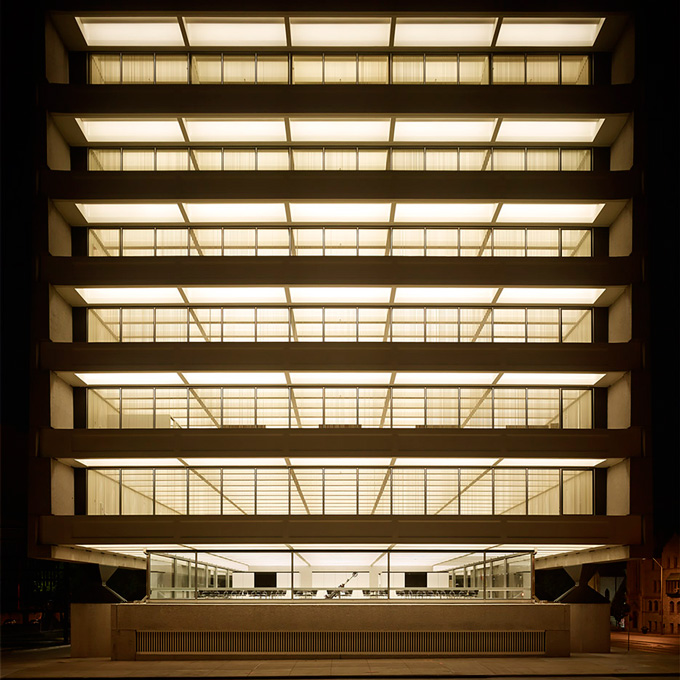
This is an "invisible" rehab of a mid-century jewel, a 1965 office building designed by one of Skidmore, Owings & Merrill LLP's legendary principals Gordon Bunshaft, FAIA.
The original design of the eight-story building, sublimely simple for its day, integrated the mechanical systems with the architecture. Thus, updating the systems fifty years later would necessarily entail demolition of internal walls and finishes. The work was done obsessively, in order to tuck new mechanicals, including the important addition of contemporary life-safety systems, into reconstructed walls that had the same elegance as the originals.
Adapting the building to modern standards of sustainability meant following the lead of a plan that had been far-sighted when completed half a century ago. SOM had used a timeless orientation strategy: opaque east and west facades, with full-height glazing on north and south shaded by deep overhangs. The renovation brought in historically matched, high-performance replacement windows, as well as new or additional insulation to assemblies. These updates and new, more efficient MEP systems put the building on track to consume about two-thirds less energy than it did before the project began, in mid-2014.
Asia Society Center; Admiralty, Hong Kong ; by Tod Williams Billie Tsien Architects with AGC Design Ltd and Associated Architects

Combining historical buildings from the British colonial period with an angular footbridge and a glass-wrapped modern pavilion, the Asia Society complex in Hong Kong spans eras, cultures and styles. They connected the three 19th-century buildings to an extant 1940s structure via a footbridge that cuts a sharp "V" line through the verdant setting, and inserted a new 11,000-square-foot pavilion behind the younger building. The zigzagging bridge through the greenery – covered like many walkways in traditional Chinese gardens – yields expansive views of the city.
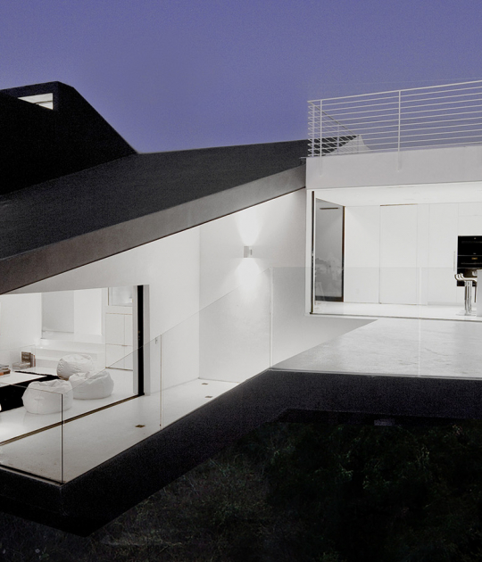
Case Inlet Retreat; Lakebay, Washington; by MW Works
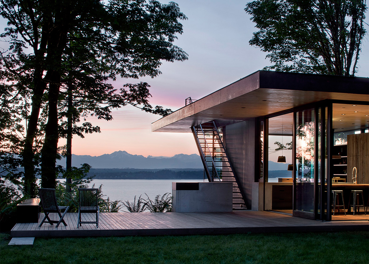
The design brief called for a modern, low-maintenance abode that had a strong relationship with the land. The architects devised a solution whose simple forms unfold into the landscape, offering a unique interaction with the site in each room. The living space projects west into the tree canopy on a cantilevered platform, capturing views of the water and sunset. The kitchen reaches out through a sliding glass door to engage the meadow and the afternoon sun. The site permeates the building, through its ample windows and doors that bring in daylight, views of the Olympic Mountains and natural ventilation. Its concerted use of rugged, natural materials that complement what is found in the local landscape and also reinforces a sense of context and connection.
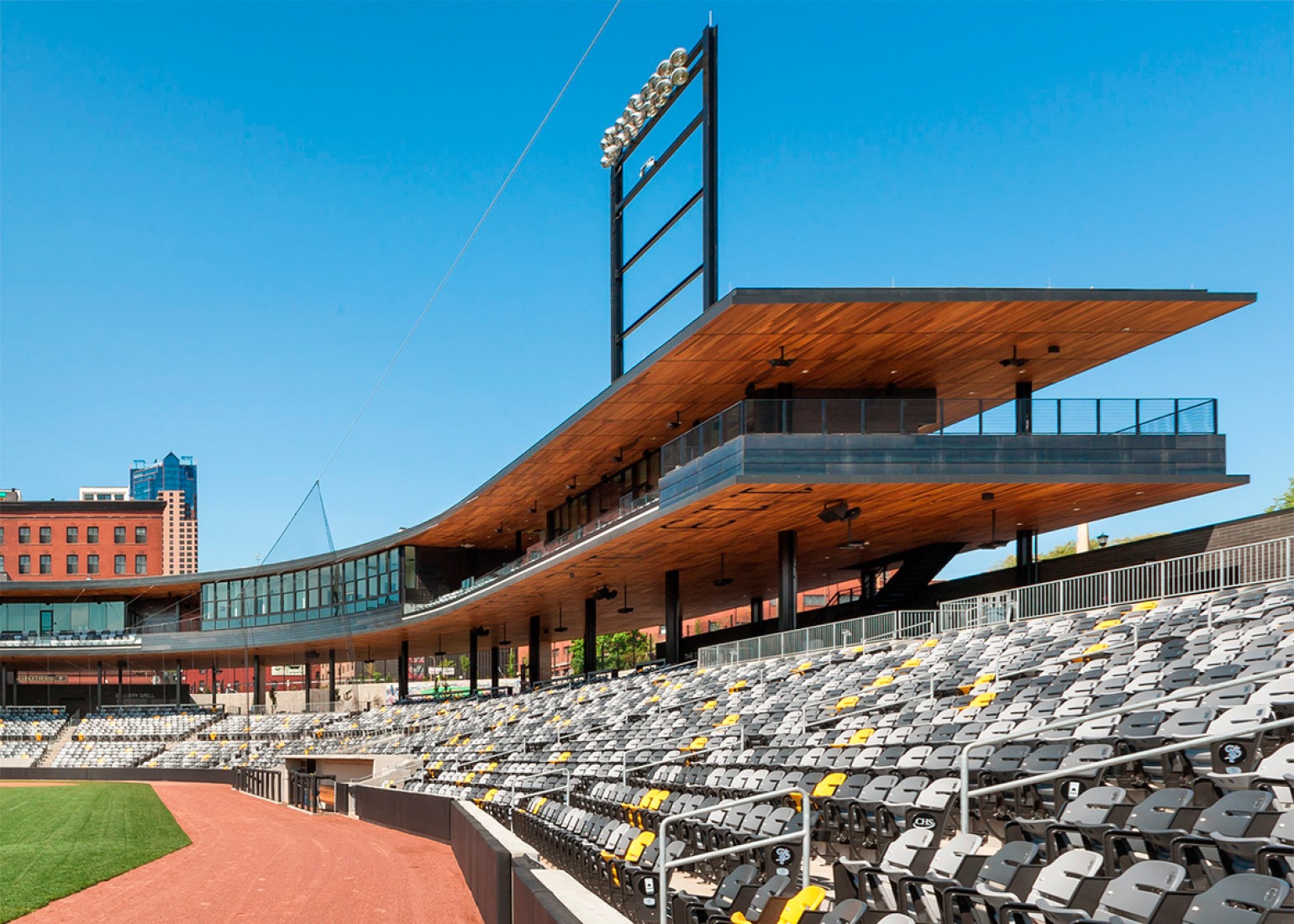
CHS Field; Saint Paul, Minnesota; by Snow Kreilich Architects, Ryan A + E Inc, and AECOM
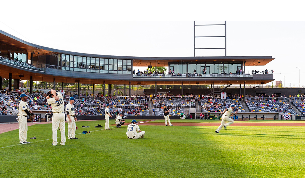
Instead of a monolithic stadium set in an isolating sea of parking lots, the CHS Field was intentionally designed to feel like an old-time neighborhood ballpark, conceived first as a park and public space, and then as a sports venue.
The St. Paul Saints are an independent league franchise committed to creating a unique fan experience. Working with the Saints and the City of St. Paul, the architects slipped a 7,000-seat ballpark into a remnant site between an interstate highway, an elevated bridge, a light-rail operations facility and the historic Lowertown District on the edge of St. Paul's business core.
Completed in the spring of 2015, CHS Field employs a restrained material palette, using wood on the underside of the canopy and suite level combined with dark steel and masonry. The palette lends a vintage feel that suits the neighborhood, at the same time that it acts as backdrop both for the team's energetic promotions and for the historic district that lies just beyond the edges of the field.
Henderson-Hopkins School; Baltimore, Maryland; by Rogers Partners
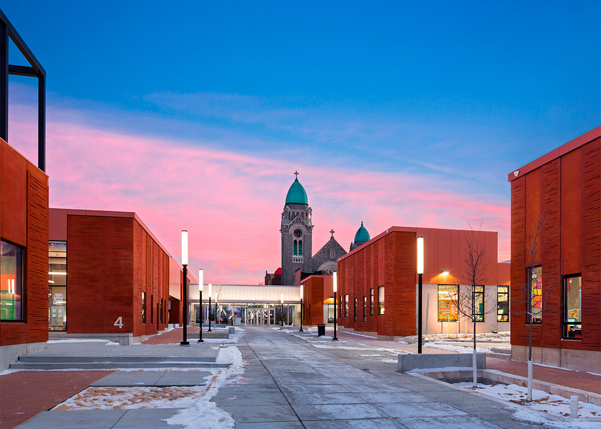
The first new Baltimore public school built in 30 years, Henderson-Hopkins School is a bright, optimistic beacon that nestles itself into the traditional urban fabric of the neighborhood known as Middle East Baltimore.
The complex fills most of two city blocks with a series of 'houses,' or classroom clusters, and related facilities whose forms and layout echo the local tradition of lowrise rowhouses surrounding interior courtyards. The street-facing facades are dominated by a grooved pre-cast concrete that mimics Baltimore's homegrown Formstone. Neighborhood streets continue through the complex as outdoor pedestrian corridors.
A model facility that will showcase the educational vision of its operators, Johns Hopkins School of Education and Morgan State University, the school is a community campus created by East Baltimore Development, Inc. as a site for not only education but urban re-generation, with a family health center and the library, gym and auditorium offered as shared resources for community residents and businesses.
Mariposa Land Port of Entry Expansion and Modernisation; Nogales, Arizona; by Jones Studio
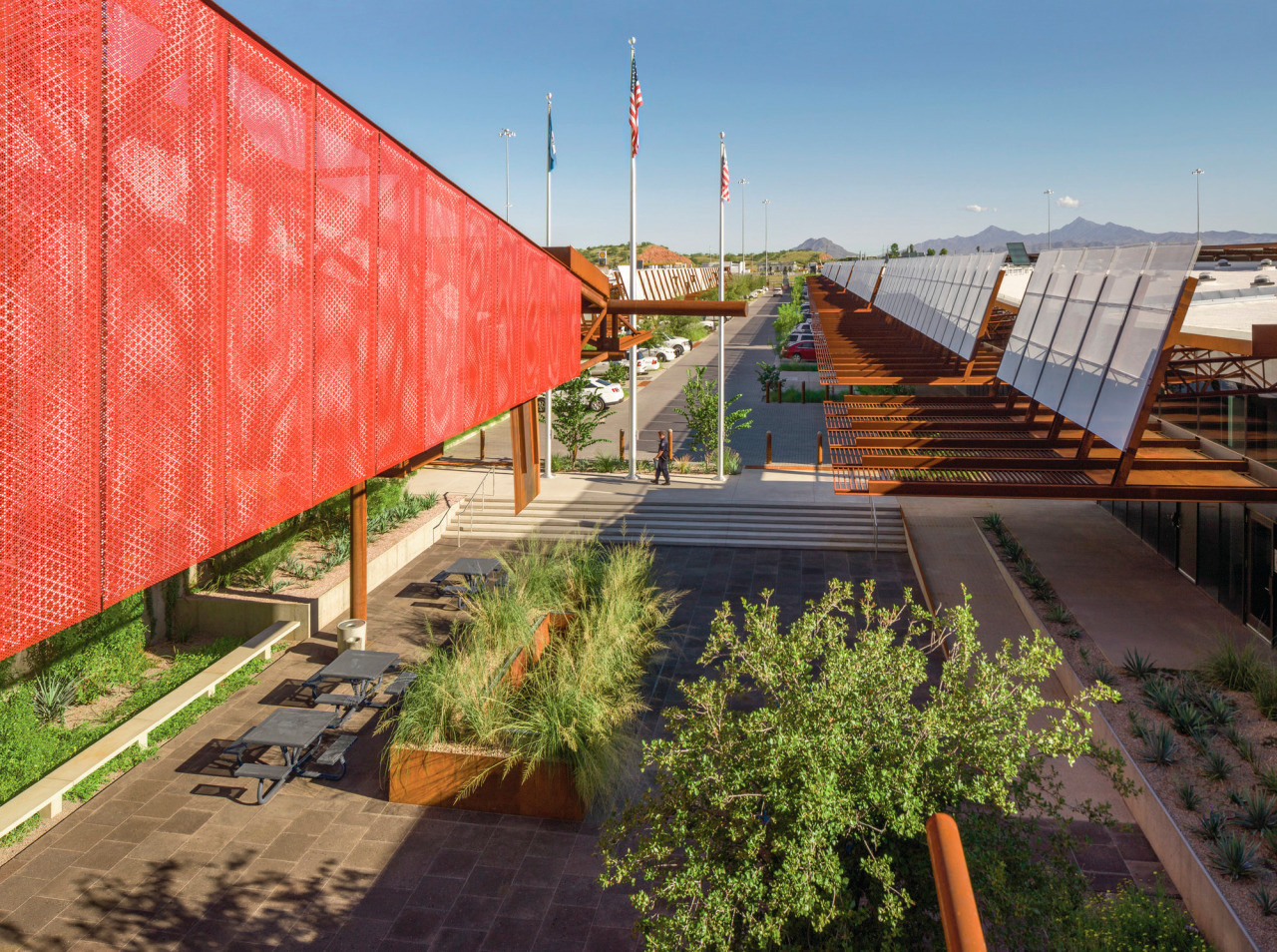
Located on the contentious, high-security Arizona/Mexico border, the Mariposa Land Port of Entry (MLPOE) is one of the busiest land ports in the United States, the gateway to $35 billion of commerce between the two nations.
When first opened in the early 1970s, MLPOE sat isolated in the Sonoran desert, but urban growth in the twin border cities of Nogales, especially since the North American Free Trade Agreement made the border more porous in 1992, swamped the crossing with dense traffic. Cars often waited three hours to get through, and commercial trucks could be delayed as much as eight hours. Awkward expansions over the years made the facility inefficient, an experience that was exacerbated for users by the blazing desert sun.
Completed in 2014, the design subtly raised a red, white, and blue banner with a series of canopies in those three colors. Each signifies a different user zone—red for private cars, white for pedestrians, and blue for commercial vehicles—but together they unfurl a long, dignified evocation of the United States flag.
Perot Museum of Nature and Science; Dallas, Texas; by Morphosis Architects with Good Fulton & Farrell
The stratified concrete facade of the Perot Museum is like a gigantic visual pun announcing the intention of the institution contained inside. Concrete is made from a scientific treatment of natural earthen material, and the museum is dedicated to nature and science.
Completed in 2012 as the home of a new museum created out of three smaller institutions, the 182,000-square-foot Perot Museum relies on sustainability tactics both active and passive. In the former, it minimizes northern and southwestern openings. In the latter, extensive computerized monitoring will forecast future energy use in order to suggest further adaptations as new technologies emerge.
Pterodactyl; Culver City, California; by Eric Owen Moss Architects
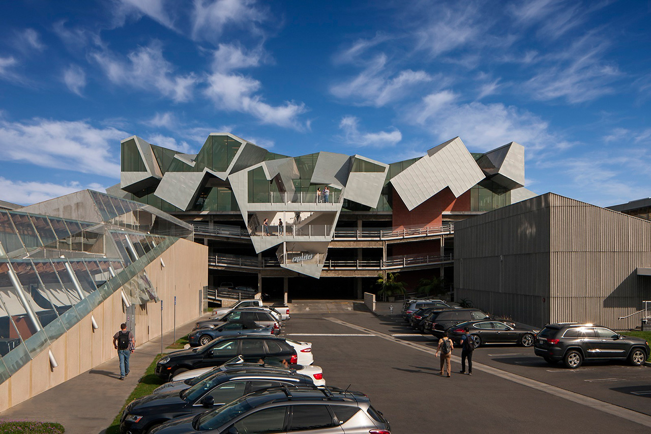
The four-storey parking garage that serves as the Pterodactyl's podium predates it, but was built to withstand the load of an upward expansion. It has an open floor plan suited to contemporary office layouts, and much of its glass front is two storeys high, providing an appealingly day-lit setting that a look at the exterior might not suggest. Because it is above many of the neighbouring buildings, the west-facing main facade is exposed to sea breezes for passive cooling. Most glazing faces north, and south-facing sections are covered in standing-seam metal panels that reflect the hot sun away from the building.
St. Patrick's Cathedral Conservation, Renovation and Systems Upgrade; New York, New York; by Murphy Burnham & Buttrick Architects
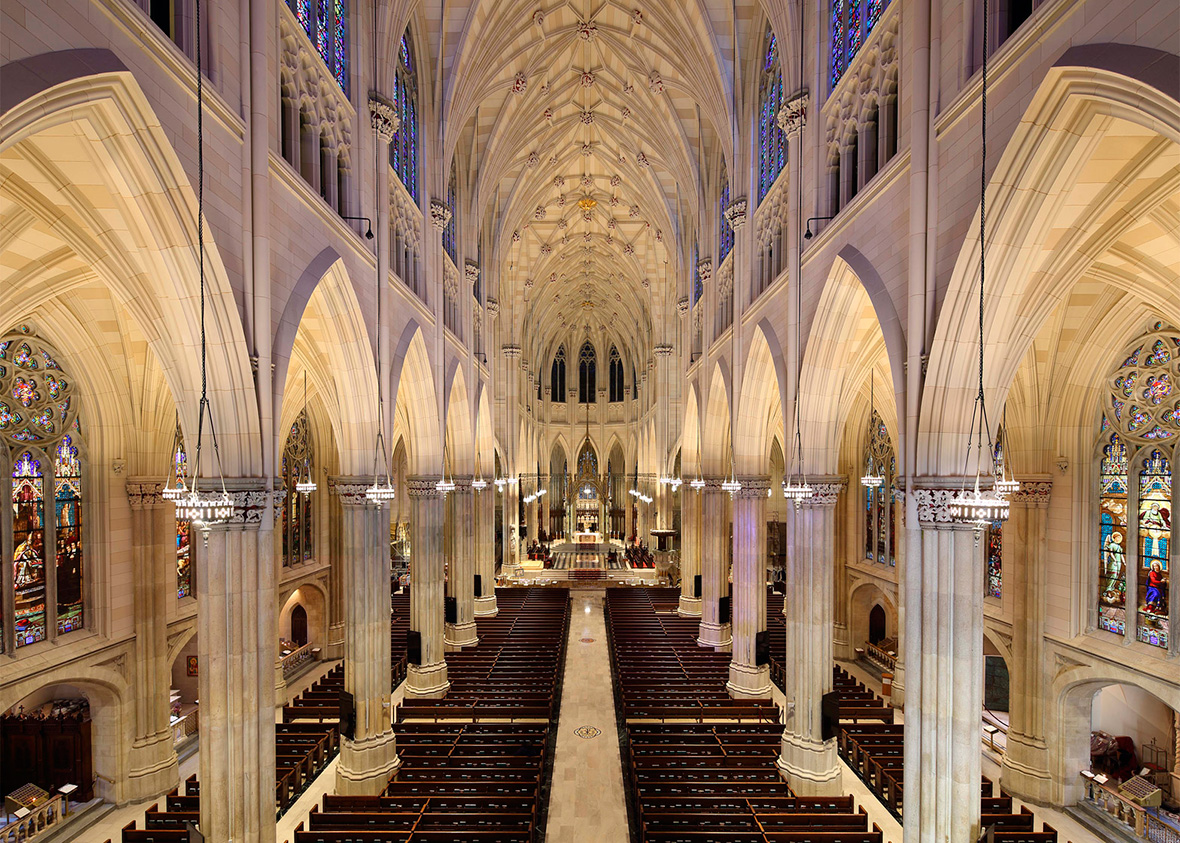
Since 1853, St. Patrick's Cathedral has stood as a soaring icon of the spiritual life of New Yorkers. Despite careful regular maintenance, by the early 21st century, this landmark Catholic cathedral in midtown Manhattan was in need of revitalization. Stone and plaster failure and deterioration of the stained glass were considerable.
A renovation launched in 2005 touched every building surface, from the top of its 330-foot spires to the bottom, inside and out. At the same time, innovative mechanical and life-safety systems were installed, with minimal intrusion on the splendid visual pleasures of the cathedral.
The work was minutely detailed, including a forensic analysis to determine the precise specifications that the original architect, James Renwick, Jr., made for interior paint and exterior stone mortar. More than 30,000 individual repairs were made, and the team used a tablet-based software program that allowed for real-time tracking of the work, directly from the scaffolding. The project included cleaning the exterior stone, a type of marble quarried in the region around Manhattan at the time of construction, with a micro-abrasive technology of low-pressure water, air and crushed glass, and where there was more tenacious staining from the copper accessories such as downspouts, with a clay poultice that draws impurities off the stone.
US Land Port of Entry; Van Buren, Maine; by Snow Kreilich Architects and Robert Siegel Architects
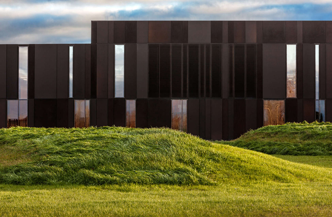
Set on a long, slender site on a bluff over the St John River, the building is configured as a "Z" to provide staffers shelter from harsh winds, sleet and snow while presenting a sleek profile to visitors and passersby. The rhythmic alternation of opaque and transparent panels on the facade mimics the view between and among trees, while at the same time representing the requisite divisions between public and secure spaces that customs work demands. An exemplary outcome of the federal General Services Administration's Design Excellence Program, the Land Port of Entry skillfully couples a modern set of materials and program needs with an appreciation for regional history and landscape.
WMS Boathouse at Clark Park; Chicago, Illinois; by Studio Gang Architects
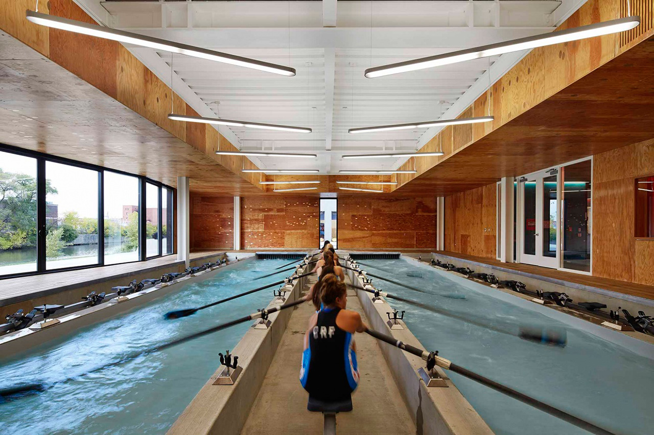
One of the cornerstones in the City of Chicago's plan to reclaim the once-industrial Chicago River for recreational and other healthy uses, this is one of four planned boathouse on the river's edge. The architects crafted a dramatic beacon signaling that the water is a stylish, enjoyable place to be.
It comprises two separate structures, a boat storage facility and field house that form a portal to the water's edge. Inside the field house, an indoor rowing tank, workout room, and after-school study space accommodate year-round use. Working within a modest budget, the roof form uses simple linear structural elements and bendable interior plywood panels to translate the motion of rowing into a dynamic surface. Conserving energy through passive systems and keeping 100 per cent of rainwater out of the city's storm sewer, the project works to improve the quality of the river, supporting its ecological and recreational revival.
2016 Institute Honor Awards for Interior Architecture
Georgetown University School of Continuing Studies; Washington DC; by Studios Architecture
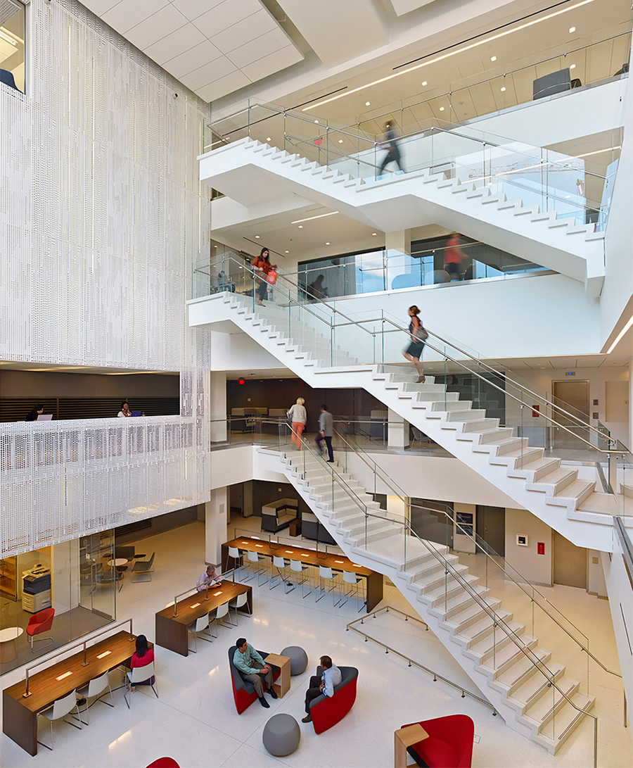
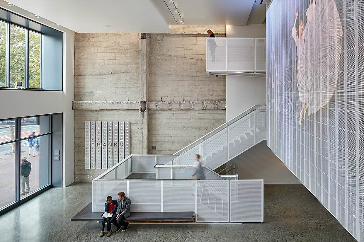
The architects created a space that is light and, thanks to a set of series of hanging staircases in a new four-story atrium abundantly open for the free flow and spontaneous interactions that a more traditional grassy campus yields.
An emphasis on light or transparent materials enhanced the brightness and conviviality that a campus centre requires. It helped make the atrium the vital hub of the space, as well as to mitigate the lack of outdoor views from the two lower levels. A perforated metal wall treatment mounted four storeys high on one side of the atrium is a contemporary curtain, alternating openness with opacity. In spaces that radiate out from the atrium, angular ceiling treatments and cutouts, horizontal piping in the wood paneling and some exposed utility lines create a visual sense of motion and lightness.
Milton Academy Pritzker Science Center; Milton, Massachusetts ; by William Rawn Associates
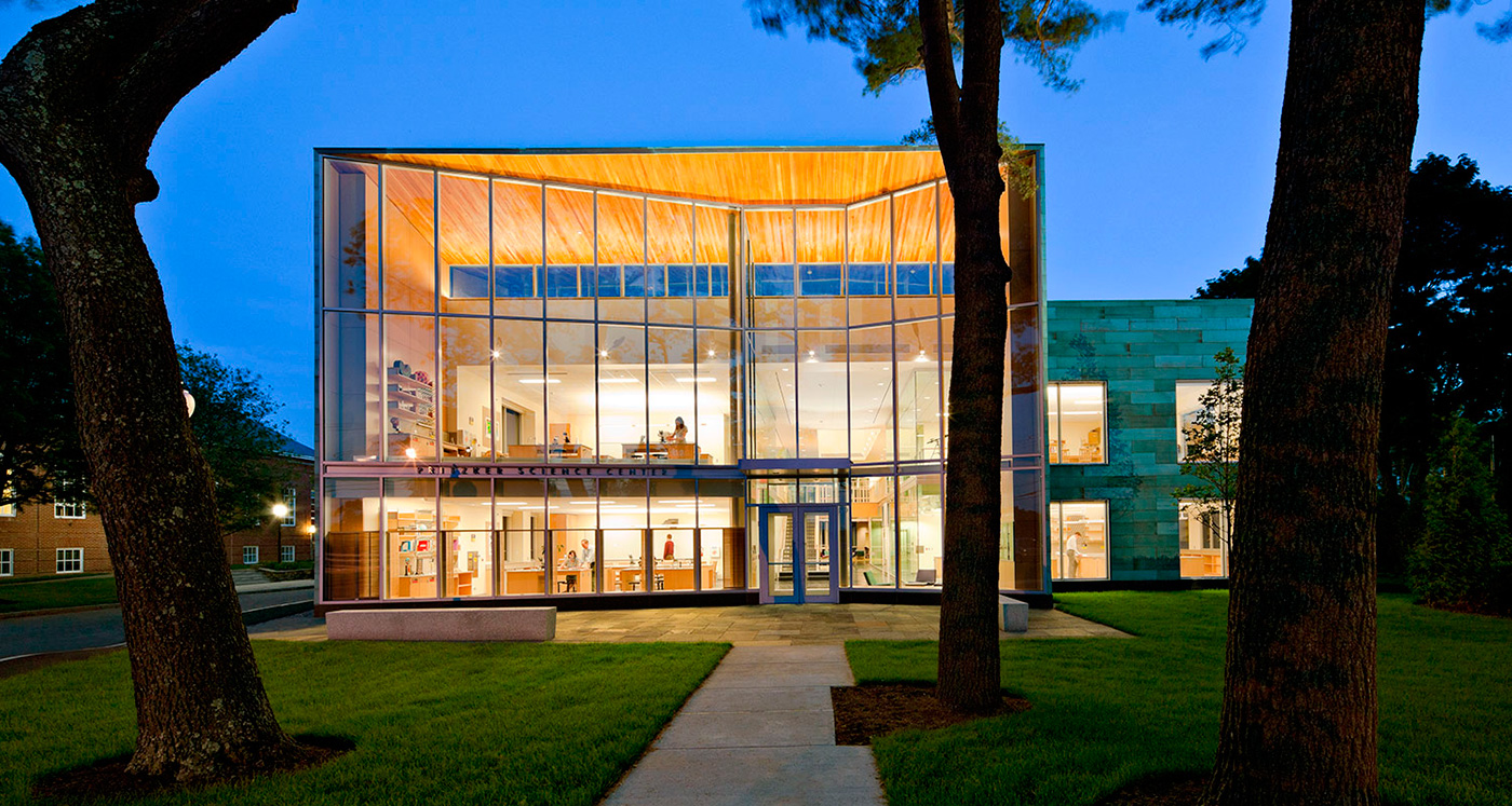
Making science visible was the guiding principle of this project at a two-centuries-old prep school in Massachusetts. After years in a series of remote, fortress-like buildings, the study of science at Milton Academy would move into a place that was abundantly open, both to the outside and from space to space within the building.
Two goals guided design of the Milton Academy Pritzker Science Center: make science visible and make science exciting. Floor-to-ceiling glass lines the interiors on two levels, allowing students from all grades to see activities in classrooms and dedicated "inquiry labs" where students pursue individual projects. Translucent glass zone provides privacy in front of the seminar tables, while clear glass at the lab areas emphasizes the variety of science activities. Classrooms also face the main campus green, showcasing and emphasizing the importance of science on campus.
PivotApartment; New York, New York ; by Architecture Workshop PC
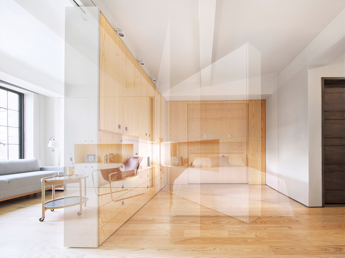
This single 400-square-foot studio apartment has multiple identities. The changes in personality are accomplished with the movement of a wall of meticulously designed custom cabinetry that can stand flat as part of a seamless main wall or pivot out from there to create a new wall that divides the studio. Expertly crafted, the pivoting wall contains drawers, cabinets and openings. A bed concealed in the rear wall can be pulled down into the space or left hiding, to make the space a dressing room or study. With the wall folded flat, out of the way, the studio opens up as one room amply day-lit from the vintage building's big windows. The client, who likes to entertain, can set up a large table for dinners, but when not entertaining a group, folds the table down to a smaller size for its spot next to the galley kitchen.
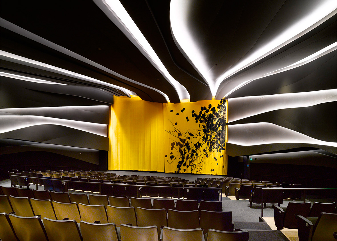
The Strand, American Conservatory Theater (ACT); San Francisco, California; by Skidmore, Owings & Merrill LLP
The dramatic rebirth of a theater built in 1917 on San Francisco's Market Street created a stellar new venue for live theatre that pays homage to the original wherever possible.
The transformation of an abandoned century-old movie house into a highly visible, alternative performance space for San Francisco's preeminent nonprofit theatre company is a major milestone in the regeneration of mid-Market Street. The redefined space incorporates intimate theatres, educational facilities, rehearsal space, and public lobby and cafe. The programme is inserted within the building's shell, overlaying modern architectural and theatre elements on top of the raw backdrop of the original cinema. The design creates inspiring civic theatre and dramatically opens the lobby to the sidewalk, energising the building and neighbourhood.
Windhover Contemplative Center; Stanford, California; by Aidlin Darling Design
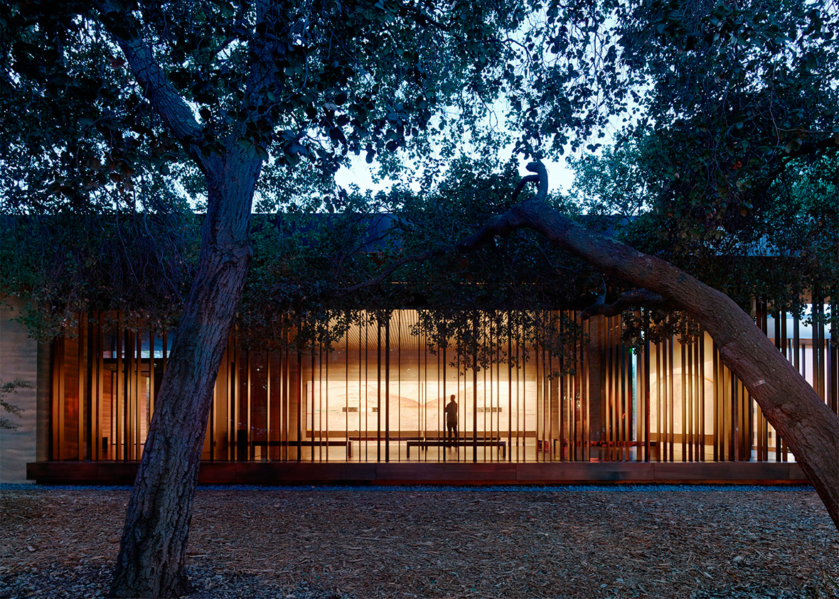
The Windhover Contemplative Center is a spiritual retreat on the Stanford campus to promote and inspire personal renewal. Using Nathan Oliveira's Windhover paintings as a vehicle, the chapel-like centre provides a refuge from daily life and a space for quiet reflection. The extended progression to the sanctuary's entry allows visitors to shed the outside world before entering. Inside, the space opens to the oak glade beyond while louvered skylights wash the paintings with natural light, unifying art, architecture and landscape. Rammed earth walls, wood surfaces, and water heighten the visitor's sensory experience acoustically, tactilely, olfactory, and visually.
2016 Institute Honor Awards for Regional & Urban Design
Fayetteville 2030: Food City Scenario ; by University of Arkansas Community Design Center
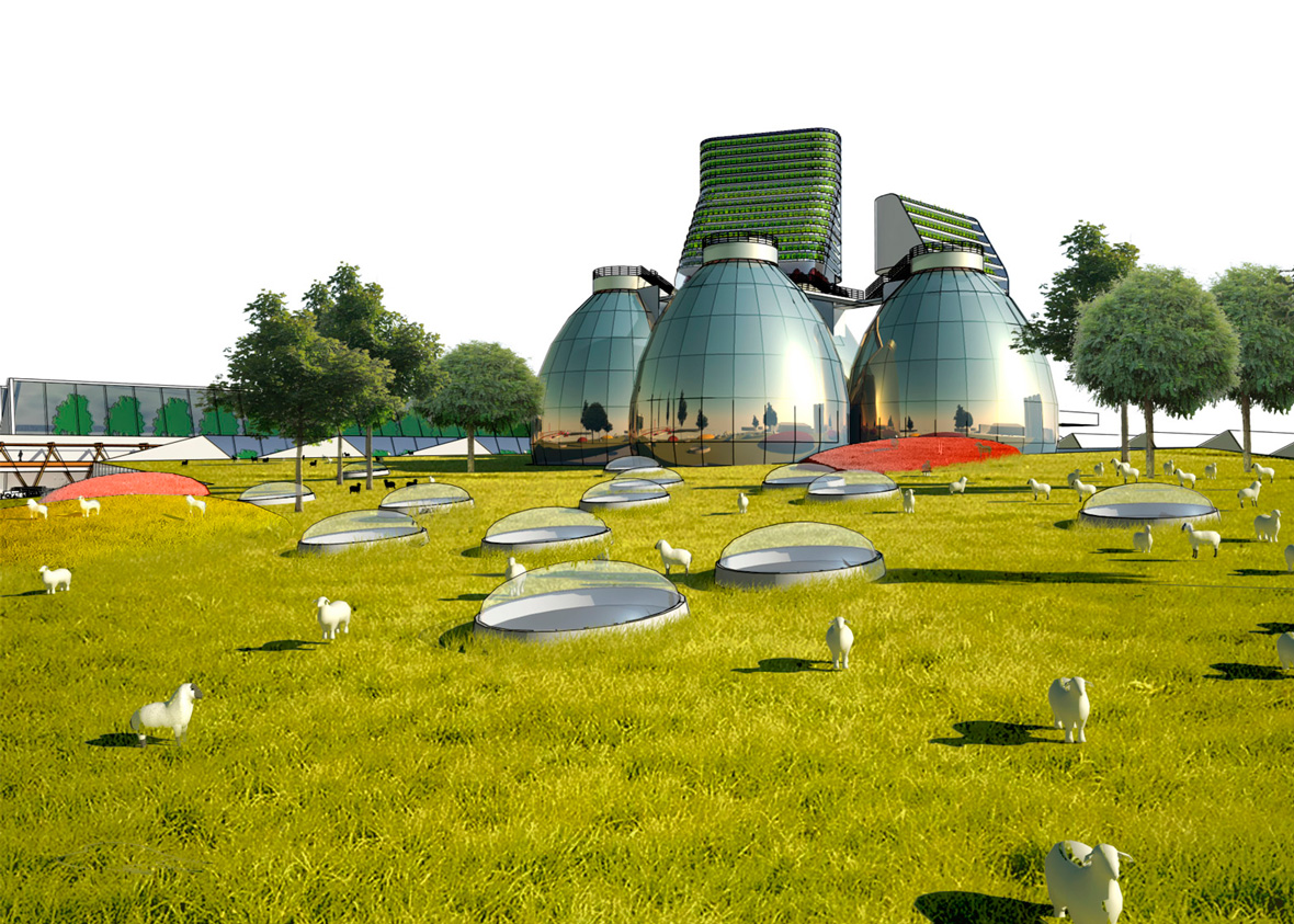
More than 28 per cent of Arkansas children live in food-insecure situations, compared to 14.5 per cent nationally. The Food City plan, which is being funded by the Clinton Global Initiative, aims to build in to Fayetteville a sustainable approach to combating hunger while permeating new development with productive green spaces. The project team envisioned a way to reduce hunger in the city by integrating a network of mid-sized agricultural sites into the urban grid as it expands. The intent is to "re-localise" food production at a scale that is larger than isolated home garden plots and smaller than the nation's current industrial scale. Future development would include not only the traditional sidewalks, parks and other public amenities, but an infrastructure that supports agriculture with spaces for growing food, distributing it, and turning waste into compost.
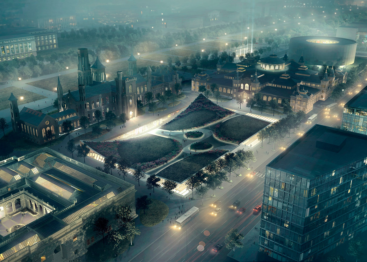
Smithsonian Institution South Campus Masterplan; Washington DC; by Bjarke Ingels Group, GHT Limited, Robert Silman Associates, Stantec, EHT Traceries, GHD, Atelier Ten, VJ Associates, Wiles Mensch Corporation, Kleinfelder, Surface Design Inc, and FDS Design Studio
A comprehensive plan for enhancing the visitors' ability to flow through and among the Smithsonian Institution's South Campus museums, this project lays out a 20-year program of building updates and enhancements to 15 acres on the rim of the National Mall. The visual centrepiece of the project is a clever revamp of the garden adjacent to the Smithsonian's beloved castle, designed by James Renwick Jr, in which the garden, which is the rooftop of below-ground museum space, comes to look like a carpet with its corners flipped up. The project also promises more openness within the castle, built in 1849 as the sole vessel of what is now the world's largest complex of museums. In particular, the castle's lavish Great Hall will be restored to its full grandeur with the removal of modern partition walls that reduce floor area by 40 per cent.


