The programme laid out for the complex by Dominique Coulon & associés includes a set of offices on the lower levels of the building, displaying great transparency and offering the interior activity to the city as if it were a shop window. The upper levels are reserved for residential use, with public spaces for the building's users on the roof.
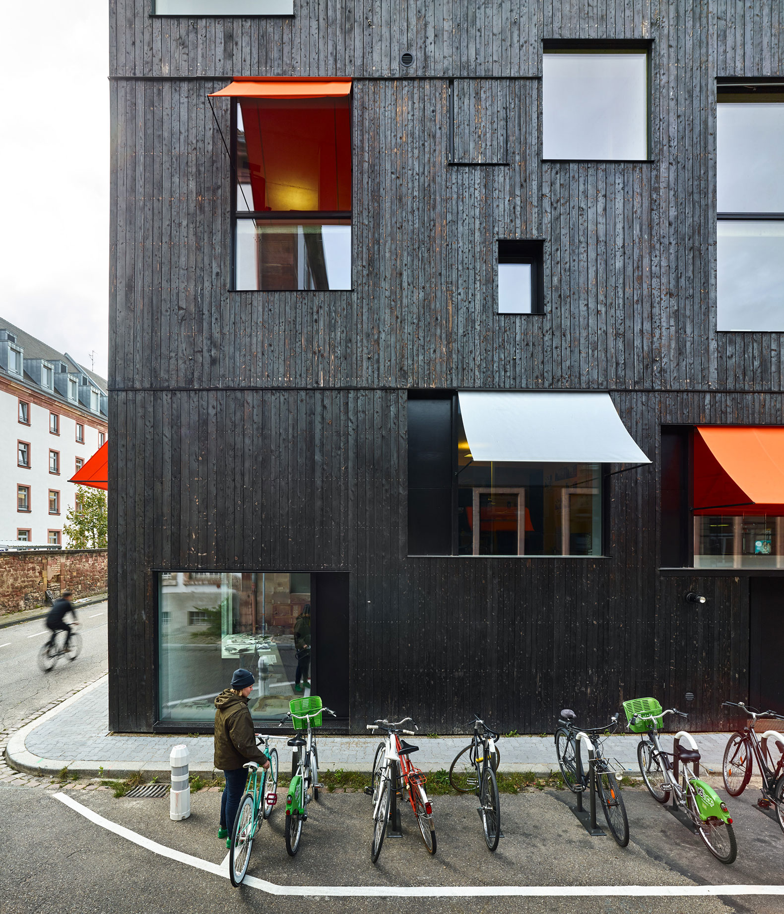
The openings of different sizes in the façade seem to respond to no functional requirement, serving to conceal the interconnection between the different levels of the building. The protruding orange and silver shutters add a touch of colour to a façade that stands out for its dark colour, thanks to an exterior cladding of burnt wood.

Mixed-use building in Strasbourg by Dominique Coulon & associés. Photograph by Eugeni Pons.
Project description by Dominique Coulon & associés
This small tower has been built in the historic Krutenau district in Strasbourg. The city has a number of “hollow teeth”: vacant plots that are too small to be of interest to promoters. In exchange for an attractive price, the consultation called for the production of an exemplary building guaranteeing the achievement of high energy performances, the use of bio-sourced materials, and a mixed-purpose project.
On a plot measuring just 120 square metres, we proposed a programme of offices and accommodation, with a kitchen garden and an organic swimming pool on the topmost terrace. The skin is in scorched wood (larch), a technique often utilised in Japan that makes the material long-lasting by scorching its outer surface. The facade masks the interconnection of the programmes. The openings in the walls do not seem to correspond to any functional requirements, and their different sizes make it difficult to distinguish the different levels of the building. This is contained freedom. Towards the top, a volume of rough concrete pivots through ten degrees, appearing to detach itself from the black mass of the wood base and producing a dynamic angle.

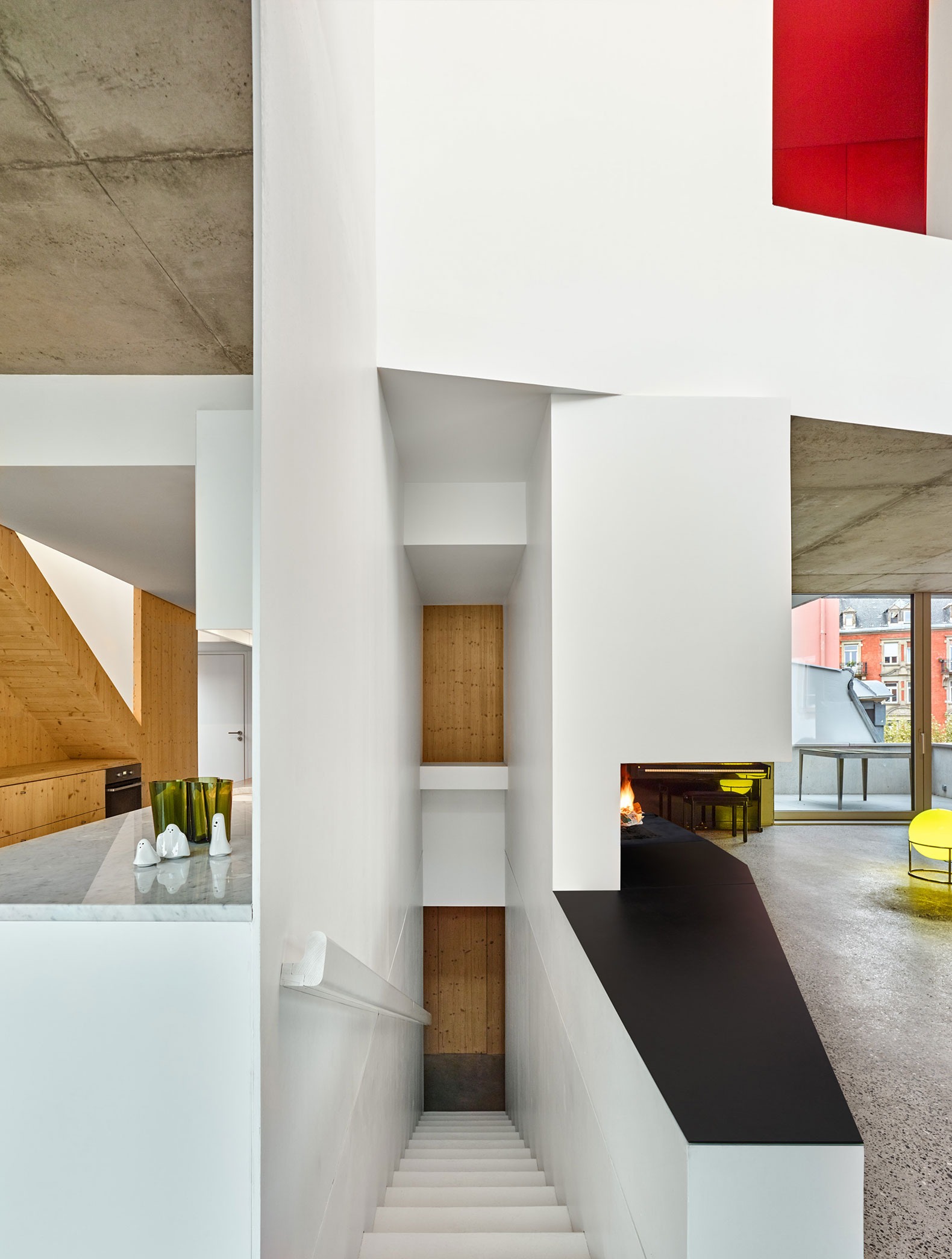
The orange and silver-coloured projecting blinds add a touch of colour to the strange outline of this dark building. The building is generous with the street. Large bay windows offer views into the scale-model workshop, which is slightly below street level, so that the activity of an architect’s office can be seen. This transparency is often seen in Scandinavian countries, where people place their most attractive belongings next to a window, as if offering them to the street outside. Like Loos’ Raumplan, the spaces interconnect in a complex fashion, with double heights lending fluidity to the whole. The spacing between the different floors differs according to the spaces, giving them their proper proportions.
On the inside, the materials used are sturdy and rustic. The concrete floors have merely been polished. Shelving and cupboards are in wood; the staircase is in untreated metal. The building appears to play with the contradictions in the situation, condensing its complexity and offering a joyful rendition.


