The exhibition is a world first and is the result of a four-year research project, supported by the Arts and Humanities Research Council and led by the British Museum and the University of London. In total, more than 400 people from 20 countries have worked on the exhibition and the research project. The exhibition is also accompanied by two books, both edited by Jessica Harrison-Hall and Julia Lovell: first, China's Hidden Century, which sets out a new interpretation of this important era through the exhibition's themes. The second book is a who's who of China in the late Qing period: "Creators of Modern China 100 Lives from Empire to Republic 1796-1912", with 100 essays written in collaboration with around 100 scholars from 14 countries.
Visitors will be able to see and feel the textures of life in 19th-century China through art, fashion, newspapers, furniture, and even the ingredients in soup! Many people not only survived but thrived as new art forms, such as photography and lithographic printing, flourished, while at the same time technology and transportation (telegraph, electricity, railways) transformed society.
Visitors will be able to see and feel the textures of life in 19th-century China through art, fashion, newspapers, furniture, and even the ingredients in soup! Many people not only survived but thrived as new art forms, such as photography and lithographic printing, flourished, while at the same time technology and transportation (telegraph, electricity, railways) transformed society.
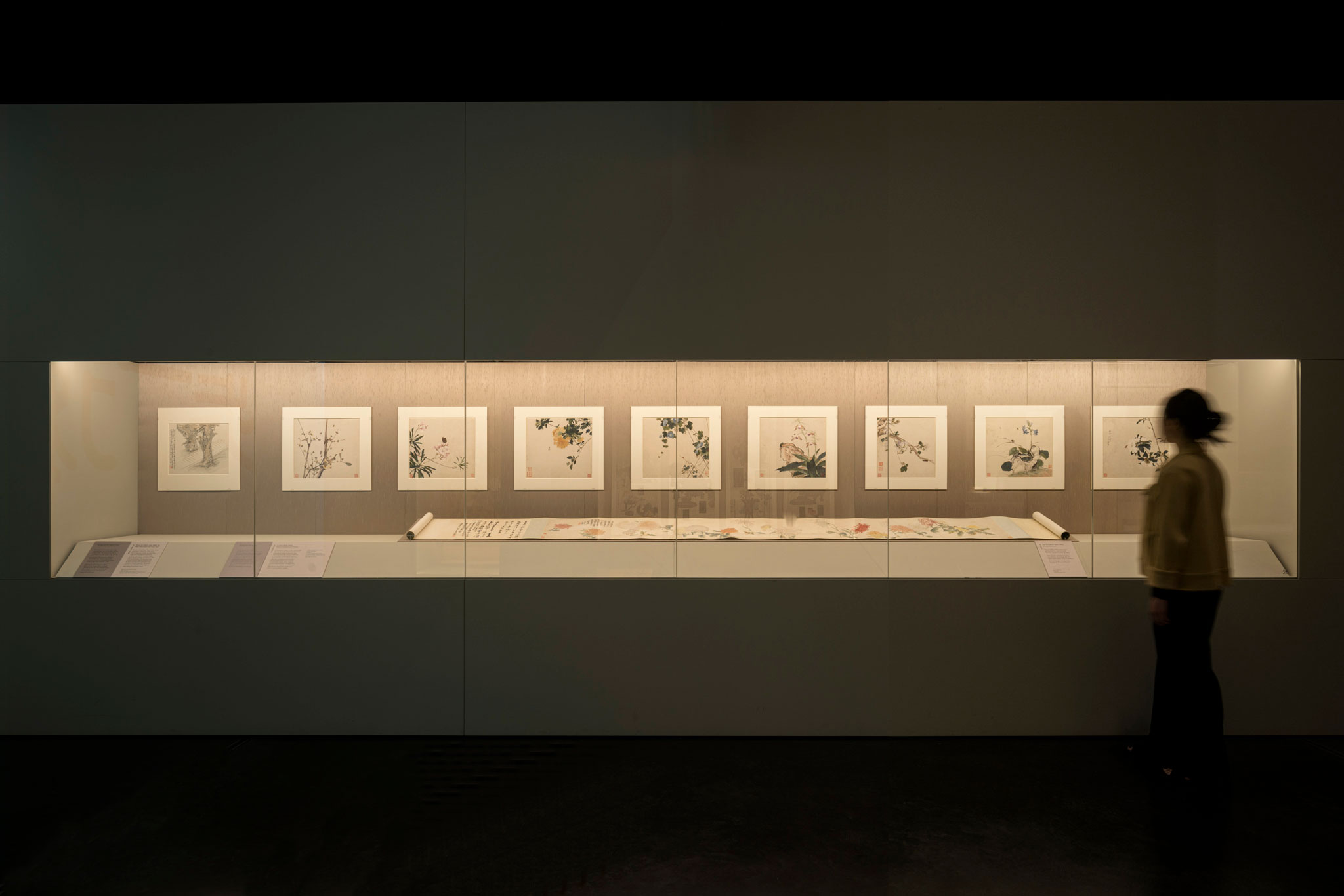
"China's hidden century" at the British Museum. All images by Gareth Gardner.
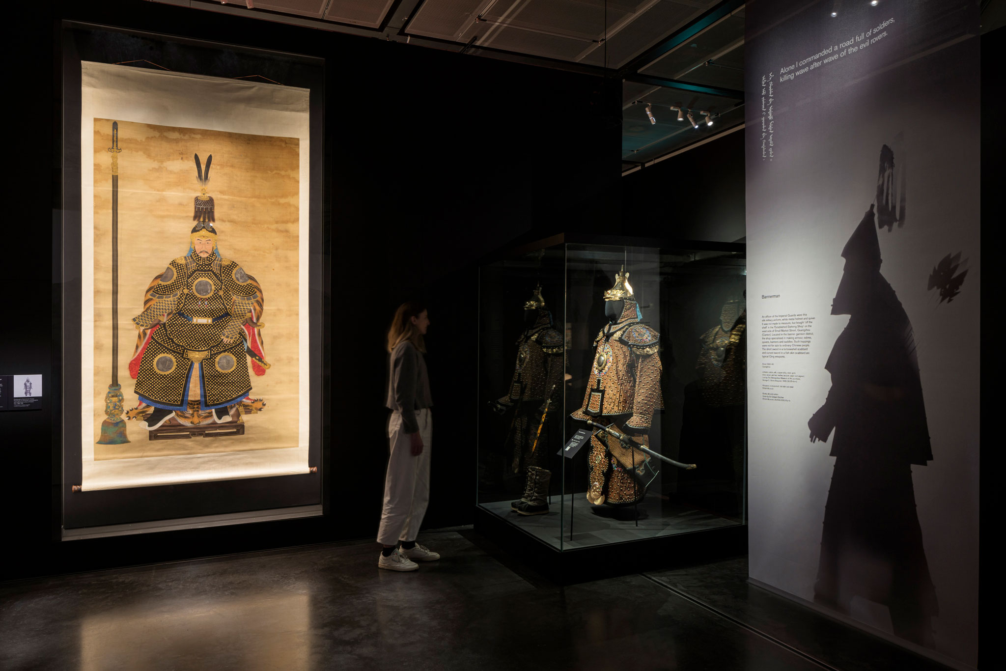
 "China's hidden century" at the British Museum. All images by Gareth Gardner.
Design Approach
The exhibition features over 300 objects, many of which were very large in size, including a number of colourful and beautifully-crafted costumes. An early-stage design decision was that the exhibition’s structures, colours and interpretation should sit seamlessly alongside and not compete with these spectacular objects. Nissen Richards Studio, therefore, designed the exhibition so the visitor would go on a journey through 19th-century China via theatrical architecture, with the exhibition’s look and style created through the setting of a white and shifting shadowy world, using interesting and unusual fabrics and textured materials.
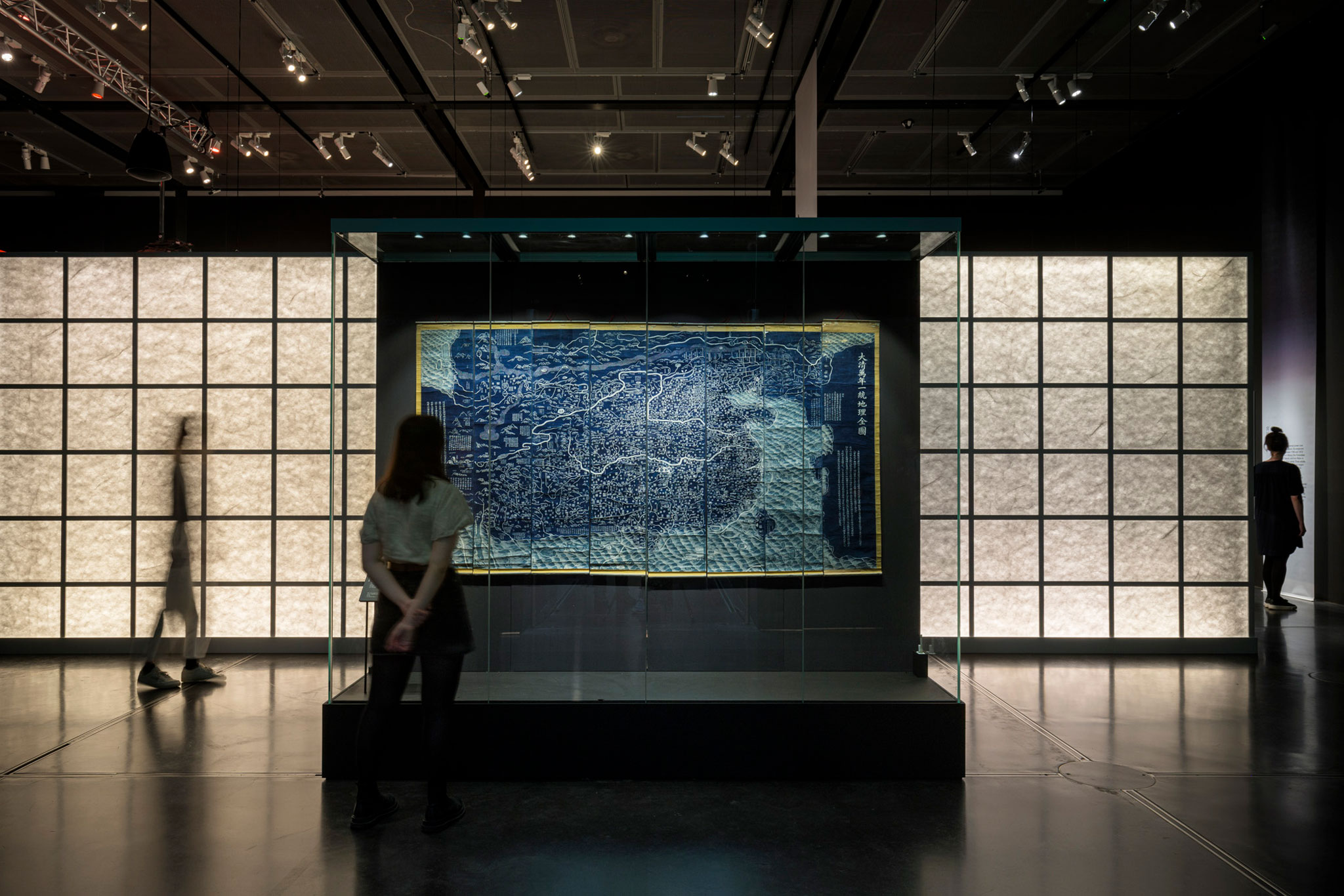
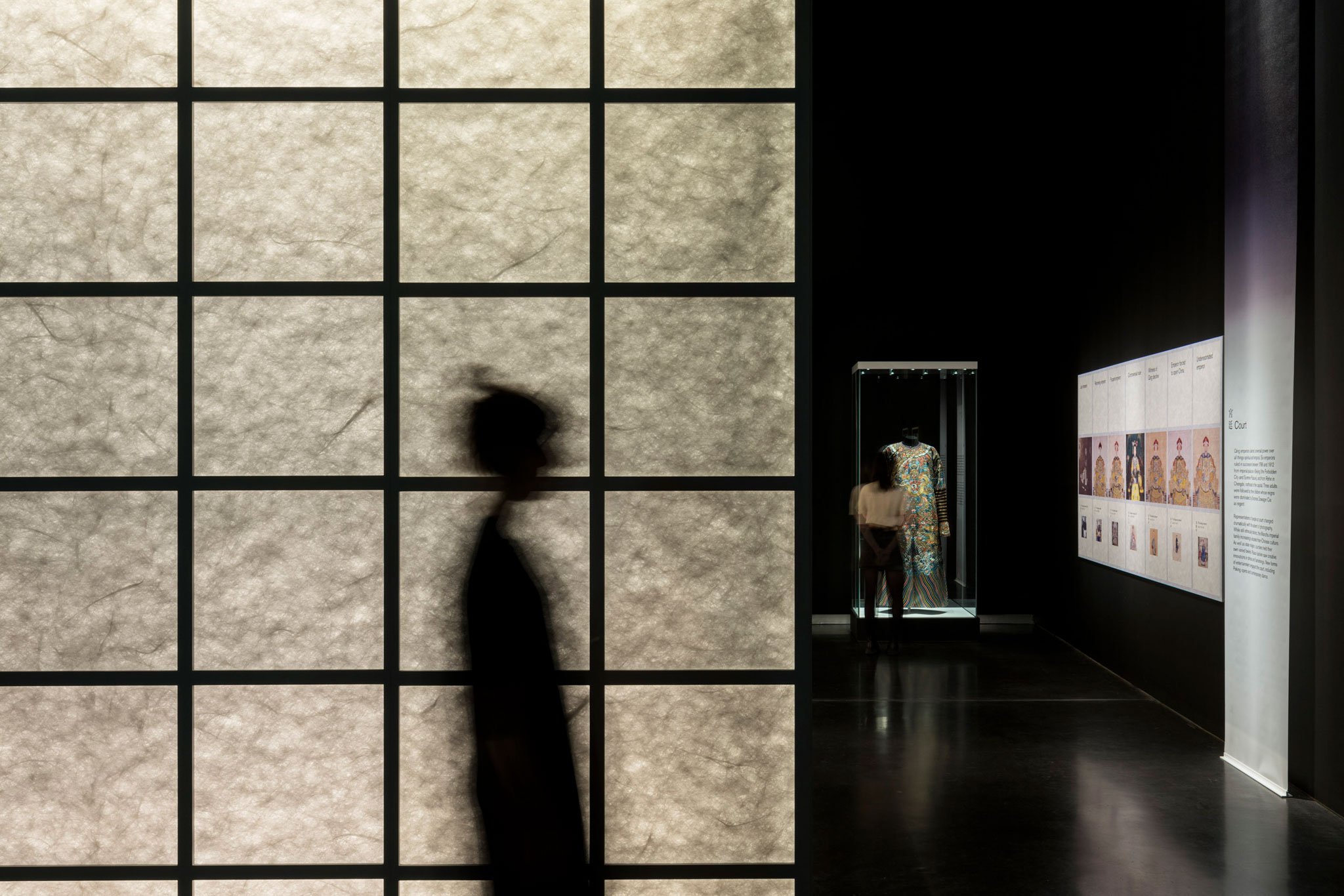
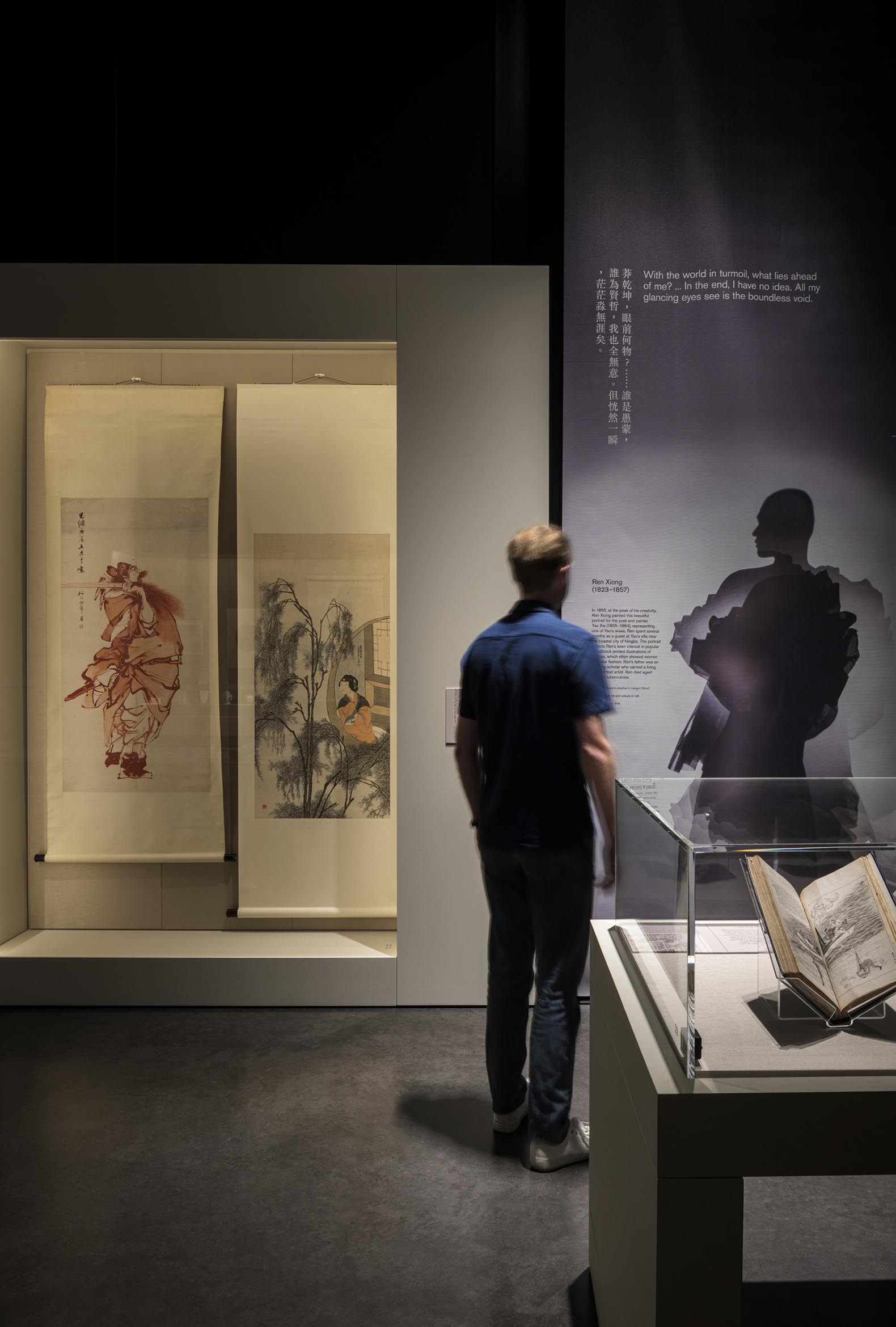
‘We wanted to ensure the visitor experience was objected Pippa Nissen, Director of Nissen Richards Studio, commented, ‘so that the wonderful detail and colour of the objects wasn’t overwhelmed by our designs and the overall feel would be stripped-back, clean and architectural. The drama was added through design moves, such as large-scale images, screens and banners, which shape the visitor journey. The overall palette is neutral, featuring translucent screens made of a paper-like material called Tyvek, which interplays with shadow and light. The use of shadows, layers and textures adds subtle suggestion throughout.’
The exhibition’s six key sections mostly feature a subtle geographical locator - or associated landscape - and are developed with a focus on a set group of people. Objects are then embedded within the exhibition’s architecture to become intrinsic parts of the room they’re in, surrounded by the evocative, shifting atmospheres which create a sense of place and evoke the settings for the people who lived or worked there. The designs also include light, tonal shifts and sometimes graphic mark-making, as well as the creation of shadow photography of the key, highlighted individuals in the story, which was the result of a special collaboration between the British Museum, Nissen Richards Studio and students from the London College of Fashion.
Large-scale environmental graphics talk about people, places, and craft. Although the whole exhibition acts as an architectural series of interventions, there is a subtle shifting colour palette with that too, based on a subdued Qing colour palette. This is seen in highlights and in fabric textures within showcases.
"China's hidden century" at the British Museum. All images by Gareth Gardner.
Graphic Design
Section titles and painting names in the exhibition are in dual languages, in English and Traditional Chinese characters. The fonts used for body text follow the accessibility/inclusivity guidelines given by the British Museum, while there was a little more leeway for the Chinese version, with the chosen font giving a subtle nod to a brush-like quality from handwriting. The key graphic language of the exhibition is the use of banners, which are allusive and ethereal. The graphic approach was also based on a sense of place, using paintings of landscapes, mountains and the sea, taken from images of the period – many in the exhibition.

