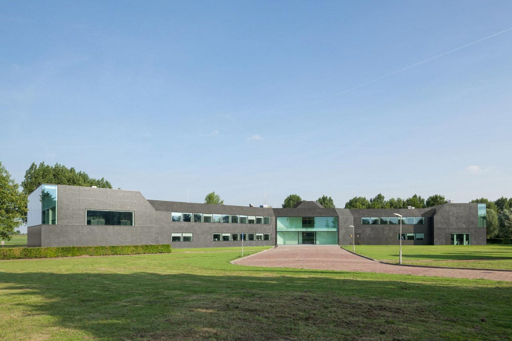
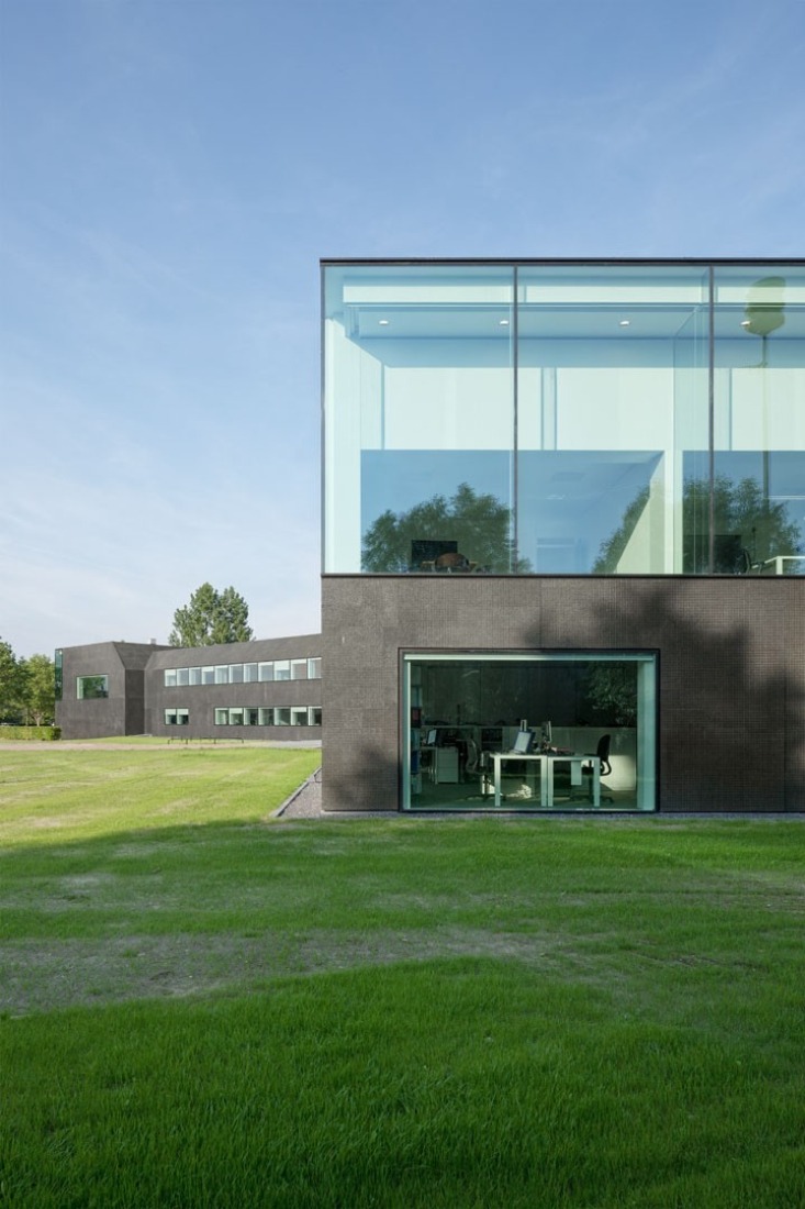
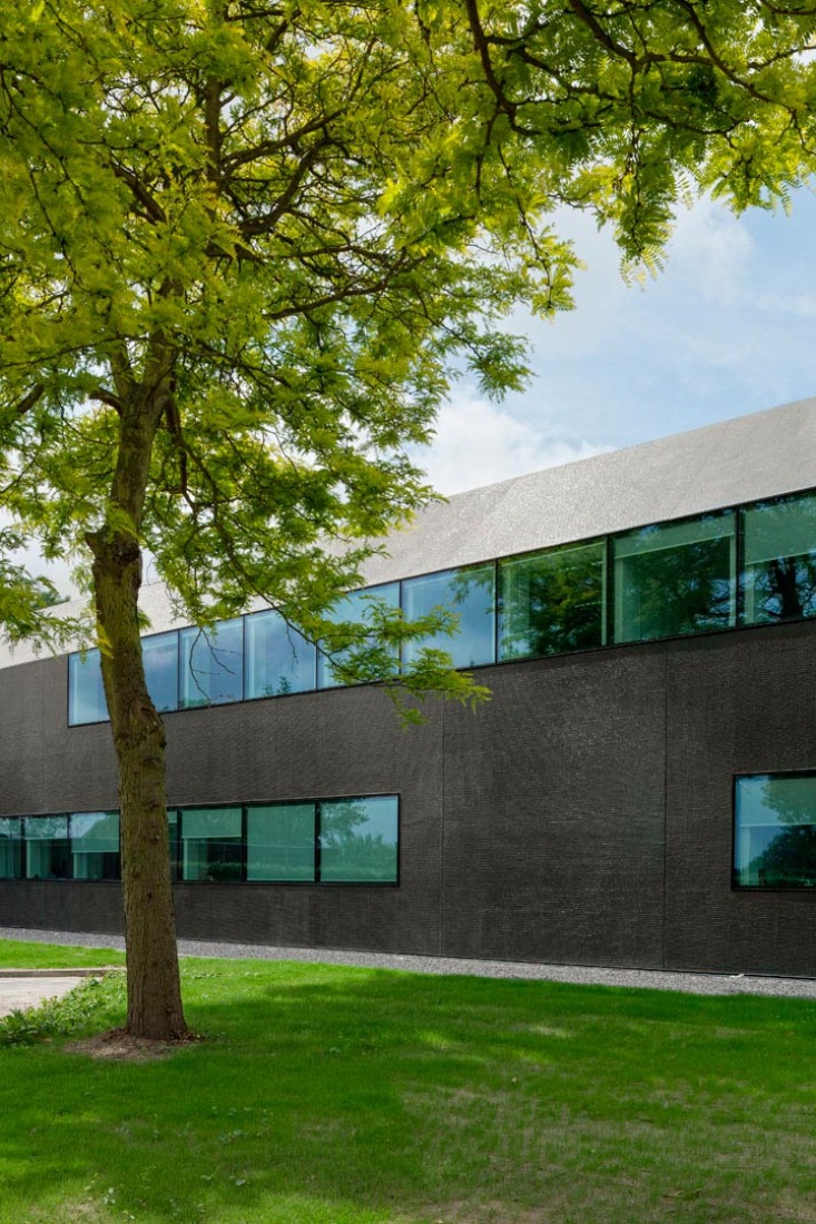
Atelier Kempe Thill proposed, from the existing form of the town hall rather unclear and defensive, design a new building's profile in order to create a new relation with the public space. The project was realized in different phases and layer by layer.
Description of project by Atelier Kempe Thill
The municipality of Borsele in the Dutch province of Zeeland was founded in 1970 by the merging of 13 villages. Heinkenszand was assigned centre of this newly formed administrative unit and a new town hall was built for the 25.000 inhabitants. More then 30 years after the opening, the building was in need of rehabilitation. On the one hand, the façade as well as the roof weren’t fully waterproof anymore. Furthermore, the building had to undergo an asbestos abatement to adapt to modern building standards. On the other hand the interior of the building had to be renovated in order to create a flexible and modern office environment. The building climate had to be improved in order to reduce energy loss.
Above all, the goal of the transformation was to improve the overall impression of the poorly designed and run-down building. For these reasons, in 2009 the municipality organized a European architecture competition, which was won by Atelier Kempe Thill from Rotterdam. While at that moment it was still intended to extend the existing building, this was given up due to financial reasons during the planning phase.
The task turned out to be a very delicate challenge for the architects. Due to the tight cost frame, the existing geometry of the building had to be preserved to a great extend. Therefore, structural or spatial interventions were hardly possible. The task was rather to aesthetically and technically improve the existing surfaces and thereby also the overall impression of the building.
The existing basic form of the building was hardly evident and had to be reinterpreted and conceptualized, in order to strengthen the spatial integration of the town hall within the surrounding of the village. Similar to many projects of the Italian Renaissance, the central idea was to fully wrap the building with a new, more monumental façade, to emphasize the public and representative character of the building and thus to make the building become architecture. Furthermore, the new façade was not merely seen as an instrument to improve the exterior impression, but also to positively affect the quality of the interior spaces and the workflow of the government employees.
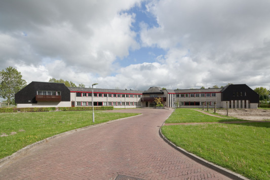
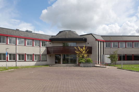
Old building previously remodelation.
EXTREME MAKE- OVER
Since the existing form of the town hall was rather unclear and defensive, first the profile of the building had to be enhanced, in order to create a relation with the public space. The project was realized in different phases and layer by layer, similar to the work of a plastic surgeon.
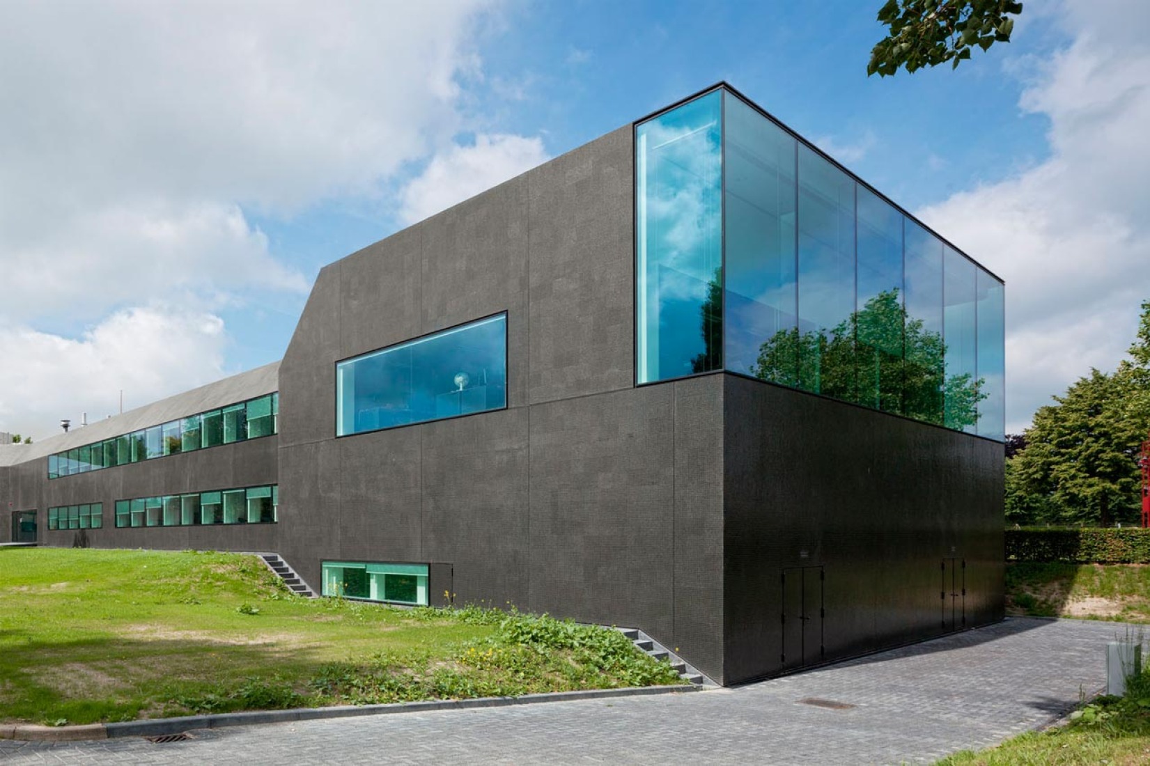
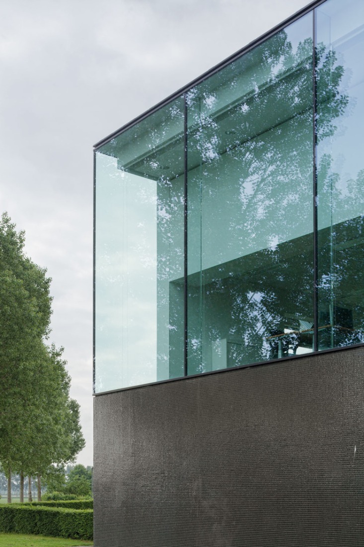
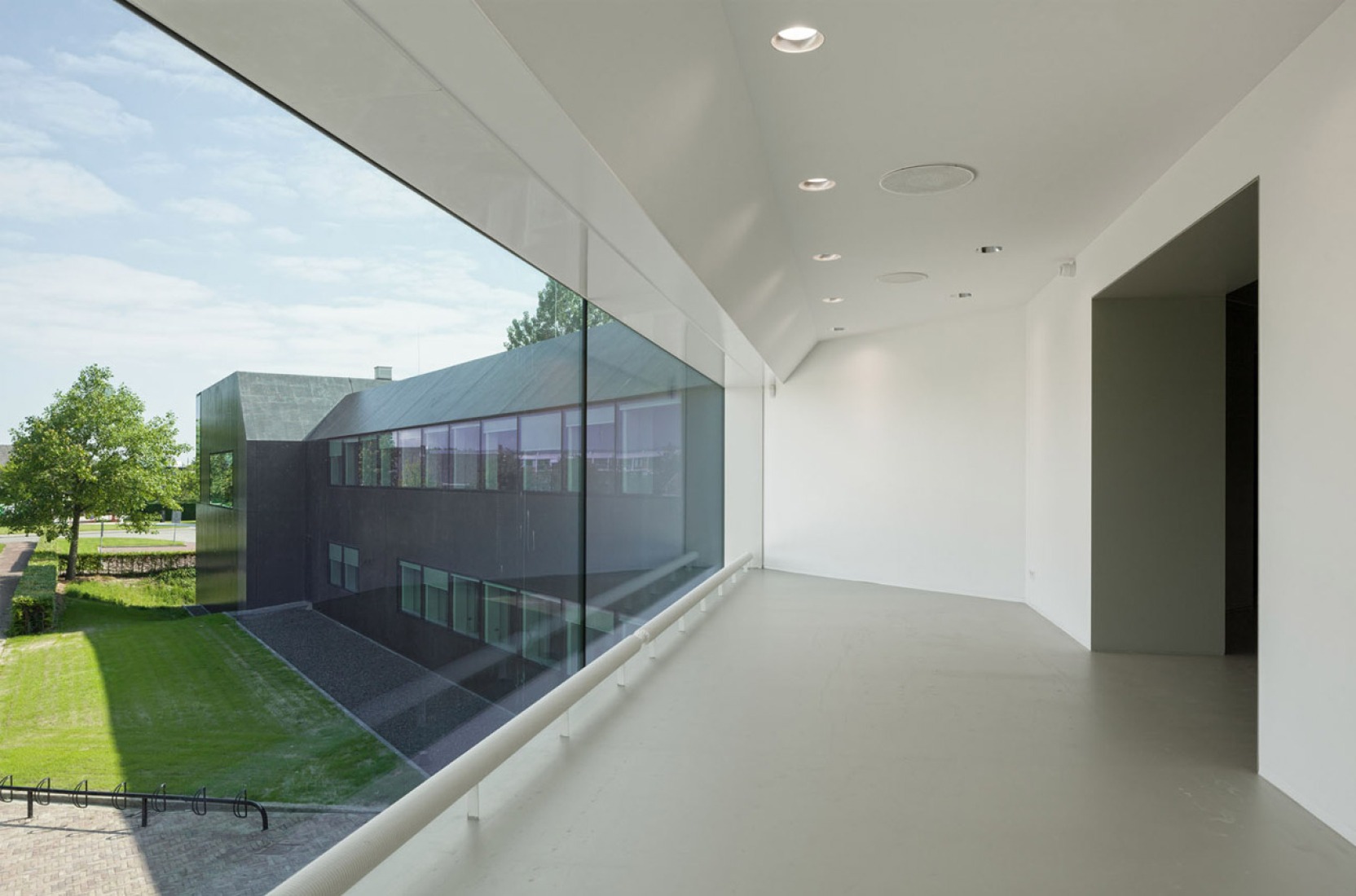
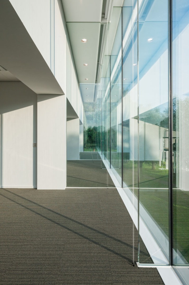
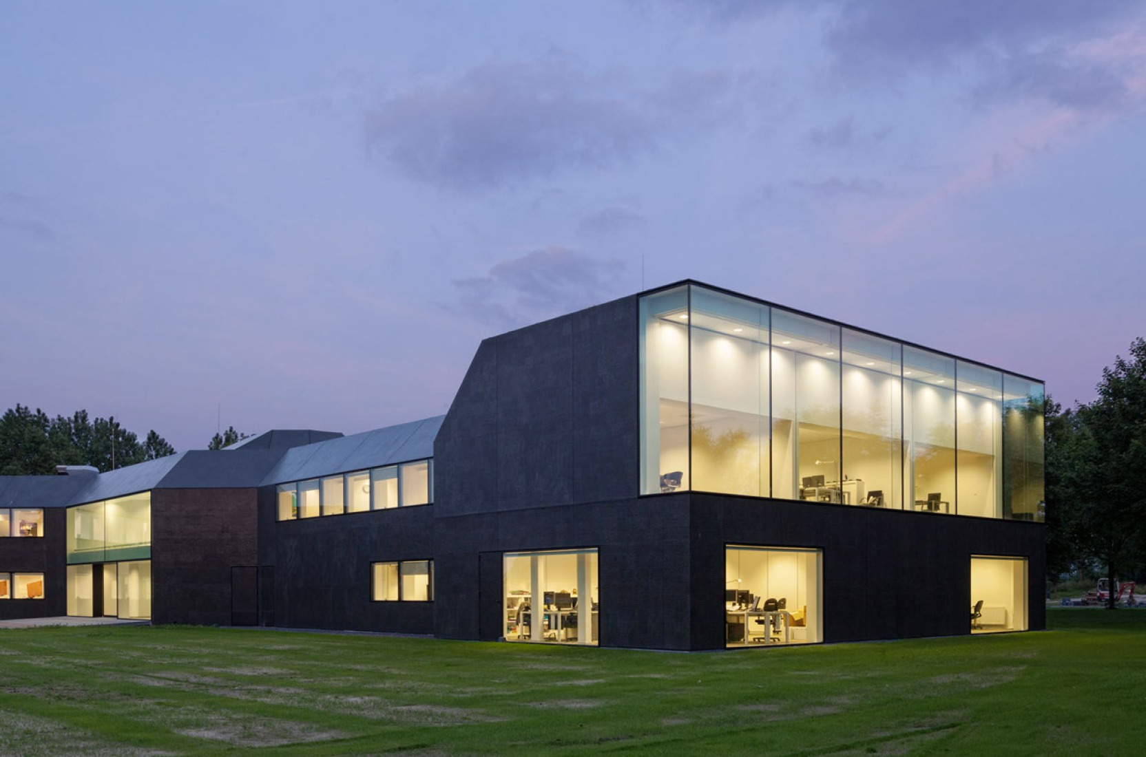
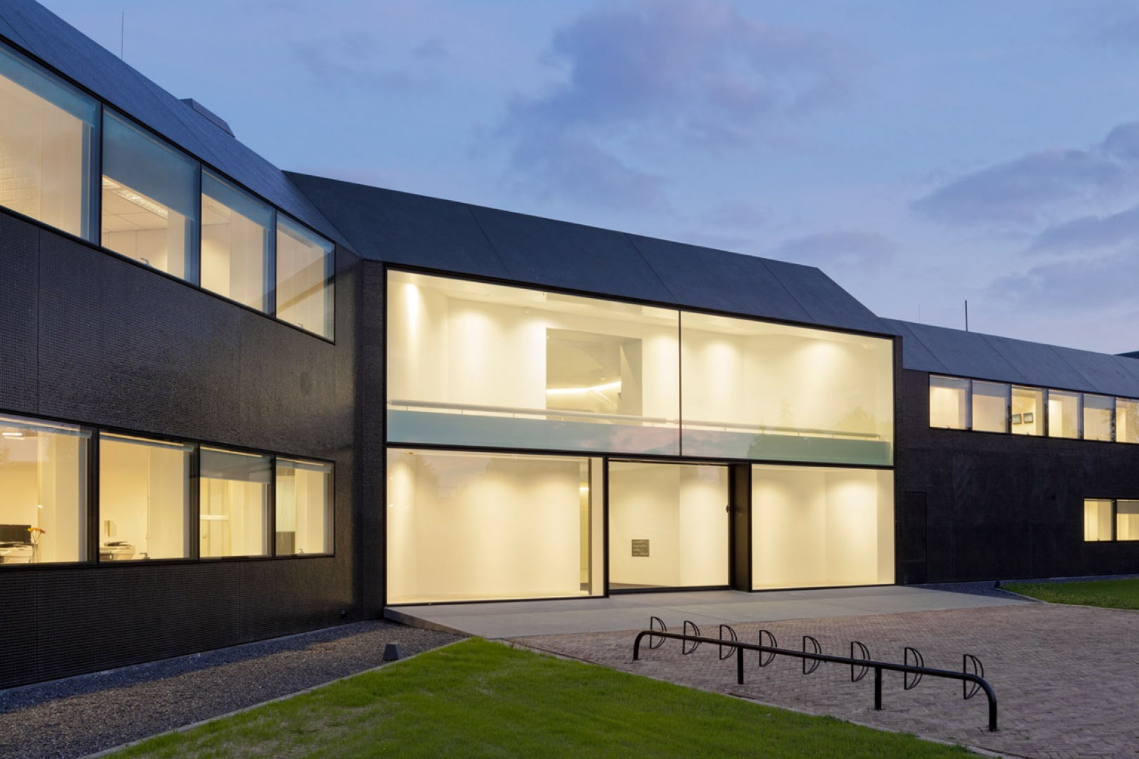
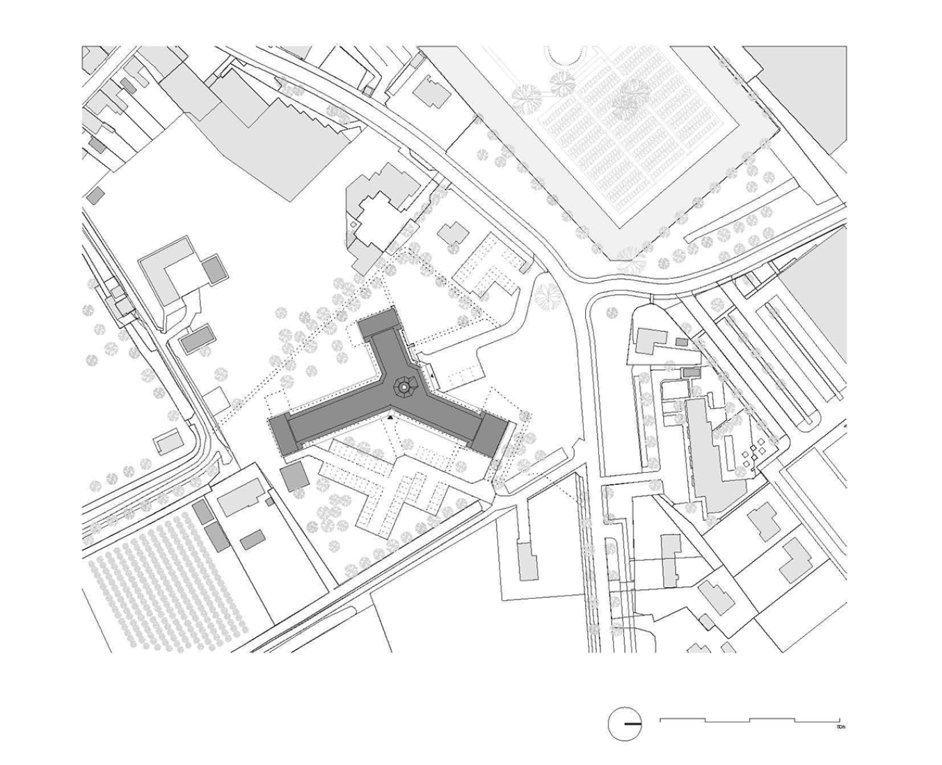
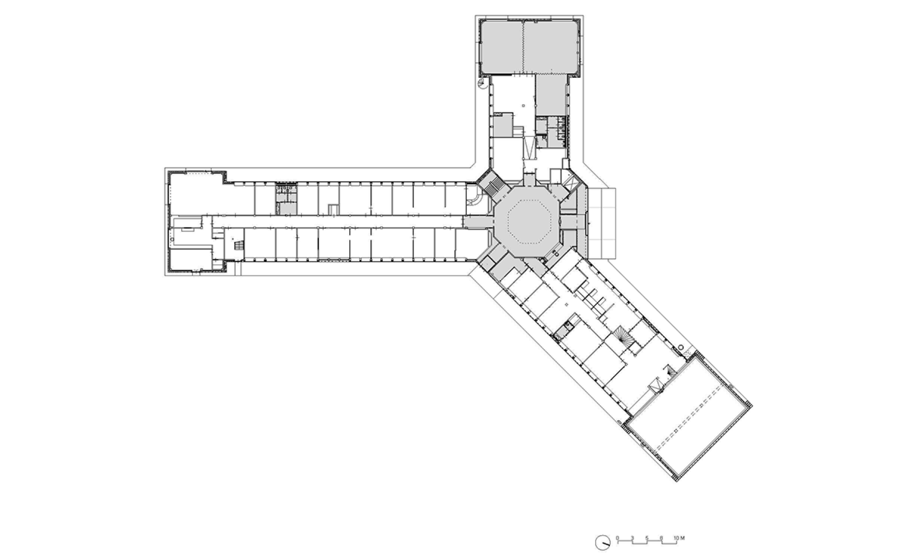
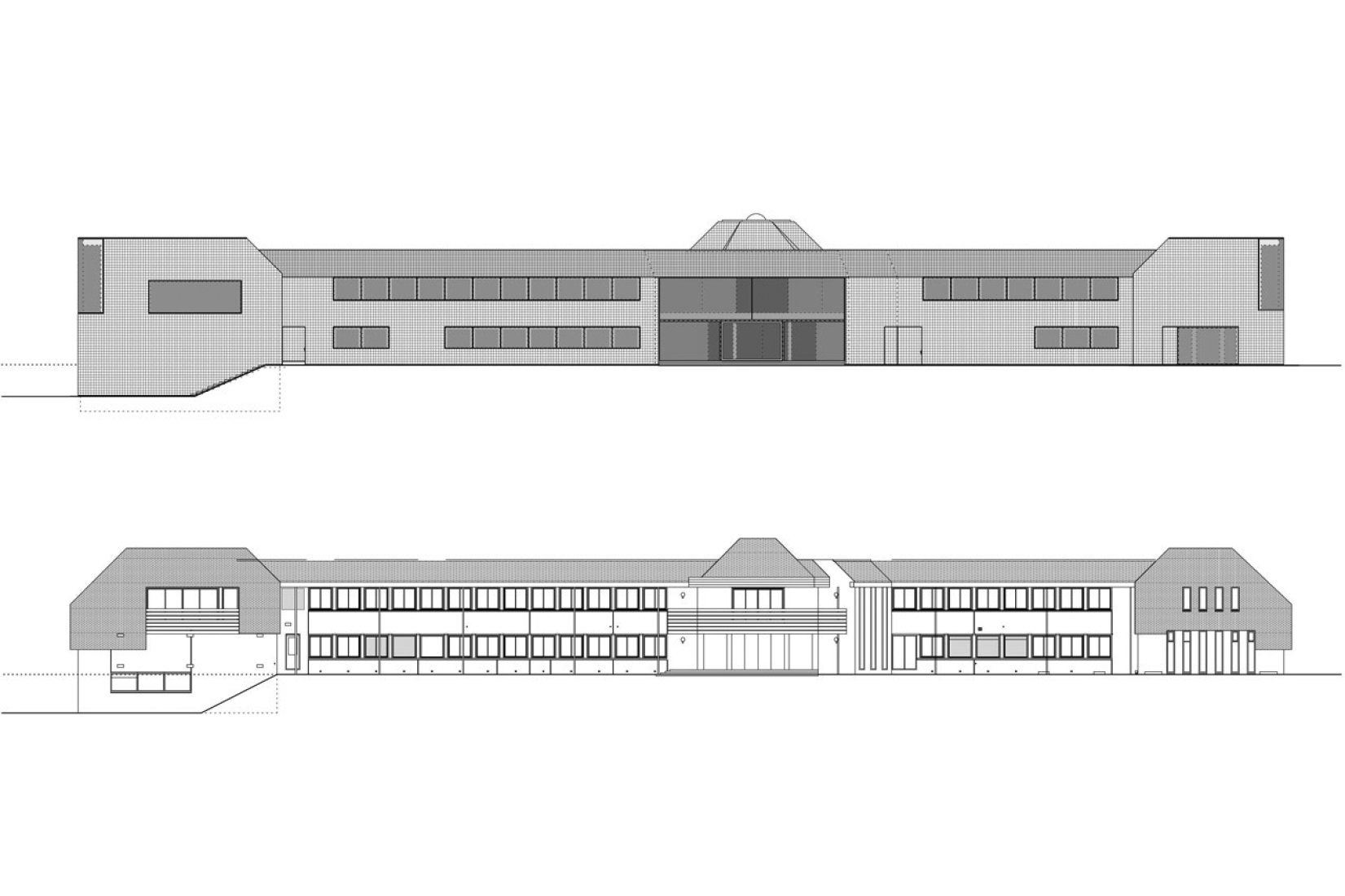
In a first step, the architects decided to adjust the three “heads” and the entrance hall of the star-shaped building, in order to partly clarify the existing geometry and to strengthen the building’s position within the context of the village. The façades of the heads where removed to a great extend and generous structurally glued glass facades were added. By that, the interior of the building became visible and a relation with the exterior was created. Furthermore, the entrance hall was slightly extended towards the outside, in order to enhance the visibility from the main road.
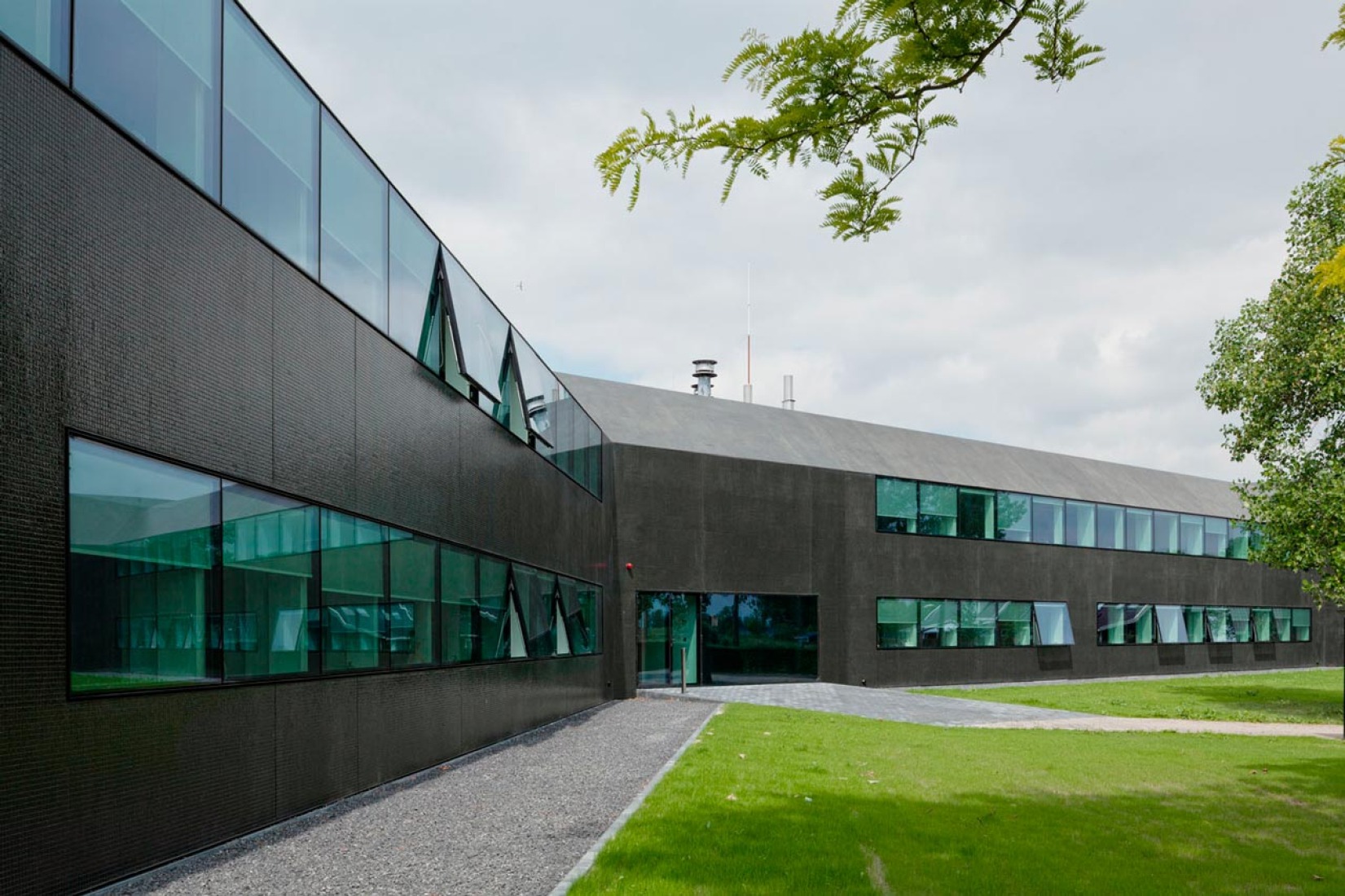
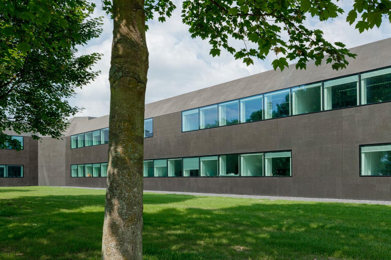
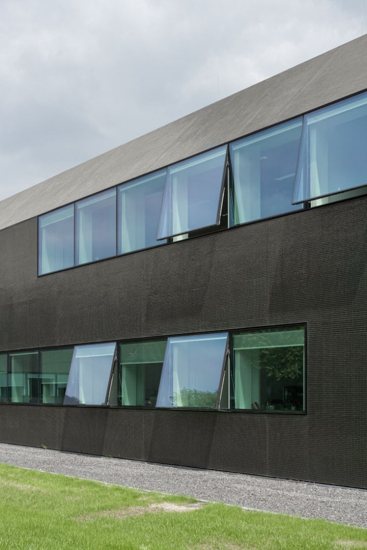
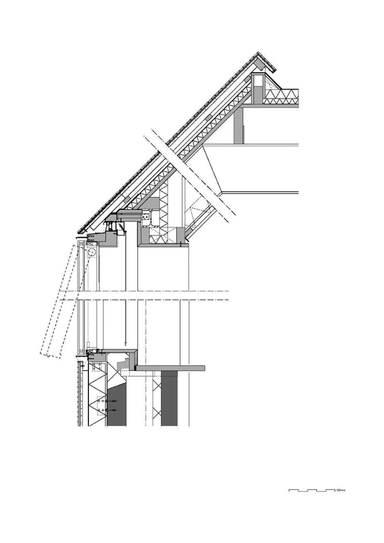
In a second step, the fragmented building shape was tamed and visually integrated by consequently wrapping the façade as well as the roof with one façade material. The new façade consists of glass mosaic tiles, which are glued on mounting plates and placed in front of a new insulation layer on the existing brick walls. The tiles were custom-made in China. Through the process of enameling rich light reflections are created. The black and green colour visually binds the building together and ads to the impression of compactness. At the same time, the colour refers to the tarred barns, which are typical in the Zeeland surrounding.
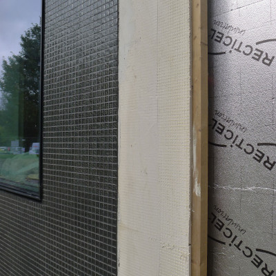
Detail, new layers façade.
The last step of the external renewal was to refine the proportions of the building. All exterior technical installations such as water pipes, ventilation grids and sun screens where removed. Several windows were adjusted. The window grid was enlarged to a format of 1,8m x 1,6m per window. The frames are filigree “pivoting frames” with solar glass filling. High performing textile screens were installed on the inside to provide additional sun protection.
OCTAGON AND PANORAMA
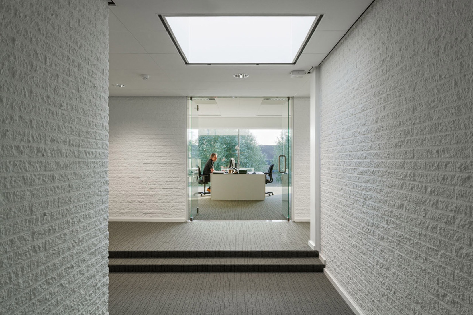
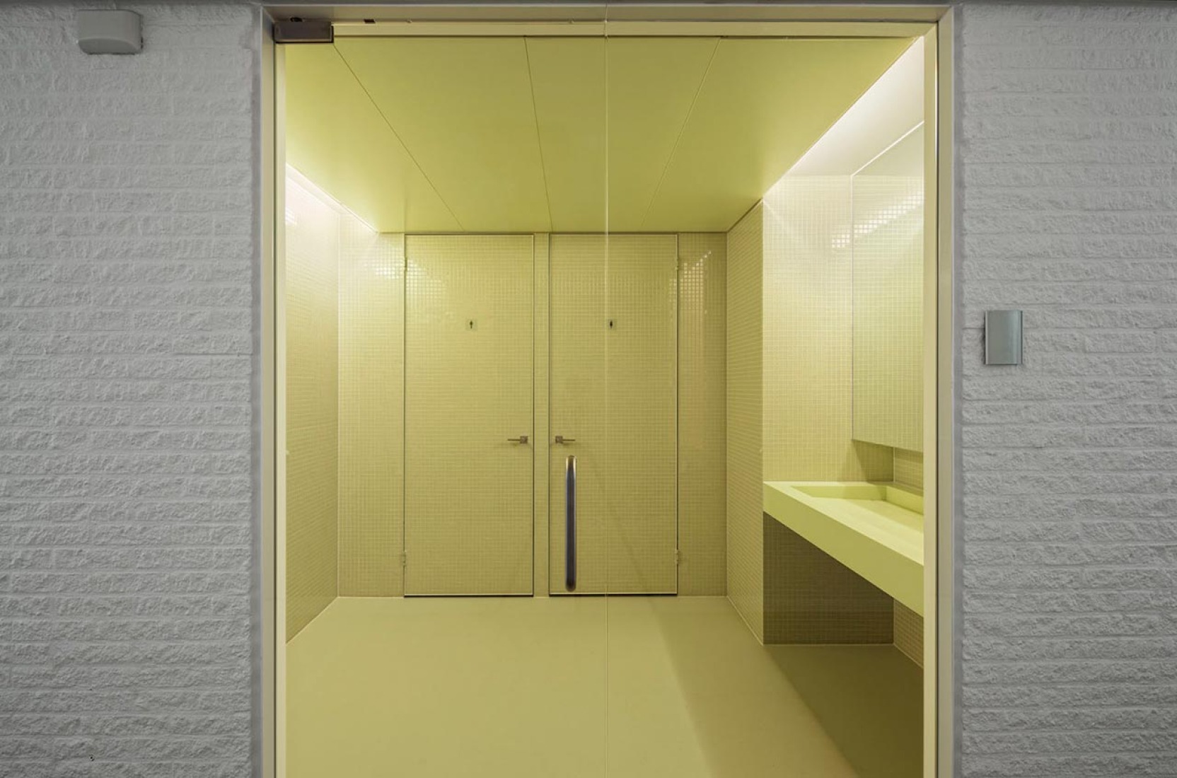
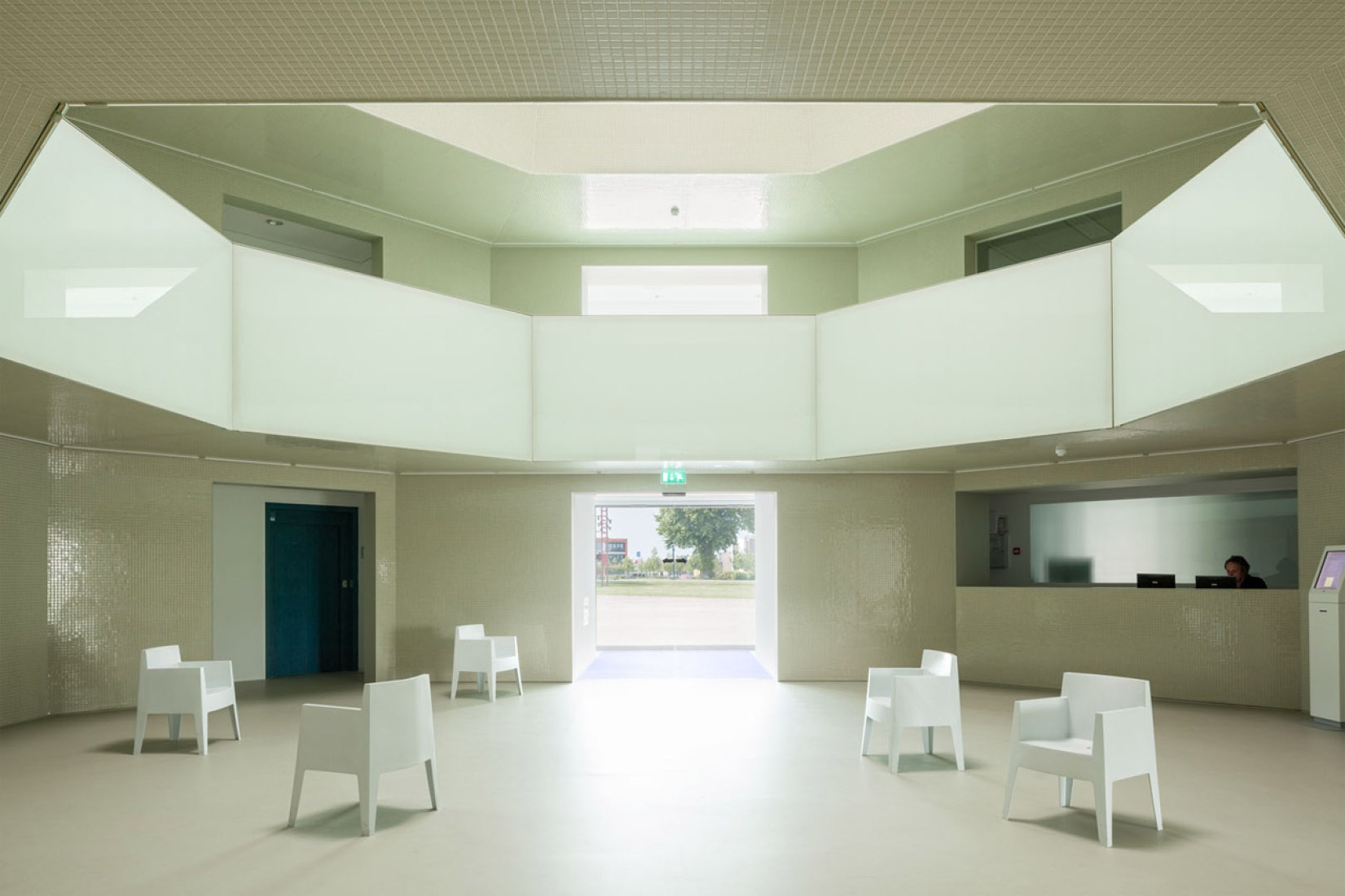
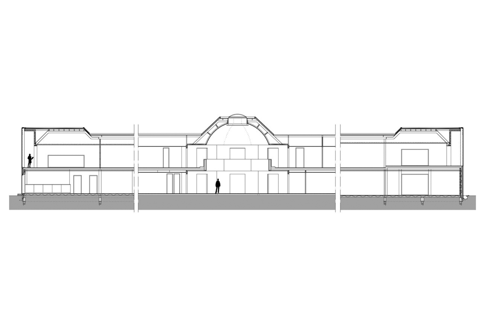
Regarding the interior, several steps were taken to improve the atmosphere and working conditions of the town hall. In particular, the two- floor high entrance hall turned out to be challenging. Since the existing geometry was unclear and the client wanted a more modern appearance, the architects decided to fundamentally reorganize the hall. The entrance hall was strategically downsized and organized in an octagonal shape, which was the result of the existing octagon-shape floor opening in the first floor. Within this new structure, it was also possible to create new meeting rooms and a separable reception area around the hall. The new ceiling was developed as a dome, again as a result of the existing octagon. In order to create a fluent experience between interior and exterior, the entrance hall was as well materialized from glass mosaic tiles, this time in a light – reflecting mint-green colour. The hall is illuminated by a circular skylight. The glass balustrades on the first floor are luminaires, which additionally spread light throughout the hall. Generous office landscapes were situated at the three heads of the building. Here, the fully glazed façades offer a panoramic view towards the green surrounding and the landscape of Zeeland.
CREDITS. TECHNICAL SHEET.-
Architects.- Atelier Kempe Thill.
Location.- Stenevate 10, 4451 KB Heinkenszand, Netherlands.
Architect In Charge.- André Kempe, Oliver Thill, Jan Gerrit Wessels.
Collaborators.- Ruud Smeelen, Blanca Sánchez Babé, Andrius Raguotis, Helen Webster, Teun van der Meulen, Roel van der Zeeuw, Sezen Zehra Beldag, Renzo Sgolacchia, Karel Kubza, Martins Duselis.
Structural Engineer.- Breed-id Grontmij Nederland BV.
Building Contractor.- Bouwbedrijf Fraanje, Lewedorp.
Area.- 4,387.0 sqm.
Year.- 2014.

