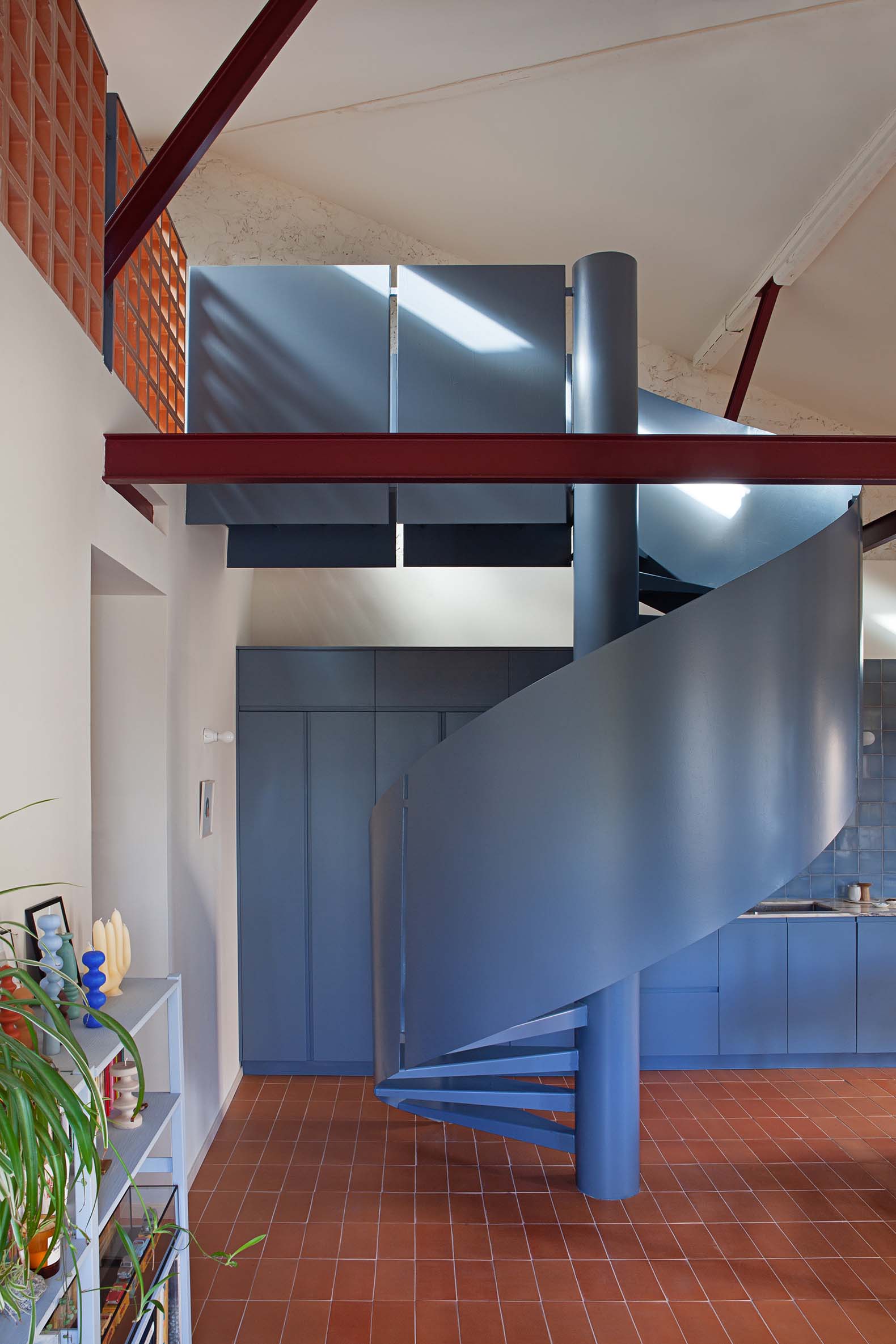
The new interior organization divides the interior into two clearly differentiated spaces, the first, double height, houses the living room-dining room-kitchen in an open space that provides access to the second through a spiral staircase that connects the study space. in the attic. The new metal structure is detached from the envelope and left visible (lacquered in garnet color) showing all its construction details.
The other half of the volume houses three bedrooms, two bathrooms and a small double-height hall that allows a visual and spatial connection with the loft and its natural lighting. The use of color as an element of spatial singularization was decided by involving each of the family members.

Casa Rubens by EstudioReciente. Photograph by Asier Rua.

Casa Rubens by EstudioReciente. Photograph by Asier Rua.
Project description by EstudioReciente
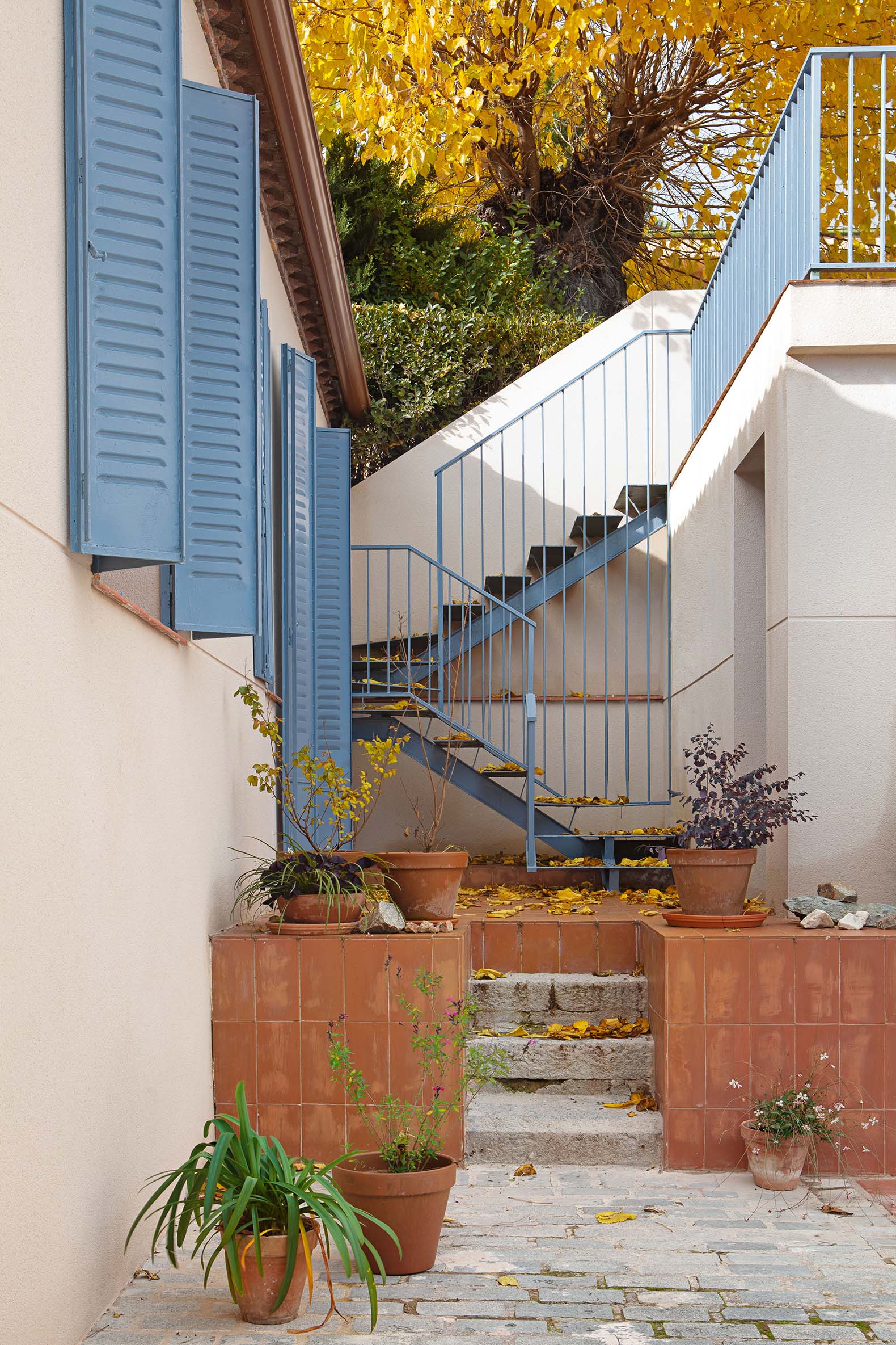
Comprehensive rehabilitation of a single-story house located at the foot of Monte Abantos, in San Lorenzo del Escorial. Conceived as a weekend home for a young couple from Madrid with two children, it takes the summer homes of Cadaqués from the 1950s as a reference. The premise was to create a warm and welcoming home, where in addition to recreating a subtle idea of what we understand as the Mediterranean, color was the other protagonist. Color is the guiding thread of a house that is designed to host friends and artistic presentations on a regular basis.
The intervention respects the housing envelope because it is, firstly, an area of special protection given its proximity to the Monastery of El Escorial, and on the other hand, due to the original composition of the 80cm-thick stone walls and the good cover condition. The interior, due to poor construction of the floors, and the dilapidated state of the pillars and the wooden structure, was completely emptied, allowing a complete redistribution of the plan.

Casa Rubens by EstudioReciente. Photograph by Asier Rua.
The new distribution divides the volume in two, giving rise to a double-height unitary space that houses the living room-dining room-kitchen, and a study on the mezzanine that is accessed through a sculptural spiral staircase. The original arrangement of the wooden structure, with its complex joints, is exactly reproduced in steel. Lacquered in an intense garnet color, the objective was to make visible an exceptional work that previously remained hidden behind the partitions and under the roof. The three pillars and their capitals become the protagonists of the space and also distribute it and help to understand it. The other half of the volume houses three bedrooms, two bathrooms, and a small double-height distributor that allows direct interaction with the mezzanine and its natural lighting.
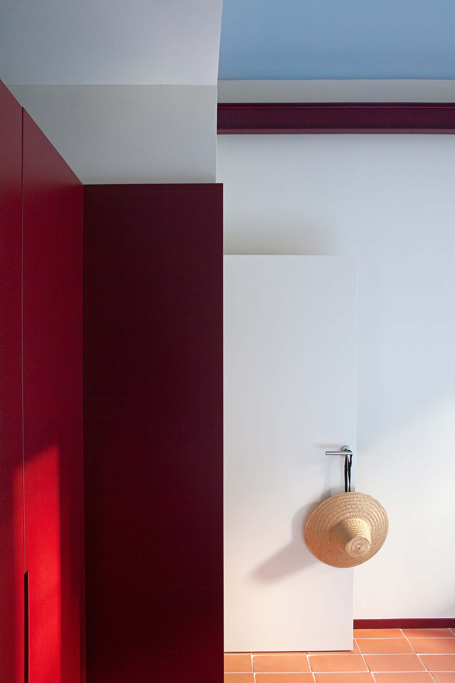
The use of color as an element of individualization was very important when it came to involving each of the family members in the design process. Including the risky combination of tiling in the bathrooms, which despite its simplicity in terms of distribution, come to claim its place within the overall composition of the project.


