J and R: After researching about you, we could not find much information about you, but it seems that you met in Barcelona, in the Master of Landscape Architecture (MAP) at the ETSAB. What made you choose this field of architecture? Because we understand that for Michèle in France, landscape and architecture are different professions, but Michèle, what made you go to Rosa Barba's Masters at the ETSAB?
Michèle: I studied architecture in France, and then I taught urban planning classes in the master's program in Architecture, Urbanism, Environment and Landscape. He talked a lot about landscape, but he never had any training in it.
Miquel: The master's program was two years, and when I started, she (Michèle) was in her second year, but she was already teaching there. She was a student and she was my teacher.
We both studied architecture, but in my case I don't really know why I went into landscape... I was bored and working, but I left it at that moment and saw that there was a good level of teaching in this master's program. We don't have the landscape tradition of Versailles, for example, here landscape is taught from the perspective of the architect.
Michèle: Here there was an idea of treating the landscape on a large scale, something that was not seen in other places. I was attracted by the way of treating it in harmony with urban planning and public space.
J and R: And finally, how did your collaboration come about and how did you decide to create your own studio?
Miquel: We met in class, we started working together in a competition and we liked the way we worked together. We decided to create a studio together and it worked, we have been there for 27 years (since 96).
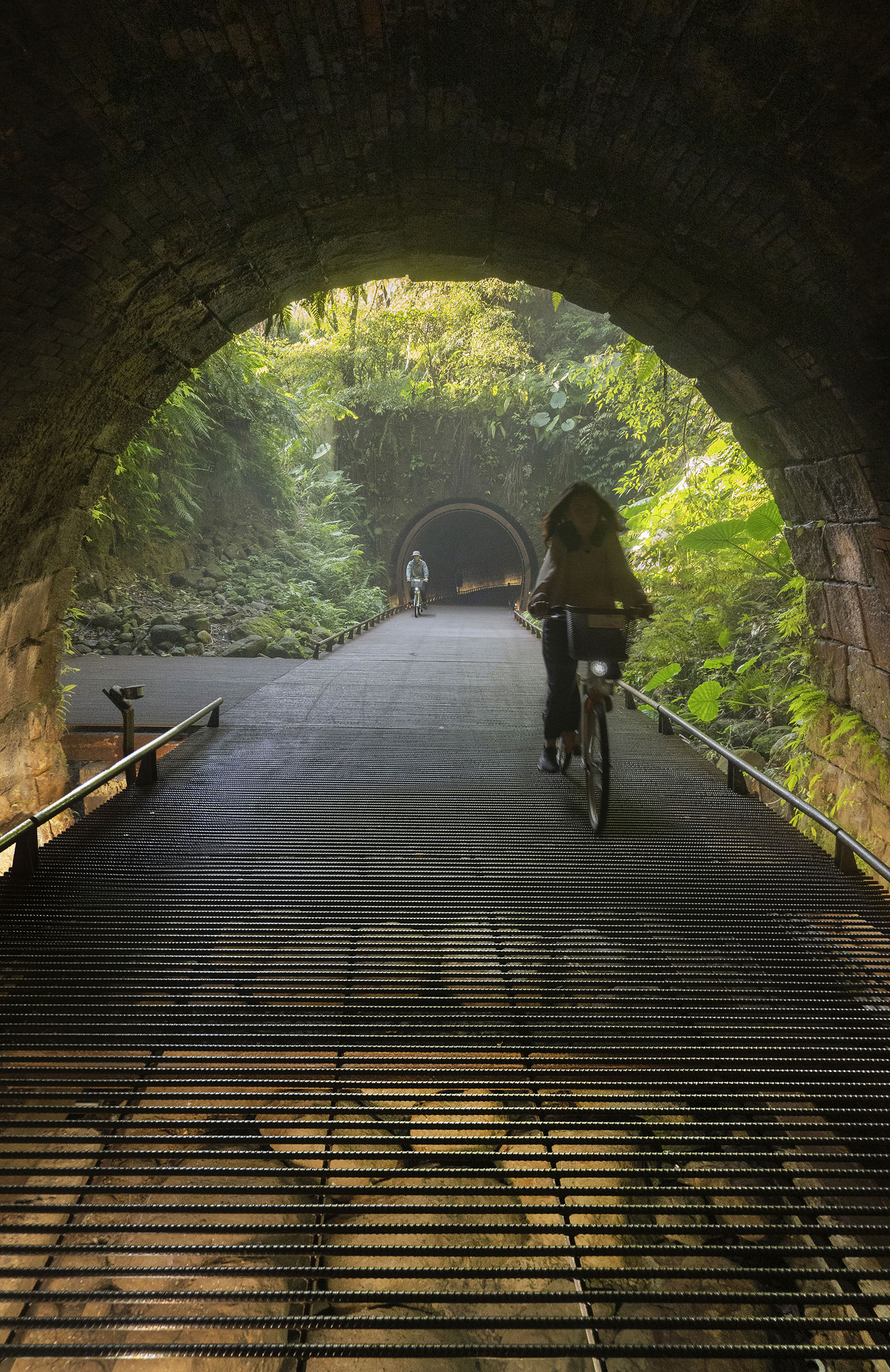
The Dark Line by Michèle & Miquel and dA VISION DESIGN. Photograph by LU Yu-Jui, Michèle & Miquel.
2. The Sensitive
J and R: As a result of this beginning of your collaboration, we have studied your professional career and we wanted to link them together to finally arrive at one of your latest projects. We start with a theme that has caught our attention, which is your sensitivity to the landscape and how you treat it.
For example, in "Plaça Cap Roig" (2005, in L'Ampolla, Tarragona), if we have learned something clear, it would be the sensitivity that you had when facing the project. Here you excavate a void in the square, highlighting the existing vegetation in contrast to the environment; what you did was the opposite, a tabula rasa with the landscape to build a series of residential blocks. Why did you make these choices to achieve this result?
Michèle: The project is developed with an ironic, even political touch. The urban planner who started the project did not take into account the existing topography, for him it was a straight plane on which to place his buildings. There was no sensitivity to the landscape at that time. You had to go in very carefully. This idea of doing the opposite of what we have, with a more than ironic, angry tone.

Water Park in Figueras by Michèle & Miquel. Photograph by Imma Jansana.
J and R: In these first works, you begin to appreciate ideas that will accompany you throughout your work, such as the concepts of adaptability and sensitivity to the pre-existing environment. In an interview published by the Bureau Français Du Taipei, Miquel refers to Woody Allen's 1983 film "Zelig" in reference to another project, but uses it as an analogy to argue that architecture, like the protagonist, must adapt to the environment. What methodology do you use to adapt to the environment in your projects? Is this mimetic architecture a strategy that you try to reflect in your projects?
[Note: In the movie, the character changed his appearance to adapt to the environment in which he evolved.]
Miquel: I don't know if we see it as a strategy, but we almost always find ourselves playing Zelig, we see that the smartest way to intervene is to pay attention to the place. It is not a recipe, it depends on where you are, you always have to be humble with what was already there, not try to impose our own. We are very receptive to what we see.
There is also part of an inability to try something different. This receptivity to the place is absolutely necessary to ground ourselves and not start from scratch. We have to take what exists and almost reproduce it in a different way. There is a part of sensitivity to what exists, of knowing how to capture what is really worth it. And on the other hand the inability to do anything else, at least in my case.
Michèle: I think it's ridiculous not to take care of it. You create a footprint, some waste. If you express what you feel about the place, you have to adapt to it. We are not looking for the object itself, the form, but the way of acting. We are always looking to connect with the place.
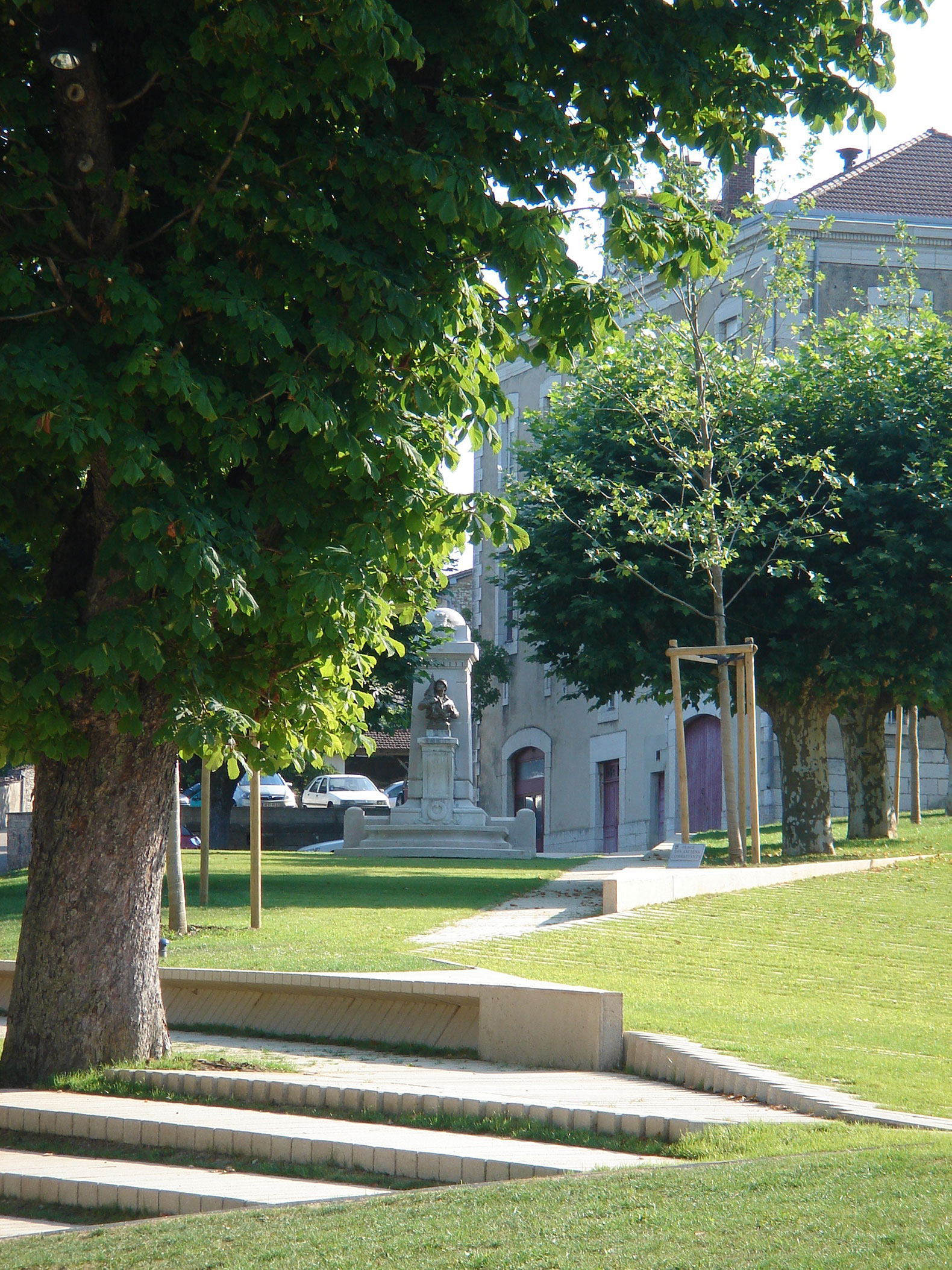
The Fairgrounds in Treffort by Michèle & Miquel. Courtesy of Michèle & Miquel.
3. The walk
J and R: Following the path of "adaptability", we come to the "Gorges du Mondony" project in France. In this work, you can already see processes of approaching the territory that will later be repeated in other projects. Although we are in France, we have noticed that some concepts are beginning to be used, whether intentionally or not, that are related to the Oriental culture that you will later delve into. As far as we know, in some Eastern countries it is believed that in order to explore and get to know a mountain, it is not necessary to climb to the top, but rather to go around it.
In line with this concept, you propose a walk along an abyss, in which the idea of a path appears, like a permeable Tramex path, so that the visual continuity with what is below is not lost. Knowing this, have you taken any elements or references from Eastern culture as inspiration for this or any other project?
Miquel: Not in this particular case, but references are something that come to you almost unintentionally. You look at things, you register them in your mind, and one day they come to you almost without realizing it. There is a project we did that we explain with an image from Japan, the entrance to the Via Ferrata de Llo, where the reference comes from the wooden porticoes that represent the path to the temple (torii).
They appear continuously on the way to the temple, since they are donations from the people in honor of their deceased, creating in the end a great path of the dead. The beautiful thing is the path, not the temple at the end. We explain this project in the same way, a set of porticos that gives access to the via ferrata.
Michèle: In Mondony, we find a cliff, and these paths are not only oriental, we also find them in Spain (Camino del Rey), where fragile pieces appear attached to the stone wall.
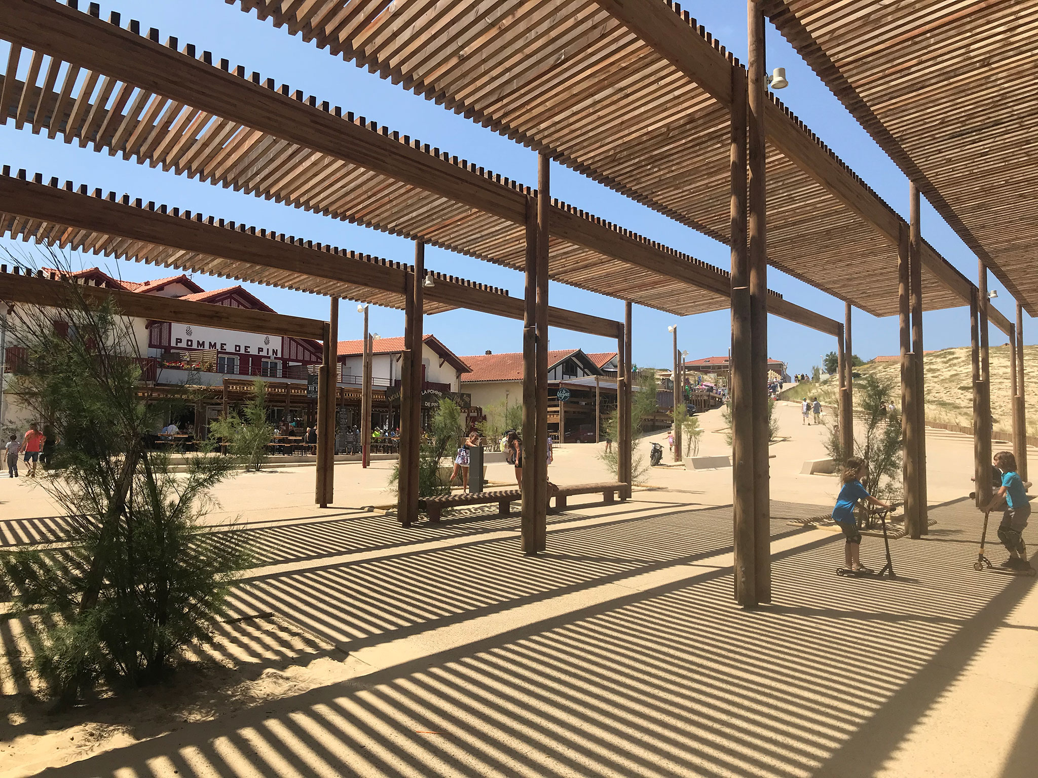
Back Dunes in Vieux-Boucau-les-Bains by Michèle & Miquel. Courtesy of Michèle and Miquel.
J and R: Adaptability to the limits of the mountain is an interesting concept. How did the topographical challenges affect your decision making?
Miquel: There is mainly a problem of implementation, of construction. Vertical walls without access. The walkways could only be placed by helicopter, something that affects the whole project. It makes you think about prefabricated elements that do not exceed 800 kg, that are easy to place...
Something that recurs in our projects is that we use only one material and think about its construction system. We like the repetition of this system, they are prefabricated pieces in the workshop. We wanted them to be light and transparent, to have as little impact as possible. Not a single piece is cut, they are modular elements that are placed overlapping and drawing the geometric profile of the rock, trying to get as close to it as possible without modifying the modules.
Michèle: In this project, as in others, we are very impressed by the contrast between a rigorous existing geometry and another that is imposed. The pieces are not cut, but are configured to get closer to the rock, creating a relationship of contrast between two elements that do not quite fit together, which leads to very interesting things.
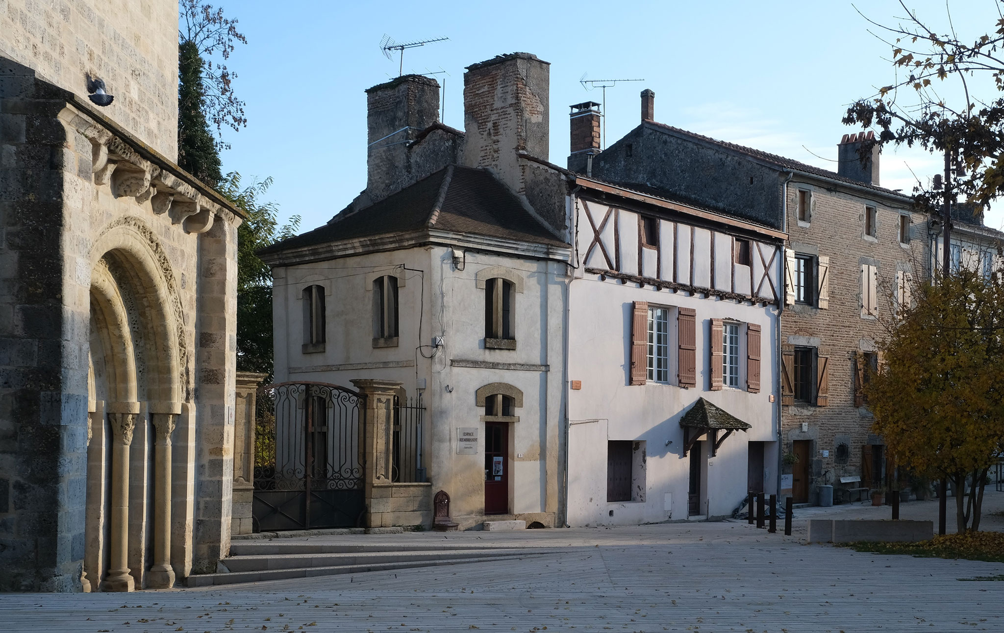
Abbey Square in Mas d'Agenais by Michèle & Miquel. Photograph by Vincent Boutin.
4. The urban detail
J and R: We also see this geometric play you speak of in Port-Vendres, Occitania, in the south of France. Here you use a strategy that is in line with the urban environment, but at the same time it is more landscape than architectural, because it is a pavement treatment where the pieces are dynamic in plan and height, as if it were a tiled garden.
How did you come to treat a totally anthropized space as if it were a natural landscape? What was the design work on this project and how did you adapt it to the narrative of the landscape?
Michèle: This street is on the outskirts of a city and leads to the port. You could say that it is very chaotic, it did not have a regular geometry, so we repeated the geometric system and decided to put a parallel pavement. We make it meet a more undulating, more organic geometry, more in common with the medieval city and see this confrontation between the two systems. This allows us to save a lot of material and construction. This is where a lot of the details come from that later give a lot of play.
Miquel: Yes, in this case we start with a stone that is already cut at the factory with measurements of 40 cm, and are found with others whose measurements begin to be variable. When the game of the turn in the street comes, it becomes very difficult for us because each piece is different from the next and when we play, this rule means that we have to adapt to different situations.
The interesting thing is what you do with this rule when the situation that worked for you no longer works and you have to adapt, because it can produce a much richer and more complex drawing.
Michèle: Well, we were able to see later that all these thousands of details that worked the richness of this kind of fabric. These pavements were almost a sewing job, like when you sew a sleeve or a collar, you make a cutout and you try to make a beautiful seam. It's a little bit like that.

The Dark Line by Michèle & Miquel and dA VISION DESIGN. Photograph by dA VISION.
5. The matter
J and R: Well, this game of pieces leads us to another project that is also located in the city, but in this case gives more prominence to the landscape. And we are referring to the prize-winning "Jardin Niel" in Toulouse, France. In this project, the role of sculpture could be given to the furniture elements that surround the park, for example, the designer doors that never close the view of the interior park, or the slides that, once again resorting to adaptability, collect the curves of the terrain.
On the other hand, you also address different scales at the same time, mixing architecture, urbanism and landscape. But what really caught our attention in this project was the paving system you used. We are referring to the "Flexbrick" system, which you lay down like a carpet; it is striking how a system like this, which is basically used for facades, you have used to form a network on the pavement, allowing you to create random voids that blur the boundaries between the pavement and the vegetation. How did you come to experience the material in this way, given that it is a system used on facades? Did you know it would work?
Michèle: This Niel was a parade ground, an empty space where all the military parades took place and there was a large esplanade. In this area of Toulouse there were no gardens and a park was needed, but we found some archaeological remains and we ran into the problem that we could not plant. In this case, we tried to go in the sense of place, but a little beyond what we found, implying a form of landscape that we assume existed but no longer exists, so we reinvent it. As a French writer says:
Michèle: I studied architecture in France, and then I taught urban planning classes in the master's program in Architecture, Urbanism, Environment and Landscape. He talked a lot about landscape, but he never had any training in it.
Miquel: The master's program was two years, and when I started, she (Michèle) was in her second year, but she was already teaching there. She was a student and she was my teacher.
We both studied architecture, but in my case I don't really know why I went into landscape... I was bored and working, but I left it at that moment and saw that there was a good level of teaching in this master's program. We don't have the landscape tradition of Versailles, for example, here landscape is taught from the perspective of the architect.
Michèle: Here there was an idea of treating the landscape on a large scale, something that was not seen in other places. I was attracted by the way of treating it in harmony with urban planning and public space.
J and R: And finally, how did your collaboration come about and how did you decide to create your own studio?
Miquel: We met in class, we started working together in a competition and we liked the way we worked together. We decided to create a studio together and it worked, we have been there for 27 years (since 96).

The Dark Line by Michèle & Miquel and dA VISION DESIGN. Photograph by LU Yu-Jui, Michèle & Miquel.
2. The Sensitive
J and R: As a result of this beginning of your collaboration, we have studied your professional career and we wanted to link them together to finally arrive at one of your latest projects. We start with a theme that has caught our attention, which is your sensitivity to the landscape and how you treat it.
For example, in "Plaça Cap Roig" (2005, in L'Ampolla, Tarragona), if we have learned something clear, it would be the sensitivity that you had when facing the project. Here you excavate a void in the square, highlighting the existing vegetation in contrast to the environment; what you did was the opposite, a tabula rasa with the landscape to build a series of residential blocks. Why did you make these choices to achieve this result?
Michèle: The project is developed with an ironic, even political touch. The urban planner who started the project did not take into account the existing topography, for him it was a straight plane on which to place his buildings. There was no sensitivity to the landscape at that time. You had to go in very carefully. This idea of doing the opposite of what we have, with a more than ironic, angry tone.

Water Park in Figueras by Michèle & Miquel. Photograph by Imma Jansana.
J and R: In these first works, you begin to appreciate ideas that will accompany you throughout your work, such as the concepts of adaptability and sensitivity to the pre-existing environment. In an interview published by the Bureau Français Du Taipei, Miquel refers to Woody Allen's 1983 film "Zelig" in reference to another project, but uses it as an analogy to argue that architecture, like the protagonist, must adapt to the environment. What methodology do you use to adapt to the environment in your projects? Is this mimetic architecture a strategy that you try to reflect in your projects?
[Note: In the movie, the character changed his appearance to adapt to the environment in which he evolved.]
Miquel: I don't know if we see it as a strategy, but we almost always find ourselves playing Zelig, we see that the smartest way to intervene is to pay attention to the place. It is not a recipe, it depends on where you are, you always have to be humble with what was already there, not try to impose our own. We are very receptive to what we see.
There is also part of an inability to try something different. This receptivity to the place is absolutely necessary to ground ourselves and not start from scratch. We have to take what exists and almost reproduce it in a different way. There is a part of sensitivity to what exists, of knowing how to capture what is really worth it. And on the other hand the inability to do anything else, at least in my case.
Michèle: I think it's ridiculous not to take care of it. You create a footprint, some waste. If you express what you feel about the place, you have to adapt to it. We are not looking for the object itself, the form, but the way of acting. We are always looking to connect with the place.

The Fairgrounds in Treffort by Michèle & Miquel. Courtesy of Michèle & Miquel.
3. The walk
J and R: Following the path of "adaptability", we come to the "Gorges du Mondony" project in France. In this work, you can already see processes of approaching the territory that will later be repeated in other projects. Although we are in France, we have noticed that some concepts are beginning to be used, whether intentionally or not, that are related to the Oriental culture that you will later delve into. As far as we know, in some Eastern countries it is believed that in order to explore and get to know a mountain, it is not necessary to climb to the top, but rather to go around it.
In line with this concept, you propose a walk along an abyss, in which the idea of a path appears, like a permeable Tramex path, so that the visual continuity with what is below is not lost. Knowing this, have you taken any elements or references from Eastern culture as inspiration for this or any other project?
Miquel: Not in this particular case, but references are something that come to you almost unintentionally. You look at things, you register them in your mind, and one day they come to you almost without realizing it. There is a project we did that we explain with an image from Japan, the entrance to the Via Ferrata de Llo, where the reference comes from the wooden porticoes that represent the path to the temple (torii).
They appear continuously on the way to the temple, since they are donations from the people in honor of their deceased, creating in the end a great path of the dead. The beautiful thing is the path, not the temple at the end. We explain this project in the same way, a set of porticos that gives access to the via ferrata.
Michèle: In Mondony, we find a cliff, and these paths are not only oriental, we also find them in Spain (Camino del Rey), where fragile pieces appear attached to the stone wall.

Back Dunes in Vieux-Boucau-les-Bains by Michèle & Miquel. Courtesy of Michèle and Miquel.
J and R: Adaptability to the limits of the mountain is an interesting concept. How did the topographical challenges affect your decision making?
Miquel: There is mainly a problem of implementation, of construction. Vertical walls without access. The walkways could only be placed by helicopter, something that affects the whole project. It makes you think about prefabricated elements that do not exceed 800 kg, that are easy to place...
Something that recurs in our projects is that we use only one material and think about its construction system. We like the repetition of this system, they are prefabricated pieces in the workshop. We wanted them to be light and transparent, to have as little impact as possible. Not a single piece is cut, they are modular elements that are placed overlapping and drawing the geometric profile of the rock, trying to get as close to it as possible without modifying the modules.
Michèle: In this project, as in others, we are very impressed by the contrast between a rigorous existing geometry and another that is imposed. The pieces are not cut, but are configured to get closer to the rock, creating a relationship of contrast between two elements that do not quite fit together, which leads to very interesting things.

Abbey Square in Mas d'Agenais by Michèle & Miquel. Photograph by Vincent Boutin.
4. The urban detail
J and R: We also see this geometric play you speak of in Port-Vendres, Occitania, in the south of France. Here you use a strategy that is in line with the urban environment, but at the same time it is more landscape than architectural, because it is a pavement treatment where the pieces are dynamic in plan and height, as if it were a tiled garden.
How did you come to treat a totally anthropized space as if it were a natural landscape? What was the design work on this project and how did you adapt it to the narrative of the landscape?
Michèle: This street is on the outskirts of a city and leads to the port. You could say that it is very chaotic, it did not have a regular geometry, so we repeated the geometric system and decided to put a parallel pavement. We make it meet a more undulating, more organic geometry, more in common with the medieval city and see this confrontation between the two systems. This allows us to save a lot of material and construction. This is where a lot of the details come from that later give a lot of play.
Miquel: Yes, in this case we start with a stone that is already cut at the factory with measurements of 40 cm, and are found with others whose measurements begin to be variable. When the game of the turn in the street comes, it becomes very difficult for us because each piece is different from the next and when we play, this rule means that we have to adapt to different situations.
The interesting thing is what you do with this rule when the situation that worked for you no longer works and you have to adapt, because it can produce a much richer and more complex drawing.
Michèle: Well, we were able to see later that all these thousands of details that worked the richness of this kind of fabric. These pavements were almost a sewing job, like when you sew a sleeve or a collar, you make a cutout and you try to make a beautiful seam. It's a little bit like that.

The Dark Line by Michèle & Miquel and dA VISION DESIGN. Photograph by dA VISION.
5. The matter
J and R: Well, this game of pieces leads us to another project that is also located in the city, but in this case gives more prominence to the landscape. And we are referring to the prize-winning "Jardin Niel" in Toulouse, France. In this project, the role of sculpture could be given to the furniture elements that surround the park, for example, the designer doors that never close the view of the interior park, or the slides that, once again resorting to adaptability, collect the curves of the terrain.
On the other hand, you also address different scales at the same time, mixing architecture, urbanism and landscape. But what really caught our attention in this project was the paving system you used. We are referring to the "Flexbrick" system, which you lay down like a carpet; it is striking how a system like this, which is basically used for facades, you have used to form a network on the pavement, allowing you to create random voids that blur the boundaries between the pavement and the vegetation. How did you come to experience the material in this way, given that it is a system used on facades? Did you know it would work?
Michèle: This Niel was a parade ground, an empty space where all the military parades took place and there was a large esplanade. In this area of Toulouse there were no gardens and a park was needed, but we found some archaeological remains and we ran into the problem that we could not plant. In this case, we tried to go in the sense of place, but a little beyond what we found, implying a form of landscape that we assume existed but no longer exists, so we reinvent it. As a French writer says:
"Art is the echo of a past we have invented."
Pascal Quignard.
It's a little bit like that, we try to base what we do on the history of the place, but we end up inventing it. This place was on a hill, and we wanted to go back to the hill that was there before. Filling all this emptiness with a fabric with the topography that covered the whole archaeological part for future generations and creating a relief that in turn created a corridor. It was like a fabric that rippled with the wind and in turn created spaces such as areas with beds, children's games...
It gives the idea that everything is a single fabric, that everything is progressive, from the highest and greenest to the lowest and mineral. It was very important that these boundaries between the mineral and the vegetal were porous and that the vegetation that grew infiltrated them, that there was no discontinuity between the paths.
Miquel: At first we had a proposal like the one in Taiwan, with steel bars, but we really wanted to put a brick floor because that was the material par excellence used in Toulouse. The problem was that it made no sense to put brick by brick in the space we had, and we also had to make a concrete base. But when we discovered this mesh, we thought they should have invented it for us, because you could put 800 bricks on each side, because the mesh was 10 meters long and 1 meter wide. In addition, it absorbed all the imperfections of the terrain, the bumps, the curves, it adapted perfectly. You could also choose different patterns, and it blended in with the mountain meadow, which was really interesting. It was a single space, a parade ground that was understood as a single space, and we totally perverted it, but maintained that space.
The Dark Line by Michèle & Miquel and dA VISION DESIGN. Photograph by LU Yu-Jui, Michèle & Miquel.
6. Everything, everywhere, all at once
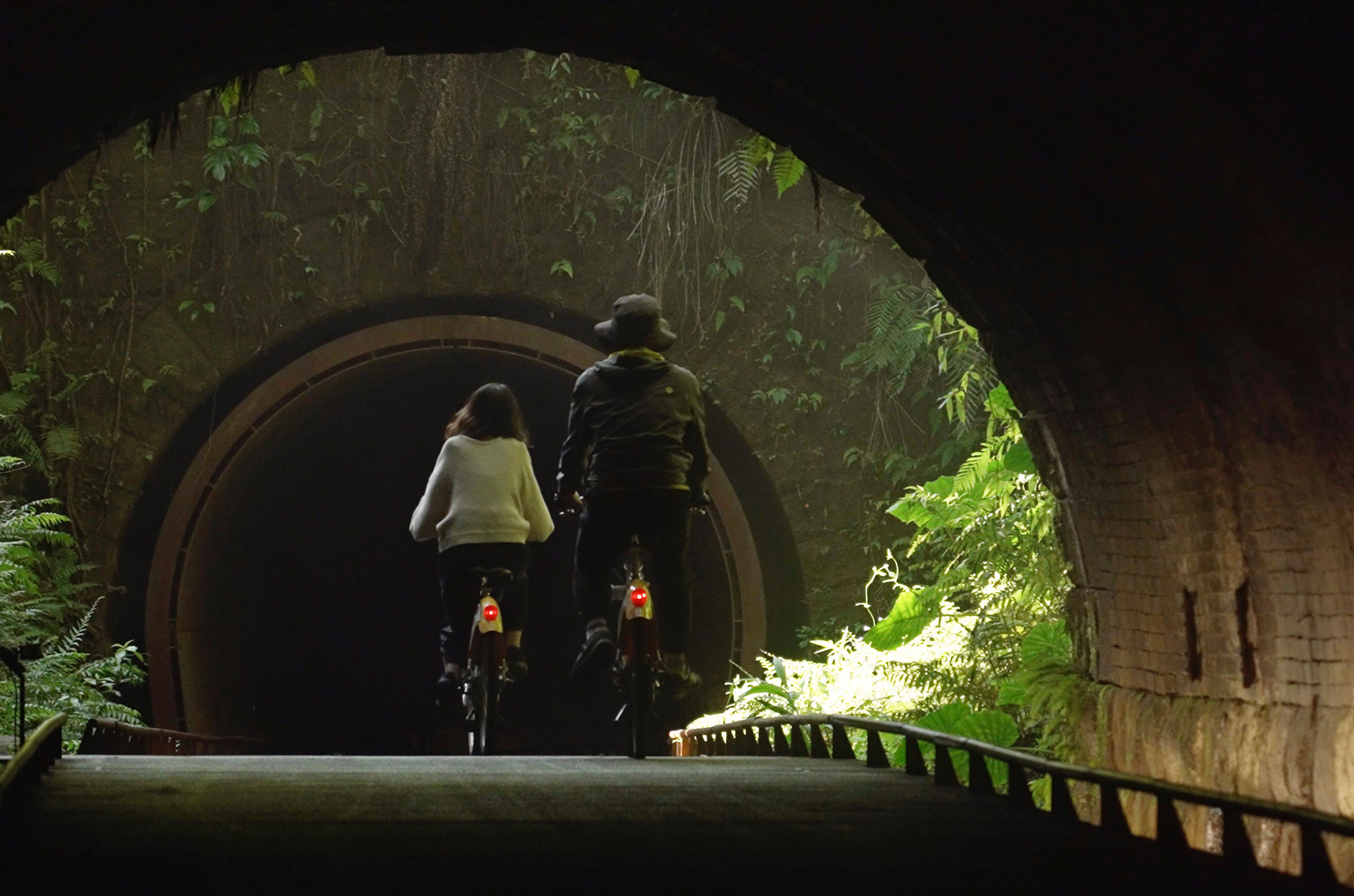
J and R: Well, taking advantage of the fact that you just mentioned one of the latest projects, which is "The Dark Line" in Taiwan, a wonderful project in which we believe that elements of all the projects we have mentioned so far from your entire professional career.
Because it gives rise to the sensitivity of the landscape, respect for environmental integration, adaptation in terms of form, adaptation to detail, limits... in addition to the oriental influence in particular. It could be compared with some engravings related to Asian culture, with these landscapes that we see in Chinese ink, and it can be seen as a certain similarity. We don't know if you agree with this, you have already indicated that you do, but do you think that your recognition in the East and the fact that this project has been selected and awarded there is due to the fact that you understand and project in a way that corresponds to your culture? That is, have you recognized the culture and used the mode of representation or performance that they would use? And on the other hand, how do you manage to balance these aesthetic details with the functionality of the work?
Miquel: Yeah, we try to be very receptive and usually things turn out where you don't expect them to. You are like a sponge, you absorb, you look, you see, and when you refer to these landscapes of Chinese cultures, we really experienced it there in person, that suddenly a waterspout falls on you, it makes you emotional precisely because it is a veiled landscape and it is exactly the same as in the paintings. And then we tried to make something like a veil as well. This place impressed us a lot, we try to do the most intuitive thing and stay with the first impact, you spend four years trying to make that feeling stay and after all the work, which is crazy, it is almost the only goal to make it stay that feeling.
The materiality comes from the idea of recovering what used to be the outline of a railroad track and wanting to look through this materiality, to let it merge with the vegetation and even disappear.
Michèle: It is true that the vegetation is waiting for you, the water, the humidity, it was very impressive for us who were not used to it. We wanted to disappear, but it wasn't easy at all because they wanted to do things and how can you do them without wanting to do almost anything.
Miquel: We usually reproduce what we have encountered, because we see that it has strength and that our intervention is not felt, but it is felt. The place itself already has a personality and a history, so we did not want to impose ours, because there is an attitude of respect or imitation or just trying to reproduce what is there, but in our own way.

Taichung World Flora Exposition 2018-2019 by Michèle & Miquel. Photograph by LU Yu Jui.
J and R: Well, to conclude, we have seen that conceptual elements are collected from the first project to the last. How do these elements evolve or transform as they are applied in different contexts? Is there a conscious intention to maintain conceptual continuity between projects?
Miquel: I think that in our case it was like this "walker, there is no path, the path is made by walking", but now, looking back, we see that yes, there are things that are repeated, it's just that each project is different because each place is different, but there is a way to make sure that it unites all these projects. There is like a system, yes, in all the projects there is only one material, there is only one construction system, there is only one lack.
Michèle: The place makes sense with the material, which makes sense with the way of making and also with the economy, and that gives the final aesthetic. At the beginning we do not intend to do anything, but in the end they are projects that have a lot of power.
Text by José Moreno and Raquel Altares


