The building consists of seven floors built on three underground floors, which have parking functionality. It also has an inverted vault where there is a suspended garden in the heart of the capital. Its structure is made of concrete, carefully implementing interior elements that enhance its image. The different programs implemented, for housing, office and exhibition hall, allow greater versatility for its occupants in a neighbourhood that is rejuvenating and maintaining all its vitality.

Description of project by Moussafir Architectes
In the heart of the Marais, in the 3rd arrondissement of Paris, Jacques Moussafir has completed the rehabilitation of a building dating from the 1970s, transforming it into a mixed-use commercial location with offices and flats.
Inside Outside studio (Amsterdam) intervened in this operation to create a 10m curtain façade.
Restructuring a modern building in the Haut Marais.
This 10-level commercial building designed in the 1970s by the Biro Fernier firm is a rare example in this sector of France's 30-year post-war economic boom. It is comprised of a 7-story reinforced concrete framework on top of a 3-level underground car park built with prestressed concrete technology - innovative for the period - an inverted vault supporting a suspended garden in the heart of the city block and a Mansard roof profile with 6 lucarnes crowning the building, the entire structure is made of shuttered concrete. Although standing amidst a landmarked district composed entirely of protected historic buildings, local authorities (the ABF) determined that it had no heritage interest, thereby facilitating the transformation of both the interior distribution and its envelope.
A neutral and generic structure.
Like open-plan floors without intermediate columns, the principal quality of the original construction resided in its neutral and generic character. It is this overall grasp of the building's structure that guided our architectural choice, from the insertion of interior elements (staircases, guardrails, floor, and ceiling coverings) to the design of the envelope by way of the choice of materials and the details regarding their implementation. Thus, the staircases and guardrails, as well as the façades, were designed as features borrowed from locksmithing, most often suspended and dissociated from the concrete structure in order to highlight the loadbearing role of the original shell in relation to these “borrowed” features.

Restructuring a modern building in the Haut Marais by Moussafir Architectes. Photograph by Hervé Abbadie.
INSIDE/OUTSIDE PETRA BLAISE.
The façade curtain of 5 rue du Vertbois was designed by Inside Outside.
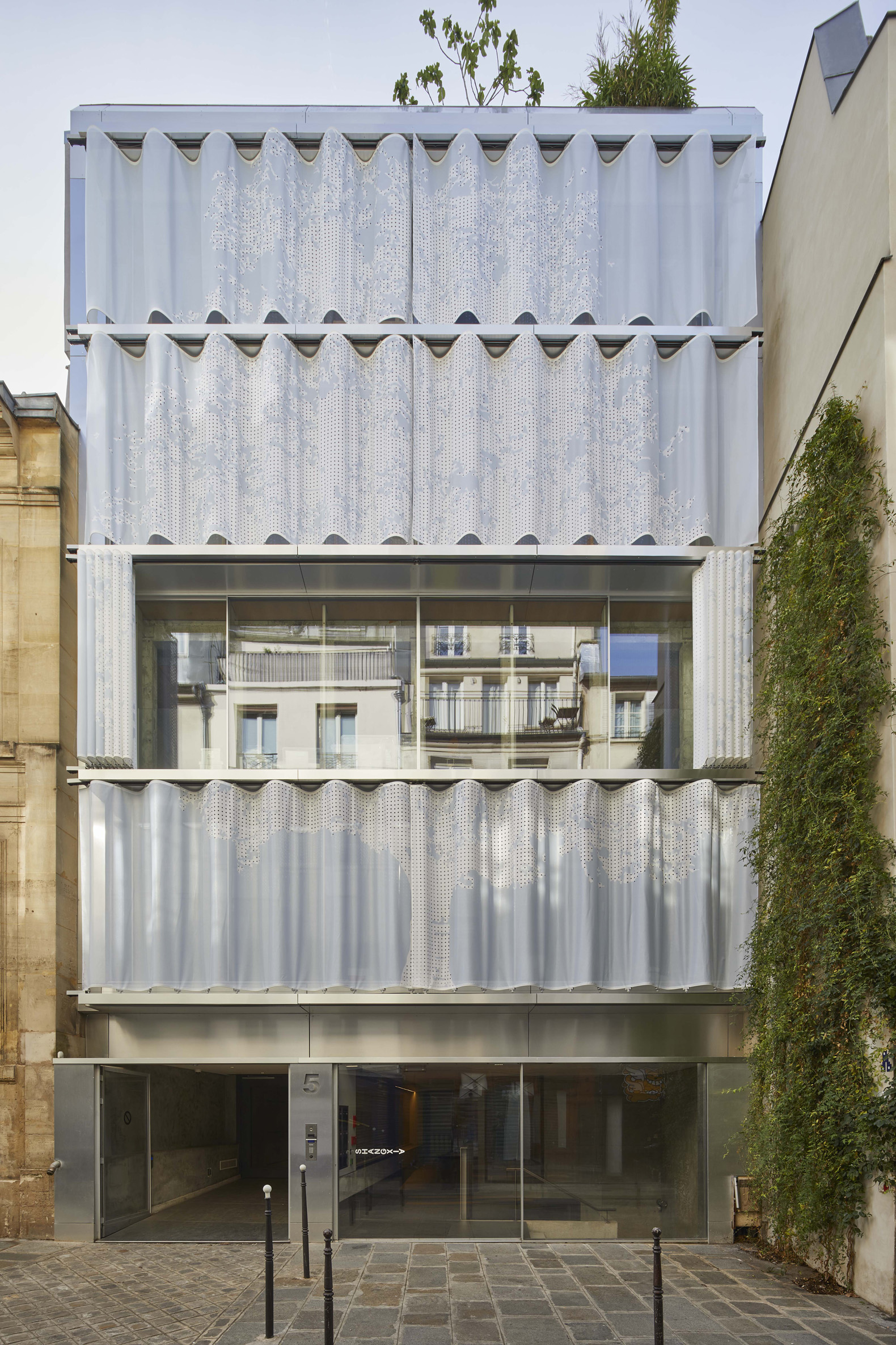
A façade curtain twelve meters in height with the silhouette of a great 'Prunus Lusitanica' (Portuguese laurel) gives new vitality to the Rue du Vertbois. The spectacular result of close collaboration between Inside Outside (Amsterdam) and Moussafir Architects, the exterior curtain covers the façade of this building in the heart of the Marais.
Textile architecture has become the signature of the Inside Outside firm, its flexibility often immediately transforming both the interiors and exteriors. For this project, a shade curtain stretches across the exterior of the glass and steel façade. This curtain, comprised of four independent parts, unfolds over the four street-facing levels. On the one hand, its role is to filter natural light and views while also cooling interior spaces, on the other hand, it dialogues with the building's architecture to put the finishing touches on the façade's composition.
The curtain’s undulating movement can be controlled on each floor as well as the lighting effects across the entire surface of the PVC mesh thanks to the discrete integration of LEDs. Circular perforations define the outline of the tree, rendering the mesh permeable to the wind whilst also casting playful swathes of natural light into the interior. A solid blue-grey composes the image of the Portuguese laurel across all five of the building’s floors. The curtain opens and closes by means of a motorized system with integrated sensors.
Flats like offices.
Like the facade on the street, which has a pitch of 1m36, and the façade on the garden, which is 10 meters long and has no intermediate load-bearing structure, the rationality of the pillar and beam system enabled the transition from a single-purpose to a mixed-use building superimposing housing with offices. Our decision to expose the structure provided the incentive to not differentiate the dwelling spaces from the offices and to design the flats like offices.
Modernist principles and brutalist aesthetics.
In addition to demonstrating the multi-purpose aspect of an ordinary structure, our aim was to assert the relevance of the building’s modernist principles (open plans, grid and façade open to the north, ribbon windows to the south) and to highlight its brutalist aesthetic by enhancing its materiality.
The previous windows inserted in the grid and the stapled stone cladding hiding the structure of the façade have given way to a superposition of uninterrupted vitrines exposing the raw structure. The new façade is suspended from vertical steel plates centred on the concrete columns and hooked onto the edges of the conserved floors. It is removed from the structural grid and it integrates into the interval radiators underneath the interior window sills as well as a double screen made of textiles (curtains in coated canvas) and carpentry (wooden shutters) allowing for a wide range in the degree of light and privacy.
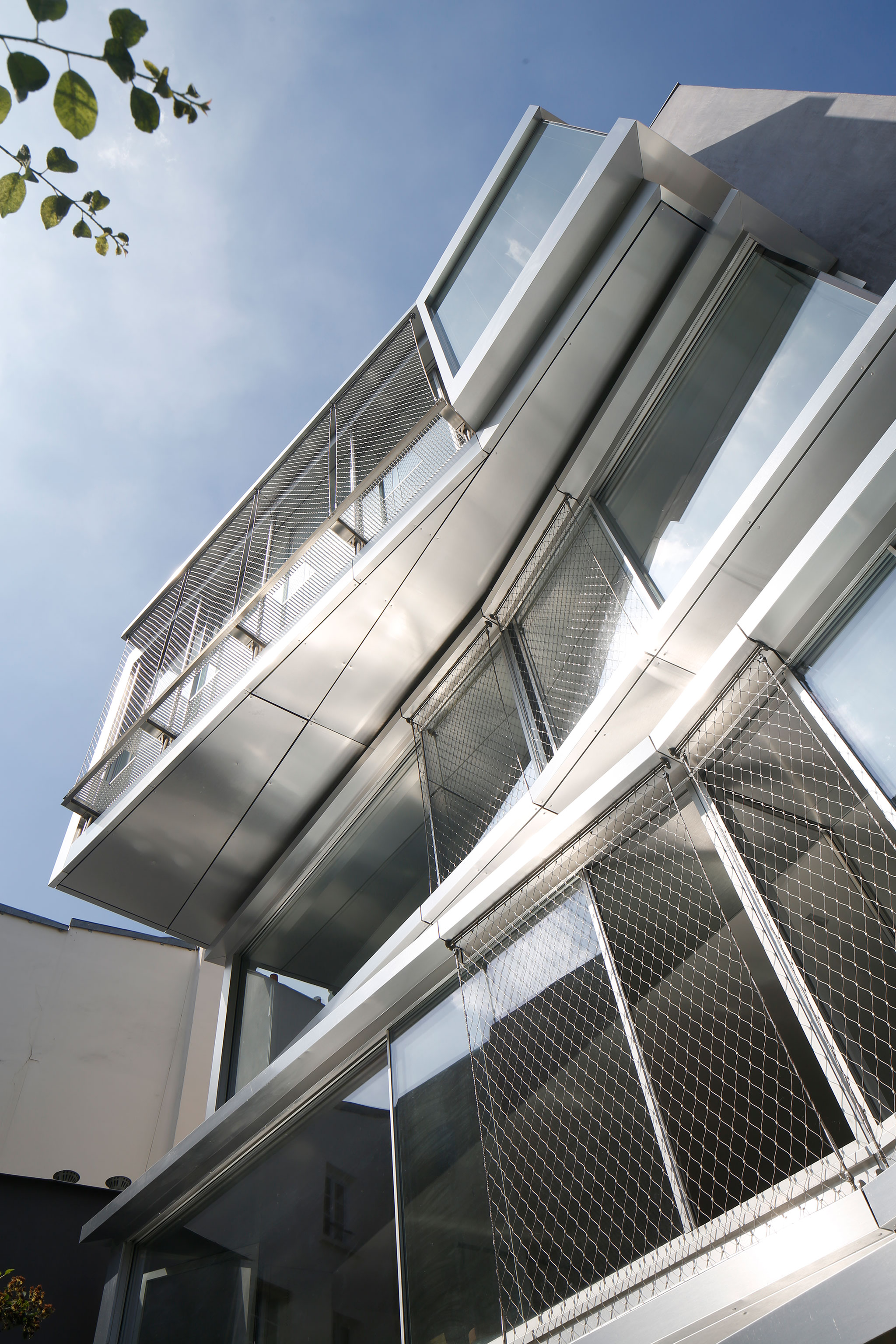
On the courtyard side, the smooth and thin curtain wall so characteristic of the International Style has been replaced by a complex interplay of volumes hanging from the spandrel beams generating intermediate spaces, sort of benches with large windows overlooking the garden and offering various angles of view. The idea is to pass from a diaphanous design of the façade to an inhabited thickness in which one can remain between the interior and exterior, whether standing, seated, or reclining.


