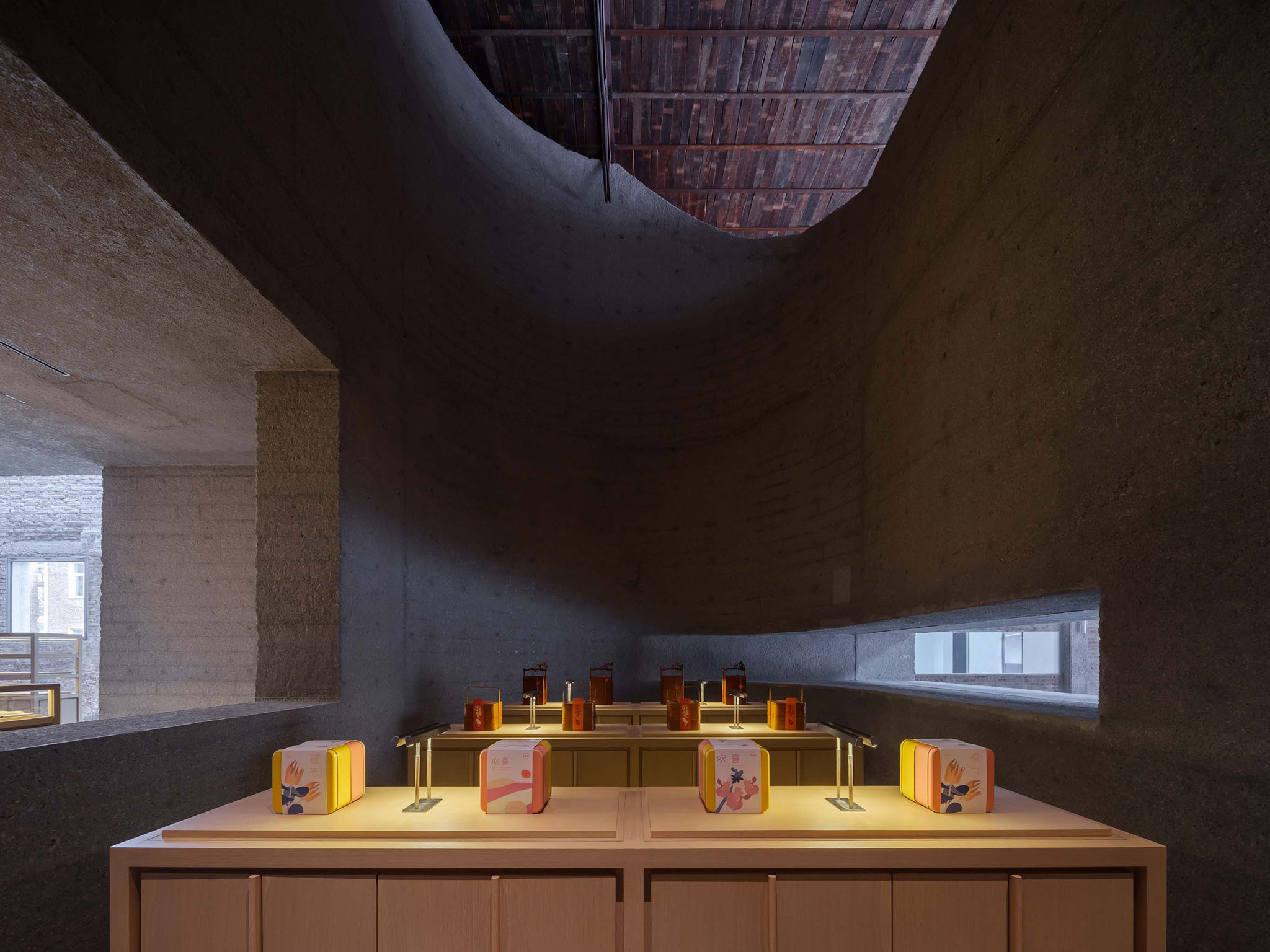
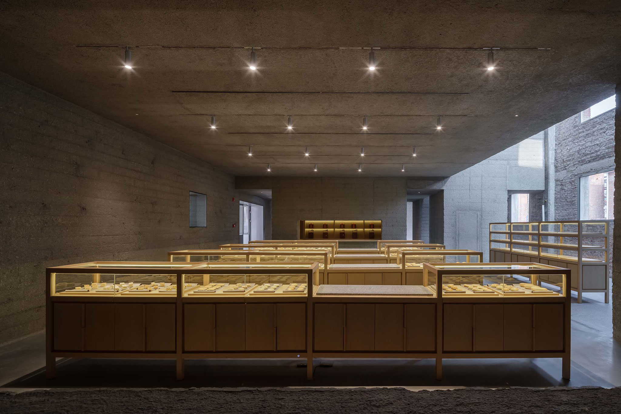
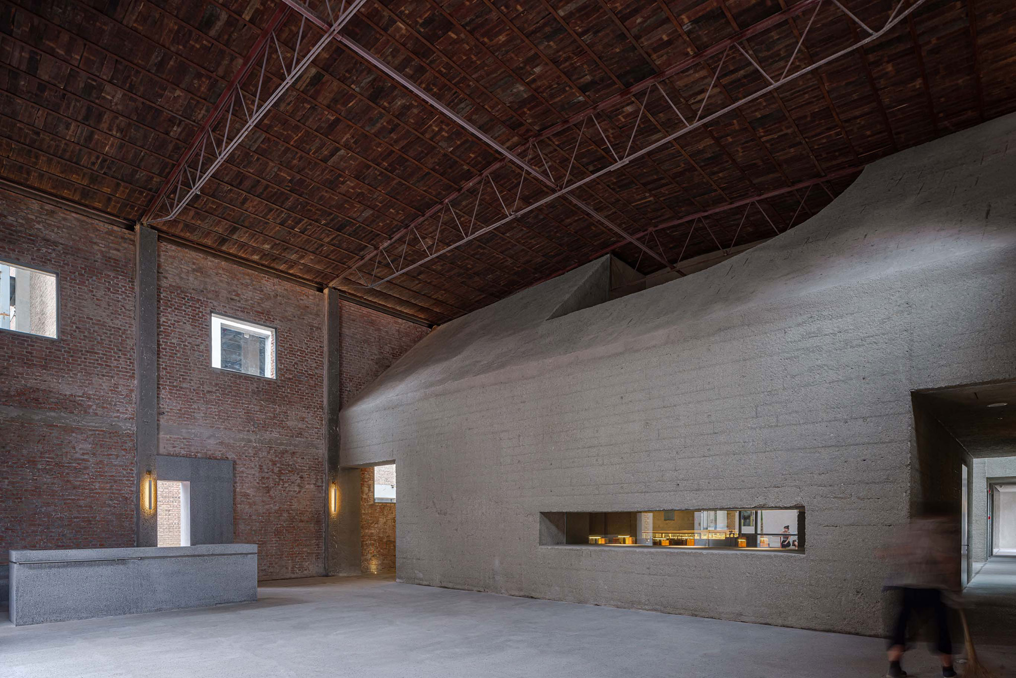
The area created between the new object and the original shell allows for flexible spaces for a cafeteria and a multi-purpose foyer. The ground floor will house the exhibition area, the flagship shop, the garden, and the café, while the first floor is mainly the headquarters and offices.

Lao Ding Feng Beijing by Neri&Hu. Photograph by Zhu Rhunzi.

Lao Ding Feng Beijing by Neri&Hu. Photograph by Zhu Rhunzi.
Description of project by Neri&Hu
Near the Northeast 5th Ring Road in Beijing, the project site is part of a once thriving industrial area with its own train depot called the Langyuan Station. In the past, it was used for transporting goods in and out of Beijing.
Today the neighborhood is undergoing a transitional phase, and Neri&Hu was called upon to design the adaptive reuse of an old warehouse building once used for cotton textile production for the main office and retail concept store for the historical Beijing pastry brand called Lao Ding Feng founded in 1911.
The original brick structure is composed of a main warehouse and three annex buildings, plus a courtyard garden. For projects like this, Neri&Hu’s strategy always begins with a thorough investigation of what parts of the building at present may be kept and restored, while any new additions should not only respect the existing, but also stand in contrast to it, so that a clear distinction may be drawn between old and new.

Lao Ding Feng Beijing by Neri&Hu. Photograph by Zhu Rhunzi.
The design concept is inspired in part by the client’s main product, traditional Chinese style pastries often formed in a decorative mold — the notion that a container may hold or form the shape of its contents within. Here, a new cast concrete object is molded into the old brick shell, its various openings and negative spaces form the main retail, gallery and office spaces. After pouring the concrete and allowing it to cure, specialized craftsmen then bush-hammer it for a soft textural quality that both contrasts with and also compliments the old bricks. In certain moments, the new inner concrete will seep out and appear on the façade to fill in the voids or indicate new access points. The gap spaces between the new object and the original shell become flexible areas for a café and multipurpose lobby. The ground floor contains the exhibition area, the flagship store, the garden and the cafe while the second floor is mainly the head office.
Traversing through the new concrete object and experiencing the interstitial spaces between the new insertion and the old building brings a sense of connectivity between past, present, and future and gives this historical Beijing pastry brand a new home.


