The new narrative structure is summarized in two sections A and B. Section A is made up of layers 2 and 3, the second layer is made up of the children's reading area. In the third layer, there is a skylight that permeates the interior. The atrium ceiling is projected in a way that creates a metaphor in which the library is the temple of knowledge. Section B belongs to the mezzanine, an intimate reading area where you can see the different stairs.
The library has become an engine for the reactivation of the community and the city. After its inauguration, in two months, it has been visited by more than 180,000 people who have never been in a library before.
For the first time in the city's history, a place of public interest became the city's first and most attractive landmark, once again highlighting the Zikawei shopping district, which had remained hidden from the rest of the city, for a long time. That is the magic of a library. This is the magic of Shanghai.

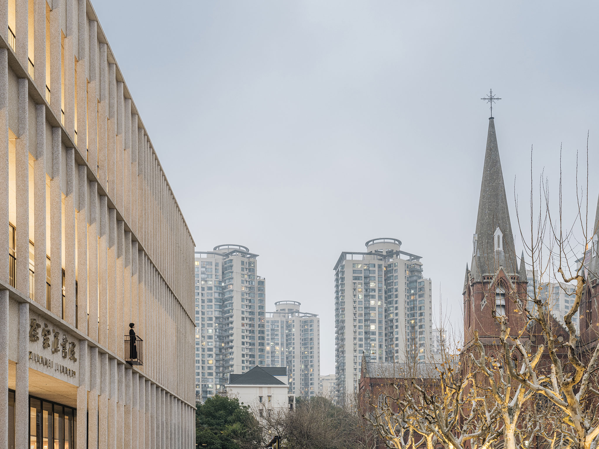
Zikawei Library by Wutopia Lab. Photography by CreatAR Images.
Description of project by Wutopia Lab
At the beginning of 2023, the Zikawei Library, designed by Wutopia Lab for four years, was officially opened. Coming to be the most sensational cultural landmark in Shanghai, it was also the first time that the project was known to the whole city before the official announcement from the studio. Now, this article is more like a summary instead of its unveiling.
Before it became the Zikawei Library, the building was designed as a bookstore by David Chipperfield Architects. Unfortunately, just after the facade and the structure of the building were completed, the building was left vacant. After two investments of the bookstore had bowed out, this building was eventually designated to be the public library in Zikawei District and named the Zikawei Library.
Wutopia Lab's Magic
Wutopia Lab, as an architectural firm, wants to do interior design from a different perspective. Rather than putting makeup on the original structure, we develop a new spatial narrative based on the characteristics of the project to implant or dissolve the original architecture, thus creating a nouveau experience known as magical realism.
The original building has a three-story atrium with a mezzanine on both sides. This classical atrium occupies the centre of the central axis. We want to avoid this classical-centred narrative, nor do we want to completely neglect it.
In his book Underland: A Deep Time Journey, Robert Macfarlane observes that the burial of uranium waste from nuclear reactors: people seal the spent uranium cores in zirconium rods in copper columns, which are embedded in iron cylinders, at the same time, iron cylinders encased in bentonite slurry, and finally store them deep underground in rock formations, thousands of feet deep in gneiss, granite, or rock salt. This seems to be a common procedure in human societies to preserve important objects. This is the structure of the "Chinese boxes within boxes" with its nested layers, which inspires me to implement the classical-centred order as well as create a new narrative.
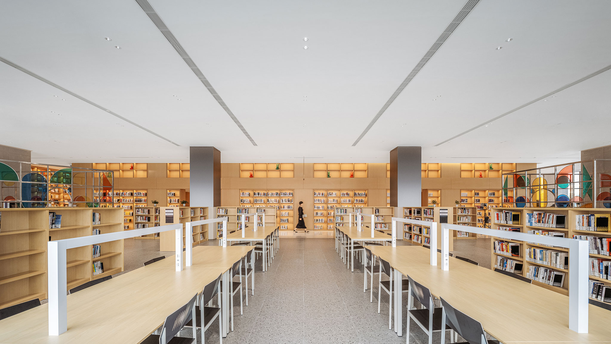
Zikawei Library by Wutopia Lab. Photography by CreatAR Images.

Zikawei Library by Wutopia Lab. Photography by CreatAR Images.
We create a "Chinese nested box" structure in the Zikawei Library, which is derived from the traditional Chinese trousseau box in the Han Dynasty. The first layer of the box is the thin façade designed by DCA; the second layer consists of the main programs of the library such as coffee, various reading areas, lecture halls, exhibition halls, etc; the third layer is the doughnut-shaped aisle; the fourth layer is the atrium that serves as the library's reading hall; and lastly, the heart of the library, the last protected treasure of the box structure.
This narrative structure translates into space, where the 2nd and 3rd layers can be seen as part A and the 4th and 5th layers as part B. As for the outermost façade as the outer skin of the set, the inner set can be expressed independently in design without being influenced by its architectural language. And the treasure on the fifth layer does not constitute a spatial meaning, but it does exist to complete the symbolic meaning of the box set.
Then what could be the treasures collected in this set box? Since the Zikawei Library was once going to integrate the Tou-Se-We Museum, the pagoda from the Tou-Se-We was introduced here. As a library, it should also contain its own iconic representation, a reading table. We put in a reading table which is close to 30 meters, the longest in Shanghai. Together they both reinforce the central axis, also becoming the most important treasure in the Chinese nested boxes.
According to Wutopia lab's dualism strategy, once the two main structures of A and B are sorted out, parts A and B can be used as opposing sentences of each other. A, as a packaging set of boxes, can express solidity with concrete, terrazzo and paint. B, as a storage set box, can express lovingly with the warm wood tone.
In the A area, it is also necessary to finely distinguish the 2nd and 3rd layers with paving and grey variations and nest smaller boxes in the main functional area as a library. On the second floor, the cafe is a round island, the children's reading area is a round centralized seating reading area, and on the second floor, a stained glass box taken from the glasswork of Tou-Se-We is embedded as a resting area. On the third floor, the skylight left by DCA combined with lighting is designed as a resting sofa between the 2nd and 3rd layers of boxes.
In the B section, the mezzanine on both sides of the atrium is designed as an intimate scale reading and display area. This enriches the structure of the nested layers. In order to strengthen the visual, at the junction between the two areas, the flooring and ceiling are made beside, so that the two areas could each form an independent visual expression.

Zikawei Library by Wutopia Lab. Photography by CreatAR Images.
The B area, where the treasures are collected, exhibits a sacredness. In this regard, the architects borrowed the basilica, a typical spatial type of Catholic church in the neighbourhood of the library, to sanctify the atrium. The atrium ceiling is designed as an arch to complete the symbolic interpretation of the library as a temple of knowledge for people nowadays. The arch-form language is replicated on the first floor to form a continuous spatial expression, further divorcing the interior narrative structure from the facade construction logic to better fit the narrative of the Chinese set box. And because the Tou-Se-We Museum did not end up incorporating the library, we didn’t introduce the pagoda into the atrium. In the end, the decision was made to print a modern design rewritten pagoda in 3D printing as the culmination of the axis. In this way, the Western basilica and the Eastern pagoda, the traditional wooden structure and the modern printing technology as a pair cleverly completed the proposition, combining East and West and blending the ancient and the modern. Thus the symbolic meaning of Zikawei as the source of modern Chinese science is sublimated in the structure of the nested Chinese set of boxes in layers.
Library's Magic
Wutopia Lab believes that any interior should be designed from an architectural perspective, to actively interact with the city. The Zikawei Library is the public library in the Zikawei district, rather than a research library. It should be designed to build a stronger connection within the community. Therefore, instead of a closed and inward-looking cultural place, the Zikawei Library should be more welcoming, not only to attract people who read but also to those who don't.
The atrium showing from the facade would be a good opportunity to welcome people. We designed the atrium to be a warm lighting open space, visible through the colonnade behind the translucent facade, to offer a soothing island for people who travel in the unsettling sea of the metropolitan.
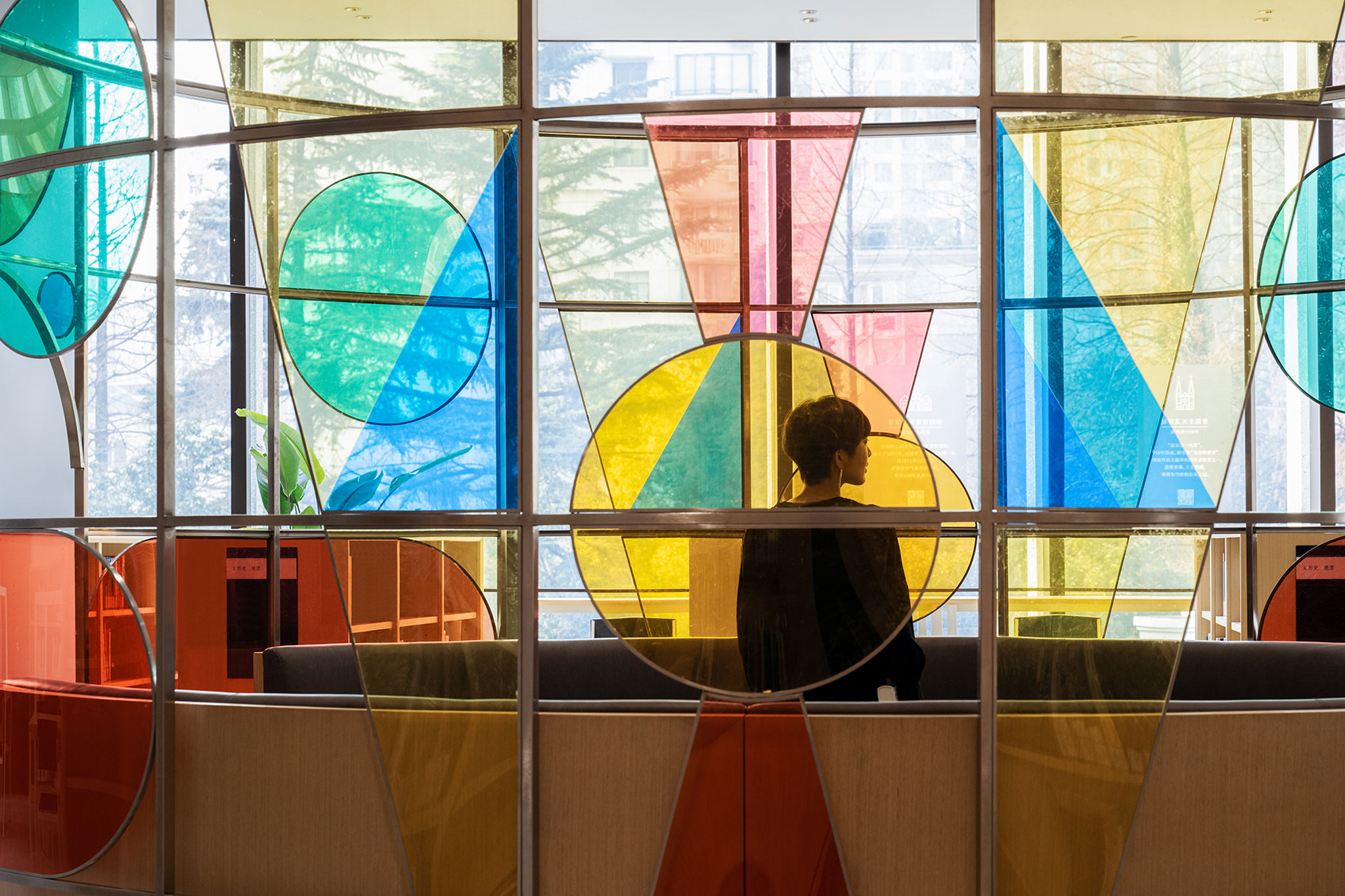
Zikawei Library by Wutopia Lab. Photography by CreatAR Images.
The openness in a library should not jeopardize the reading experience, therefore, we took advantage of the wide balcony left by David Chipperfield and changed it into a step seating area to provide more public reading spaces. The bookstore faces an exquisite city street square. We looked at the square as a stage and the stepped seating area as a theatre where readers sit as the audience. As "You stand on the bridge viewing the sight; You're beheld by the viewer from height" (Part of Article, Bian Zhilin, 1935), the interaction between the two interrupts the rigid façade.
The client asked for a cantilevered balcony from the colonnade, which would break the rhythm of the original façade. After a lot of testing and deliberate thinking, we designed a tiny step on the side of the balcony on the second floor for people to step out. This tiny step provides a vast view into the city, as if in the air, just like the tiny step we took to change our whole perspective on life.
A welcoming library re-activates the community and renews the city. The Zikawei Library was more popular than we expected, with 180,000 people flocking to the library in two months, including many who had never been to the library before. For the first time ever, a place of public interest became the first and hottest landmark in town and drove the Zikawei business district, which had not been in the city's view for a long time, into the spotlight again. That's the magic of a library. This is the magic of Shanghai.
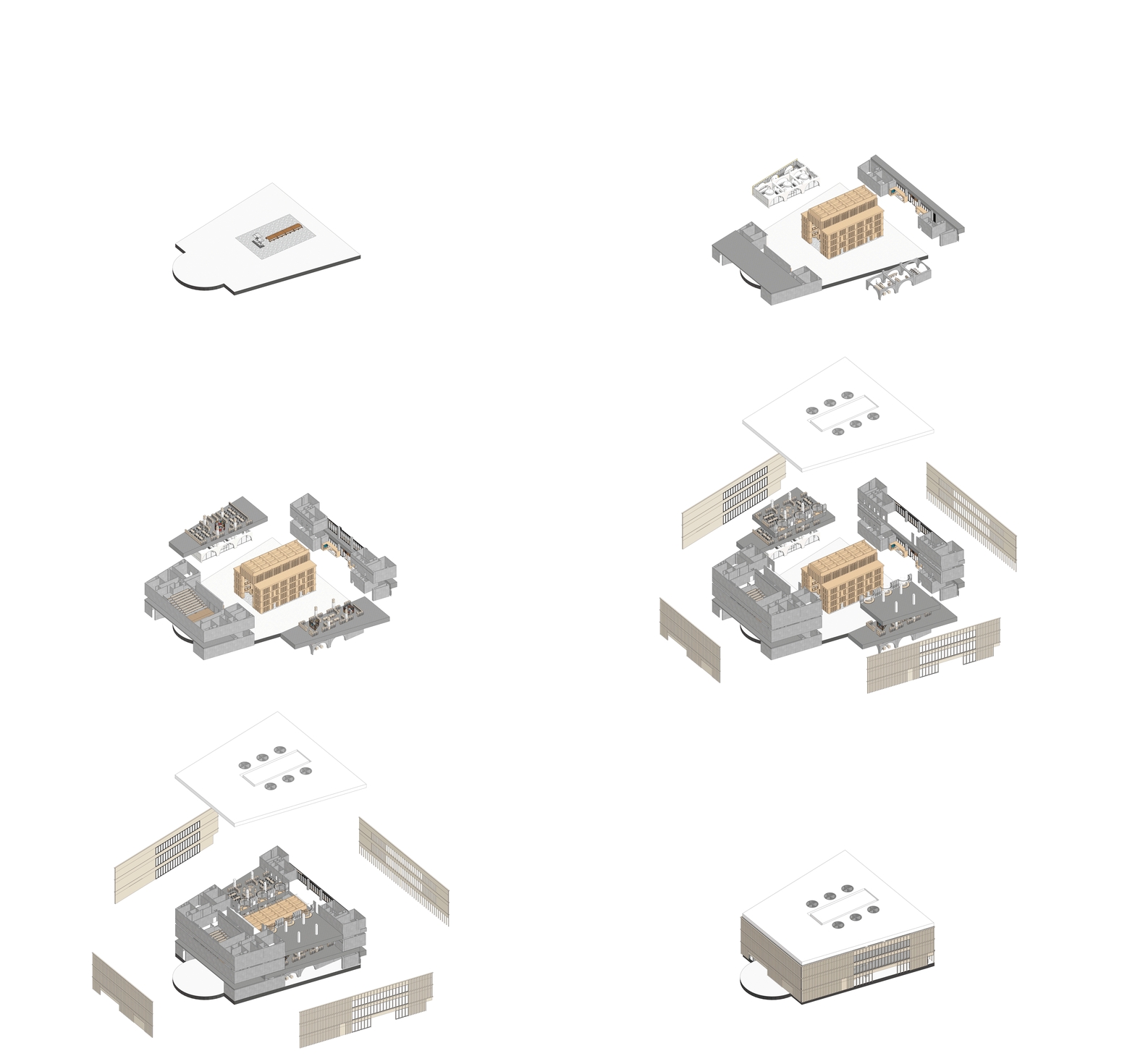
Axonometric view. Zikawei Library by Wutopia Lab.


