Rem Koolhaas announced in his Biennale presentation that he was determined to deliver to a Now-for-Something-Completely-Different moment and he certainly did not disappoint us. Some speak of the curator's legions of fans and warrant that they are former or current students, a somewhat inconsistent statement if we consider the time Rem Koolhaas devotes to teaching compared to other architects who don't count with such number of followers. That is to say, something else must have the Dutch architect's discourse that makes his ideas and achievements to have had such an echo in the last decades, a fact even his detractors acknowledge with dismay.
However, if we speak about legions, those of curators attending the show are very well known. Exceptional architects, some of them invited by the general curator, others by pavilions and exhibitions and there are even others who pay to participate. The impressive displays exhibited at the Giardini, the Arsenale or scattered in different buildings and corners throughtout the city of Venice account for recognition as the largest architecture exhibition in the world.
The event is so large one could say there are two Biennales; one consisting of the exhibition areas and pavilions which address or attempt to address the issue raised by the curator, and another one formed by the remainder, but beware, generalization must not confuse us, in that remainder there are also many gems that stand out.
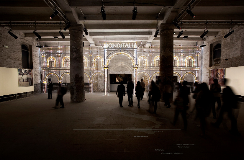 Monditalia. 14th Mostra Internazionale di Architettura, Fundamentals, la Biennale di Venezia. Photograph © Giorgio Zucchiatti. Courtesy of la Biennale di Venezia.
Let us continue a little more before reaching the particular. It is true that statements taken out of context, like the following, have served as ammunition against the curator.
“Architects’ reputations and expectations are largely based on their supposed uniqueness, but we actually assemble elements that have largely been defined by others, mass produced in series, offered in catalogues on the internet, and put together by increasingly indifferent labor... We may posture as geniuses, but we play our assigned role in the uberscript of modernization.”
Rem Koolhaas.

Radical Pedagogies: ACTION-REACTION-INTERACTION. 14.Mostra Internazionale di Architettura, Fundamentals, la Biennale di Venezia. Photograph © Francesco Galli. Courtesy of la Biennale di Venezia.
Stating that one can only be original through "absolute originality" is like actually recognizing the impossibility of moving on, so to say, it implies a too pragmatic connotation. But this statement also sends a clear and notorious provocation which is necessary in order to support the ideas raised in the exhibition and, let us not forget, it is actually used regularly by the great public outside the bombastic speeches of "firmitas, utilitas, venustas" (stability, utility and beauty). Many yearn and don't forgive Koolhaas for not taking half measures, gray or intermediate areas to save previous speeches, but many are mistaken since half measures are not enough against the discourse of the fashion catwalks of architecture stardom.
The Anti-Modernists sob when talking against Modernism and long for the alleged diversity of Postmodernism, the individualization, the prevalence of the strongest and the one with more resources. It is true that Modernism being manipulated by speculators showed an attitude of Tabula Rasa towards diversity. However, in Postmodernism, with its egocentric individualism promoted by autistic Taifa kings, in a territory mined with individualities that led us to the current crisis, the situation is once again the same; the authors of the "pensée unique" stigmatize everything they can't control.
This crisis, like all crises, is a turning point that forces us to rethink what clearly didn't work and to some extent left us naked before our future.
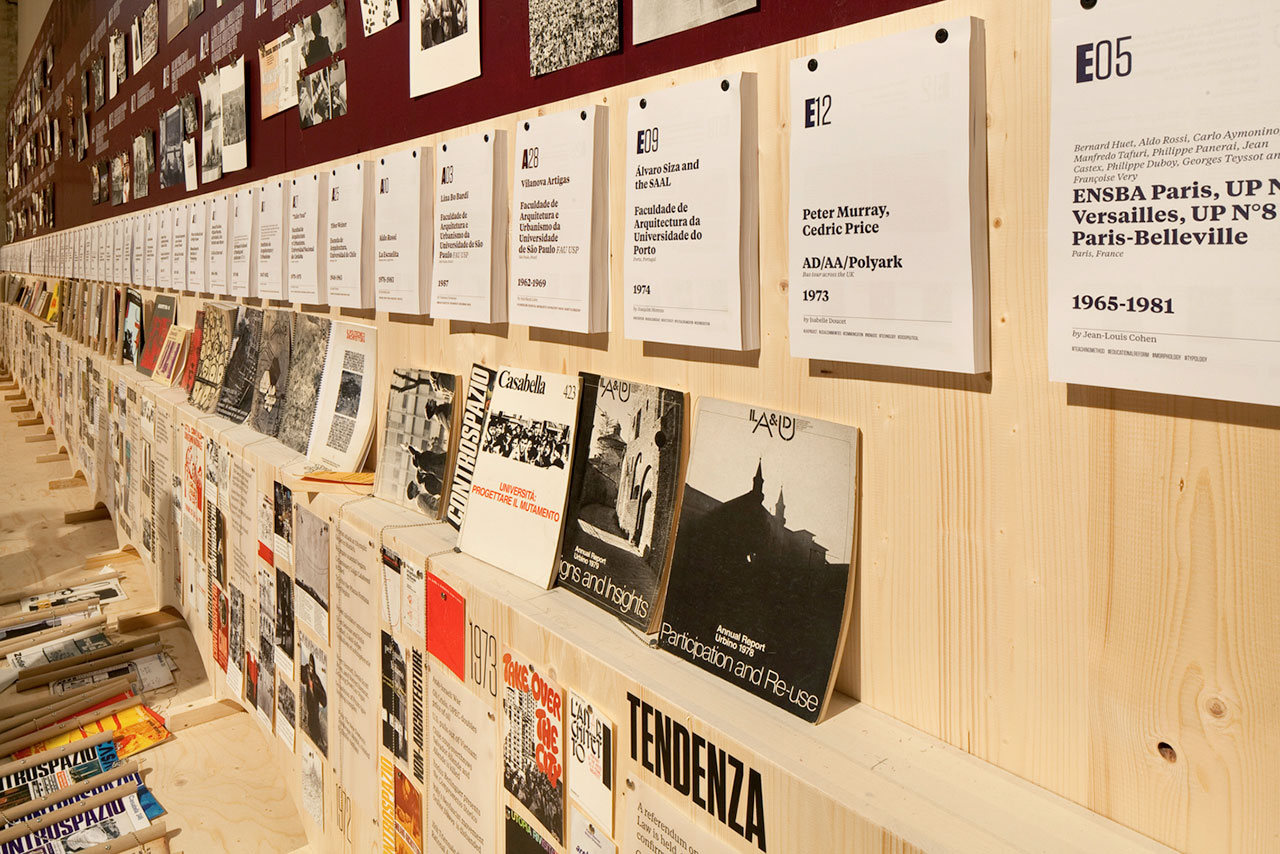
Radical Pedagogies: ACTION-REACTION-INTERACTION. 14.Mostra Internazionale di Architettura, Fundamentals, la Biennale di Venezia. Photograph © Francesco Galli. Courtesy of la Biennale di Venezia.
The Biennale meant a clear generational cutoff. In Spain this cutoff was very clear, the new ways to organize, think, and design architecture prove this, deeply marked by disaffection towards the institutions that are supposed to support architects, as I have already mentioned on other occasions. In this Biennale, criticism came mostly from representatives of a generation that is over 60 years old and the young people who are running to inherit the throne. They are a generation with an established career as can be appreciated on the videos by Domus magazine (an excellent repertoire due to the broad and diverse radiograph carried out, featuring significant architecture figures at the Biennale) or in many of the authors who critically wrote against the Biennale.
I have no intention to discuss here grammars, languages or encrypted codes of architectural realization and behavior that only the Any-acolytes are interested in. The fantastic thing about this is that for the first time there are two clearly distinct positions. In addition to the generation gap, the arguments are so brutally distinct that it is almost as if we were speaking of two opposed worlds.
Some are unable to establish an argumentative discourse that explains why the Biennale is having such echo and scope and try instead to see the supposed anarchic chorus of some pavilions as a revolutionary response. Some insist on making us see the naked king fully dressed. Surely the same who spoke critically about some pavilions' autism when on previous occasions the response was mostly a cacophony. These claimants have little memory. What short memory to remember what happened in the previous Biennale, in the one before the last, etc! They are also those who having participated in the protests of 1968 ended up on the boards of the banks that caused this crisis.
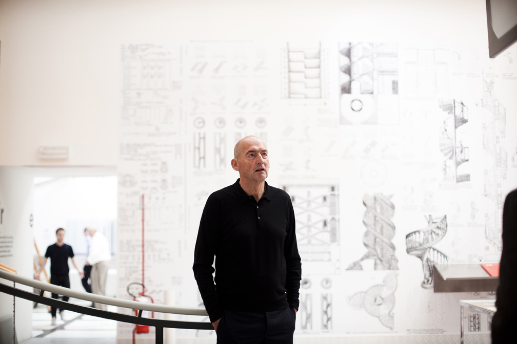 Rem Koolhaas. 14th Mostra Internazionale di Architettura, Fundamentals, la Biennale di Venezia. Photography © Giorgio Zucchiatti. Courtesy of la Biennale di Venezia.
65 pavilions and failed insurgency.
Besides these general views, sometimes densely discursive and lacking clear critical objectives, analysis on the outcome of the national pavilions, which had to respond to the issue raised by the general curator, has been seldom. We have already commented in other biennales that the answer is often characterized by an almost complete autism, usually only very few truly give a reply and generate an interesting conversation with the viewer.
In this minefield full of localisms and in which it is easier for close colleagues to provide a direct answer (agreeable or offensive), comments or reflections have been nonexistent. Among the few thoughts published it is worth underlining Michael Eisenbrey's - Berliner editor and writer - article Three Lost Days at the Biggest Architecture Show in the World, a tough title. The content reflects a lot of what many others aren't prepared to admit and does not focus on the sixty-odd pavilions scattered throughout the city, but on the seventeen national pavilions invited by Koolhaas to give an answer to the Biennale's theme.
After a first part devoted to the identity of the city of Venice and to letting us know that the visit was made together with his girlfriend (and agreeing with Michael Eisenbrey on the fact that it was not possible to visit the Biennale in three days), he comes to pay recognition to the accomplishments of some of the pavilions, starting by highlighting the Korean pavilion:
The Golden-Lion-winning Korean pavilion was engaging and thought-provoking, packed with maps, models, graphs, and films that probe the politics, geography, and architecture of the two Koreas.
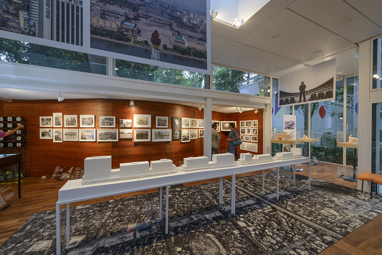 Korea, Republic of Crow’s Eye View: The Korean Peninsula. Photography © Andrea Avezzù. Courtesy la Biennale di Venezia.
It continues by highlighting the Nordic Pavilion themes, which focused on Scandinavian architecture in East Africa during the Cold War period, to continue with the Dutch pavilion and the retrospective on the work of Jaap Bakema. Both, according to the author, were reminders of "the ambition and optimism of postwar modernism — two things that are sorely lacking in architecture and public life in general today." Another outstanding pavilion was the Russian one, positively described as an amusement park, with an attractive and fun presentation, great creativity when compared with most of the other pavilions, stripping Soviet Modernity from its communist stigma and reviewing it from a contemporary perspective.
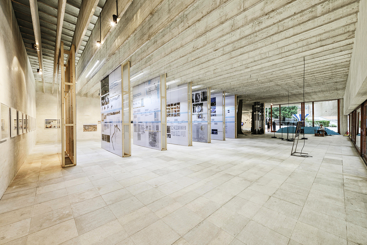
Nordic Pavilion (Norway, Filand, Sweden) Forms of Freedom. African Independence and Nordic Models. Photography © Andrea Avezzù. Courtesy la Biennale di Venezia.
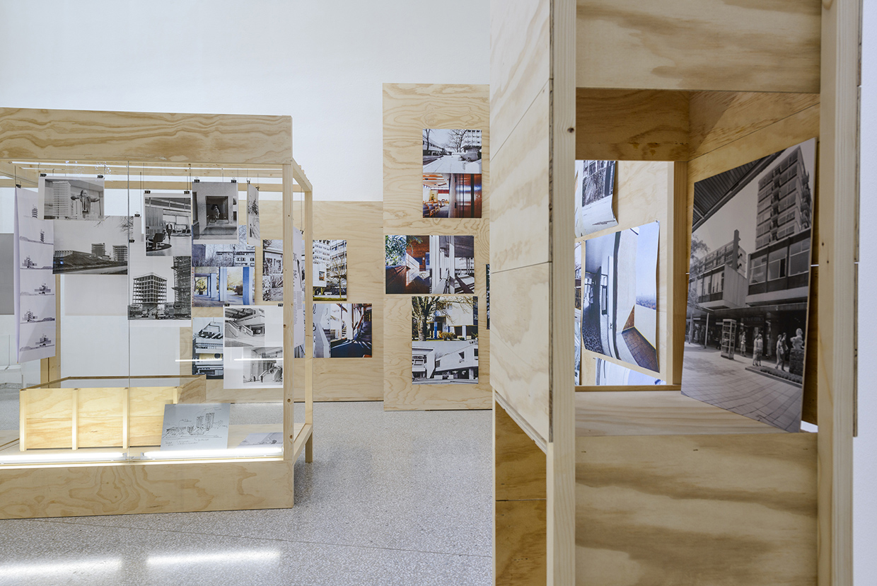
The Netherlands, The Open: A Bakema Celebration. Photography © Andrea Avezzù. Courtesy la Biennale di Venezia.
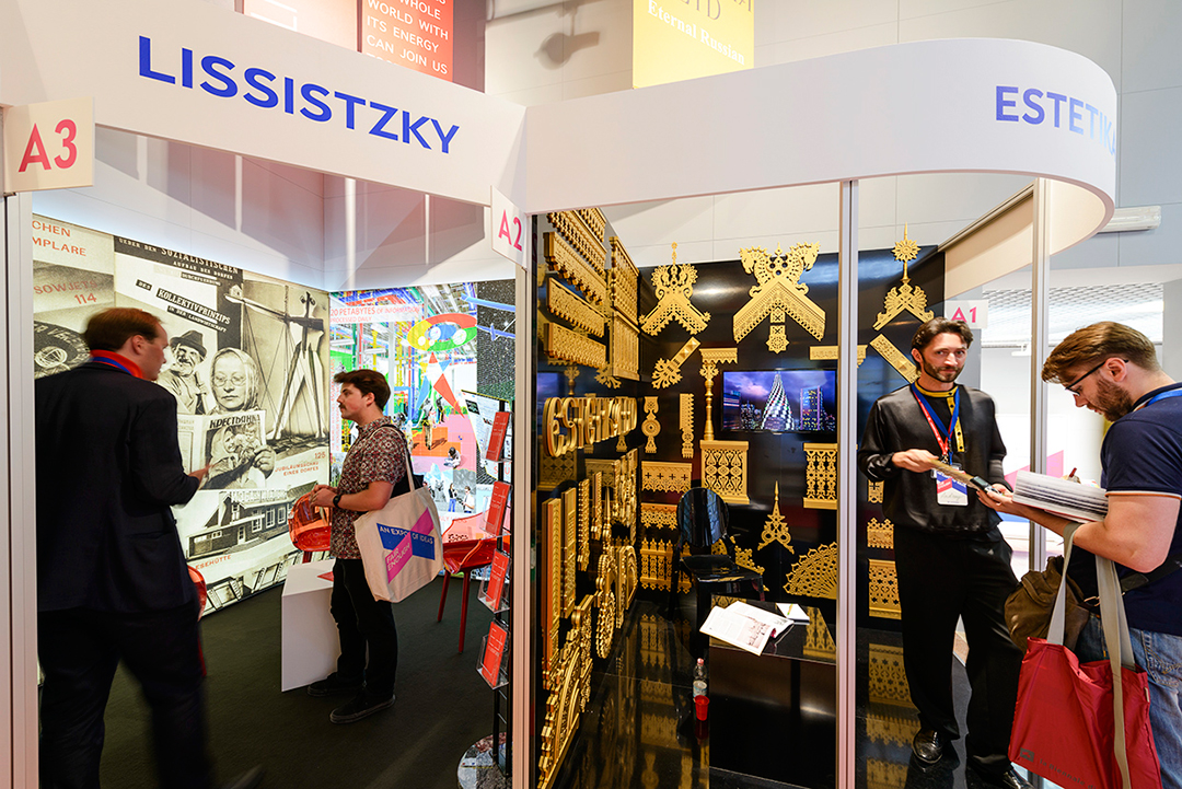 Pabellón ruso. RUSIA. Fair Enough: Russia’s past our Present. XIV Mostra Internazionale di Architettura, Fundamentals, la Biennale di Venezia. Photograph © Nikolay Zverkov. Courtesy la Biennale di Venezia.
From here, it highlights how the captivating story of the Russian pavilion is a mere exception given the limited ambition of other pavilions, including some which not even seemed to be completed. The description of this second part begins with the Israel pavilion and the total disconnection between the texts on the walls and the robots on the ground.
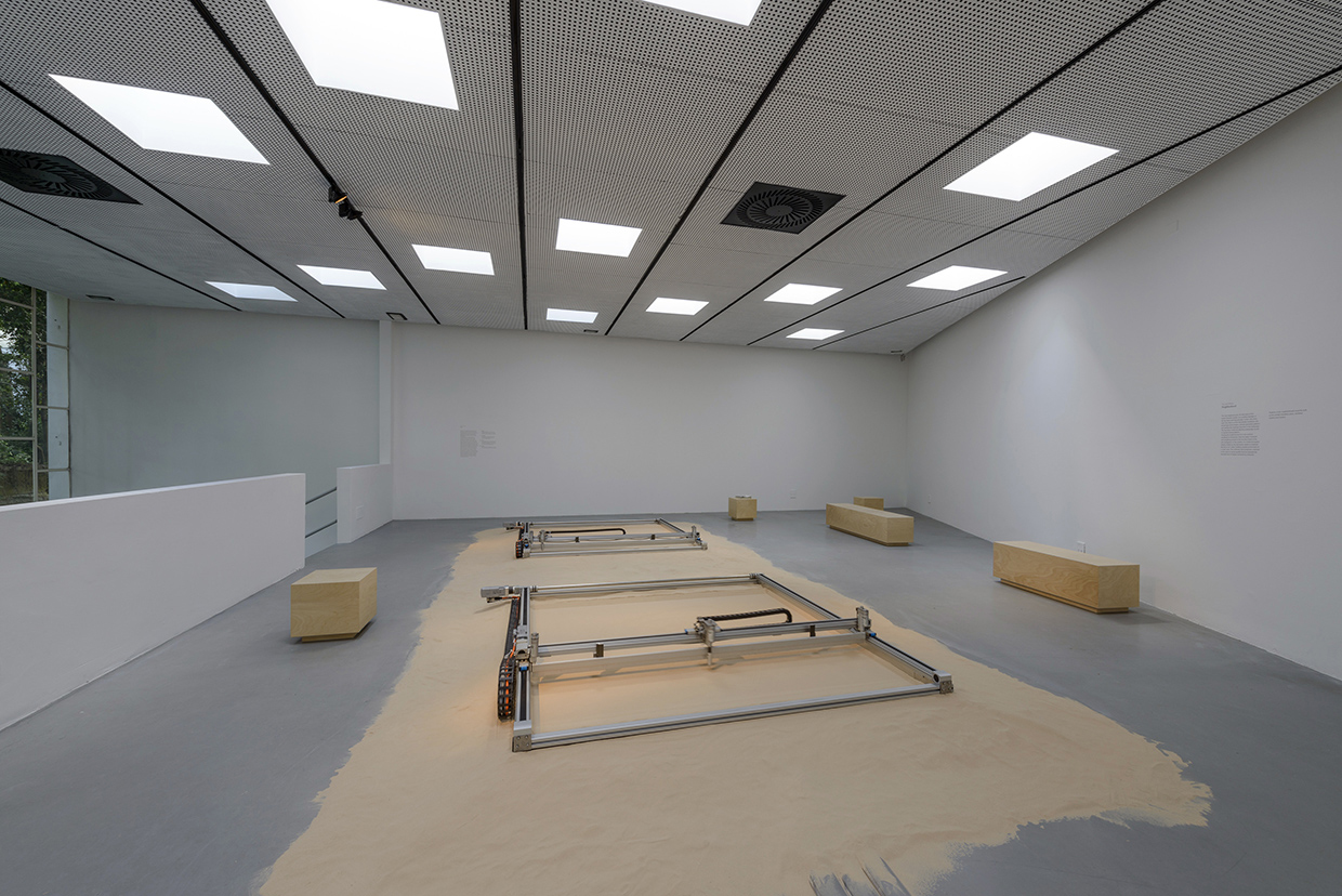
Israel. The Urburb. Photography © Andrea Avezzù. Courtesy la Biennale di Venezia.
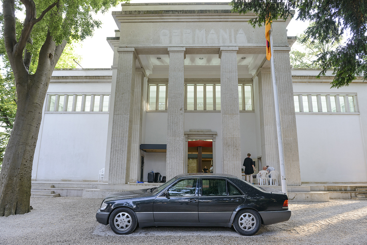
Germany. Bungalow Germania. Photography © Andrea Avezzù. Courtesy la Biennale di Venezia.
The German pavilion is criticized for its outdated content and I'd rather literally transcript the words about the Spanish pavilion.
The Spanish pavilion consisted of several rooms of attractive, large-format photographs of the interiors of contemporary Spanish buildings. The text introducing the exhibition was complete gibberish: three paragraphs of word salad about dialectical this, the vindication of that, and "maximized intensity." What did it say about Spain, modernism, or architecture? Who knows?
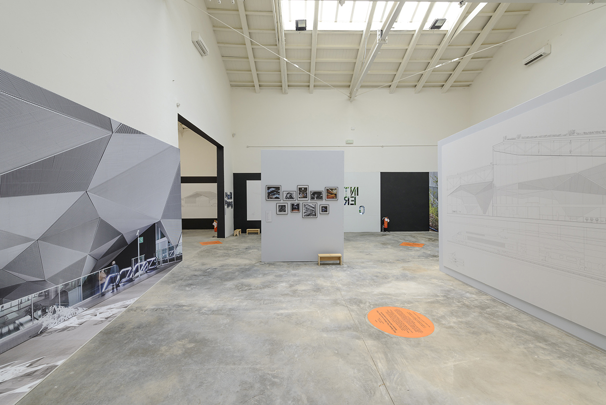
Interior. Spain Pavilion. Photography © Andrea Avezzù. Courtesy la Biennale di Venezia.
It might be extremely harsh criticism on our pavilion, although it did not refer to what was displayed but to the discourse that linked the 20th-century architecture and the current. Although it must be said that, from a distance, for others like Sarah Williams Goldhagen, the links raised were very pertinent.
Michael Eisenbrey’s pavilion tour continues, wondering why some pavilions showed an unfortunate typography in their texts (sometimes only cards that had fallen off the wall and seemed to have been nailed back with the sole of a shoe). Similarly, "the charming Danish exhibition, for example, was marred by a badly edited text on the wall. A piece that referred to the great engineer and Roman architect "Vitrovius." Michael Eisenbrey's comments on such errors at an Architecture Biennale in Venice are truly blatant.
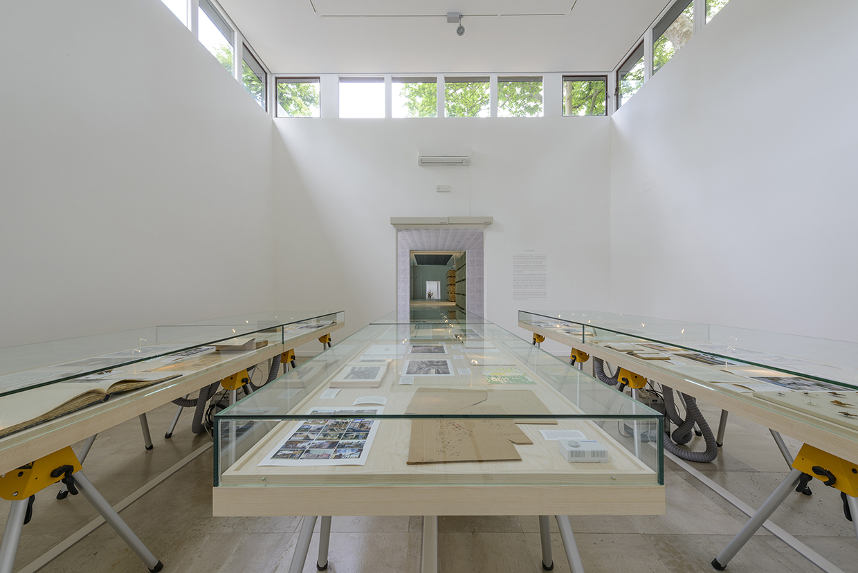
Denmark. Empowerment of Aesthetics. Photography © Andrea Avezzù. Courtesy la Biennale di Venezia.
Nowhere was this more evident than at the British pavilion, a hazy exercise that pushed Byron, A Clockwork Orange, the London Blitz, and J. G. Ballard into the same frame. Squinting at them and having nothing substantial to say, it invited the visitor to connect the dots. "It doesn't offer answers," acknowledged the Guardian’s Rowan Moore in a glowing review, "but the questions it raises are pertinent. You couldn't ask for more than this." Can’t we? The main questions raised by the British pavilion - isn’t modernism dead? Hasn’t social housing failed? - are a tacit endorsement of the Tories’ agenda: burying the welfare state, leaving the poor to fend for themselves, and celebrating this neglect as "devolution of authority" and DIY-ism (Owen Hatherley, a staunch defender of modernism and public housing, left the curatorial team in March, claiming differences of opinion).
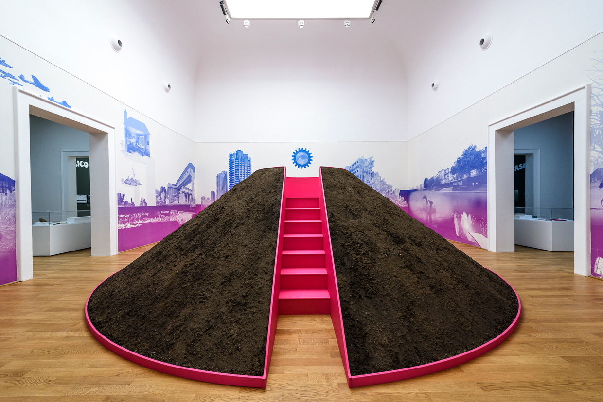
Great Britain. A Clockwork Jerusalem. Photography © Andrea Avezzù. Courtesy la Biennale di Venezia.
I fully agree with the rest of the text and don't understand the current fashion which denies responsibility and social commitment, either because it comes wrapped in buzzwords from well-known TED talks or, as Michael Eisenbrey complains, naked as "the insensitivity in Werner von Braun's architecture" - "If it's not on the blueprints, who cares where the slaves bleed? It's not my department, says Zaha Hadid."
It seems as if the pavilions curators had made little effort to communicate their ideas to the public. I've spent years repeating it, it is surprising that the citizens, the people, are not the main makers and figures in architecture. Architecture is a constant in our lives and everyone has an opinion about the new World Trade Center, the Calatrava’s works and the Alhambra. And yet, there is little dialogue between the public and the architecture world.
Faced with the brilliance of curator Rem Koolhaas' proposal, what happens with the remaining actions, which together represent the largest and most popular Architecture event? How do we solve the lack of passion or desire to communicate with society that the pavilions’ partial interventions systematically show? Nevertheless and finally, Venice will always be the best of the scenarios. The Biennale shows that Venice, lacking a present, could be at the avant-garde of a conversation about the future of architecture.


