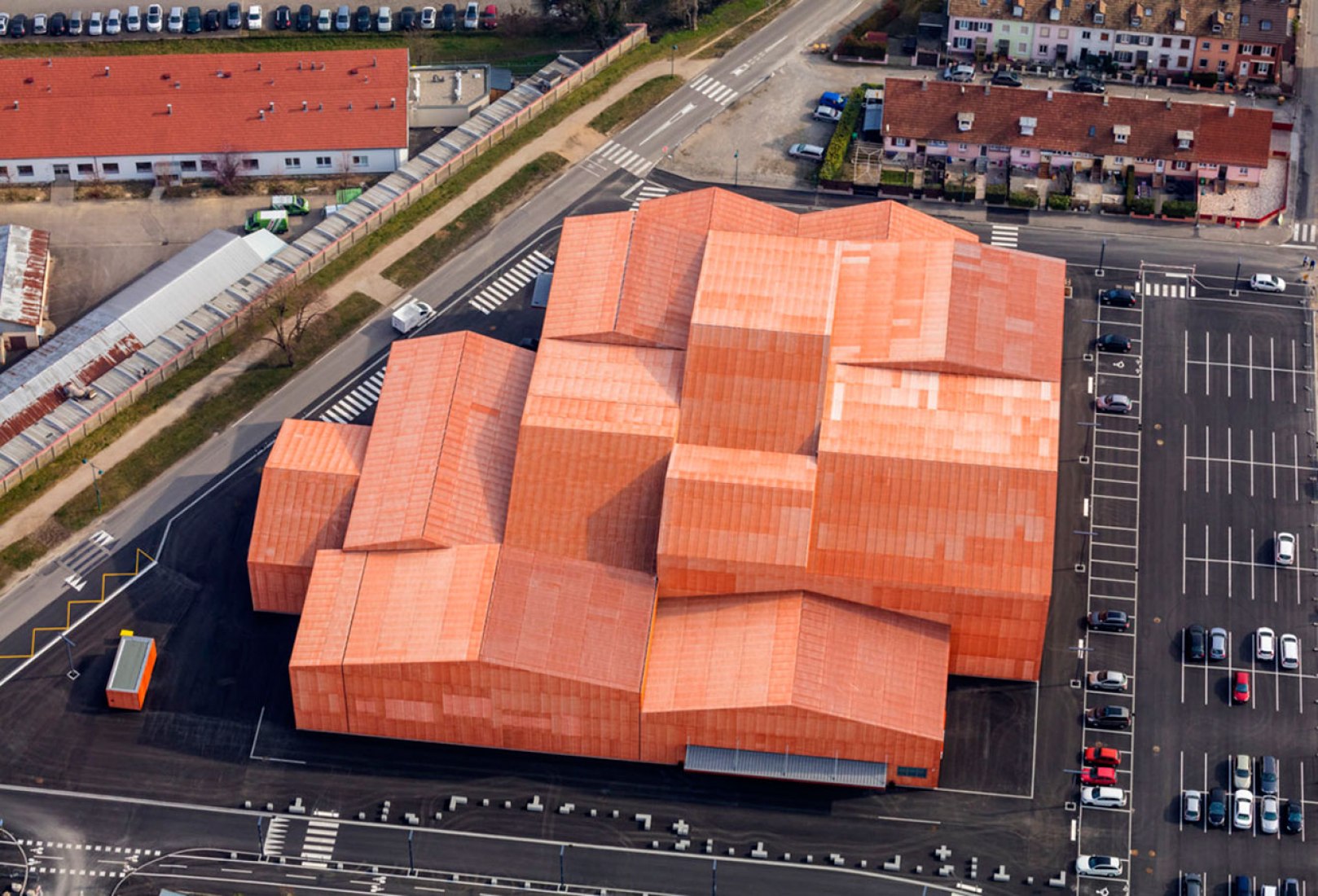
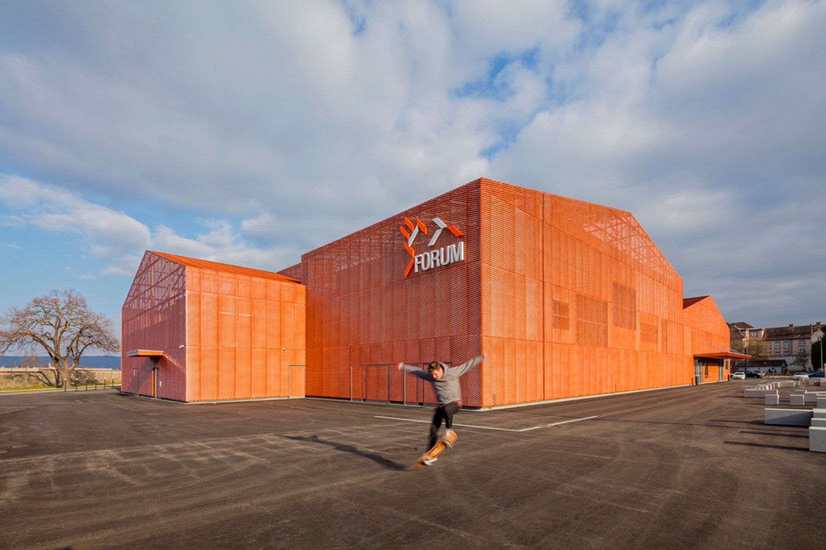
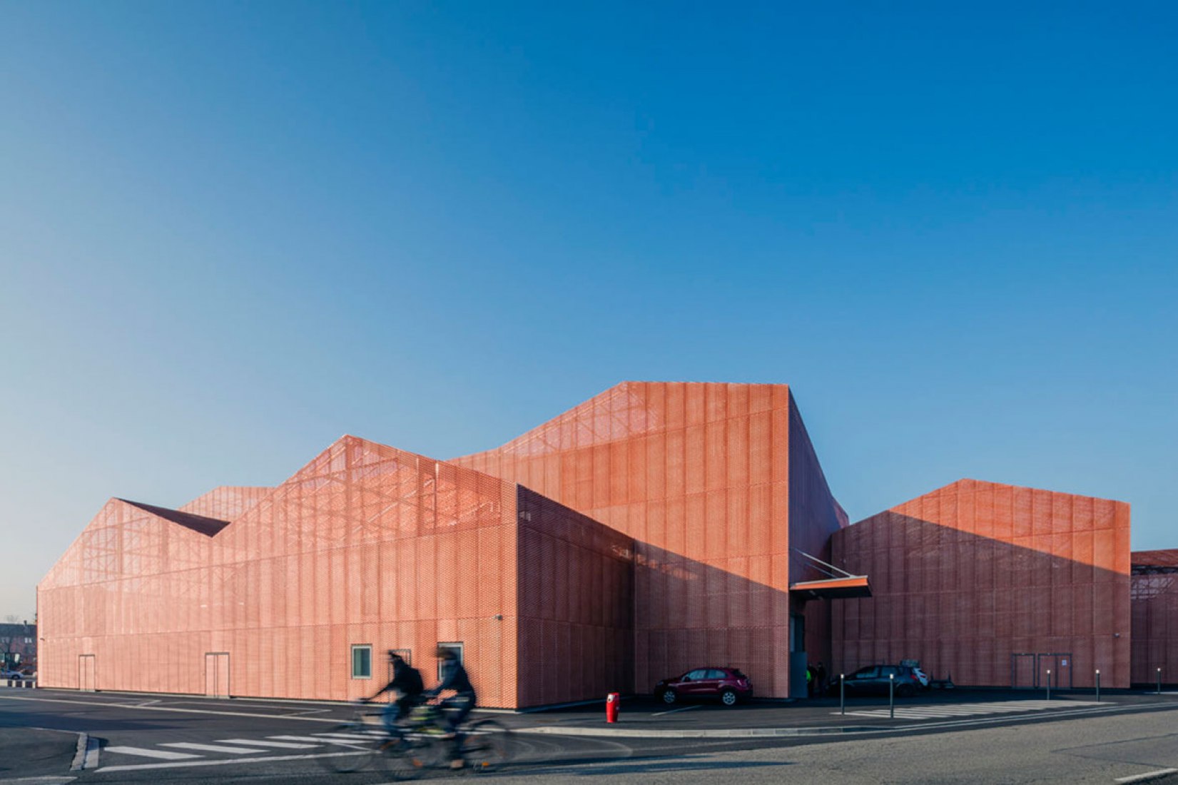
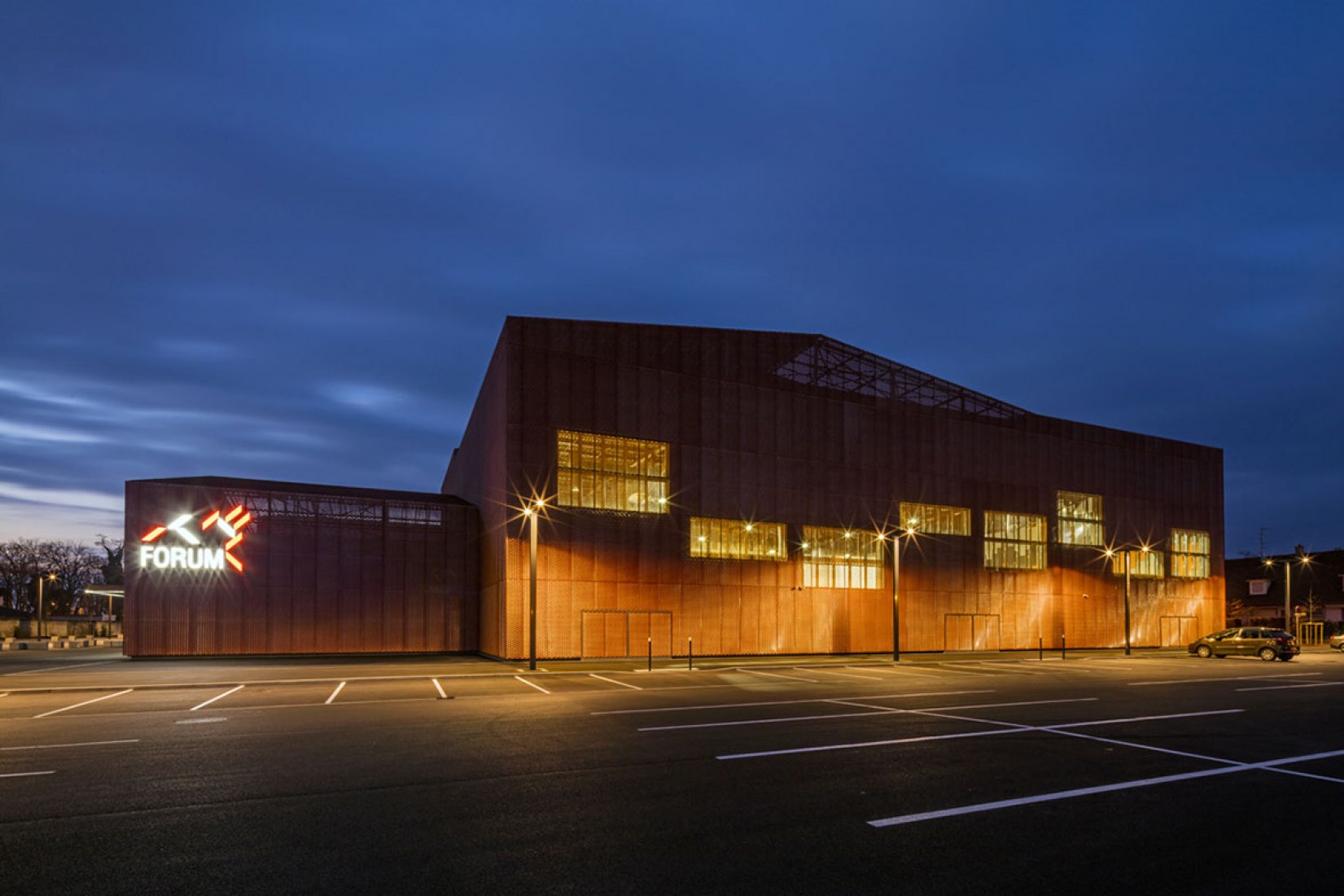
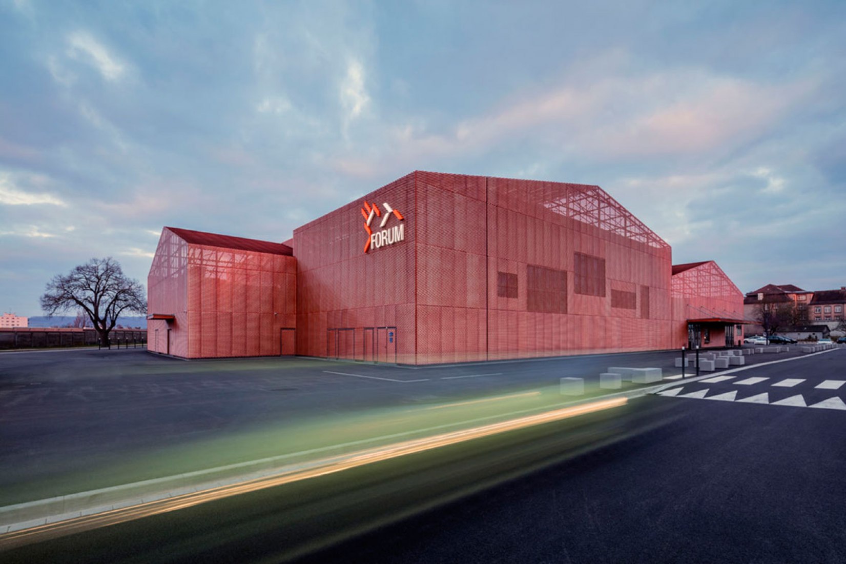
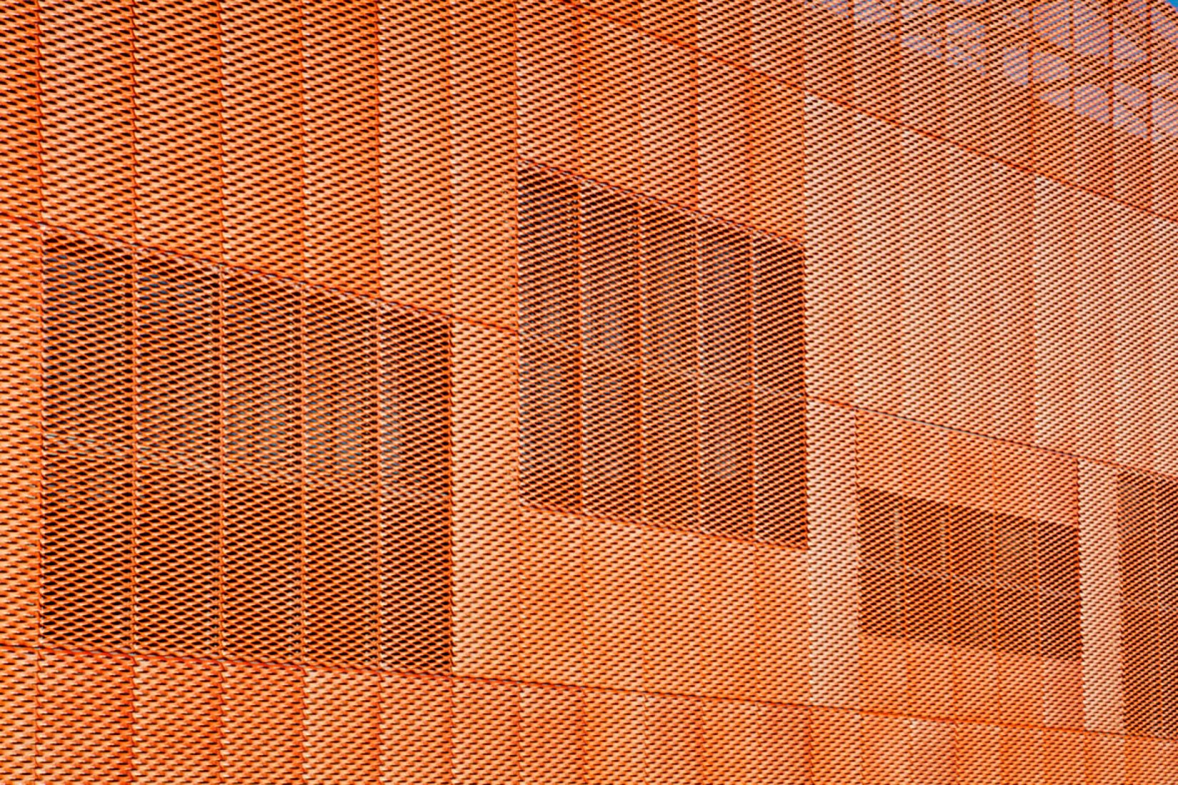
To break down the size of the structure, and to avoid dwarfing neighbouring buildings, the Forum was conceived as a cluster of smaller blocks, all clad with just one material.
All volumes have gabled rooftops – a characteristic shared by both the nearby residential buildings and many of the larger commercial properties. But they don't all run in the same direction, creating a patchwork of angled surfaces.
"The roof of each volume is then systematically made of two slopes, inspired by the design of the roofs you can observe in the surroundings, alternating the orientation of the folded faces in order to capture the light at different times." explained the studio, which was established by Manuelle Gautrand
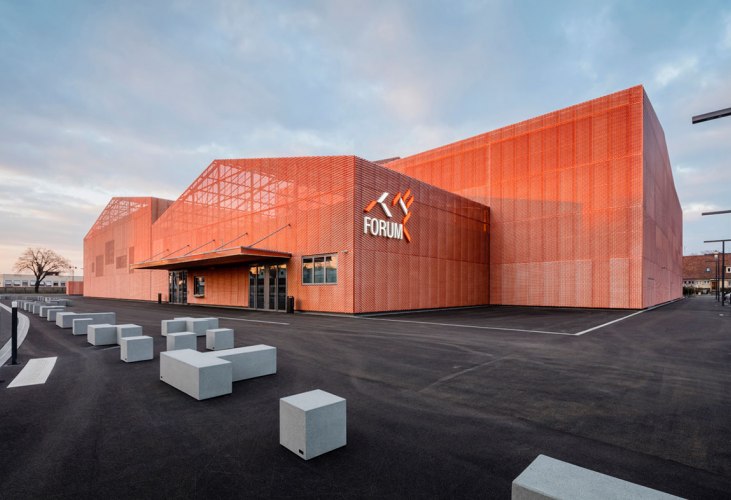
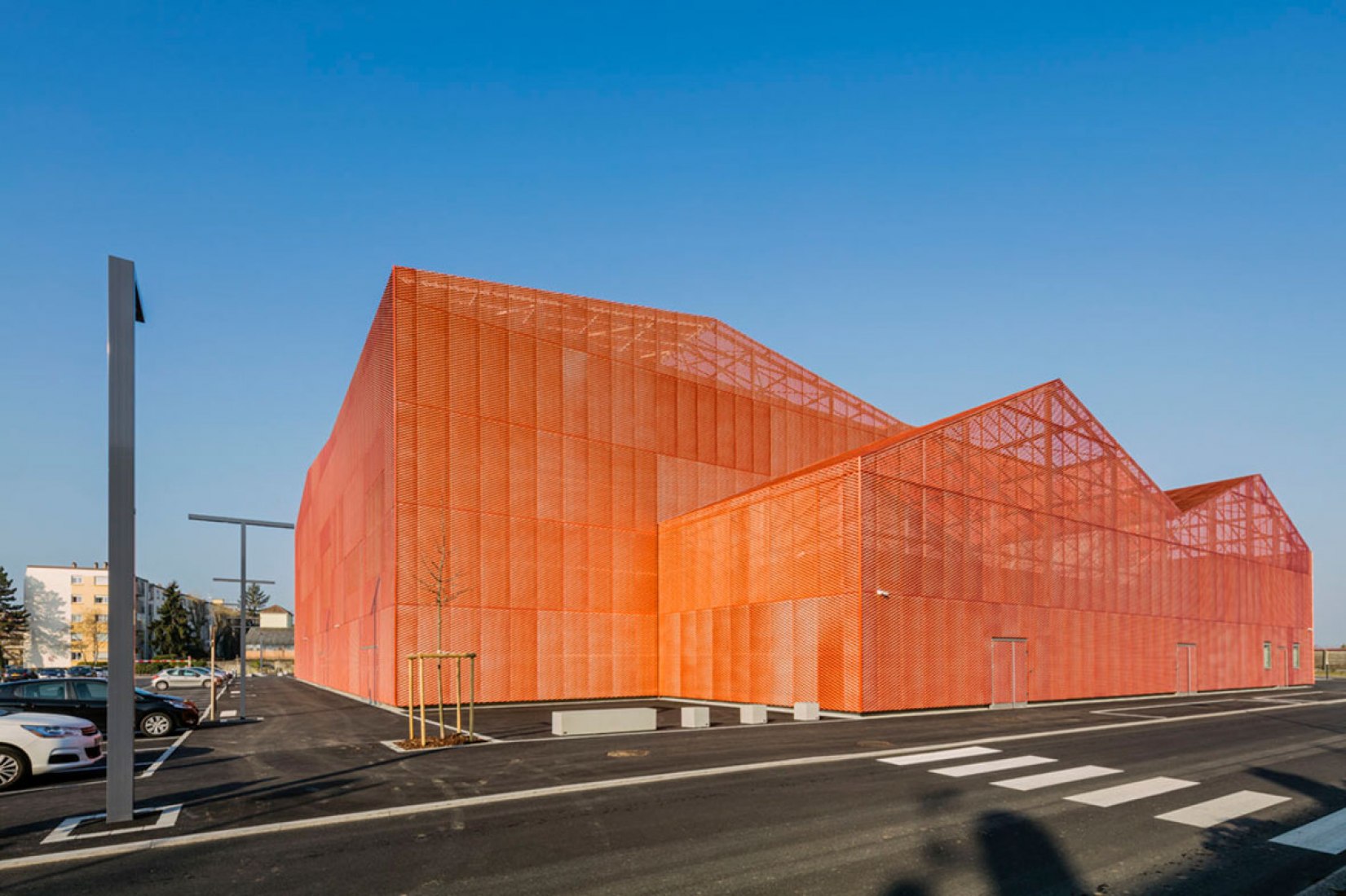
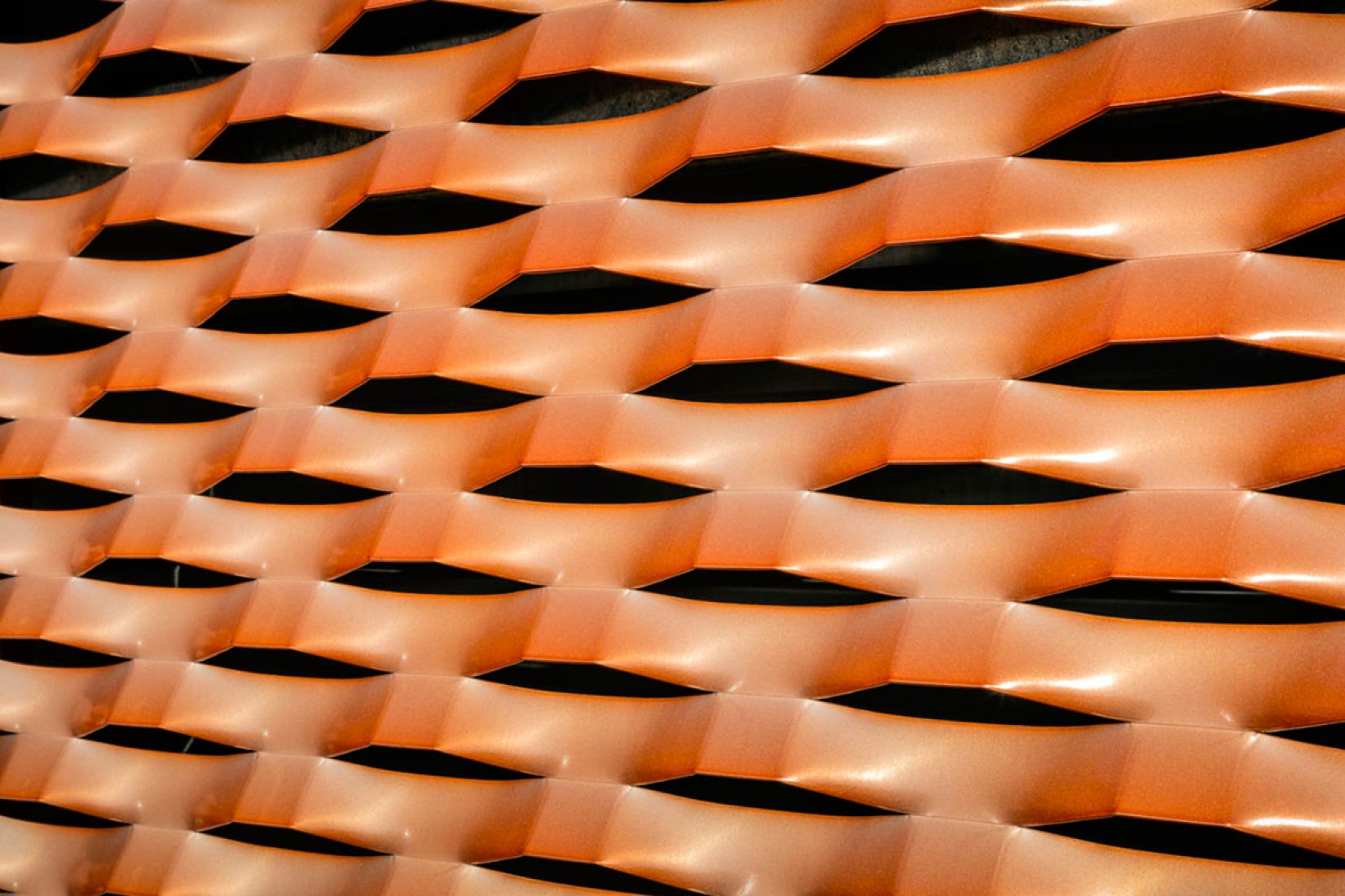
Manuelle Gautrand Architecture worked with paint manufacturer Akzo Nobel to develop the colouring for this facade, which comes from a bespoke pigmented varnish containing copper powder.
"The result is a glistening envelope which, by turns and according to the light it gets, may vary from an almost white colour to a nearly orange bright tint, or also to rose, salmon and pale orange. The sophistication of the material, along with its implementation on such a big surface, make the building a surprising landmark," said the design team.
Description of the project by Manuelle Gautrand
13 VOLUMES CLEVERLY ASSEMBLED IN ONE BIG PUZZLE AT THE MIDDLE OF THE SITE
Located in Saint-Louis (Alsace, France) in the “Three Borders” region and in the inner suburb of Basel, the “Forum” dedicated to replace the old “Palais des fêtes” of the town, is a cultural facility designed to host associative, sporting and cultural events. The land, vast enough, is located close to the city center of Saint-Louis in an area mixing different scales and uses: it remains a residential area mainly made up of low height houses mingled with some characterless large-sized collective buildings, but it also includes offi ces and workshops for small companies, as well as a kindergarten and a primary school. The project has been designed to fi t between these different built scales, in the smoothest possible way, by trying to minimize the breaks.
The program also involves strong contrasts between reception/offi ces/lockers spaces which required small-sized volumes, and the Festival Hall and the Great Hall, the two main spaces of the project which are requiring substantially greater volumes. Thus, between the relatively heterogeneous nature of the site and the one as well heterogeneous of the program elements, it was essential to work on a play with progressive volumes that could interconnect with each other while displaying the two key programs.
The project is then made of several distinct volumes, linked up to one another in a way the smaller volumes are placed at the edge of the individual houses, and the more imposing ones placed at the center. At the end there are 13 volumes connected to each other gathered at the center of the site, like the pieces of one single puzzle in this work of compactness and articulation with the environment. They all fi t in a unique writing because they are all covered with the same principles of forms, materials and openings.
The roof of each volume is then systematically made of two slopes, inspired by the design of the roofs you can observe in the surroundings, alternating the orientation of the folded faces sometimes North-South, sometimes South-West, in order to capture a light each time different. The expanded metal (©Métal Déployé), used as a cladding on all the facades, also contributes to this unity, and gives the project its originality. The project thus plays constantly with a double scale: One of fractioning that links the Forum with its urban context, and one of homogeneity that gives the building a strong and iconic design.
A MODULAR ARCHITECTURE FOR A MULTI-LIFE PLACE
The building is fortunate to be located on a widespread site, which enables a fl at installation and a maximization of functionality and fl exibility: all the functions communicate in a fl uent way, without vertical breaks. Several sub-spaces are created within the project: the Festival Hall situated on the North, the Great multifunctional Hall situated on the South, the public entrance halls on the West, the schoolchildren entrance hall on the East, and the storage rooms on the Northeast.
The main issue of the project was to ensure that those spaces had the possibility to communicate in a more or less direct way according to the program of the moment. Designed like a puzzle, each space fi ts into the continuity of the next one, allowing a fl uid circulation and rapid fl ow between the functions, where no corridor or galleries are needed. The flexibility was a fundamental issue of the project, each space is expressing by analyzing the flexibility allocated to it.
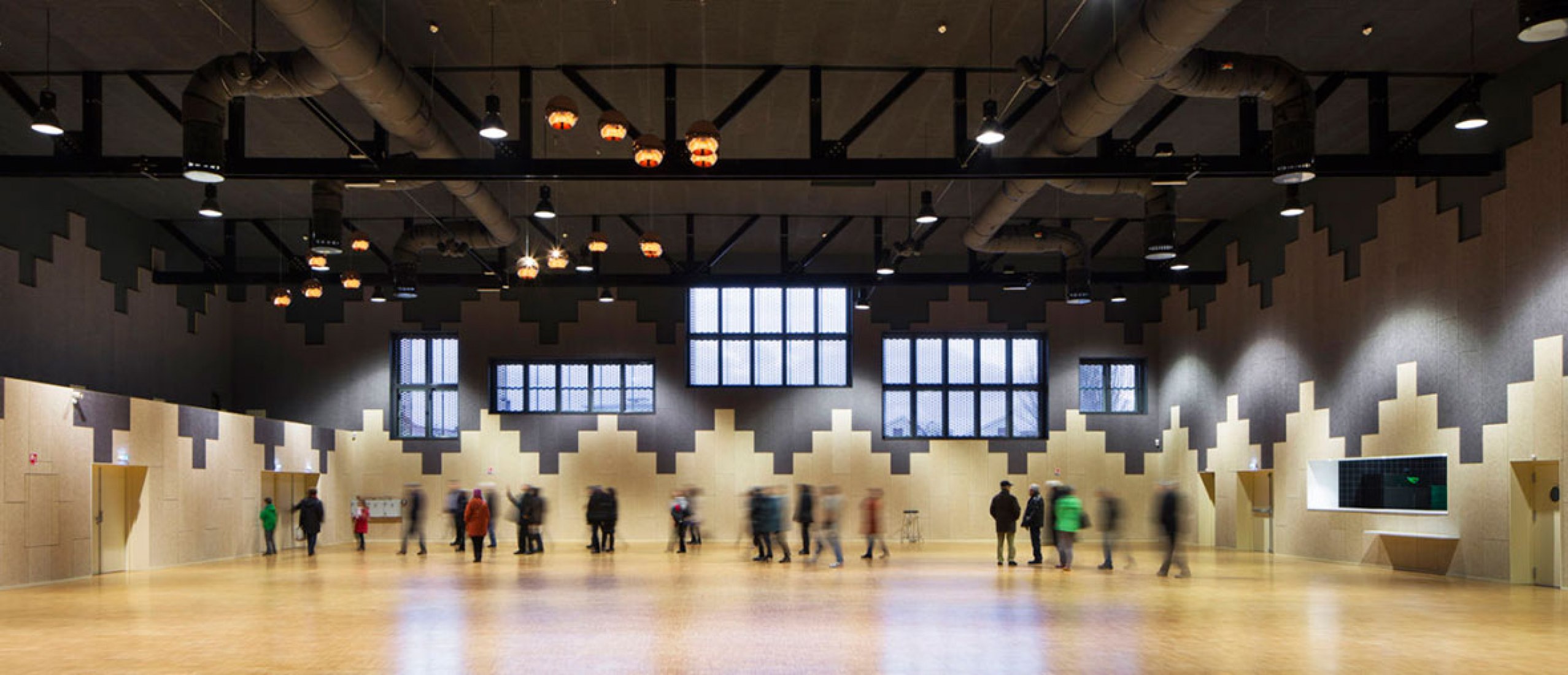
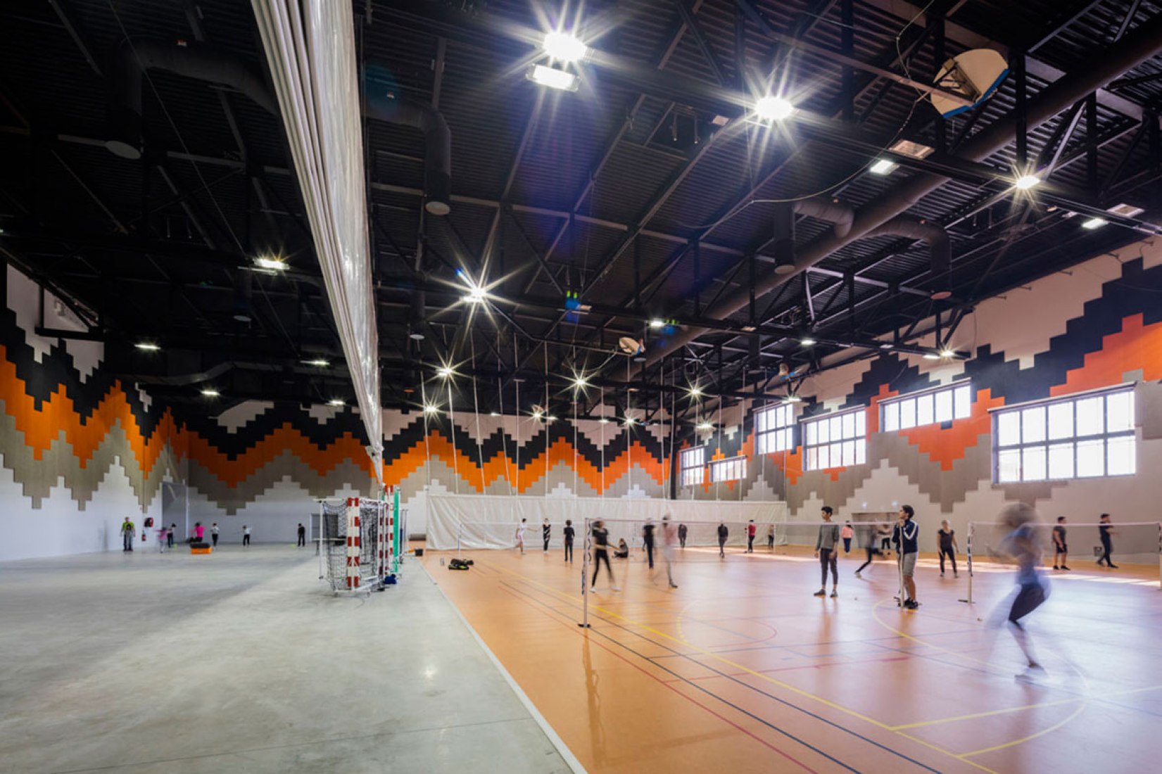
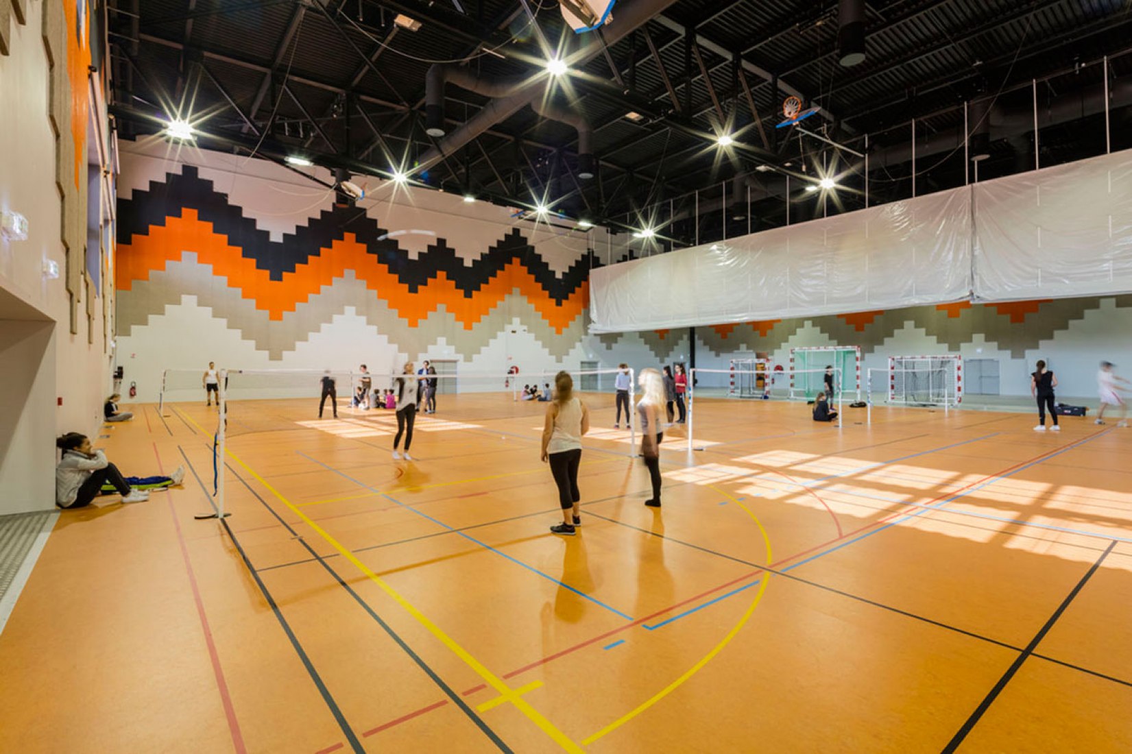
The 1,870 sqm wide and 13 meters high Great Hall, hosts various functions: first it is dedicated to sport practice, namely basketball, handball, mini-handball, badminton, judo, and gymnastics, as much for the schoolchildren than for sportive competitions, sometimes on a national level for some of those disciplines (especially badminton). The Great Hall can also host concerts and shows, with a gauge of maximum 2400 standing people, or about 1000 seating on a mobile bleacher provided for the purpose. Lastly, it can also host exhibitions or/and fairs. It can be intersected in different ways thanks to a play of retractable sliding partitions, allowing for instance the organization of an exhibition while a sport practice is taking place for the schoolchildren. The Festival Hall covers an area of 872 sqm, and is also dedicated to host shows, associative events, weddings, or even fairs and exhibitions. Right next to it is a kitchen which allows the organization of banquets of 600 persons maximum.
That gauge can rise to 900 persons in case of a big event or a ball. The Festival Hall can be opened directly on the Great Hall thanks to their connection, which is required when fairs and big events like the Book Fair are taking place and that the use of the whole building is necessary. The modularity is also included for the accompanying functions: the long lobby on the east is leading to the two big areas, at the same time or not if the activities require a separation for a total operational independence. All the material is shared in storage rooms situated in northeast (450 sqm): during big events, those storages will be specifi cally adapted with a direct access from the Acacias street, and will be directly connected to the Festival Hall in the west, and to the Great Multifunctional hall in the south.
THE INDOOR DESIGN: A JOYFUL PALETTE WITH RESISTANT MATERIALS
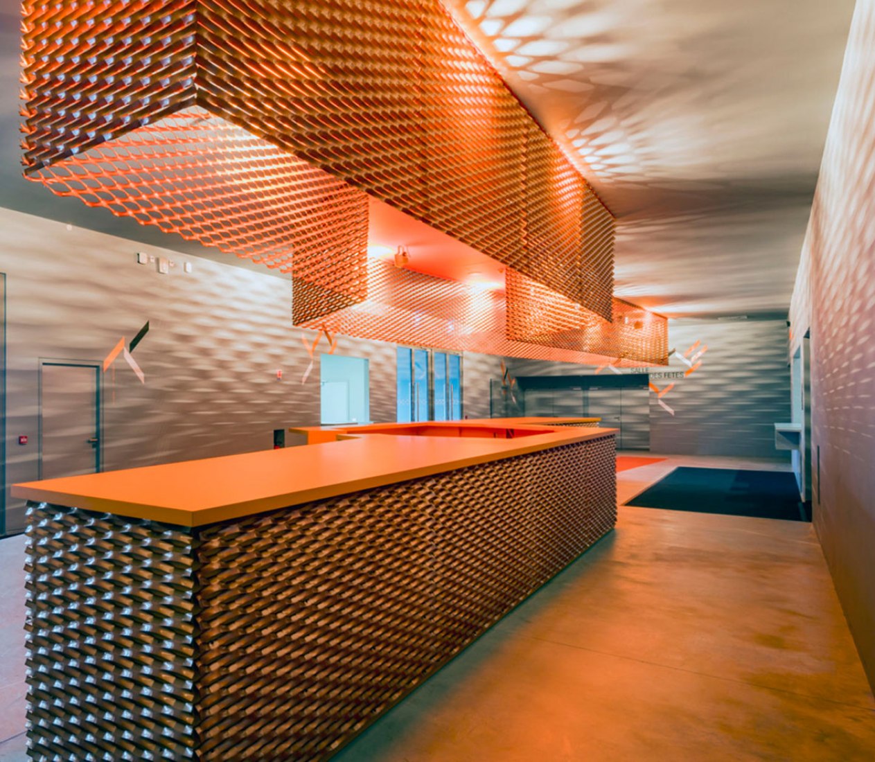
We looked for extending the outdoor ambiances into the indoor spaces: As they are walking along the building, the visitors discover the coppered-metal facades, and at the moment they enter the welcoming hall, they fi nd the long bar covered with the same large expanded metal panels. The length of this bar, more than 14 meters, gives it a central role, welcoming and festive: it takes up the space, in a certain way forces the detour, even incites to stop and share a friendly time over a drink.
Above the bar itself, a long chandelier follows its contours and kind of shelters the visitors under a warm light. The hall seems at once fl ooded by this bar, but also by the refl ects the chandelier is spreading into the space: its envelope made of expanded metal creates a fi lter that cuts the chandelier inner light and refl ects it to the hall walls, grounds, and ceilings. We wanted our visitors to be impressed, as soon as they entered the building, immersed in a unique and colorful atmosphere. To highlight this bar and its chandelier in the middle of the lobby, the different walls are soberly tinted of a soft grey, the ideal medium to this work with refl ects we sought for.
All through their promenade into the building, the visitors will fi nd this colored palette again, regularly mixing beautiful bright oranges to greys made to enhance them. From time to time, those oranges and greys will be combined to blacks, especially in the two big rooms where a subdued light is needed during the day, whereas the darkest possible medium will be needed at night, to accompany shows and concerts. The signage always follows this register, with a graphic work both inspired by this color palette and by the natural pattern of the expanded metal, made of little angular folds we developed in a range of multiple little dynamic lines accompanying the texts, as so many little arrows and braces.
The project’s indoor materials are simple but rustic and strong: large fi bracoustic panels on the walls for the sound absorption, orange sports fl ooring in the Great Hall, beautiful bamboo parquet fl oor in the Festival Hall, some nice Tom Dixon’s coppered lights, and the last but not least Vitra furniture (whose headquarters are located at less than 20 kilometers of Saint-Louis) with a beautiful set of Eames stackable chairs, which allow to host all the banquets and associative events.
A SINGULAR ENVELOPE FOR A GREAT ENERGETIC EFFICiENCY
As mentioned above, our wish was to create a unifi ed project, playing on both the multiplicity of the connected volumes, and on a global homogenous design. Thus, all the claddings (facades and roofs) are treated with the same fi nishing material; an expanded metal (©Métal Déployé) mounted on big frames, with a very specifi c color inspired from natural copper.
The inspiration has come from the context, which combines big orangey interlocking tile roofs with some industrial brick chimneys reminding the industrial past of the site. We used a specifi c varnish which we designed and tested with Akzo Nobel: this is a translucent varnish which enables to keep the vision of the expanded metal panels shiny aluminum in the background, in which the manufacturer inserted some pigments containing copper powder.
The application was delicate due to the volatility of those pigments and their tricky assembly. The whole required several prototypes, and the result is a glistening envelope which, by turns and according to the light it gets, may vary to an almost white color to a nearly orange bright tint, or also to a roses, salmons and pale oranges palette. The expanded metal is perforated enough to reinforce this variety of perceptions: it gives the feeling of alternatively a strong opacity, or a transparency according to the angle on which you look at it. This sophistication of the material along with its implementation on such a big surface, make the building a surprising and calling landmark in the city.
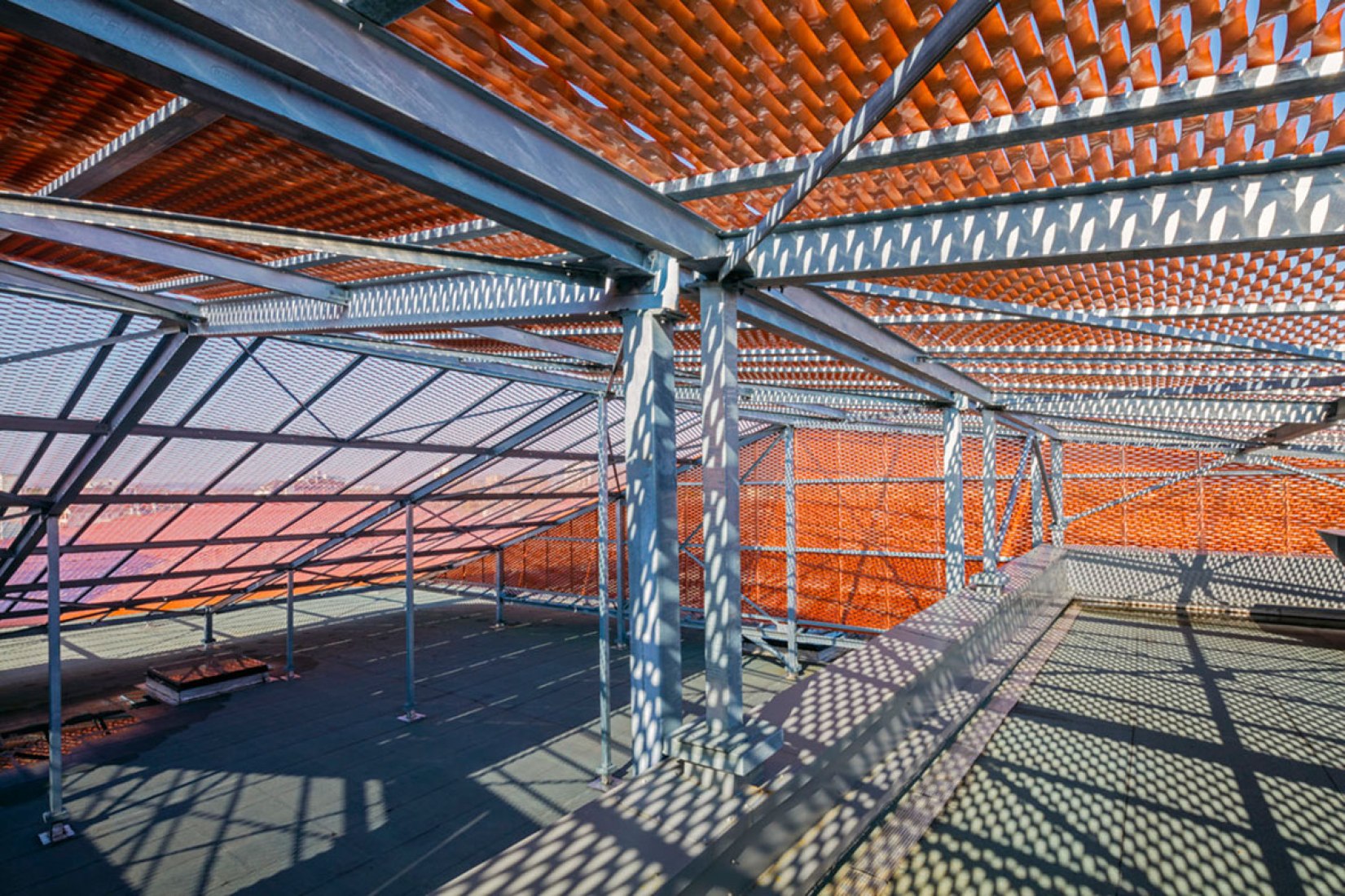
The project is actually made of two envelopes with complementary functions: A first structural envelope, developed at the nearest of the functions, is forming the core and shell while guaranteeing thermal and acoustic insulations. This fi rst structural envelope is made alternatively of reinforced concrete walls, or of a light metallic set. Over this envelope, a second skin is wrapped, made of large expanded metal panels, mounted on a very simple steel frame and relatively repetitive. Their mounting over the core and shell volume creates a wide plenum.
This plenum, protected by the big uniting envelope that really embraces all the faces of the building, answers two technical issues: First, by masking the numerous and large-sized technical equipment that have been installed or/and spread on the roofs. Then, it makes a kind of thermal protection during summer, plunging all the roofs forming the core and shell and the technical equipment, into a protective relative darkness, while providing a kind of natural ventilation intensifi ed by the expanded metal perforations. All of this fi nally enables to minimize the use of air conditioning. The low energy consumption of the building has been achieved thanks the combination of these two complementary functions envelopes, among other things.
The global performance of the building has guided the whole conception and design. The main goal was to reach the BBC label, that is a regulatory consumption level lower for a half of the reference consumption, which is a feat for a cultural facility dedicated to host shows inherently very energy intensive. The achievement of the BBC label has been obtained with dynamic thermal simulation. Furthermore, the powerful outside insulation and the low quantity of glass surfaces allow to limit the energy loss. Indeed, the project owns facades primarily closed: no curtain walls but numerous bay windows and glass doors that connect the indoor and outdoor.
The building also has dual-fl ow ventilation and three heat pumps air/air. The whole equipment is connected to the district heating. The new air treatment of the other rooms is made with CTA – in partial recycling. To achieve effi cient consumption labels the attention was paid in the fi rst instance on the built: the wall transmission coeffi cients lower than 0.20 W/sqmK for the opaque walls, and between 1.5 and 1.7 W/sqm for the glass walls. A commitment on the air-tightness, with a permeability of 1m3/hsqm under 4 Pa, that results from details of precise execution, through linking workshops with the contractors, and at the end a measure of air-tightness with a specialized organism.

