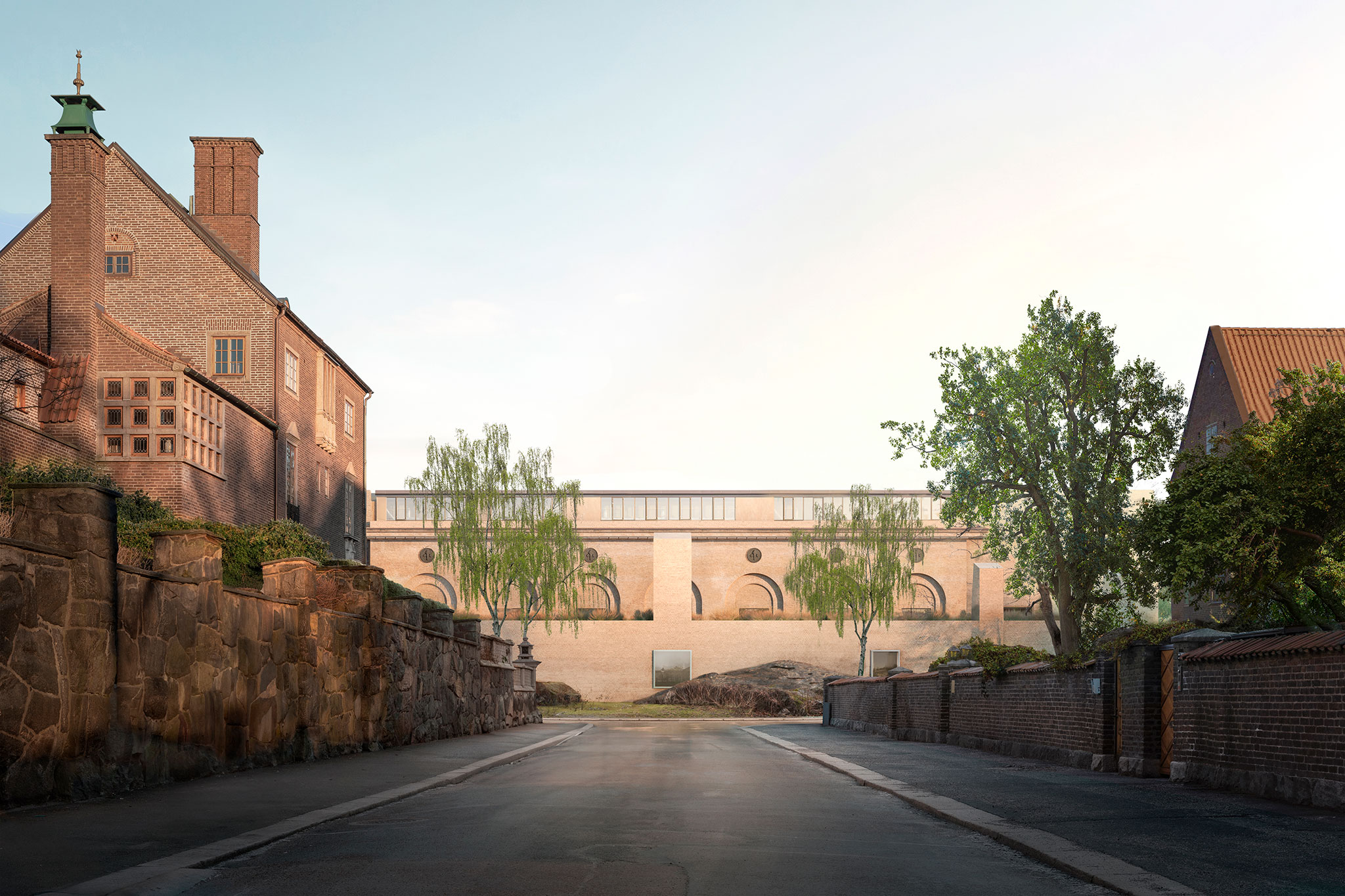
The abstract and discreet facades, with some precise openings, create a certain continuity but also a certain contrast with the existing building, allowing a dialogue between the two architectural styles. In this way the new building adds value to the existing building by resolving the relationship between the museum and the small neighboring development.

Gothenburg Art Museum by Barozzi Veiga. Rendering by Filippo Bolognese Images.
Project description by Barozzi Veiga
Barozzi Veiga, in collaboration with the local architects Hermansson Hiller Lundberg Arkitekter and the landscape architect Peter Korn, won the competition for the renovation and the extension of the Göteborgs Konstmuseum.
The whole intervention hinges on the idea of a respectful and complementary relationship with the existing museum. In doing so, the extension is designed as an elongated plinth in front of the southern façade of the historical building.
The new volume is perceived as a complement addition to the historical building, but also as an element with its own character that—in contrast to the institutional and classical features of the second one—stands out through its geometric contrast with the existing nature. Highlighting the characteristic rocks and integrating them in the facades’ composition, the extension becomes rooted in the site, appearing as a half-buried plinth emerged from the ground.

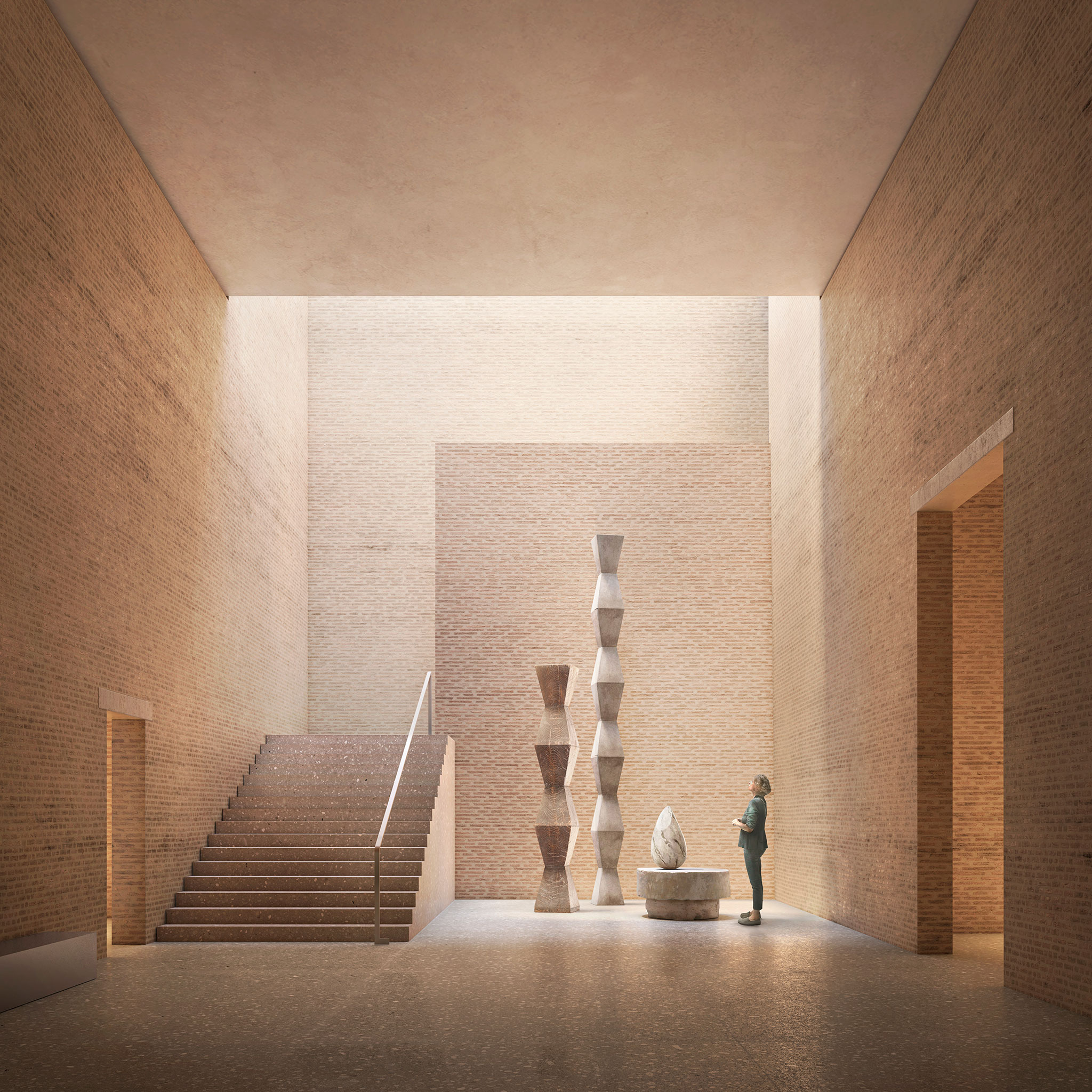
Gothenburg Art Museum by Barozzi Veiga. Rendering by Filippo Bolognese Images.
The proposal composes an ensemble that is sensitive to the specific characteristics of the place, that adds value to the existing building and that, from an urban point of view, resolves the relationship between the museum and the neighbouring small-scale development. The geometry of the extension is derived from the composition of the existing museum and its urban location. The new building maintains and reinforces the central axial geometry of the ensemble and follows the lines predetermined by the museum and the urban plan.
The abstract and low-key facades, with a few precise openings, create a certain continuity but also a certain contrast with the existing building, allowing a dialogue between the two architectural styles.

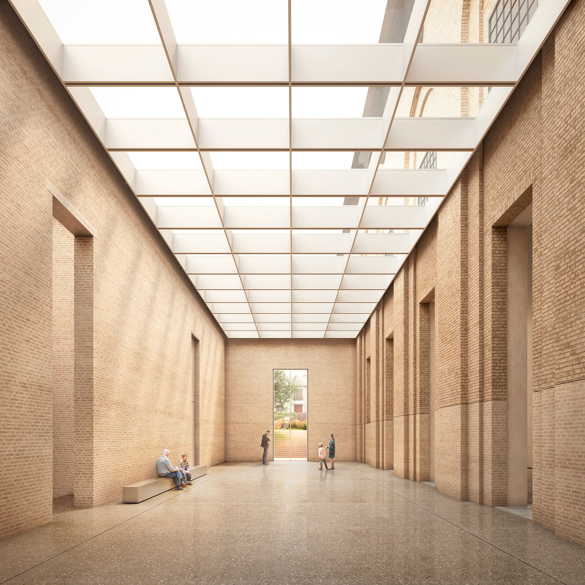
Gothenburg Art Museum by Barozzi Veiga. Rendering by Filippo Bolognese Images.
The project proposes a functional and rational organisation in terms of art, visitors’ flows, and security areas. The distribution of the different uses creates a compact and flexible project that avoids an overly vertical organisation of the public spaces and give it a more outward-looking character.
At a new main public level, the space between the historic building and the extension constitutes the museum's central public square around which all exhibition spaces are organised. In this interstitial and bright space, characterized by the natural light, one can grasp the relationship between old and new.


