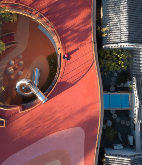
Freeing up the upper views and the placement of the canopies, give an organic personality to the project that contrasts with the orthogonality of the surrounding buildings that allow understanding the project as a place of leisure, a place of rest, a different place.
Description of project by Kokaistudios
Kokaistudios was recently commissioned by property developer CR Land to redesign Galleria-Instreet (Hereinafter referred to as “Instreet”) in central Beijing. Calling for interventions both large and small, the extensive urban renewal project has transformed what was previously an underused, sparse space by injecting all-important human scale to invite public participation. The result is a clear flow to this formerly disjointed thoroughfare, as well as community-focused lifestyle elements to cater to both residents and visitors.
Located in Chaoyang District in the northeast of Beijing, Instreet is now representative of a hybrid-ized public space prototype that is becoming increasingly popular in Chinese cities. Comprising commercial functions as well as residential, and typically pedestrian, they feature lifestyle elements aimed squarely at communities. In the case of Instreet, these include children’s play areas, a net-work of canopies to provide welcome shade, plentiful public seating, and flexible spaces for mar-kets, concerts, and outdoor events of all kinds.
Despite several core landmarks - namely, a main entrance to both Phoenix Mall plus Sanyuanqiao subway station, as well as a long-redundant concrete bridge - the street lacked visual unity, its vari-ous elements disparate and unconnected. An absence of public seating contributed to not only the street’s empty feel, but also its non-human scale.
Kokaistudios’ first action was to demolish the concrete bridge that once connected the two ends of Instreet. An unnecessary feature along an already pedestrianized route, and disliked by locals, it was largely unused. Furthermore, it brought the negative effect of obstructing the line of sight from one end of the street to the other. Its razing opened up the space significantly, further highlighting the street’s distinct lack of character. At the same time, the bridge’s demolition presented multiple opportunities for design interventions.
A total re-landscaping of the area saw the introduction of instruments aimed at encouraging public interaction and use. In particular, a network of canopies running the length of the street visually in-terrupt the otherwise empty space. Not only does the string of shelters provide welcome shade, come nightfall they light up in a way that is not only atmospheric, but also brings safety and securi-ty. Resembling an archipelago, they are designed as oases of various activities. These include a children’s play area; clusters of green planters; as well as plentiful benches. At the centre is a versa-tile open-air platform for events of all kinds, further opening Instreet for future actions and possibili-ties.
Smaller interventions also play a part in Instreet’s redesign. For example, an intricate rain collection system and custom-made elements such as steel tree root guard meshes are representative of the project’s close attention to detail, and elevation in quality on what was previously in place.
Frontages of existing commercial tenants, as well as future ones, have also been given an over-haul. That includes a new louvered facade to a multipurpose facility comprising a gym, restaurant, and private club for residents. Now more visually and thematically linked, a mainstay of F&B outlets feature extended terraces, surrounded by planters. The smart wooden decks, combined with rough stone elements, as well as additional trees all make for a pocket of nature in the heart of Beijing. The overall effect is welcoming, comfortable and in keeping with Instreet’s refined lifestyle focus.


