The project places the entry points at the ends of the wings of the palace. Traces of the past remain visible in the subtle marble inlays on the walls where the old structure was hollowed out to create the lantern-shaped entrance pavilions. From here visitors are guided up to the light-filled balcony, which houses all the necessary visitor facilities and leads to the Grand Foyer which is the central hub of the subterranean extension.
The underground extension maintains the symmetrical logic of the Baroque composition and the Corps de Logis of the palace as the basic plan. Visually, the palace can be seen looking up through the glass ceiling of the Bassecour ponds.

Museum Paleis Het Loo by KAAN. Photograph by Simon Menges.

Museum Paleis Het Loo by KAAN. Photograph by Simon Menges.
As part of the intervention, the historic building was carefully restored to improve technology and climate control systems and provide better amenities for visitors.
“It is not only what you see but also what you feel that adds to the quality of the architecture. It is the texture of the materials, the craftsmanship with which the details are made.”
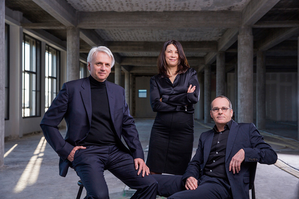
Prof. Dikkie Scipio, architect and co-founder of KAAN Architecten, on how to draw inspiration from the baroque palace.
Paleis Het Loo, together with the re-opened Royal Museum of Fine Arts in Antwerp, are two recent museum transformations by KAAN Architecten, adding to their vast list of heritage renovation projects. Others include B30 in The Hague, Education Centre Erasmus MC and Central Post building in Rotterdam.

Museum Paleis Het Loo by KAAN. Photograph by Simon Menges.

Museum Paleis Het Loo by KAAN. Photograph by Simon Menges.
Project description by KAAN Architecten
Paleis Het Loo was initially constructed in 1686 as a royal hunting palace for King William III and Queen Mary on the outskirts of Apeldoorn. The property's ample forest grounds and necessary underground water pressure created ideal conditions for a baroque composition of lush gardens punctuated with numerous water features and a monumental palace at its base. KAAN Architecten's intervention draws from this inextricable connection between architecture and the landscape. The entire extension is placed underground, and the new water feature is integrated as part of the architecture, continuing the tradition of the overall composition without disrupting the historical image.
Nestled between the palace wings lies the Bassecour, formerly a courtyard with grass parterres and a water trough for horses. Today, it has been transformed into a stunning space with a central fountain and four glass surfaces, each adorned with natural stone and a thin layer of running water, paying homage to the waterworks in the historic gardens. The Bassecour has evolved beyond just the palace forecourt, now serving as the roof of the new extension. The four-centimetre-deep ponds reflect the monumental palace while daylight permeates the water, casting a brilliant effect below.
Rather than creating a prominent entrance that could encroach on the open Bassecour, the entry points have been positioned at the ends of the palace wings. Traces of the past remain visible in the subtle marble inlays on the walls where the old structure was hollowed out to create the lantern-like entry pavilions. Visitors are guided down to the light-filled balcony, which hosts all necessary visitor facilities and leads into the Foyer.
The Grand Foyer is the central hub of the underground extension. Stretching along the central axis, it forges a twofold connection with the historic building. Physically, the old and new sections of the palace share a common foundation through a vaulted stairway. Visually, one can behold the palace by gazing upward through the glass roof of the Bassecour ponds. In the heart of the Foyer, directly beneath the fountain, a large wind rose in the floor indicates the centre of the extension and invites visitors to choose a direction - continue to the Corps de Logis, enter the exhibition halls, head towards the east wing, or return to the entrance balcony?

Museum Paleis Het Loo by KAAN. Photograph by Simon Menges.
The underground extension keeps the symmetrical logic of the baroque composition and the palace's Corps de Logis as the basic floor plan. In the original layout, the vestibule boasts a central staircase and adjoining rooms designated for an audience with the king. This principle is maintained in the extension, where the Grand Foyer, flanked by exhibition halls, connects with the stairway to the palace.
To the west of the Grand Foyer, spacious square halls with almost 5-meter-high ceilings host temporary exhibitions. Above them, a museum in the historic west wing has been developed specifically for children called the Junior Palace. Meanwhile, the east wing is accessible through the magnificent staircase hall and highlights the history and present-day activities of the Dutch royal family in a permanent exhibition House of Orange.
As part of the intervention, the historic building was carefully restored to improve the technology and climate control systems and provide better amenities for visitors. A new staircase was added leading to the roof of the Corps de Logis and offering unprecedented views of the grounds. Additionally, the palace wings underwent significant renovations to accommodate new exhibition spaces, while the old ballroom adjacent to the west wing was transformed into a restaurant.

Museum Paleis Het Loo by KAAN. Photograph by Sebastian van Damme.
Although its architectural expression is restrained and elegant, the new building befits the grandeur and imagination associated with the term palace. “It is not only what you see but also what you feel that adds to the quality of architecture. It is the texture of materials, the craftsmanship with which the details are made,” explains Prof. Dikkie Scipio, the architect and co-founder of KAAN Architecten, about drawing inspiration from the baroque palace.
Special focus was put on the finish of the stairs, floors and walls, which blend in pattern and material. Subtle textures are layered through alternating sandblasted, honed and polished marble, playfully brought to life by the reflection of natural light through the pond. Set against the white of the veined marble is the warmth of the walnut applied on the doors, wherever one makes the transition to a new spatial experience. The wood pattern represents a single orange blossom leaf, or flowers and butterflies when multiplied, in reference to the gardens and their symmetrical graphic. This pattern can also be found on the door handles, in various pieces of furniture and the wall tapestries of the restaurant. These opulent fabrics are interwoven with metallic threads, adding a shimmer to the walls as a nod to the ornate halls of the Corps de Logis.
“The aim of the design is to achieve a balance and unity between the old and new buildings, a result greater than the sum of its parts,” Scipio says. At first glance, the renovation and extension are invisible, then later revealed through a series of carefully considered features. Each of them enhances the visitor experience without detracting from the monument, positioning Paleis Het Loo to remain a vital cultural institution for years to come.


